547名前の落款ロゴ
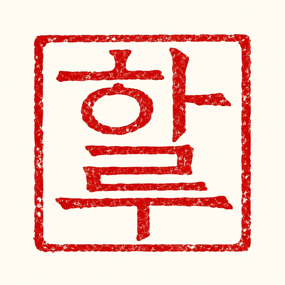
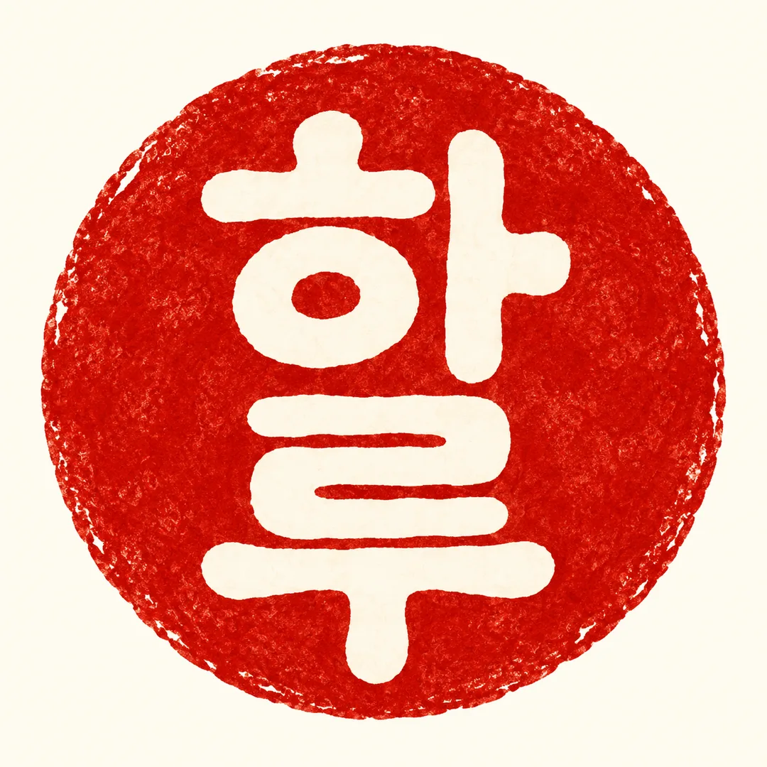
短い名前をそのまま生かし、四角や丸に彫り込んだ赤い落款ロゴを作ります。
受け取れるもの
- 入力した名前をそのまま刻んだ落款ロゴ1枚
ChatGPT 無料 OK
項目を入力
- 1項目を入力します
- 2コピーを押します
- 3GPTのチャットに貼り付けます
- 4そのまま送ると、サムネイルの例のような画像になります
- 5カードに合う実際の写真を一緒に入れると反映されます。背景カードなら背景の写真、人物・料理カードならその写真 任意
実際に試しました
- 試験日
- 2026-10-29
- ツール
- ChatGPT画像モデル(Codexで実行) — 無料ChatGPTと同じモデルかどうかはこの実行情報では確認できない
- 結果
- 合格
- できたこと
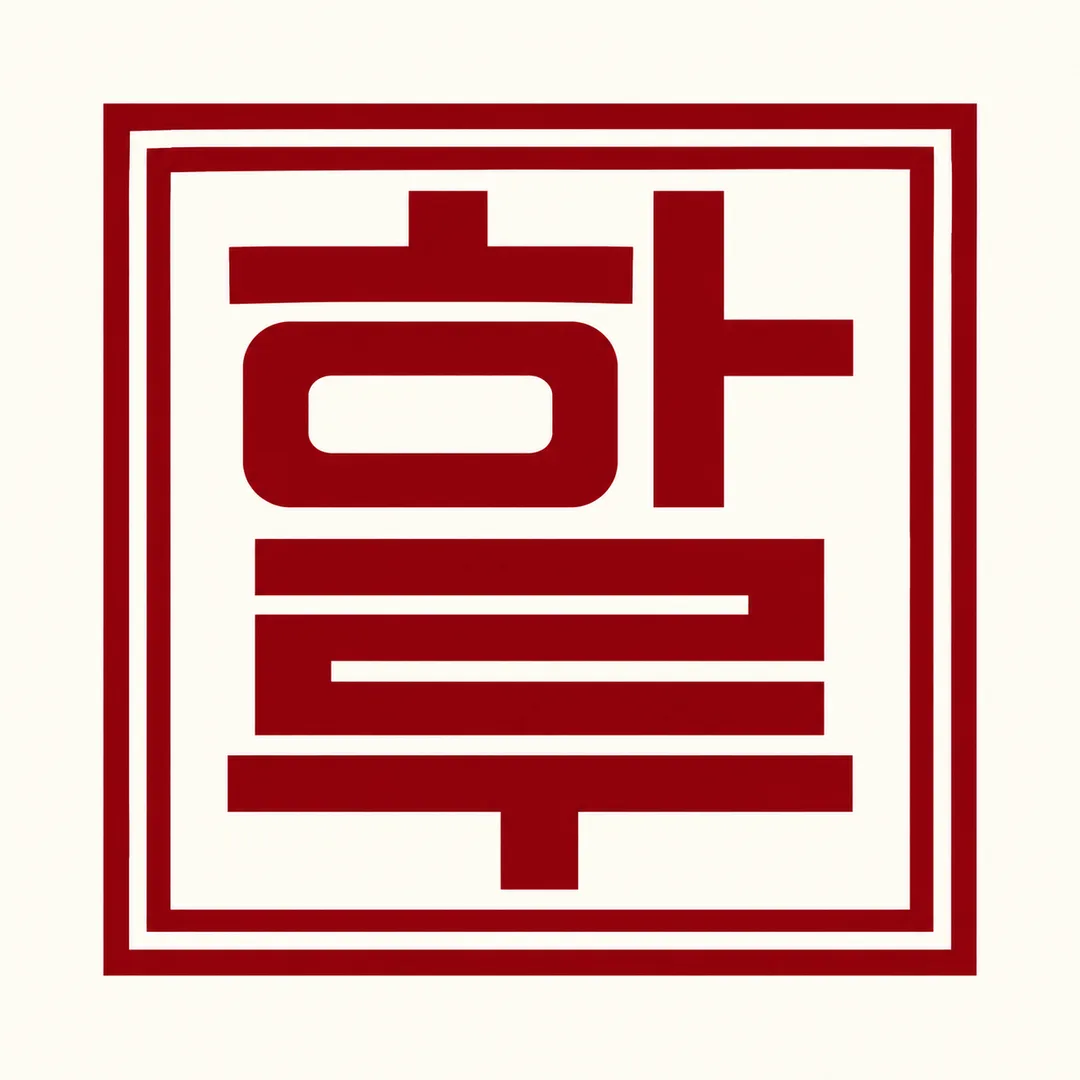
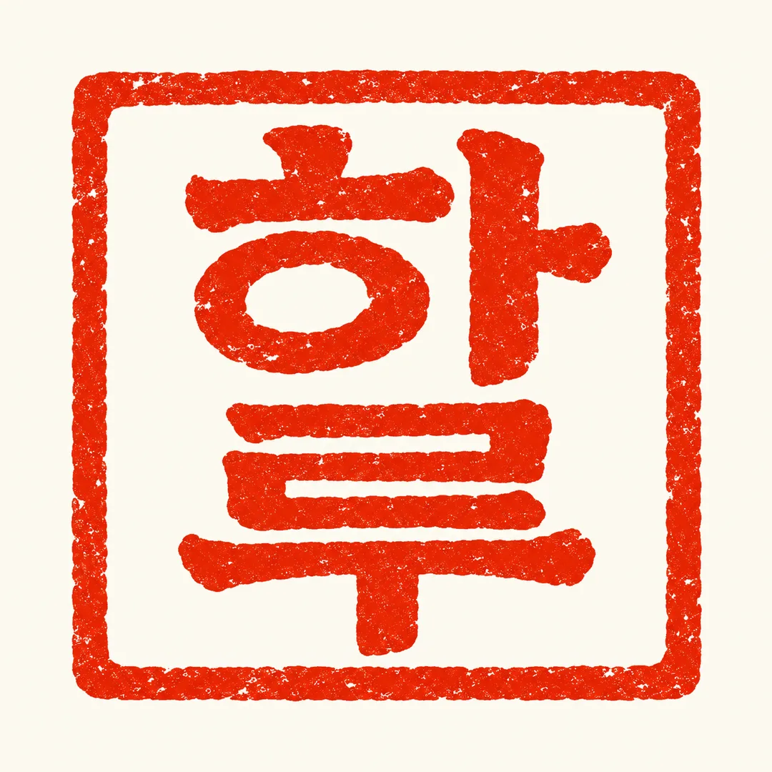
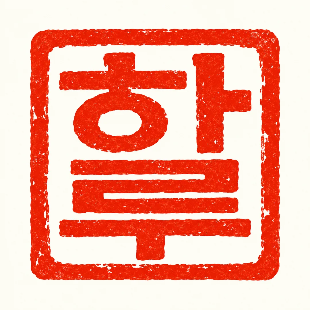
- 両方の結果で文字「하(ㅎ·ㅏ)」と「루(ㄹ·ㅜ)」が読めるように配置され、上から下に並んでいる。正方形の枠内に朱色系の単色の平面落款が1つ、アイボリーの背景と彫ったようなインクの質感。追加の文言・数字・小道具・ウォーターマークなし。文字は上部12%より下、下部15%より上に位置。キャンバスは1:1。
- できなかったこと
- なし
- 改善のヒント
- 確認された改善方法なし。同じ入力で再度実行してもピクセルサイズは変わらなかった。今回テストした値は하루・네모・주홍のみであり、他の名前・形・色は未検証。
プロンプト全文を見る 2,282文字
Generate exactly ONE finished flat seal logo image now. No explanations or follow-up steps.
出力サイズは1080×1080ピクセル、1:1の正方形にしてください。文字を読みやすく配置してください。
NAME: "【文字】"
SHAPE: "【形】" (default: 四角)
INK: "【色】" (default: 朱色)
Use 2–4 input characters verbatim, preserving script, order, case and every stroke. Never translate, romanize or replace Hangul with Chinese characters. Preserve Hangul initial consonant, vowel and final consonant as recognizable components. For other scripts retain their actual glyphs rather than forcing Hangul shapes.
Create one original Korean carved-seal-inspired identity: bold balanced lettering, deliberate negative spaces and subtle carved ink edges. Two characters stack top-to-bottom; three follow a balanced clear reading order; four form a 2-by-2 grid, read left-to-right then top-to-bottom. Keep Latin words recognizable across the grid. Use a true square outer contour for the square option and a true circle for the circle option. The shape selection changes only the outline, not the output type. Match the selected single ink color. Default colors correspond to vermilion, crimson and burgundy respectively.
An ivory background fills the entire canvas. Enlarge the single seal to about 86% of canvas width within the central safe area; for a portrait ratio retain an actual square or circle, without stretching it. Keep all lettering below the top 12% and above the bottom 15%. No mockup, stamp tool, props, decorative illustration, extra text, numerals or watermark. Never imitate an existing brand, logo, real person's signature, character or artist's style. All shop identities and product applications are fictional original concepts.
Before returning the image, zoom mentally through each input character and check every component, especially Hangul vowels and final consonants. Correct substitutions, missing strokes and merged characters while retaining the selected outline and ink. Return the single finished logo only.

[Final output format]
出力サイズは1080×1080ピクセル、1:1の正方形にしてください。文字を読みやすく配置してください。
This selected output format takes priority over any fixed canvas size or aspect ratio elsewhere in this template. Adapt the composition, text zones and margins to the selected canvas without stretching or cropping essential content. Device safe areas apply only when a device is selected. Never print these format instructions on the image.
結果はどうでしたか?
こちらのカードも人気です
使い方・よくある質問
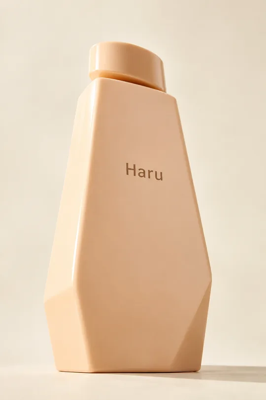
個人作家、工房、小さなお店の目印に使う落款風のロゴです。写真や商品モックアップではなく、明るい無地の背景に平面の印を一つ作ります。基本比率は1:1で、一覧の表紙は別に作った縦長の完成例です。
必須の欄は文字だけです。空白を入れず2〜4文字を指定します。例はHaruです。文字を翻訳したり漢字に置き換えたりせず、入力どおりの表記を保ちます。ハングルでは子音、母音、パッチムを保ち、英字では綴りと大文字、小文字を保ちます。2文字は上下、3文字は順番が分かる均衡した配置、4文字は左から右へ読む2×2の配置にします。落款の彫刻的な線を参考にしても、元の文字の読みやすさを優先します。
形は四角か丸、色は朱色、深紅、えんじから選びます。空欄なら四角と朱色になります。別の色を指定した場合も一色のインクとして扱います。名前以外の標語、日付、業種の絵は加えません。ギャラリーには、細い線の工房向け、丸い白抜きのお茶屋向け、幾何学的な制作室向けという異なる印象の架空デザインを載せています。線の細部は生成ごとに変わる場合があります。
生成前に入力の綴りを確認してください。結果は拡大し、一文字ずつ小さな線や空間まで照合します。線がつながって読めない場合は、名前を正確に指定し直して文字間の空間を広げるよう依頼します。アイコン程度の小さな表示でも読めるか確認すると、包装や名刺への使用を検討しやすくなります。画像はデザイン案であり、ベクターデータや実際の印章を彫るための加工線ではありません。製作前に業者の規格を確認し、商用利用前に類似商標を調べてください。