
578한 단어 스위스 타이포 — 큰 글자와 격자의 포스터
단어 하나와 두세 가지 색으로 큰 글자가 주인공인 스위스 타이포그래피 포스터를 만들어요.
받는 것
- 큰 단어가 주인공인 포스터 한 장
- 격자에 맞춘 두세 가지 색의 구성
- 입력한 짧은 문장 또는 부제 없는 결과
ChatGPT 무료 OK
칸 채우기
- 1칸을 채워요
- 2복사 버튼을 눌러요
- 3GPT 채팅창에 붙여넣어요
- 4그대로 보내면 썸네일 예시처럼 나와요
- 5카드에 맞는 실제 사진을 같이 넣으면 그 사진이 반영돼요 — 배경 카드는 배경 사진, 인물 · 음식 카드는 그 사진 선택
직접 해 봤어요
- 시험일
- 2026-10-29
- 도구
- ChatGPT 이미지 모델(코덱스에서 실행) — 무료 ChatGPT와 같은 모델, 한도만 다름
- 결과
- 통과
- 지켜진 것
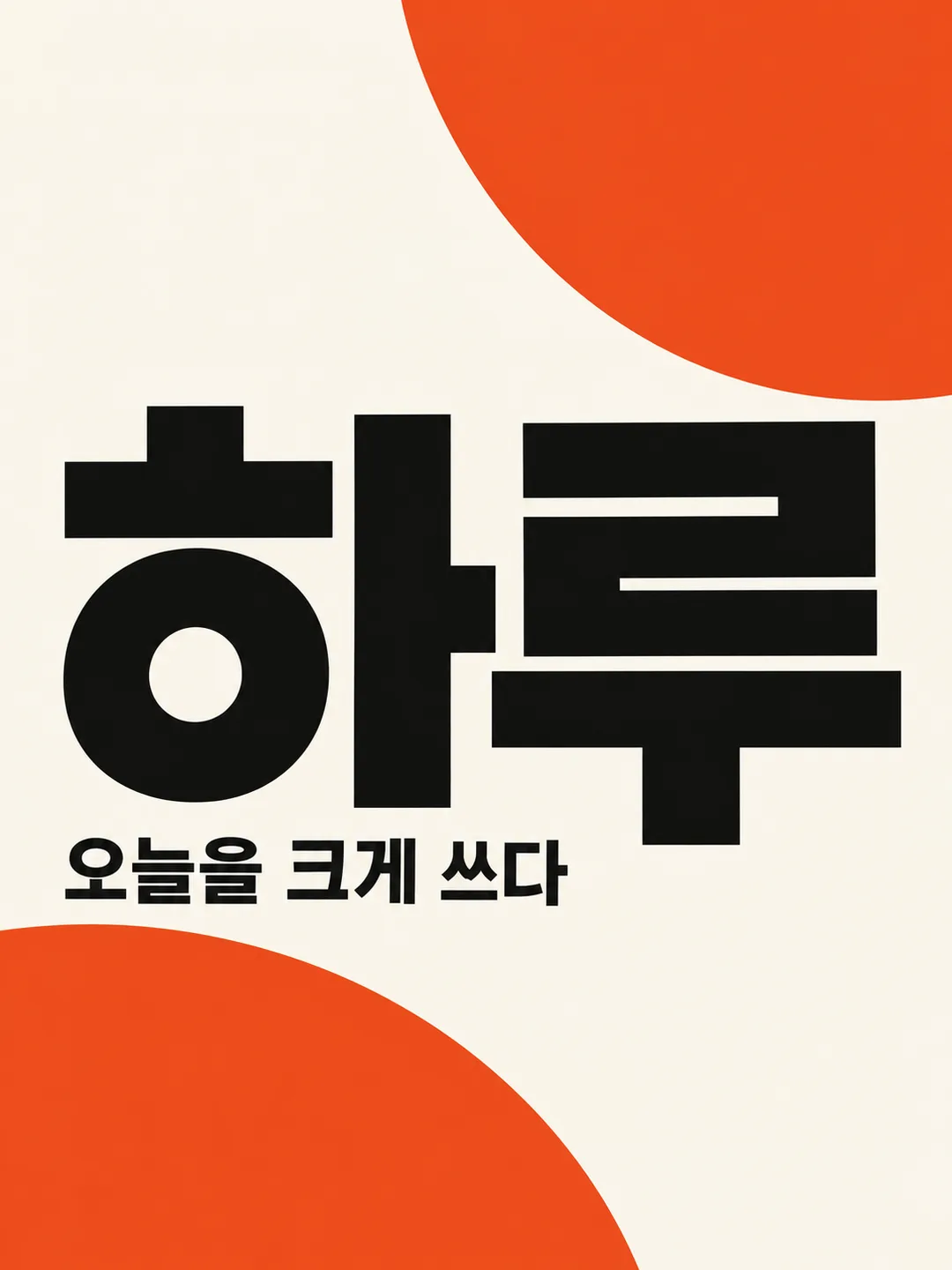
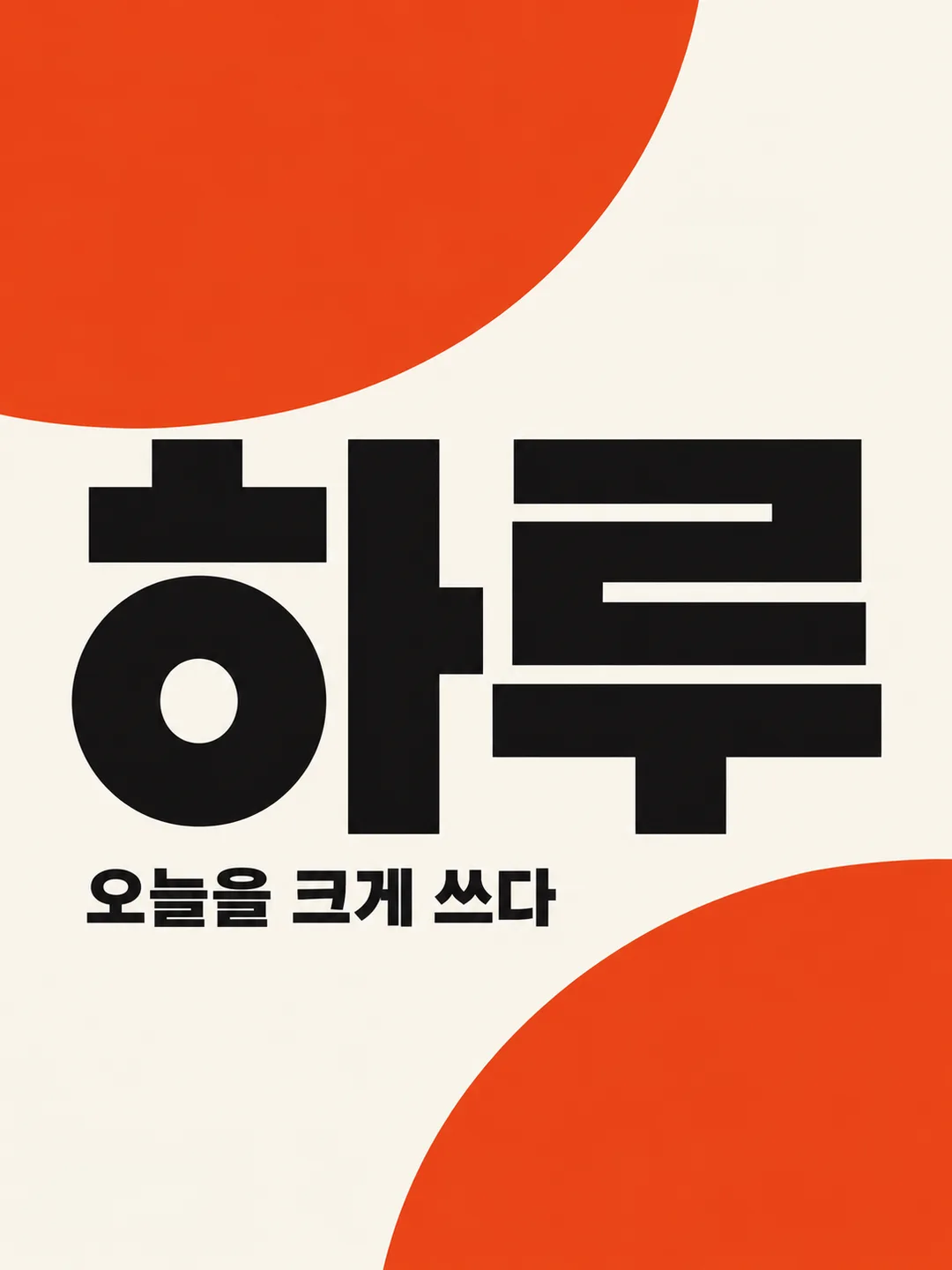
- 네 결과 모두 큰 단어 ‘하루’와 작은 문장 ‘오늘을 크게 쓰다’가 정확하며, 작은 문장은 한 번만 나온다. 포스터 한 장에 큰 검정 산세리프 글자, 아이보리 바탕, 주홍 원형 두 개를 배치했다. 색 이름·추가 문구·로고·날짜·가격은 보이지 않고 글자 획도 잘리지 않았다. 세로 3:4 비율을 유지했다.
- 안 된 것
- 없음
- 이렇게 하면 나아요
- 글자 배치 문장을 ‘가로 12~88%, 세로 20~75% 영역 안에 전체 글자 배치, 들어갈 때까지 축소’로 바꿔 시험하니 두 번째 결과에서 기존 6% 좌우 안전 여백은 확보됐다. 다만 지정 영역·픽셀 크기까지 정확해지지는 않았으므로 인쇄 전 실제 크기와 여백을 확인하세요.
프롬프트 원문 보기 2,797자
Generate this image now. Draw it directly without explanations or questions.
Output size 1080x1440 pixels, 3:4 portrait, social media post.
Create exactly ONE original Swiss typography poster. Default portrait 3:4; obey the supplied shared size if different. Flat full-bleed artwork itself, no mockup, frame, paper on a table, collage or extra panels. Ignore attached photos.
WORD: "【단어】". Empty means "하루". Treat this as one headline, preserve every character, case and order. Use crisp large geometric sans-serif letters, complete and readable; shorten nothing and shrink only if needed to fit. Support the supplied script with correct letterforms.
COLORS: "【색】". Empty means "주홍, 검정, 아이보리". Use only two or three flat colors including background. If more than three are supplied use the first three. Preserve strong text/background contrast. Never print palette names.
SMALL SENTENCE: "【작은 문장】". Empty means OMIT the subtitle completely. The special value "알아서 골라줘" means invent one brief Korean sentence suited to the word; never print that instruction. Otherwise print the supplied sentence exactly once without translation or additional copy.
DESIGN: invisible six-column grid, asymmetrical alignment, large scale contrast, disciplined baseline and generous intentional negative space. Headline dominates the central 65% of the canvas; place the compact subtitle below it on the same grid. Place the entire headline and subtitle inside a text box from 12% to 88% canvas width and from 20% to 75% canvas height. Reduce the headline size until every stroke fits this box, leaving at least 6% clear side margins. Keep decorative shapes behind and away from all letterforms. Use at most two simple geometric shapes as counterweights. Interpret the word and palette to tune density and atmosphere: energetic words feel forceful, rest-related words feel quiet, wave-related words feel rhythmic and experimental. Maintain Swiss typography throughout, not a selectable alternative art style. No gradients, shadows, distressed textures or ornamental illustrations.
TEXT CHECK: compare each headline and subtitle character against the resolved input before returning. Preserve spaces, punctuation and complete strokes. Do not add any other words, digits, dates, prices, weekdays, author names or labels. Original abstract design only: no real brands, trademarks, logos, famous people, products, characters, artist imitation, signatures or watermarks. Return only the finished single poster.

[Final output format]
Output size 1080x1440 pixels, 3:4 portrait, social media post.
This selected output format takes priority over any fixed canvas size or aspect ratio elsewhere in this template. Adapt the composition, text zones and margins to the selected canvas without stretching or cropping essential content. Device safe areas apply only when a device is selected. Never print these format instructions on the image.
결과 어땠어요?
이 카드도 많이 사용해요

쓰는 법 · 자주 묻는 것
한 단어를 벽에 걸고 싶은 타이포그래피 포스터로 만드는 카드예요. 개인 공간의 포스터, 가상 캠페인의 광고 시안, 짧은 감성 문구를 담은 SNS 이미지에 쓸 수 있어요. 큰 산세리프 글자와 보이지 않는 격자, 두세 가지 색으로 한 장을 구성해요. 사진은 필요 없고 첨부해도 사용하지 않아요. 완성된 프롬프트를 그림 AI에 한 번 붙여 넣으면 포스터 한 장을 요청해요. 기본 비율은 3:4이며 다른 비율은 사이트 공통 크기 선택에서 바꾸세요.
꼭 채워야 하는 칸은 없어요. 단어를 비우면 ‘하루’, 색을 비우면 ‘주홍, 검정, 아이보리’가 적용돼요. 단어에는 한글 두세 글자나 짧은 영어 단어 하나가 잘 맞아요. 길게 쓰면 글자 크기를 줄이되 철자와 순서를 유지하도록 요청해요. 색은 바탕을 포함해 두세 가지를 적고 보기에서 고르거나 원하는 조합을 적으세요. 네 가지 이상이면 처음 세 가지만 써요. 색 이름은 인쇄하지 않아요.
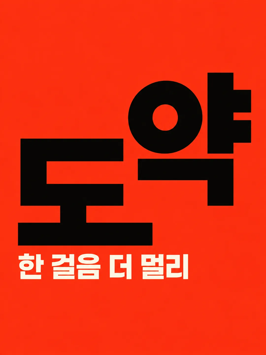
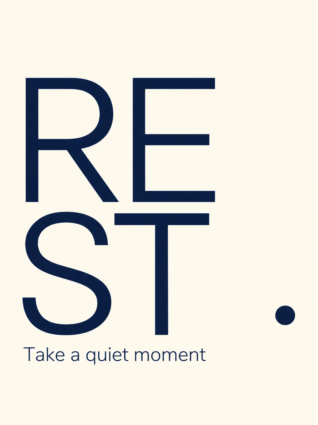
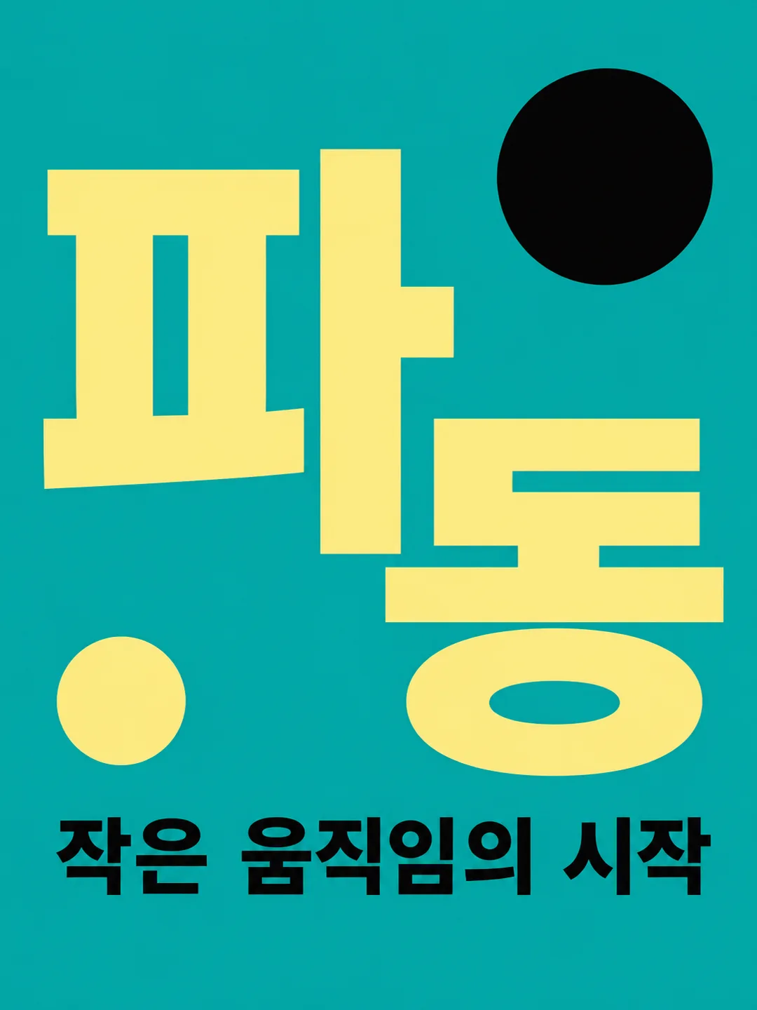
작은 문장에는 큰 단어 아래 넣을 한 줄을 적어요. 보기의 ‘알아서 골라줘’는 단어에 어울리는 짧은 한국어 문장 하나를 맡기는 값이고 그 안내 자체는 인쇄하지 않아요. 작은 문장을 비우면 부제 없이 큰 단어만 나와요. 기본 예시처럼 ‘오늘을 크게 쓰다’를 적으면 그대로 출력해요. ‘도약’과 주홍 배색은 힘찬 긴장감, ‘REST’와 남색 배색은 조용한 휴식, ‘파동’과 청록 배색은 실험적인 리듬을 보여 줘요. 모두 같은 스위스 타이포그래피 원칙 안에서 단어의 의미와 색에 맞춰 밀도와 크기 대비를 조절해요.
공유 전에 확대해서 큰 단어와 작은 문장의 모든 글자를 원문과 대조하세요. 받침, 영어 대소문자, 띄어쓰기와 문장부호를 확인하고 글자 획이 잘리지 않았는지도 보세요. 틀리면 해당 글자와 정확한 문장을 지정해 같은 조건으로 다시 생성하세요. 별도 날짜, 가격, 요일이나 숫자는 자동으로 붙이지 않아요. 실제 브랜드나 인물 이름 대신 사용할 권리가 있는 일반 단어를 쓰세요. 이 카드는 프롬프트를 제공하며 외부 서비스의 요금과 이용 조건은 해당 서비스에서 확인해 주세요.