558余白で魅せるアルバムと本の表紙
タイトルから一つの象徴を選び、広い余白と読みやすい文字で表紙を作ります。
受け取れるもの
- 余白を生かした表紙一枚
- タイトルから決めた一つの絵
- 指定したタイトルと任意の名前
ChatGPT 無料 OK
項目を入力
- 1項目を入力します
- 2コピーを押します
- 3GPTのチャットに貼り付けます
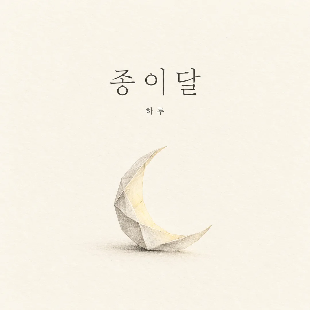
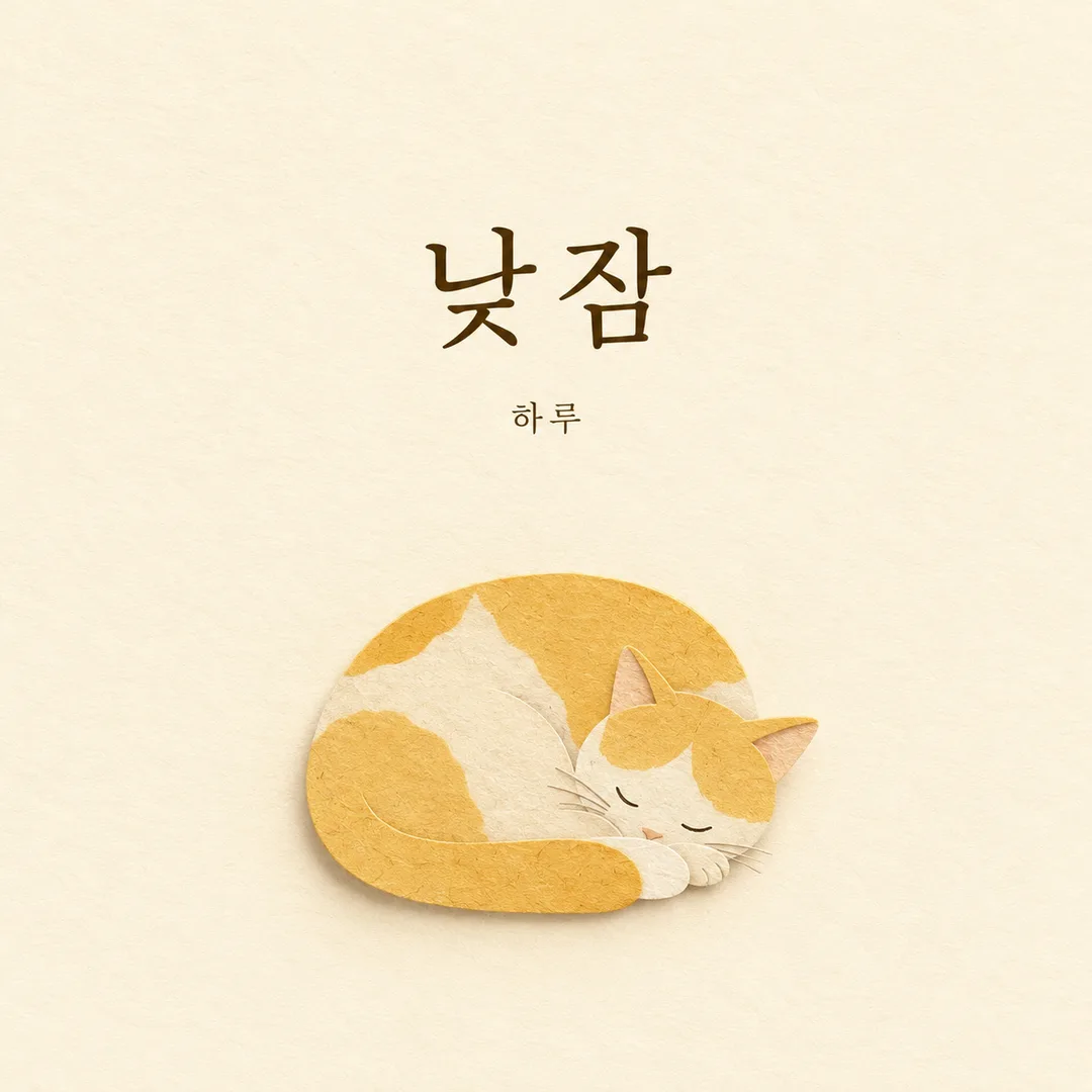
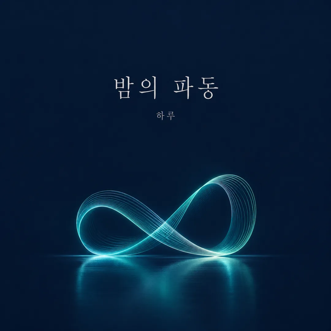
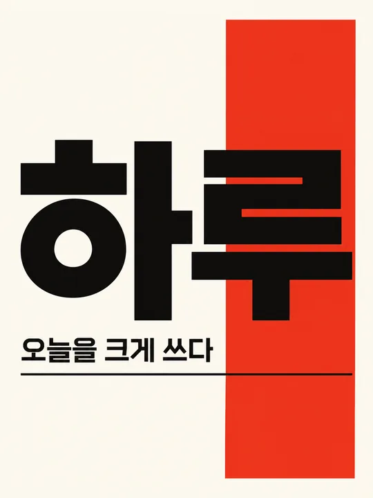
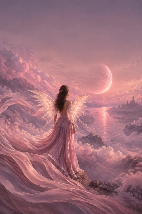
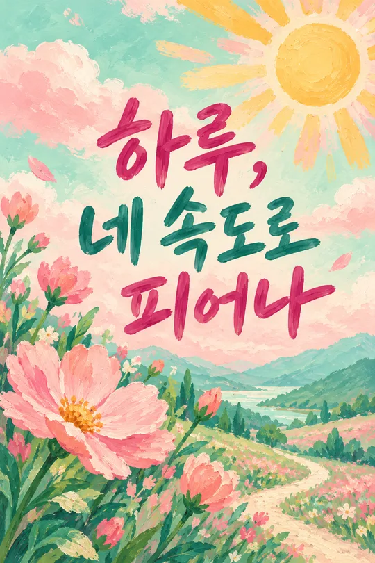
- 4そのまま送ると、サムネイルの例のような画像になります
- 5カードに合う実際の写真を一緒に入れると反映されます。背景カードなら背景の写真、人物・料理カードならその写真 任意
実際に試しました
- 試験日
- 2026-10-29
- ツール
- ChatGPT画像モデル(Codexで実行)— 無料版ChatGPTと同じモデル、制限のみ異なる
- 結果
- 合格
- できたこと
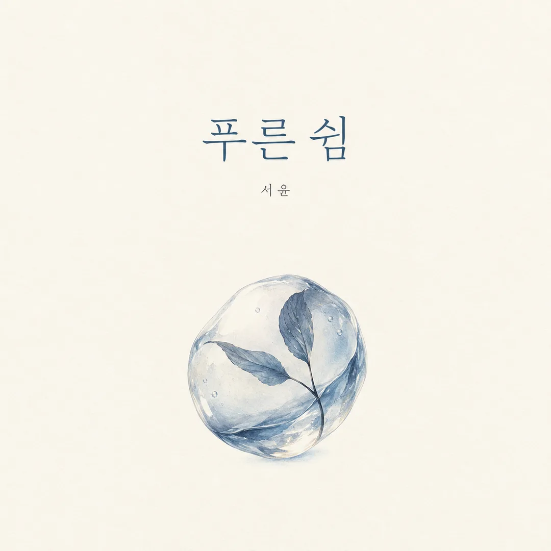
- 最終結果は1254×1254の正方形の平面カバー1枚である。‘푸른 쉼’と小さな‘서윤’がそれぞれ1回ずつ入っており、サブタイトル・ロゴ・価格・ウォーターマークはない。アイボリーの背景が端まで続き、下部中央には葉が入った透明な水滴が1つある。画像全体の幅は画面の約33%で、‘대략 22~32%’という指示の上限に近い。高さは約34%、中心は横約50%・縦約67%に位置する。タイトルと名前はセーフエリア内に収まり、広い余白が維持されている。55~65%の余白は境界のない紙の質感のため正確なピクセル比率としては保証されず、構図基準で判断した。
- できなかったこと
- 最終版においてカードの核心的な約束事項の不遵守は確認されなかった。原文の2回は水紋と反射が広がりすぎ、中間修正の2回は新しく追加した高さの上限を超えた。これら4枚もそれぞれ修正前/中間修正に保存してある。
- 改善のヒント
- 広い水紋が伴う場合は‘風景 대신 독립된 사물 하나’を選択させ、反射や影まで画像の指定領域内に収める文章を使うと効果的である。この修正により実際の試験で周囲の水面が消えた。現在コピー用プロンプトに反映されている。
プロンプト全文を見る 3,299文字
Generate this image now. Draw it directly; do not explain or ask questions.
出力サイズは1080×1080ピクセル、1:1の正方形にしてください。文字を読みやすく配置してください。
Create exactly ONE original minimalist editorial cover artwork. Default square 1:1; obey the requested aspect ratio. It is a single flat front-cover design suitable for an independent album or literary book, never a physical book, sleeve, spine, device, framed print or scene mockup. Background fills every edge. No collage, variants, promotional badges or surrounding margins.
TITLE: "【タイトル】". Preserve its exact language, spelling, spaces and punctuation. If blank, use "青い休息". NAME: "【名前】". Print exactly once in smaller type; omit the name line entirely if blank. COLOR DIRECTION: "【色】"; if blank use ivory, muted blue and charcoal. Color words and codes are instructions, never visible text.
Derive one concrete, original visual metaphor from the title and its emotional associations. If the title is abstract, choose a single simple object rather than extra words. Choose its visual treatment automatically to suit that metaphor: delicate graphite for fragile reflective subjects, tactile cut paper for playful warm subjects, or precise luminous geometry for nocturnal rhythmic subjects. Do not imitate any named artist. Keep a consistent minimalist editorial design discipline while varying the subject-specific medium. Never combine treatments into a collage or provide a style menu.
Keep 55-65% of the canvas as quiet uninterrupted negative space. Place exactly one focal illustration in the lower-middle area, occupying roughly 22-32% of canvas width. Choose one isolated object, not a landscape or a scene. All illustration marks, including shadows, reflections and any supporting parts, must fit together inside a single bounding box 22-32% of canvas width and 22-40% of canvas height, centered at 50% across and 66% down the canvas. Outside that box, keep only the uninterrupted background and the specified lettering; no water surface, horizon, ground line or surrounding scenery. Set the title in refined, highly legible typography in the upper-middle area, with deliberate optical spacing and a clear contrast to the background. Place the smaller name below the title. Keep important lettering between 16% and 80% of canvas height, with side safe margins of at least 9%. Adapt spacing to the selected ratio; no clipping or shrinking everything into an inset square. Large negative space belongs to the cover itself, not to an outer mockup.
Render ONLY the exact title and optional exact name. No subtitle, numbers, dates, publisher mark, logo, signature, watermark, price, promotional copy or production notes. Check every visible character against the supplied strings before completing. Use fictional original visual designs only; no recognizable branded products, logos, characters, real people or existing cover artwork. Do not reproduce a reference image or its text. Ignore attached photos. Return one finished cover image.

[Final output format]
出力サイズは1080×1080ピクセル、1:1の正方形にしてください。文字を読みやすく配置してください。
This selected output format takes priority over any fixed canvas size or aspect ratio elsewhere in this template. Adapt the composition, text zones and margins to the selected canvas without stretching or cropping essential content. Device safe areas apply only when a device is selected. Never print these format instructions on the image.
結果はどうでしたか?
こちらのカードも人気です
使い方・よくある質問
自主制作の音楽や短い作品集のために、大きな余白、一つの象徴的な絵、タイトルと任意の名前で表紙を作るカードです。完成したプロンプトを画像AIに一度貼り付けて、一枚の画像を依頼します。基本は正方形の1:1。本を撮影したモックアップや複数案の一覧ではなく、表紙そのものが画面を満たします。写真は不要で、添付しても使用しません。
必須項目はタイトルだけです。実際に載せたい短い文字列を指定してください。意味から中心となる絵と表現方法を自動で決めます。「紙の月」は繊細な鉛筆、「昼寝」は温かな切り紙、「夜の波動」は光の幾何学というように、題材によって雰囲気が変わります。結果の種類や画風を選ぶ別の欄はありません。空欄なら「青い休息」を使います。
名前は小さな文字で一度だけ表示し、空欄ならその行全体を省きます。例はHaruです。色には背景、絵、文字に使いたい色を指定します。色コードも使えますが、コード自体は印字しません。空欄ならアイボリー、くすんだ青、チャコールを使います。比率は共通のサイズ選択で変更してください。
生成後は拡大し、タイトルと名前の文字、空白、句読点を一文字ずつ原文と照合してください。誤りがあれば正しい文字列を引用符で示して再生成を依頼します。不要な副題や出版社のマークは削除を依頼してください。中心の絵は一つ、背景は端まで続くことを確認します。既存の表紙や作家の画風を模倣しないでください。出版や音楽配信の前には提出先の画像寸法と規格を確認してください。このカードはプロンプトを提供します。外部サービスの料金と利用条件は各サービスで確認してください。