
558미니멀 앨범, 책 표지 — 큰 여백과 한 가지 그림
제목에서 고른 상징 하나와 넓은 여백으로 나만의 표지를 만들어요.
받는 것
- 넓은 여백의 미니멀 표지 한 장
- 제목에서 정한 중심 그림 하나
- 입력한 제목과 선택한 이름
ChatGPT 무료 OK
칸 채우기
- 1칸을 채워요
- 2복사 버튼을 눌러요
- 3GPT 채팅창에 붙여넣어요
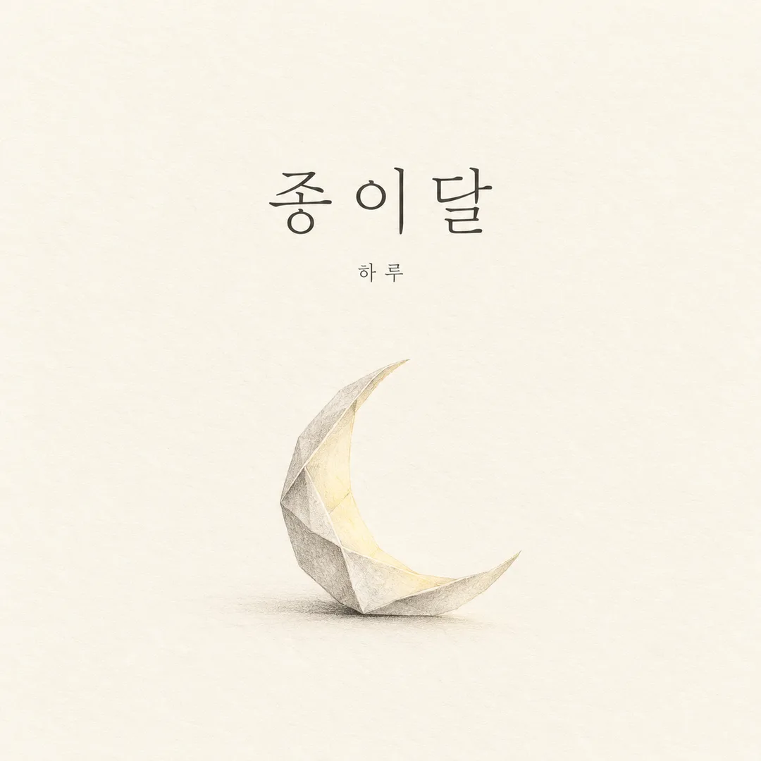
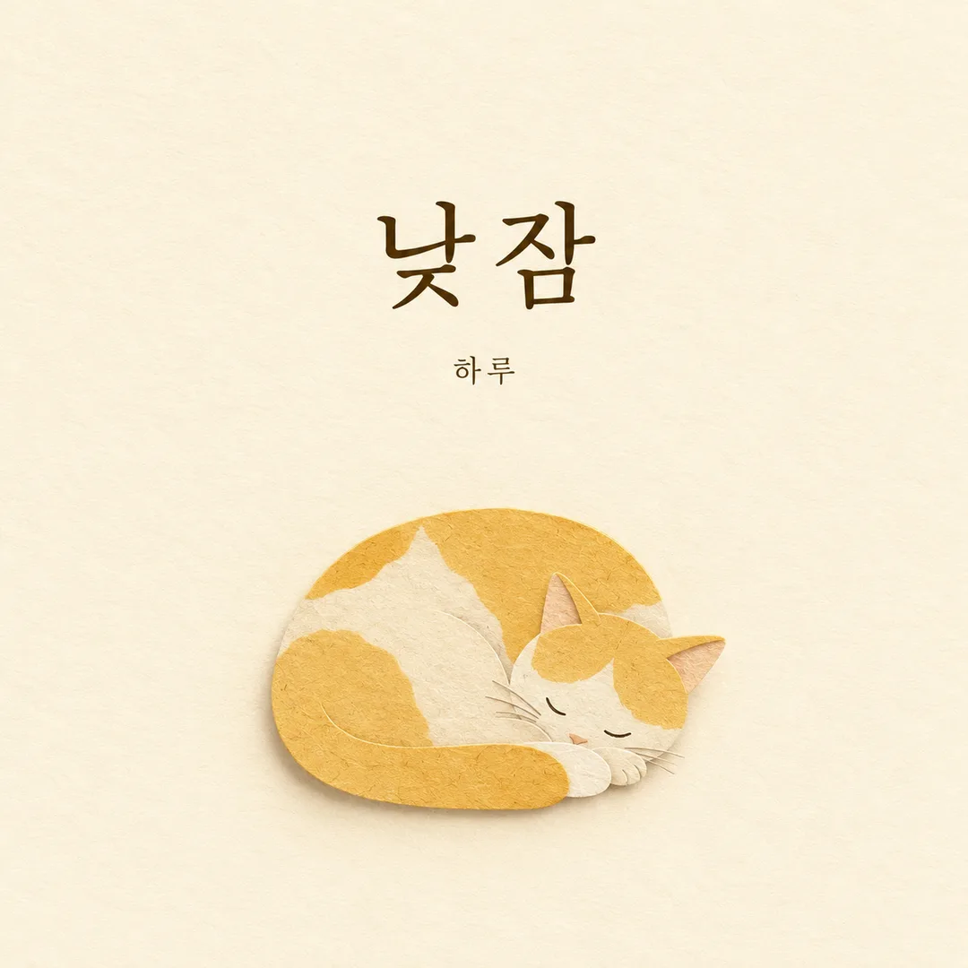
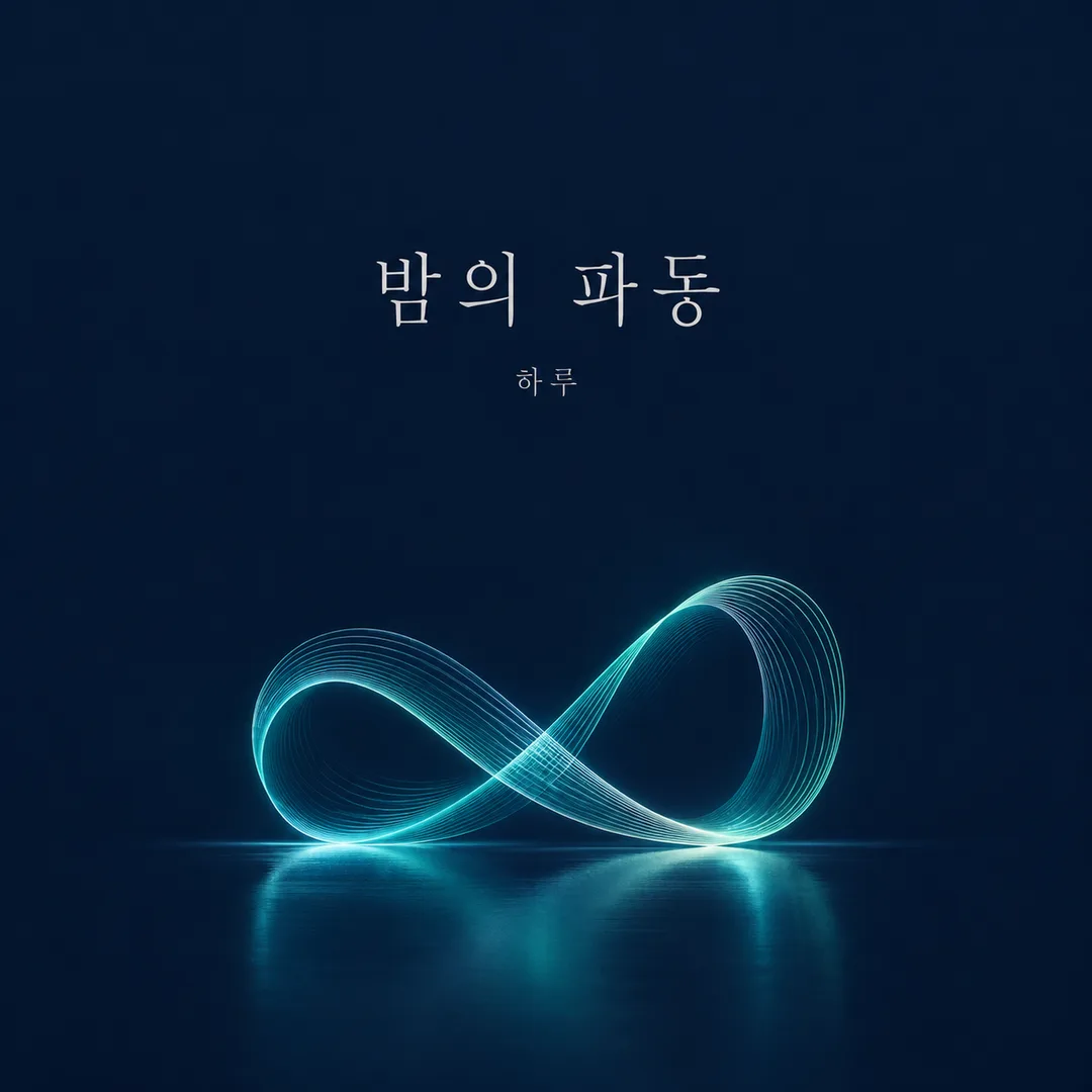
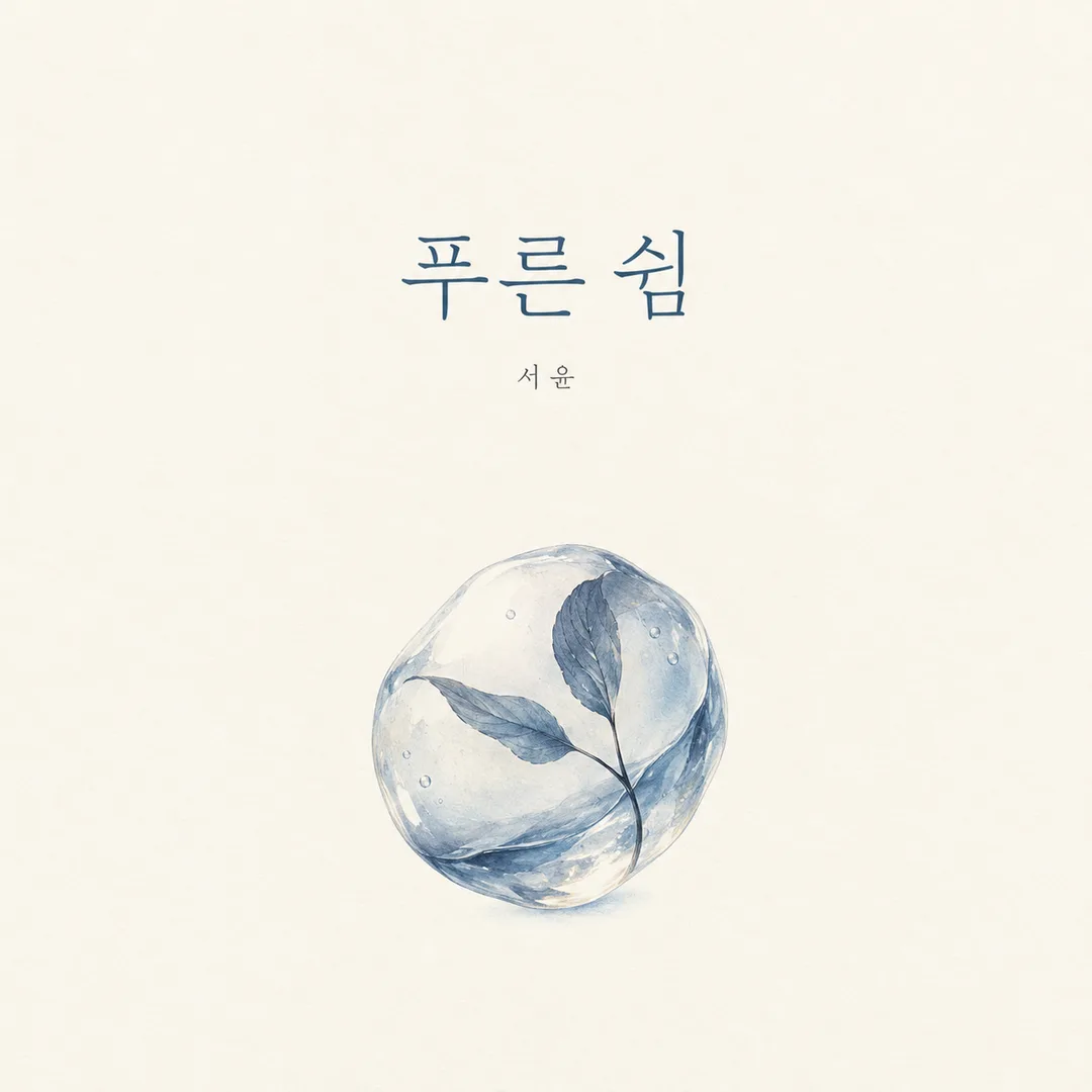
- 4그대로 보내면 썸네일 예시처럼 나와요
- 5카드에 맞는 실제 사진을 같이 넣으면 그 사진이 반영돼요 — 배경 카드는 배경 사진, 인물 · 음식 카드는 그 사진 선택
직접 해 봤어요
- 시험일
- 2026-10-29
- 도구
- ChatGPT 이미지 모델(코덱스에서 실행) — 무료 ChatGPT와 같은 모델, 한도만 다름
- 결과
- 통과
- 지켜진 것
- 최종 결과는 1254×1254 정사각형의 평면 표지 한 장이다. ‘푸른 쉼’과 작은 ‘서윤’이 각각 한 번 있으며, 부제·로고·가격·워터마크가 없다. 아이보리 바탕이 끝까지 이어지고, 아래 중앙에는 잎이 든 투명한 물방울 하나가 있다. 그림 전체 폭은 화면의 약 33%로 ‘대략 22~32%’ 지시의 상한에 가깝다. 높이는 약 34%, 중심은 가로 약 50%·세로 약 67%다. 제목과 이름은 안전영역 안에 있고 넓은 여백이 유지된다. 여백 55~65%는 경계가 없는 종이 질감 때문에 정확한 픽셀 비율로 보증하지 않으며 구도 기준으로 판단했다.
- 안 된 것
- 최종본에서 확인된 카드의 핵심 약속 미준수는 없음. 원문 2회는 물결과 반사가 넓어졌으며, 중간 수정 2회는 새로 추가한 높이 상한을 넘었다. 이 네 장도 각각 수정전/·중간수정/에 보존했다.
- 이렇게 하면 나아요
- 넓은 물결이 따라 붙는 경우 ‘풍경 대신 독립된 사물 하나’를 고르게 하고, 반사·그림자까지 그림의 지정 영역 안에 넣는 문장을 사용하면 나아요. 이 수정으로 실제 시험에서 주변 수면이 사라졌어요. 현재 복사할 프롬프트에 반영돼 있어요.
프롬프트 원문 보기 3,293자
Generate this image now. Draw it directly; do not explain or ask questions.
Output size 1080x1080 pixels, 1:1 square card. Keep the same top-to-bottom order but compress the zones to fit the square: the illustration becomes smaller and every text line stays fully readable.
Create exactly ONE original minimalist editorial cover artwork. Default square 1:1; obey the requested aspect ratio. It is a single flat front-cover design suitable for an independent album or literary book, never a physical book, sleeve, spine, device, framed print or scene mockup. Background fills every edge. No collage, variants, promotional badges or surrounding margins.
TITLE: "【제목】". Preserve its exact language, spelling, spaces and punctuation. If blank, use "푸른 쉼". NAME: "【이름】". Print exactly once in smaller type; omit the name line entirely if blank. COLOR DIRECTION: "【색】"; if blank use ivory, muted blue and charcoal. Color words and codes are instructions, never visible text.
Derive one concrete, original visual metaphor from the title and its emotional associations. If the title is abstract, choose a single simple object rather than extra words. Choose its visual treatment automatically to suit that metaphor: delicate graphite for fragile reflective subjects, tactile cut paper for playful warm subjects, or precise luminous geometry for nocturnal rhythmic subjects. Do not imitate any named artist. Keep a consistent minimalist editorial design discipline while varying the subject-specific medium. Never combine treatments into a collage or provide a style menu.
Keep 55-65% of the canvas as quiet uninterrupted negative space. Place exactly one focal illustration in the lower-middle area, occupying roughly 22-32% of canvas width. Choose one isolated object, not a landscape or a scene. All illustration marks, including shadows, reflections and any supporting parts, must fit together inside a single bounding box 22-32% of canvas width and 22-40% of canvas height, centered at 50% across and 66% down the canvas. Outside that box, keep only the uninterrupted background and the specified lettering; no water surface, horizon, ground line or surrounding scenery. Set the title in refined, highly legible typography in the upper-middle area, with deliberate optical spacing and a clear contrast to the background. Place the smaller name below the title. Keep important lettering between 16% and 80% of canvas height, with side safe margins of at least 9%. Adapt spacing to the selected ratio; no clipping or shrinking everything into an inset square. Large negative space belongs to the cover itself, not to an outer mockup.
Render ONLY the exact title and optional exact name. No subtitle, numbers, dates, publisher mark, logo, signature, watermark, price, promotional copy or production notes. Check every visible character against the supplied strings before completing. Use fictional original visual designs only; no recognizable branded products, logos, characters, real people or existing cover artwork. Do not reproduce a reference image or its text. Ignore attached photos. Return one finished cover image.

[Final output format]
Output size 1080x1080 pixels, 1:1 square card. Keep the same top-to-bottom order but compress the zones to fit the square: the illustration becomes smaller and every text line stays fully readable.
This selected output format takes priority over any fixed canvas size or aspect ratio elsewhere in this template. Adapt the composition, text zones and margins to the selected canvas without stretching or cropping essential content. Device safe areas apply only when a device is selected. Never print these format instructions on the image.
결과 어땠어요?
이 카드도 많이 사용해요
쓰는 법 · 자주 묻는 것
독립 음원이나 짧은 글 모음의 첫인상을 만들 때 쓰는 미니멀 표지 카드예요. 큰 여백, 한 가지 상징 그림, 제목과 이름만으로 표지 한 장을 요청해요. 기본은 정사각형 1:1이며 책을 촬영한 목업이나 여러 표지 묶음은 나오지 않도록 설계했어요. 완성한 프롬프트를 그림 AI에 한 번 붙여 넣으세요. 사진은 필요 없고 첨부해도 사용하지 않아요.
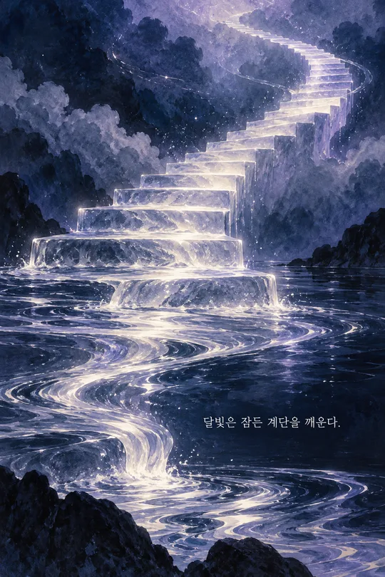
꼭 채울 칸은 제목 한 개예요. ‘푸른 쉼’처럼 짧고 실제로 인쇄할 제목을 적으세요. 제목의 뜻에서 중심 그림을 하나 정하고, 어울리는 표현 방식도 자동으로 정해요. 예를 들어 ‘종이달’은 섬세한 연필 표현, ‘낮잠’은 따뜻한 종이 오리기, ‘밤의 파동’은 차가운 빛의 기하학으로 서로 다른 분위기를 보여 줄 수 있어요. 결과물 종류나 화풍을 따로 고르는 칸은 없어요. 제목을 비우면 ‘푸른 쉼’을 써요.
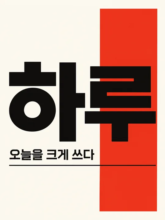
이름은 작가나 연주자 자리에 들어가는 작은 글자예요. 예시는 ‘하루’이며 비우면 이름 줄 전체가 빠져요. 색은 ‘아이보리, 흐린 파랑, 먹색’처럼 적으면 바탕과 그림, 글자에 어울리게 나눠 써요. 색을 비우면 이 기본 배색을 사용해요. 색상 코드는 쓸 수 있지만 코드 자체는 표지에 찍지 않아요. 크기는 공통 크기 선택에서 바꿔요.
결과에서는 제목과 이름을 확대해 한 글자씩 원문과 대조하세요. 받침, 띄어쓰기, 문장부호와 이름 중복을 확인하고, 틀린 부분은 정확한 문자열을 따옴표로 적어 다시 생성해 달라고 하세요. 부제나 출판사 표시가 생겼다면 빼 달라고 요청하세요. 여백이 커도 그림은 하나만 있어야 하며 바탕은 화면 끝까지 이어져야 해요. 실존 작품 제목이나 작가 이름으로 그림체를 흉내 내게 하지 마세요. 정식 출판이나 음원 등록 전에는 해당 플랫폼의 파일 크기와 표지 규격을 따로 확인하세요. 이 카드는 프롬프트를 제공하며 외부 서비스의 요금과 이용 조건은 해당 서비스에서 확인해 주세요.