40450년대 손글씨 로고
가게 이름 그대로, 흐르는 붓글씨와 긴 밑줄로 만드는 50년대 다이너 로고예요.
받는 것
- 가게 이름 중심의 손글씨 로고 한 장
ChatGPT 무료 OK
칸 채우기
- 1칸을 채워요
- 2복사 버튼을 눌러요
- 3GPT 채팅창에 붙여넣어요
- 4그대로 보내면 썸네일 예시처럼 나와요
- 5카드에 맞는 실제 사진을 같이 넣으면 그 사진이 반영돼요 — 배경 카드는 배경 사진, 인물 · 음식 카드는 그 사진 선택
프롬프트 원문 보기 2,215자
Generate exactly one finished original 1950s diner hand-lettered sign logo image. Output the image directly, no explanation. Canvas: Output size 1080x1080 pixels, 1:1 square card. Keep the same top-to-bottom order but compress the zones to fit the square: the illustration becomes smaller and every text line stays fully readable..
Shop name: "【가게 이름】"
Business: "【업종】"
Colors: "【색】"
Print the shop name exactly once, preserving every character, case, space and punctuation in its original writing system. Never translate or romanize it. This exact name is the ONLY text in the image; do not print the business, labels, slogans, dates, prices or any other words. If the name is empty ask for it; if business is empty use a soda bar; if colors are empty use coral, deep teal and warm ivory.
Create custom 1950s brush-script sign lettering: confident thick downstrokes, delicate connecting upstrokes, open counters, a lively slanted baseline, restrained dimensional painted offset shadow and one elegant underline swash. For Hangul or Japanese preserve intact readable character structures rather than forcing Latin cursive. Make the lettering large and dominant, with a clean solid background extending to every edge. Keep the complete lettering and swash visible with comfortable breathing room; adapt to the chosen canvas without cropping. This is flat finished brand artwork, not a photographed sign or mockup. Use the business and palette to determine the mood and custom letter anatomy: a soda bar feels quick and buoyant, a bakery soft and graceful, a barbershop crisp and bold. Add at most two small geometric sparkle accents; no objects, food, mascots or illustrated scenes. Avoid neon tubes, chrome, rounded 1970s bubble lettering, distressed texture, badge borders and generic font typesetting. Never imitate an existing brand, logo, artist or signature. All design elements must be original. Before returning, compare the rendered name character by character against the input and correct omissions, substitutions and duplicates.

[Final output format]
Output size 1080x1080 pixels, 1:1 square card. Keep the same top-to-bottom order but compress the zones to fit the square: the illustration becomes smaller and every text line stays fully readable.
This selected output format takes priority over any fixed canvas size or aspect ratio elsewhere in this template. Adapt the composition, text zones and margins to the selected canvas without stretching or cropping essential content. Device safe areas apply only when a device is selected. Never print these format instructions on the image.
결과 어땠어요?
이 카드도 많이 사용해요
쓰는 법 · 자주 묻는 것
가게 이름을 크게 읽히는 50년대 다이너 손글씨 로고로 바꿉니다. 굵은 붓의 내려긋기와 가는 연결획, 길게 흐르는 밑줄이 이름을 한 덩어리로 묶어요. 간판 시안, 가게 소개 이미지, 포장 스티커의 디자인 초안에 쓸 수 있습니다.
꼭 채울 칸은 가게 이름과 업종 두 개입니다. 이름은 띄어쓰기와 대소문자까지 출력할 그대로 적으세요. 업종은 글자로 찍히지 않고 글자의 인상을 정합니다. 소다 바는 경쾌하게, 제과점은 부드럽게, 이발소는 힘 있게 표현합니다. 색은 바탕을 포함한 세 가지를 적으며 비우면 코랄, 짙은 청록, 따뜻한 아이보리를 씁니다. 업종을 비우면 소다 바를 기준으로 만들고 이름이 없으면 이름을 물어봅니다.
사진 없이 프롬프트를 그림 AI에 한 번 붙여 넣으면 로고 한 장을 만듭니다. 기본은 1:1이며 목록 표지는 2:3입니다. 이름을 번역하지 않으므로 영어 이름을 넣으면 영어 그대로 나옵니다. 한글과 일본어는 글자 구조를 살리는 지시를 포함하지만 이번 실물 시험은 영문 이름으로 진행했습니다.
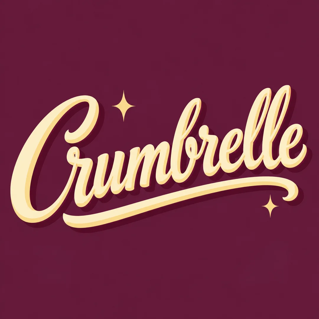
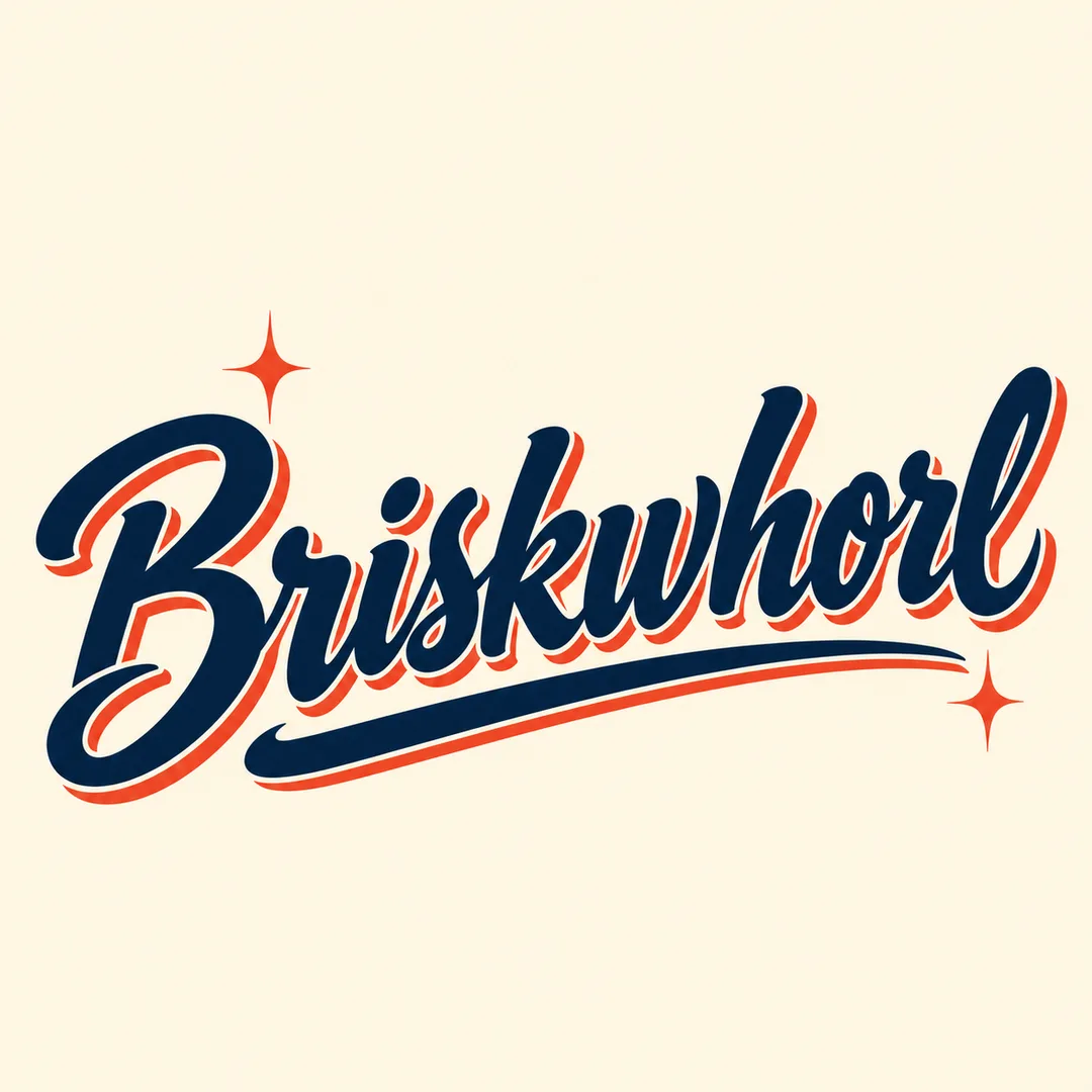
표지는 가상 소다 바 Fizzamble, 예시는 가상 제과점 Crumbrelle과 가상 이발소 Briskwhorl입니다. 모두 새로 지은 디자인용 이름이며 상표 등록 여부를 확인한 이름은 아닙니다. 사용 전 본인이 사용할 이름의 권리를 확인하세요. 결과는 래스터 이미지이므로 제작용 벡터 원본이나 상표 등록을 보장하지 않습니다.
확인할 때는 이름을 확대해 한 글자씩 읽고 밑줄과 그림자가 글자 속을 막지 않는지 보세요. 이름 외의 문구는 만들지 않습니다. 글자가 틀렸다면 해당 철자를 명시해 다시 생성하세요. 이름이 길면 장식을 늘리기보다 짧은 공식 표기를 사용하는 편이 읽기 쉽습니다. 색을 바꾸면 같은 50년대 붓글씨 범위에서 분위기가 달라집니다.