614상품 감성 연출 사진
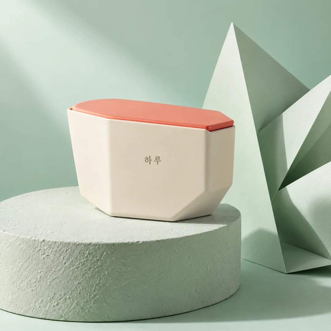
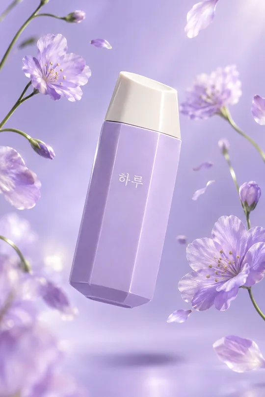
내 상품의 모양과 글자는 살리고 파스텔 받침대, 소품, 사선 그림자로 연출해요.
받는 것
- 파스텔 받침대 상품 사진 한 장
- 원본 상품의 형태와 라벨을 살린 연출
칸 채우기
- 1칸을 채워요
- 2복사 버튼을 눌러요
- 3GPT 채팅창에 붙여넣어요
- 4그대로 보내면 썸네일 예시처럼 나와요
- 5상품 정면 사진 한 장 (선택)을 같이 넣으면 그 사진이 반영돼요 선택
직접 해 봤어요
- 시험일
- 2026-10-28
- 도구
- ChatGPT 이미지 모델(코덱스에서 실행) — 무료 ChatGPT와 같은 모델, 한도만 다름
- 결과
- 통과
- 지켜진 것
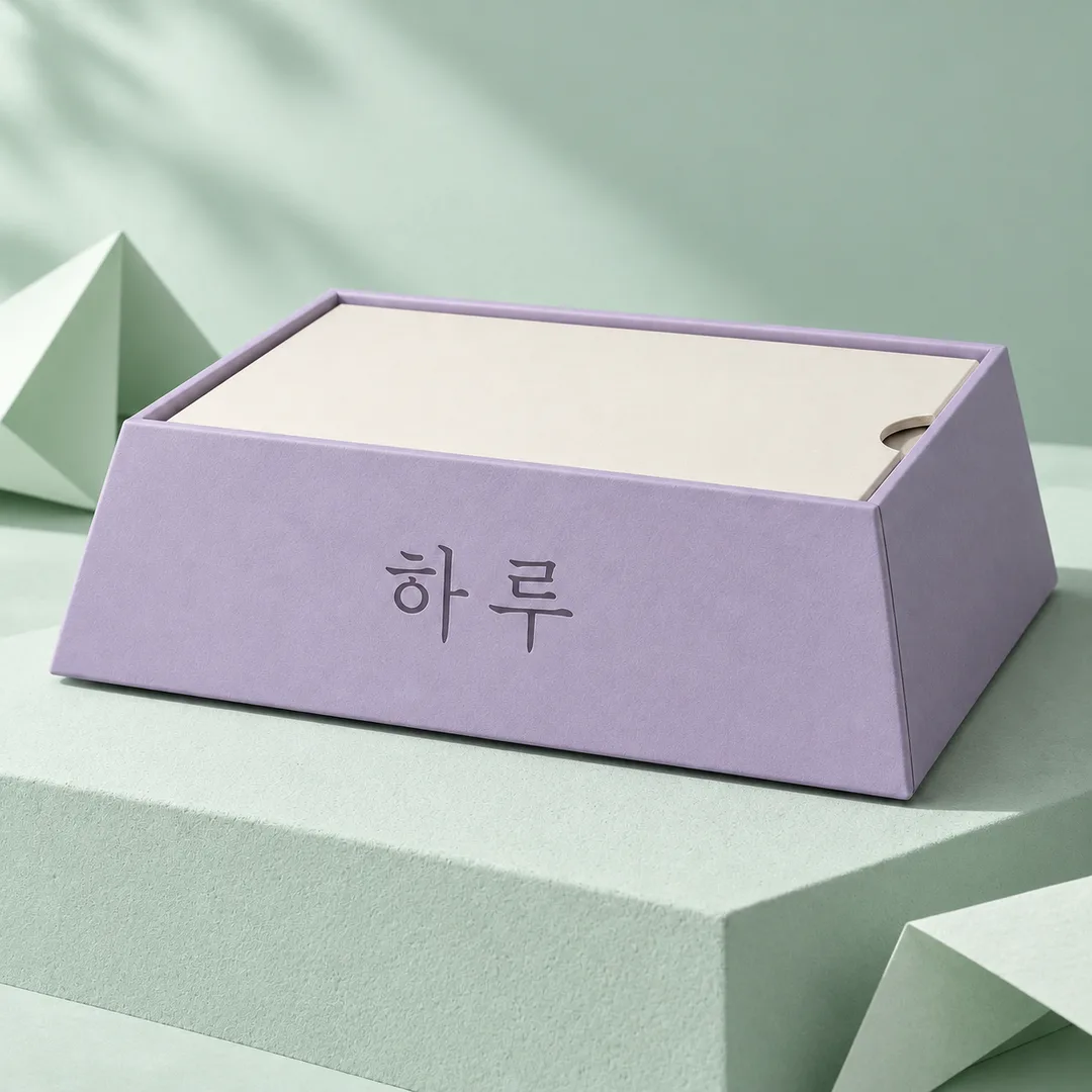
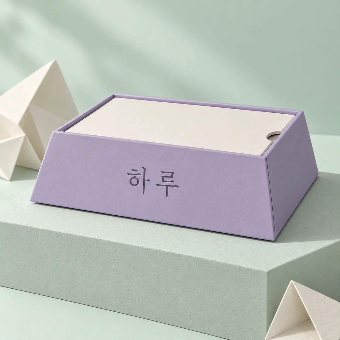
- 두 결과 모두 「하루」 두 글자가 정확하다. 연보라색 상자, 아이보리 뚜껑, 오른쪽 반원 홈, 앞면 중앙 글자와 주요 모서리를 유지했다. 민트색 받침대·배경, 접은 종이, 접촉 그림자가 있으며 소품이 상품과 글자를 가리지 않는다. 정사각형 사진 한 장이고 제목·가격·추가 로고·인물이 없다.
- 안 된 것
- 없음
- 이렇게 하면 나아요
- 같은 입력으로 다시 실행했으나 상품 크기 부족은 개선되지 않았다. 이번 시험에서 효과가 확인된 칸·문장 변경은 없음.
프롬프트 원문 보기 3,484자
Generate this image now. Draw it directly - do not describe it, explain it, or ask questions.
Output size 1080x1080 pixels, 1:1 square card. Keep the same top-to-bottom order but compress the zones to fit the square: the illustration becomes smaller and every text line stays fully readable.
Create exactly ONE full-bleed premium pastel still-life product photograph, default aspect ratio 1:1. A physical pedestal, one hero product and carefully controlled shadows form a complete advertising photograph, not a poster layout, collage or mockup.
Photo note, never printed: 【사진】
PHOTO RULE: If an image is attached, use its product as the sole hero. Preserve its exact silhouette, proportions, construction, material, surface color, seams, label position and every visible letter and numeral. Keep the front face visible and do not obscure it with props. Change the setting and illumination only; never recolor or redesign the product. The actual attachment takes priority over the photo note. Without an attachment, create an original fictional matte ivory asymmetric seven-sided stationery case with a low coral sliding lid, marked only "하루". No questions are needed.
COLOR: "【색】". If blank, use pale mint. 연한 민트 means pale mint; 라일락 means lilac; 살구색 means apricot.. Use the selected pastel for a seamless floor and backdrop with subtle tonal separation; preserve the product's original colors.
PROPS: "【소품】". If blank, use folded paper. 접은 종이 means sculptural folded paper; 리본 means one loosely curled fabric ribbon; 도자기 구슬 means two irregular matte ceramic beads.. Use only the selected prop family, one to three restrained objects arranged asymmetrically around a single matching matte plaster pedestal. Props are decoration, never ingredients or benefit claims. Leave the product face and lettering entirely clear.
Stand the product firmly on the pedestal with a visible contact shadow. Use a three-quarter camera angle with minimal distortion and the complete product occupying 50-65 percent of frame height. The pedestal fills the lower third and may extend beyond the bottom edge. Build foreground, product and backdrop depth without empty dead space. One large directional key from upper left makes a coherent soft-edged cast shadow to lower right; gentle fill preserves label legibility and tactile plaster, paper and glaze. Maintain realistic reflections, weight and scale. Premium editorial photographic realism throughout, no illustration, plastic CGI or floating objects. Keep essential label text within the middle 70 percent of the image.
Render only the existing product lettering or the fictional fallback name specified above. Add no headline, price, number, badge, claim, watermark, people or extra logo. Do not imitate real brands, recognizable product designs, celebrities or named artists. Use only authorized original packaging. Do not invent ingredients, dosage or efficacy statements. For a regulated product, verify and display the legally required local advertising warning text; never invent that wording.
Before finishing, inspect the source and result at high magnification: compare every visible letter and numeral character by character, then verify shape, lid, edges and label position. Correct discrepancies without changing the package. Output only the finished photograph.

[Final output format]
Output size 1080x1080 pixels, 1:1 square card. Keep the same top-to-bottom order but compress the zones to fit the square: the illustration becomes smaller and every text line stays fully readable.
This selected output format takes priority over any fixed canvas size or aspect ratio elsewhere in this template. Adapt the composition, text zones and margins to the selected canvas without stretching or cropping essential content. Device safe areas apply only when a device is selected. Never print these format instructions on the image.
결과 어땠어요?
이 카드도 많이 사용해요

쓰는 법 · 자주 묻는 것
이런 때 쓰세요
신상품 소개 피드나 상세 페이지 첫 사진에 쓸 파스텔 상품 연출 사진을 만들어요. 받침대 위 상품과 사선 그림자가 중심인 사진 한 장이며 기본 비율은 1:1이에요. 광고 제목이나 가격이 붙는 포스터가 아니라 상품 자체를 보여 주는 결과예요.
사진과 칸 채우기
꼭 채울 칸은 없어요. 사진 칸은 첨부할 상품을 적는 메모로 파일을 대신 올리지 않아요. 라벨과 앞면이 선명한 상품 사진을 그림 AI에 올리고, 복사한 프롬프트를 같은 메시지에 붙여 한 번에 보내세요. 사진 메모가 비어 있어도 첨부 사진을 우선 사용해요. 사진이 없으면 하루라고 적힌 가상 문구 케이스를 만들어요. 색은 배경과 받침대에 적용되며 상품 색은 바꾸지 않아요. 비우면 연한 민트예요. 소품은 접은 종이, 리본, 도자기 구슬 중 골라요. 비우면 접은 종이이며, 소품은 상품 글자를 가리지 않게 놓여요.
예시 보는 법
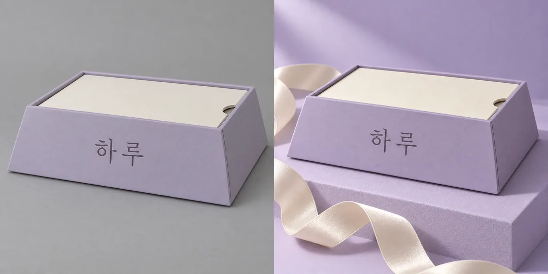
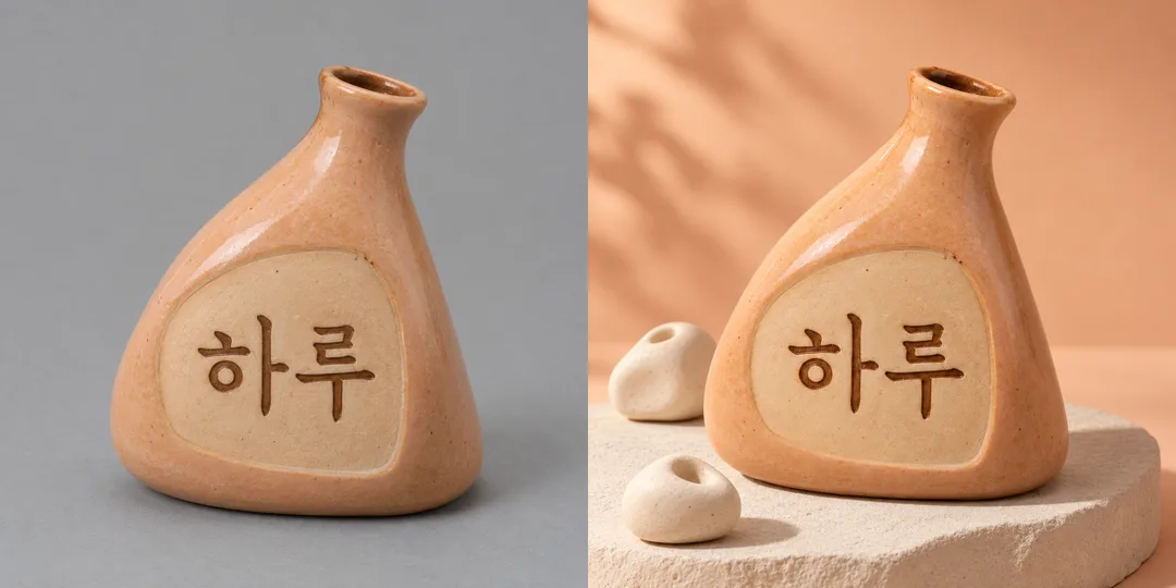
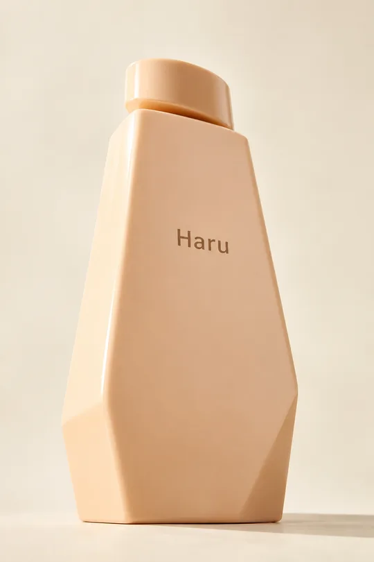
목록 표지는 민트색 문구 케이스 장면으로 따로 만들어요. 카드 안에는 다른 가상 상품의 순수 결과 한 장과 원본이 왼쪽, 결과가 오른쪽인 비교 두 장을 보여 줘요. 라일락 배경의 문구 상자와 살구색 배경의 도자기 화병으로 색과 소품의 차이를 확인하세요. 비교 속 결과를 갤러리에 다시 싣지 않아요.
확인과 고치는 법
원본과 결과를 확대해 하루의 두 글자를 한 글자씩 대조하고, 숫자와 작은 글씨가 있으면 빠짐없이 비교하세요. 상품 모양, 뚜껑, 비율, 라벨 위치도 확인해요. 색 칸은 포장색 변경 기능이 아니에요. 글자나 형태가 바뀌면 라벨이 더 선명한 정면 사진을 넣고 같은 프롬프트로 다시 요청하세요. 글자 보존은 지시이며 정확성을 보장하지 않아요. 본인이 사용할 권리가 있는 사진과 가상 포장을 사용하고 실존 브랜드나 유명 디자인을 모방하지 마세요. 외부 서비스의 요금과 이용 조건은 해당 서비스에서 확인하세요.