
전체 · 광고/포스터 · 학원·교육
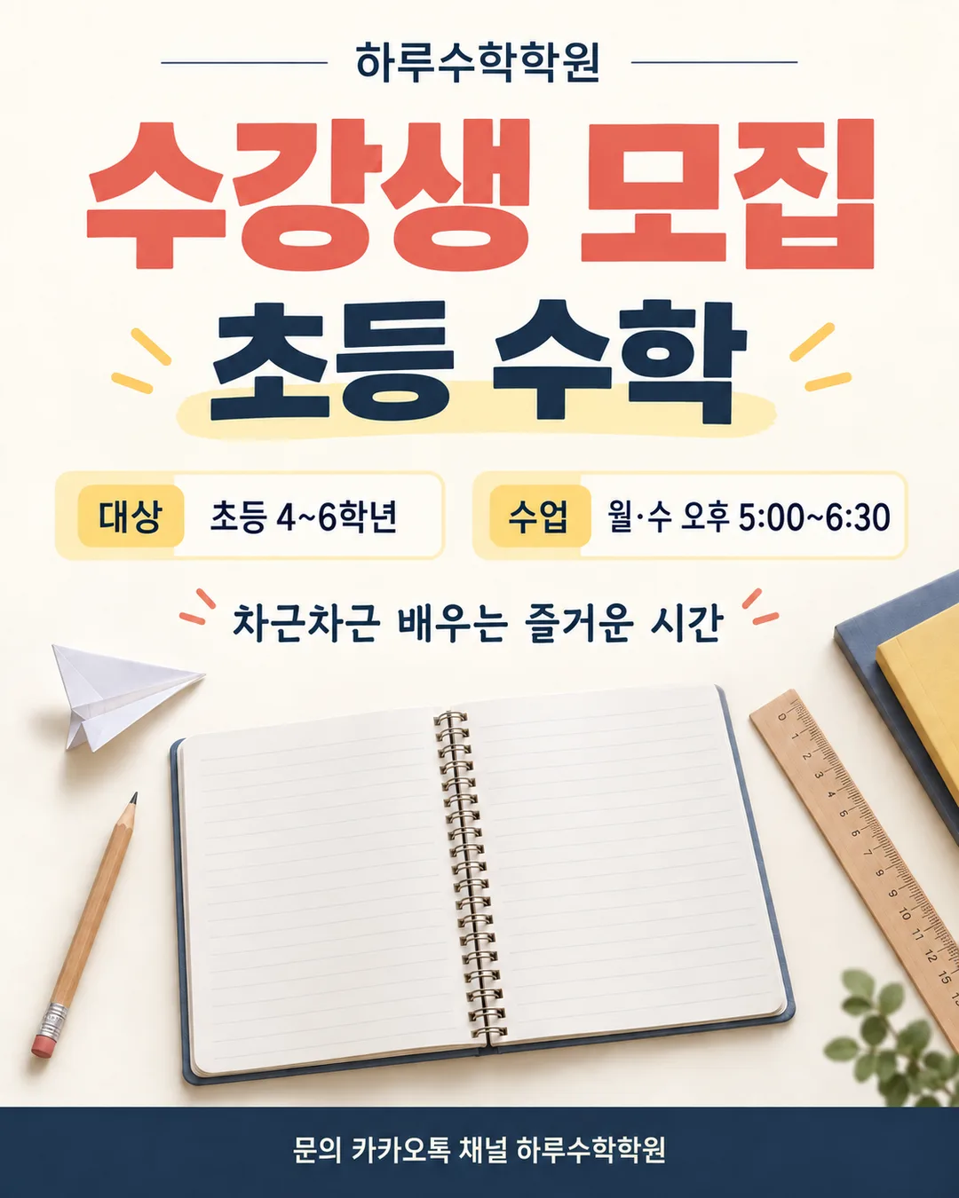
034학원·교습소 수강생 모집 포스터
과목·대상 학년·수업 시간·문의처가 한눈에 보이는 학원·교습소 모집 포스터
칸 채우기
- 1칸을 채워요
- 2복사 버튼을 눌러요
- 3GPT 채팅창에 붙여넣어요
- 4제품·인물 사진을 쓰려면 사진과 프롬프트를 둘 다 넣은 뒤에 보내요 선택
프롬프트 원문 보기 6,666자
Generate this image now. Draw it directly - do not describe it, explain it, or ask questions.
Output size 2480x3508 pixels, A4 portrait, 300dpi, print-ready poster.

[Purpose]
Create a finished student-recruitment poster for the Korean academy or private teaching studio named "【학원 이름】". It must work immediately as a social post shared through Instagram or a KakaoTalk parent group, and remain clear when printed for an entrance door. The poster must communicate the subject, eligible school years, class schedule, and exact inquiry destination in a few seconds. It must feel trustworthy, organized, welcoming, and educational without making any promise about admission, grades, rankings, test scores, or guaranteed improvement.

[Scene]
Use a clean warm-ivory paper background with a disciplined editorial grid. Build the composition around one large open notebook seen slightly from above in the lower-middle area. On the notebook, draw only simple nonverbal study motifs: a wooden pencil, two small geometric blocks, a ruler, a paper airplane, and three tiny star-shaped stickers. Behind it, use a broad muted navy arch and a smaller soft-yellow circle as flat geometric anchors. Add a restrained coral accent line that travels from the title area toward the notebook like a hand-drawn underline, but never crosses any letters. Keep plenty of empty space around every information line. Do not use a classroom photograph, student faces, school uniforms, institutional seals, certificates, trophies, medals, score sheets, upward graphs, or graduation caps. The scene must be original and generic, with no brand identity or logo.

[Attached photo]
No photo is required for this poster. If a photo is attached, do not copy any visible logo, trademark, celebrity, copyrighted character, student face, name tag, phone number, QR code, or private information from it. Use the photo only as loose color inspiration while keeping the notebook-and-stationery illustration described above. Never add a person from the attached photo and never replace or alter the exact text listed below.

[Text layout] top to bottom, as % of canvas height. Render these exact Korean strings:
- 5-10%: "【학원 이름】" - medium-size bold Korean sans-serif, muted navy, centered, with generous tracking
- 13-27%: "수강생 모집" — the largest text on the poster in very heavy muted-navy Korean sans-serif, with only "모집" in coral. Do not add a seasonal or school-term label.
- 31-38%: "【과목】" - bold Korean sans-serif in dark navy, centered, about half the main-title size, with a short soft-yellow brush underline that never touches the letters
- 42-48%: "대상  【대상 학년】" - bold Korean sans-serif, dark charcoal; make the label "대상" coral and the value dark charcoal
- 50-56%: "수업  【수업 요일·시간】" - bold Korean sans-serif, dark charcoal; make the label "수업" coral and the value dark charcoal
- 59-78%: open-notebook and stationery illustration zone, with no text, digits, symbols, pseudo-writing, or letter-like marks anywhere on the notebook or objects
- 82-88%: "차근차근 배우는 즐거운 시간" - medium bold Korean sans-serif, muted navy, centered
- 89-96%: "문의  【문의처】" - bold Korean sans-serif, cream white, centered inside one solid muted-navy footer band; make this the only text placed on a colored band. Use two balanced lines if the real destination is long, with no abbreviation.

[Style]
Use a polished Korean neighborhood-academy poster style: modern editorial typography combined with a tactile cut-paper illustration. The background should resemble lightly textured uncoated paper, while the notebook, pencil, ruler, blocks, paper airplane, and stickers have subtle layered-paper edges and very small natural shadows. Keep the palette limited to warm ivory, muted navy, soft yellow, coral, pale sky blue, and dark charcoal. The result should feel calm and credible to parents while still friendly to children. Avoid childish cartoon characters and avoid a corporate cram-school look. Typography must remain flat, crisp, large, and easy to read from several steps away.

[Visual hierarchy]
First read: "수강생 모집" and "【과목】". Second read: "대상  【대상 학년】" and "수업  【수업 요일·시간】". Third read: "【학원 이름】", the welcoming sentence, and "문의  【문의처】". The notebook illustration supports the message but must never compete with the recruitment title or the class information. Separate the target and schedule lines with empty space rather than boxes. Give the inquiry line enough height to show the full user-entered destination. In a wide aspect ratio, place the title and class information on the left 55% and the notebook illustration on the right 45%, while preserving the same reading order and exact text.

[Lighting and texture]
Use soft, even studio lighting with only subtle contact shadows beneath the paper objects. Keep the warm-ivory background bright and matte. The navy and coral shapes are flat printed colors with no glow. Paper texture may be visible at close range but must not reduce letter clarity. Do not use dramatic spotlights, lens flare, glossy plastic, metallic effects, or deep shadows.

[Text rules]
Render only the Korean text inside the double quotes above, plus the user's digits, punctuation, middle dots, tildes, time colons, and account symbols contained in the inserted values. Do not change, shorten, translate, repeat, or add a single character. Preserve spaces and the exact values of "【학원 이름】", "【과목】", "【대상 학년】", "【수업 요일·시간】", and "【문의처】". Never invent an address, telephone number, website, account name, price, discount, result, achievement, guarantee, slogan, badge, or small-print sentence. Draw every Korean syllable with complete, clean strokes. Keep all text comfortably inside the safe area and maintain strong contrast at every size.

[Avoid]
admission guarantee; grade guarantee; score improvement claim; ranking claim; pass guarantee; exaggerated educational outcome; before-and-after result; discount or tuition amount; any invented phone number or contact detail; QR code; logo; brand name other than the inserted academy name; trademark; celebrity; copyrighted character; song lyric; school emblem; government seal; award ribbon; trophy; medal; certificate; report card; test score; upward chart; student face; school uniform; classroom photograph; fake handwriting; pseudo-text; letters or numbers on the notebook; duplicated phrases; misspelled Korean; changed class days or times; missing punctuation; English text other than the exact user-entered account in the inquiry field; Chinese or Japanese characters; meaningless tiny text; multiple boxes behind information; rounded app-style cards; frames or borders; gradients; neon; glow; sparkle; 3D lettering; text outline; heavy drop shadow; clutter; decorations covering text; watermark
이 카드도 많이 사용해요


쓰는 법 · 자주 묻는 것
이런 때 쓰세요
새 반을 열거나 수강생을 모집할 때 학원·교습소의 내용을 알리는 포스터예요. 인스타 게시물이나 학부모 카톡 대화방에 올리고, 출입문이나 건물 게시판에도 붙일 수 있습니다. 계절에 묶인 「새 학기」 문구 없이 과목, 대상 학년, 수업 시간, 문의처가 한 화면에서 읽히도록 만들었어요. 확인되지 않은 학습 결과를 약속하지 않고, 실제 운영 정보만 또렷하게 보여 줍니다.
칸 채우는 법
- 학원 이름: 간판과 사업 안내에 쓰는 이름을 그대로 적어 주세요. 띄어쓰기까지 같아야 합니다.
- 과목: 한 포스터에는 가장 먼저 모집할 과목 하나를 쓰는 편이 잘 읽혀요. 반이 다르면 과목을 바꿔 포스터를 다시 만드세요.
- 대상 학년: 실제로 받을 수 있는 학년만 적어 주세요. 초등부처럼 넓게 쓰는 것보다 초등 4~6학년처럼 범위를 적으면 문의 전에 판단하기 쉬워요.
- 수업 요일·시간: 실제 수업 요일과 시작·종료 시간을 함께 적어 주세요. 예시 시간표가 실제 반과 다르면 반드시 바꾸세요.
- 문의처: 실제로 답변할 수 있는 카카오톡 채널 이름이나 인스타그램 계정을 정확히 적으세요. 예시의 「하루수학학원」과 계정은 샘플 값이므로 본인 문의처로 바꾼 뒤 게시해야 합니다.
- 화면 비율: 문과 게시판에 붙일 때는 A4, 인스타나 지역 커뮤니티에는 4:5, 스토리에는 9:16이 편해요.
입력한 내용은 그림에 그대로 들어갑니다. 반별 시간표가 다르면 한 장에 몰아넣기보다 반마다 한 장씩 만드는 편이 글자가 크고 선명해요. 문의처까지 그림에 들어가므로 이미지 한 장만 공유해도 학부모가 연락할 곳을 알 수 있습니다.
우리 제품·인물 사진을 넣고 싶을 때
이 카드는 사진 없이도 완성되는 문구와 학용품 일러스트 포스터예요. 학생 얼굴, 교복, 이름표가 보이는 사진은 개인정보와 초상권 문제가 생길 수 있으니 넣지 않는 편이 안전합니다. 꼭 공간 사진을 참고시키려면 사람, 상표, 연락처가 보이지 않는 사진만 사용하세요.
- GPT 채팅창에 사진을 올려요. 아직 보내지 마세요.
- 같은 칸에 복사한 프롬프트를 붙여넣어요.
- 사진과 프롬프트가 둘 다 들어간 걸 확인하고 보내세요.
사진만 먼저 보냈다면 프롬프트를 붙인 뒤 끝에 “위 사진은 색감만 참고해서 그려줘”라고 적으세요.
그림이 나오면 꼭 볼 것
붙이거나 올리기 전에 학원 이름의 받침, 대상 학년의 숫자, 수업 요일·시간, 문의처를 한 글자씩 확인하세요. 특히 1과 7, 5와 6처럼 비슷하게 보이는 숫자와 물결표 앞뒤, 계정의 @ 표시가 빠지지 않았는지 보세요. 입력하지 않은 학습 결과 홍보 문장이 생겼다면 사용하지 말고 지워 달라고 해야 합니다.
틀린 곳 고치는 법
같은 채팅창에서 틀린 부분 하나와 바른 글자만 짧게 알려 주세요.
수업 시간을 오후 5:00~6:30으로 고쳐줘. 나머지는 그대로 둬.
대상 학년을 초등 4~6학년으로 고쳐줘. 다른 글자는 바꾸지 마.
한 번에 한 군데씩 고치면 이미 맞게 나온 글자가 바뀌는 일을 줄일 수 있어요. 여러 번 고쳐도 같은 곳이 틀리면 새 채팅창에서 처음 프롬프트를 다시 보내는 편이 빠릅니다.
자주 묻는 것
- 문의처가 그림에 나오나요? 네. 직접 적은 카카오톡 채널 이름이나 인스타그램 계정이 아래쪽에 그대로 나옵니다. 샘플 값을 본인 문의처로 반드시 바꾸세요.
- 여러 과목을 한 장에 넣어도 되나요? 가능하지만 글자가 작아져요. 초등 수학, 중등 영어처럼 대상과 시간이 다르면 각각 만드는 편이 읽기 쉽습니다.
- 학습 결과를 약속하는 문구를 넣어도 되나요? 확인하기 어려운 결과 표현은 넣지 마세요. 수업 과목과 대상, 실제 시간처럼 사실로 확인할 수 있는 정보만 쓰는 게 안전합니다.
- 무료 GPT에서도 그림을 만들 수 있나요? 네. 다만 사용할 수 있는 이미지 생성 횟수가 제한될 수 있으니, 복사하기 전에 학년과 시간을 먼저 확인하세요.
- 그림에 엉뚱한 번호가 생겼어요. “임의의 번호를 모두 지워줘, 나머지는 그대로”라고 한 군데만 고쳐 달라고 하세요.