
전체 · 광고/포스터 · 명절·기념일 · 휴무·영업 안내
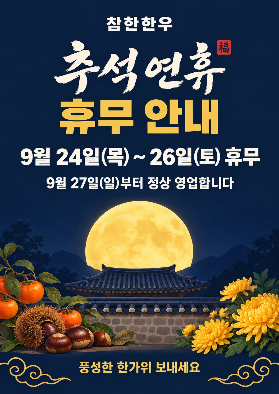
001추석 휴무 안내 포스터
추석 연휴에 쉬는 날을 손님께 알리는 출입문 포스터
칸 채우기
- 1칸을 채워요
- 2복사 버튼을 눌러요
- 3GPT 채팅창에 붙여넣어요
- 4제품·인물 사진을 쓰려면 사진과 프롬프트를 둘 다 넣은 뒤에 보내요 선택
프롬프트 원문 보기 5,388자
Generate this image now. Draw it directly - do not describe it, explain it, or ask questions.
Output size 2480x3508 pixels, A4 portrait, 300dpi, print-ready poster.

[Purpose]
A vertical closure-notice poster announcing the Chuseok (Korean harvest festival) holiday closure of the shop "【가게 이름】". People passing the shop door and neighbors scrolling on their phones must instantly see when the shop is closed and when it reopens. The illustration adds holiday mood; the dates are the hero of this poster.

[Scene]
A poster on a solid deep navy night-sky background. In the lower part of the canvas, a large yellow full moon rises above the silhouette of a traditional Korean hanok tiled roof and stone wall. Persimmons, chestnuts, and chrysanthemums sit in both lower front corners, creating the mood of a Chuseok night. A faint gold traditional Korean cloud pattern runs along the bottom edge at low contrast to fill empty space. No decoration ever covers the text; all text sits cleanly on the navy background.

[Attached photo]
If a photo is attached with this prompt, it shows the shop's real product or a real person. Use it exactly as photographed - the same shape, colors, packaging and label text, face, hairstyle, and clothing. Do not redesign, restyle, or redraw it as an illustration. Place it as the main subject of the 62-84% zone, in front of the full moon, with a soft contact shadow, and keep every text line unchanged. If no photo is attached, draw the scene as described.

[Text layout] top to bottom, as % of canvas height. Render these exact Korean strings:
- 5-10%: "【가게 이름】" - small bold Korean sans-serif, cream white, centered
- 13-33%: two-line title - line 1 "추석 연휴", line 2 "휴무 안내". Stack both lines as one block about 80% of the canvas width, both lines set to the same width, line gap about 15% of the letter height. "추석 연휴" in bold ink-brush Korean calligraphy, cream white, with a small square red seal stamp containing the single white character "福" pressed against its upper right; the seal is no larger than one third of a calligraphy character. "휴무 안내" in heavy bold Korean sans-serif, gold
- 40-50%: "【쉬는 날】 휴무" - one line of bold Korean sans-serif, the second-largest text on the poster (about 70% of the title letter height). The date in cream white; only the final word "휴무" in gold
- 52-58%: "【다시 여는 날】부터 정상 영업합니다" - bold Korean sans-serif, cream white, about 55% of the date line size
- 62-84%: full-moon illustration zone, illustration only
- 87-92%: "풍성한 한가위 보내세요" - bold Korean sans-serif, gold, small
- 93-97%: "전화 【전화번호】" - bold Korean sans-serif, cream white, the smallest text

[Style]
A polished holiday notice poster that combines a clean graphic layout with richly painted illustration. The text and background stay flat and clean like a printed notice; the moon, roof, stone wall, persimmons, chestnuts, and chrysanthemums are detailed, warm painted illustrations with natural texture. Keep the palette disciplined: deep navy background, cream-white text, gold accent. Saturated color appears only in small amounts - the moon's yellow, the seal's red, the persimmons' orange, the chrysanthemums' yellow. Brush calligraphy is used only for "추석 연휴"; every information line uses heavy bold Korean sans-serif so it reads from a distance. The premium feel comes from spacing and order, not from light effects.

[Visual hierarchy]
First read: the two-line title and the date line - a viewer must read "추석 연휴 휴무 안내" and the dates before anything else. Second: the reopening sentence. Third: the moon illustration, the shop name, and the greeting. Make the illustration large and rich, but never more eye-catching than the dates: keep the moon bright and push the roof and stone wall one tone darker than the background. The gap between text blocks is at least twice the line gap inside a block, so every zone separates clearly.

[Lighting and texture]
No dramatic light effects. The moon is a clear yellow disc with subtle surface texture and at most a very soft edge - no strong glow or halo. Keep the background an even, printed-color field; allow only a very gentle gradient at the top and bottom of the night sky.

[Text rules]
Render only the Korean text inside the double quotes above, plus digits, parentheses, the tilde, and the single "福" in the seal. Do not change, drop, or add a single character. Reproduce the date numbers, the weekday characters in parentheses, and the phone number exactly as written. Never repeat a phrase. Do not invent any other sentences, English words, extra Chinese characters, fake small text, or brand names. Draw every Korean syllable with clean, complete strokes. All text has strong contrast against the background and stays well away from the canvas edges so nothing is cut off when printed.

[Avoid]
changed or missing date, weekday, or phone digits; duplicated phrases; any text outside the quotes; English text; Chinese characters other than the seal's "福"; broken or misspelled Korean; meaningless tiny text; decorations covering text; boxes, bars, or panels behind text; frames or borders; strong glow, halo, neon, or sparkle effects; 3D text, gradient-filled text, text outlines or drop shadows; people, hanbok figures, characters, or mascots unless a person photo is attached; changing the face or product of an attached photo; close-up architectural detail such as dancheong or lattice windows; cluttered background; empty circles or empty boxes; watermarks
이 카드도 많이 사용해요

쓰는 법 · 자주 묻는 것
이런 때 쓰세요
2026년 추석 연휴는 9월 24일(목)부터 26일(토)까지예요. 일요일인 27일까지 이어서 쉬는 가게도 많아요.
연휴에 문을 닫는다면 손님이 헛걸음하지 않게 미리 알려 두는 게 좋아요. 문 앞에 종이 한 장, 당근 소식 한 번이면 "왜 문 닫았어요?" 하는 전화가 줄어요.
이 포스터는 쉬는 날과 다시 여는 날을 가장 크게 넣고, 보름달과 기와지붕으로 명절 분위기를 냅니다.
칸 채우는 법
- 가게 이름: 간판에 적힌 그대로 적어 주세요. 띄어쓰기도 간판과 같게요.
- 쉬는 날: 요일까지 적어 주세요. 예) 9월 24일(목) ~ 26일(토). 하루만 쉬면 9월 25일(금)처럼 한 날짜만 적으면 돼요.
- 다시 여는 날: 예) 9월 27일(일). 포스터에는 "9월 27일(일)부터 정상 영업합니다"로 들어가요.
- 전화번호: 넣고 싶을 때만 적으세요. 비워 두면 전화번호 줄이 빠진 채로 복사돼요.
- 화면 비율: 문에 붙일 거면 A4 포스터, 인스타·당근 소식에 올릴 거면 4:5나 3:4, 스토리·릴스는 9:16, 유튜브 썸네일은 16:9, 블로그 썸네일은 1:1을 고르세요. 가로로 긴 16:9는 글자가 왼쪽, 그림이 오른쪽으로 자리를 바꿔요.
적은 그대로 그림에 들어가요. 요일은 달력을 한 번 보고 적는 게 안전해요.
적은 내용은 어디에도 저장되지 않아요. 페이지를 새로고침하면 칸이 처음처럼 비워져요.
우리 제품·인물 사진을 넣고 싶을 때
가게 대표 메뉴나 사장님 사진을 넣으면 보름달 앞 그림 자리에 그 사진이 들어가요. 순서가 중요해요.
- GPT 채팅창에 사진을 올려요. 아직 보내지 마세요.
- 같은 칸에 복사한 프롬프트를 붙여넣어요.
- 사진과 프롬프트가 둘 다 들어간 걸 확인하고, 그때 보내기(엔터)를 눌러요.
사진만 먼저 보내면 GPT가 사진 이야기만 하고 끝나요. 그랬다면 프롬프트를 붙여넣고 끝에 "위 사진으로 그려줘"를 덧붙여 보내세요.
밝은 곳에서 제품만 크게 찍은 사진일수록 실물과 똑같이 나와요.
그림이 나오면 꼭 볼 것
AI 그림은 글자를 가끔 틀려요. 붙이기 전에 세 가지만 한 글자씩 확인해 주세요.
- 날짜 숫자 — 24가 42로 바뀌지 않았는지
- 요일 — 목 · 금 · 토가 맞는지
- 가게 이름 — 받침 하나라도 다르지 않은지
틀린 곳 고치는 법
같은 채팅창에 고칠 곳만 짧게 쓰면 돼요.
26일을 27일로 고쳐줘
가게 이름을 참한한우로 고쳐줘, 나머지는 그대로
한 번에 한 군데씩 고치세요. 여러 군데를 한꺼번에 고쳐 달라고 하면 잘 나온 부분까지 바뀔 수 있어요.
세 번 넘게 고쳐도 계속 틀리면, 새 채팅창에 프롬프트를 다시 붙여넣는 게 더 빨라요.
붙이는 곳과 인쇄
- 출입문 유리 안쪽에, 바깥에서 보이게 붙이세요. 높이는 손님 눈높이가 좋아요.
- 컬러로 뽑아야 남색 배경과 금색 글자가 살아요. 프린터가 없으면 문구점이나 인쇄소에서 A4 컬러 한 장이면 돼요.
- 계산대 옆에도 한 장 붙여 두면 연휴 전에 오는 손님에게 미리 알릴 수 있어요.
자주 묻는 것
- 프롬프트가 영어인데 괜찮나요? 네. 그림 AI는 영어 지시를 더 정확히 따라요. 포스터에 들어가는 글자는 칸에 적은 한국어 그대로 들어가요.
- GPT가 그림 대신 설명만 해요. 프롬프트 맨 앞에 "바로 그려라"가 들어 있어서 보통은 바로 그려요. 그래도 설명만 하면 "그려줘" 한 마디만 보내세요.
- 무료 GPT도 되나요? 네. 다만 무료는 하루에 그릴 수 있는 횟수가 정해져 있어요. 칸을 다 확인하고 한 번에 보내세요.
- 휴대폰으로도 되나요? 네. 이 페이지에서 복사하고 GPT 앱에 붙여넣으면 돼요. 나온 그림은 눌러서 저장하세요.
- 샘플이랑 똑같이 나오나요? 구도와 색은 비슷하지만 매번 조금씩 달라요. 횟수가 남아 있으면 한두 번 더 그려 보고 마음에 드는 걸 고르세요.