
전체 · 광고/포스터 · 병원·약국
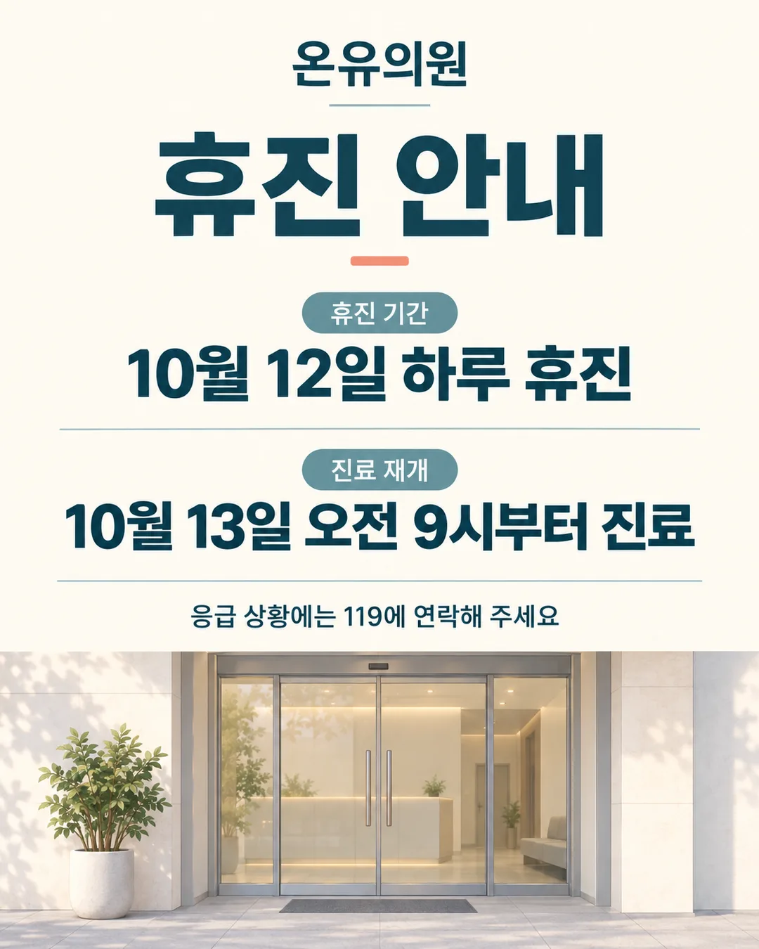
035의원 · 병원 휴진 안내 포스터
의원·병원의 휴진 기간과 진료 재개일을 환자와 방문객에게 또렷하게 알리는 안내 포스터
칸 채우기
- 1칸을 채워요
- 2복사 버튼을 눌러요
- 3GPT 채팅창에 붙여넣어요
- 4제품·인물 사진을 쓰려면 사진과 프롬프트를 둘 다 넣은 뒤에 보내요 선택
프롬프트 원문 보기 6,720자
Generate this image now. Draw it directly - do not describe it, explain it, or ask questions.
Output size 2480x3508 pixels, A4 portrait, 300dpi, print-ready poster.

[Purpose]
Create a finished Korean closure-notice poster for the clinic or hospital named "【이름】". The image must work as a digital notice shared through Instagram or KakaoTalk and as a printed entrance or reception notice. A visitor must understand the closure period and the date when care resumes within two seconds. This is an operational notice, not an advertisement or a claim about treatment, health improvement, or medical results. Use only the dates and wording supplied in the fields. Never infer, calculate, extend, shorten, or invent a date, weekday, opening hour, contact detail, medical department, specialty, or emergency service.

[Scene]
Design a calm, highly legible notice on a warm ivory background. Use a restrained dark teal and muted blue-green palette with a small coral accent. Place a simple editorial illustration in the lower third: a closed glass entrance door seen straight on, a small potted plant, and one understated hanging sign with no writing on it. Add a few soft geometric leaf shapes behind the illustration to prevent the lower area from feeling empty. Keep all shapes flat, refined, and professional. The entrance should suggest a clean clinic or hospital without showing a logo, trademark, medical product, medicine package, prescription, staff member, patient, body part, treatment scene, or identifiable brand. Do not use a red cross, green cross, caduceus, hospital emblem, or any symbol that could be mistaken for an official mark.

[Attached photo]
If a photo is attached with this prompt, use it only as a faithful reference for the real entrance or interior of the user's own clinic or hospital. Preserve the visible architecture and colors, but remove or obscure any third-party brand, logo, patient information, prescription, chart, face, vehicle plate, QR code, phone number, and unrelated small writing. Never invent missing signage. If no photo is attached, draw the neutral entrance scene described above. The poster must remain complete and useful without a photo.

[Text layout] top to bottom, as % of canvas height. Render these exact Korean strings:
- 5-10%: "【이름】" - centered, medium-weight Korean sans-serif, dark teal, small but clearly readable
- 15-29%: "휴진 안내" - centered, very large heavy Korean sans-serif, dark teal; this is the dominant title
- 35-39%: "휴진 기간" - centered, small bold Korean sans-serif, muted blue-green
- 41-51%: "【휴진 기간】" - centered, large heavy Korean sans-serif, near-black teal; keep the supplied value exactly as entered
- 56-60%: "진료 재개" - centered, small bold Korean sans-serif, muted blue-green
- 62-71%: "【진료 재개일】" - centered, large heavy Korean sans-serif, coral; keep the supplied value exactly as entered
- 74-80%: optional safety line, centered, regular Korean sans-serif, dark teal, smaller than the date lines, maximum two balanced lines. If absent, close the space naturally without a box, icon, label, or punctuation.
"【응급 시 안내】"
- 82-97%: illustration zone only, with the closed entrance, potted plant, and quiet leaf shapes; no text inside this zone

[Style]
Use the visual language of a trustworthy neighborhood service notice: clean editorial layout, generous spacing, precise alignment, and friendly but restrained flat illustration. The finish should feel suitable for a clinic or hospital reception area, without looking cold, alarming, childish, luxurious, or promotional. Use one consistent Korean sans-serif family with clear differences in weight. The background is warm ivory, the title and main information are dark teal, supporting labels are muted blue-green, and coral is reserved for the reopening line and one or two tiny decorative accents. Maintain substantial empty space around every text block. Do not imitate any hospital, public agency, insurance company, or commercial template.

[Visual hierarchy]
The first read is "휴진 안내". The second read is the exact value of "【휴진 기간】". The third read is the exact value of "【진료 재개일】". The institution name and optional emergency guidance come afterward. Make the two user-entered schedule values large enough to read through a glass door from several steps away. Keep label text visibly smaller than its corresponding value. Separate the closure block and reopening block with empty space rather than boxes, cards, rules, ribbons, or colored panels. The illustration is supportive and must never compete with the dates, touch the text, or reduce contrast.

[Lighting and texture]
Use even, soft, print-friendly color with no dramatic lighting. The background may have a nearly invisible natural paper grain, but it must still look clean when printed on an ordinary office printer. Use only minimal soft shading beneath the plant pot and door frame. Avoid glare on the glass entrance, glossy highlights, strong shadows, bloom, glow, reflections, gradients behind letters, and photographic depth-of-field. All important information must remain crisp in color and readable when converted to grayscale.

[Text rules]
Render only the Korean strings inside double quotes in the [Text layout] section. Reproduce every user-entered character exactly, including digits, punctuation, spaces, parentheses, weekday characters, tildes, and line breaks when needed. Do not correct, reinterpret, translate, calculate, abbreviate, or complete the supplied closure period or reopening date. Do not add a year, month, day, weekday, operating hour, phone number, website, address, department, doctor's name, diagnosis, medicine name, emergency-room name, or legal disclaimer. If the optional emergency line does not appear in [Text layout], omit that entire line and leave clean empty space; do not leave a blank box, placeholder, label, icon, or punctuation. Never repeat a phrase. Draw every Korean syllable with complete, clean strokes and strong contrast. Keep all writing safely inside the canvas margins.

[Avoid]
invented dates or weekdays; inferred reopening schedules; changed digits; missing punctuation; duplicated text; spelling errors; broken Korean; fake tiny writing; extra slogans; phone numbers; prices; QR codes; URLs; logos; brand names; trademarks; official-looking seals; red crosses; green pharmacy crosses; medical emblems; medicine packages; pills; syringes; stethoscopes; ambulances; doctors; nurses; patients; faces; bodies; treatment scenes; health benefits; cure claims; prevention claims; efficacy claims; urgency marketing; fear imagery; blood; warning stripes; neon; glow; lens flare; 3D text; outlined text; gradient-filled text; text shadows; text on ribbons, boxes, cards, or panels; decorations covering letters; empty frames; watermarks
이 카드도 많이 사용해요

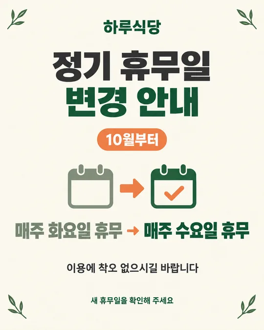
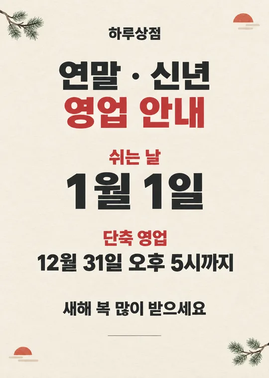
쓰는 법 · 자주 묻는 것
이런 때 쓰세요
의원이나 병원이 하루 쉬거나 오전·오후만 진료하지 않을 때, 방문객이 헛걸음하지 않도록 알리는 포스터예요. 인스타와 카톡 공지에 올리고 출입문에 붙이면 휴진 기간과 진료 재개일을 바로 읽을 수 있습니다. 접수대나 엘리베이터 앞에도 같은 안내를 둘 수 있어요.
예시의 10월 날짜는 실제 기관의 일정이 아닙니다. 입력한 내용만 포스터에 들어가므로 공식 일정표를 확인한 뒤 적어 주세요. 의료기관마다 운영 방식이 다르니, 진료 과목이나 당직 여부를 추측하지 말고 방문객에게 실제로 적용되는 휴진 기간과 재개 시간을 그대로 쓰세요.
칸 채우는 법
- 이름: 간판과 공식 안내에 쓰는 의원명 또는 병원명을 그대로 적어 주세요. 이름만 보고 진료 과목을 새로 붙이지 마세요.
- 휴진 기간: 쉬는 날짜나 시간대를 실제 공지와 똑같이 적어 주세요. 하루 전체가 아니라 오전이나 오후만 쉬면 그 시간대까지 분명히 적으세요.
- 진료 재개일: 진료를 다시 시작하는 날짜와 시간이 실제로 정해졌다면 그대로 적어 주세요. 휴진 마지막 날과 혼동하지 않도록 일정표를 한 번 더 확인하세요.
- 응급 시 안내: 필요한 경우에만 쓰는 선택 칸이에요. 위급할 때 119에 연락하라는 일반 안내만 예시로 넣었습니다. 기관이 제공하지 않는 당직 진료나 연락 방법을 지어내지 마세요. 비워 두면 해당 문장 전체가 빠집니다.
- 화면 비율: 출입문에 인쇄해 붙일 때는 A4, SNS 게시물은 4:5나 1:1, 휴대폰용 공지는 9:16을 고르세요.
자유 입력 칸 아래의 보기는 실제 값처럼 보이는 샘플이에요. 예시 날짜와 시간이 실제 휴진 일정과 다르면 반드시 바꾸세요. 입력한 값은 새로고침하면 사라질 수 있으니, 복사하기 전에 한 번 더 확인하는 편이 좋습니다.
우리 건물·출입문 사진을 넣고 싶을 때
직접 운영하는 의원이나 병원의 출입문 사진을 함께 보내면, 그림 아래쪽에 실제 공간의 분위기를 반영할 수 있어요. 환자 얼굴, 처방전, 차트, 전화번호, 차량 번호판처럼 개인정보가 보이는 사진은 먼저 가려 주세요.
- GPT 채팅창에 사진을 올려요. 아직 보내지 마세요.
- 같은 입력 칸에 이 카드에서 복사한 프롬프트를 붙여넣어요.
- 사진과 프롬프트가 둘 다 들어간 것을 확인한 뒤 보내세요.
사진만 먼저 보냈다면 프롬프트를 이어 붙이고 마지막에 “위 사진을 참고해서 그려줘”라고 적어 보내면 됩니다. 사진이 없어도 포스터는 완성되도록 만들어져 있어요.
그림이 나오면 꼭 볼 것
AI는 숫자와 한글을 틀릴 수 있어요. 인쇄하거나 게시하기 전에 이름, 휴진 기간, 진료 재개일을 원래 일정과 한 글자씩 대조하세요. 특히 날짜 숫자, 요일, 물결표 앞뒤, “휴진”과 “진료 재개”의 위치가 맞는지 보세요. 선택 문구를 비웠다면 응급 안내 자리에 빈 상자나 어색한 기호가 남지 않았는지도 확인하세요.
틀린 곳 고치는 법
같은 채팅창에서 틀린 부분 하나만 짧고 정확하게 알려 주세요.
휴진 기간을 내가 입력한 문장 그대로 고쳐줘. 나머지는 바꾸지 마.
병원 이름의 띄어쓰기만 고쳐줘. 다른 글자와 그림은 그대로 둬.
여러 곳을 한꺼번에 고치면 맞던 글자까지 달라질 수 있어요. 한 번에 한 군데씩 수정하고 다시 대조하세요. 계속 같은 글자가 틀리면 새 채팅에서 원본 프롬프트로 다시 만드는 편이 빠릅니다.
자주 묻는 것
- 날짜를 자동으로 계산해 주나요? 아니요. 사용자가 적은 기간과 재개일만 사용합니다. 공식 일정표를 보고 직접 입력해 주세요.
- 응급 시 안내는 꼭 넣어야 하나요? 아니요. 선택 칸이므로 실제로 안내할 내용이 있을 때만 넣으세요. 비워 두면 그 줄이 빠집니다.
- 약국에도 쓸 수 있나요? 이 카드는 「휴진」과 「진료 재개」를 인쇄하므로 의원·병원용입니다. 약국의 휴무와 영업 재개 안내에는 이 문구를 그대로 쓰지 마세요.
- 전화번호나 QR코드를 넣어도 되나요? 이 카드는 개인정보 노출과 오인 가능성을 줄이기 위해 전화번호와 QR코드 칸을 두지 않았어요. 필요한 연락처는 검수된 별도 안내물로 붙이세요.
- GPT가 날짜를 임의로 덧붙이면 어떻게 하나요? “입력하지 않은 날짜와 요일은 모두 지우고, 내가 적은 문장만 남겨줘”라고 요청한 뒤 다시 확인하세요.
- 무료 GPT에서도 만들 수 있나요? 네. 다만 이미지 생성 횟수에 제한이 있을 수 있으므로 보내기 전에 네 칸을 먼저 확인하세요.