
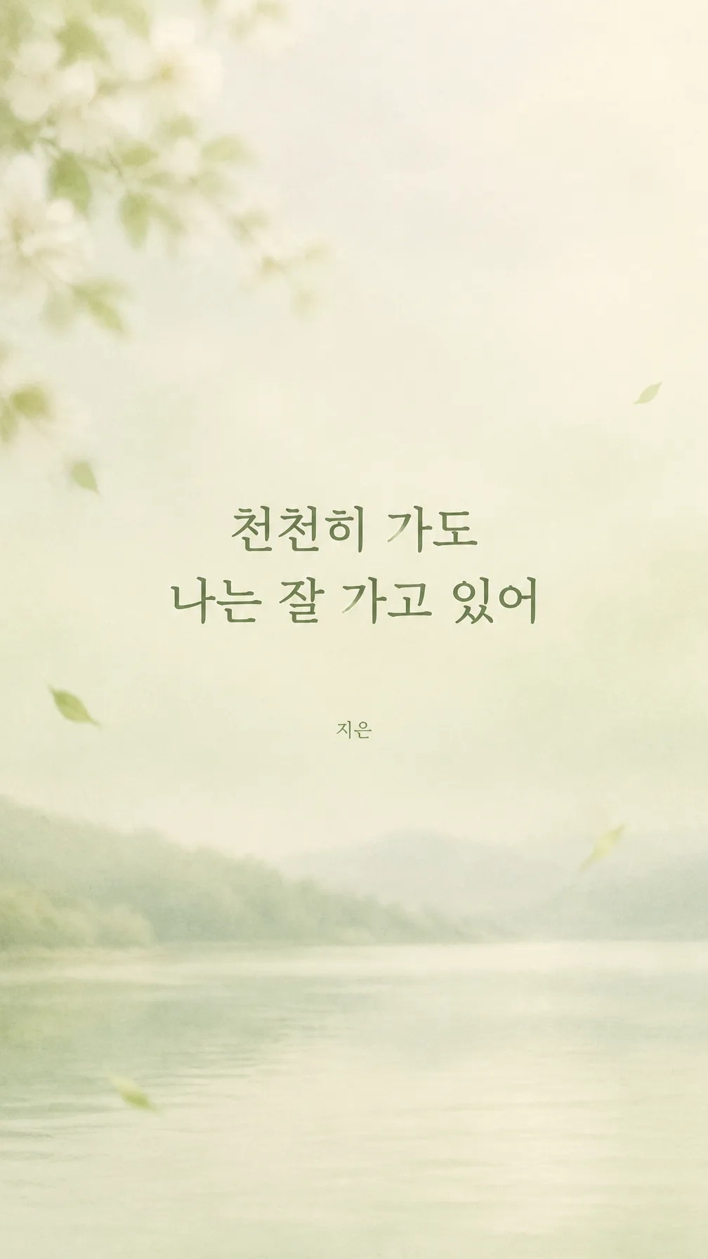
전체 · 배경화면 · 폰 배경화면 · 감성 문구
015이달의 문구 폰 배경화면 만들기
나에게 필요한 문구와 계절 분위기, 색을 골라 매일 보는 잠금화면 배경화면을 만들어요.
칸 채우기
- 1칸을 채워요
- 2복사 버튼을 눌러요
- 3GPT 채팅창에 붙여넣어요
- 4제품·인물 사진을 쓰려면 사진과 프롬프트를 둘 다 넣은 뒤에 보내요 선택
프롬프트 원문 보기 8,525자
Target screen: "【기종 또는 비율】". If this is an aspect ratio such as 9:16, make a portrait image at exactly that ratio. Otherwise it names a device: before drawing, look up on the web that device's native screen resolution and aspect ratio (for a foldable, the specific screen named — main or cover; if not named, the main screen), its lock-screen clock placement, and its punch-hole camera position, and make the image at exactly that aspect ratio and resolution. Then generate the image directly - do not describe the search or ask questions.
Generate this image now. Draw it directly - do not describe it, explain it, or ask questions.

[Purpose]
Create one finished vertical Korean phone lock-screen wallpaper for one individual to save and look at every day. The wallpaper must feel quiet, personal, restorative, and useful behind a real phone lock screen. It is not a poster, greeting card, book cover, social-media post, or phone mockup. Deliver only the complete flat wallpaper artwork at the selected output aspect ratio, edge to edge, without showing a phone, hands, frame, room, desk, app interface, clock, battery icon, notification, or presentation scene. The single chosen sentence is the emotional center, supported by a restrained seasonal atmosphere rather than a busy illustration.

[Scene]
Build an original atmospheric background inspired only by the selected "【계절·분위기】". Interpret that choice through subtle natural cues such as softly blurred branches, a distant horizon, fine rain traces, calm water, pale mist, small drifting leaves, or gentle abstract paper-cut shapes, choosing only the few elements that fit the selected mood. Do not combine all seasons or turn the scene into a detailed landscape. Use "【색】" as the dominant palette, with nuanced lighter and darker variations that preserve strong readability. Keep the composition spacious and uncluttered. The upper quarter and lower fifth must remain genuinely quiet because a phone will place its clock, status icons, flashlight, camera controls, and gesture bar there.

The middle of the canvas should contain a softly defined calm zone for the sentence. It may be created with natural negative space, a faint translucent wash, subtle mist, or an evenly toned patch within the background, but never a hard rectangle, label, ribbon, card, speech bubble, or framed text box. Decorative details may approach the central zone but must never cross the lettering. The result should remain attractive even when a phone crops a few pixels at the edges.

[Attached photo]
No attached photo is required. Do not invent a portrait, recognizable person, celebrity, character, product, logo, or photographed object. Create the background and typography as original artwork from the supplied choices only.

[Text layout]
Render the exact Korean strings below without the surrounding quotation marks. Use the full canvas height as the coordinate system and keep all meaningful lettering within the middle 40% of the screen.
For the target screen, treat the 0-25% and 80-100% bands and all text positions below as adjustable guides: move or enlarge the safe areas to fit the actual lock-screen clock, punch-hole camera, and controls; foldable main screens and tablets are wider and may place the clock differently.
- 0-25%: Leave this entire upper safe area free of all text, faces, focal objects, badges, stars, high-contrast decorations, and important details. It is reserved for the phone clock and status icons. Only a low-contrast continuation of the background may appear here.
- 30-65%: The main sentence is "【문구】". If it is exactly "알아서 골라줘", never print those words; instead write one original, emotional Korean sentence of encouragement or courage yourself — the gentle words someone needs to read on a hard day, as if quietly telling oneself "you can do this" or "you are doing well" (10-20 characters excluding spaces, plain everyday words, no quotation, lyric, poem line, or famous saying) — that also suits the selected mood and colors, and use it as the main sentence. Place the main sentence as the only main sentence. Center it horizontally and optically within this middle region. Use two or three balanced lines only when needed for legibility, with natural Korean phrase breaks, generous line spacing, and wide side margins. Keep every syllable between 30% and 65% of canvas height. Use refined, warm Korean lettering that is clear at a glance: either a neat handwritten style with complete strokes or a restrained Korean serif, selected to suit the mood. The sentence must remain the largest and first-read element.
- 67-70%: Place "【이름 넣기】" as a very small, quiet signature centered below the sentence on its own line. Keep it subtle but readable. If no name is supplied, omit this line completely and preserve empty space; do not invent a name, label, dash, or placeholder.
- 80-100%: Leave this lower safe area free of all text, faces, focal objects, badges, high-contrast decorations, and important details. It is reserved for lock-screen controls, the gesture bar, and icons. Only a low-contrast continuation of the background may appear here.

[Style]
Use a contemporary Korean editorial wallpaper aesthetic: minimal, intimate, soft, and polished. Blend delicate gouache, fine paper grain, subtle photographic depth, or restrained digital painting according to the chosen seasonal mood, while keeping the visual language coherent. Prefer quiet negative space over decoration. Let the selected palette "【색】" guide the entire image instead of printing the palette name. Colors should be sophisticated and slightly muted rather than sugary or neon. The background may contain small original botanical or atmospheric motifs, but it must not imitate a known artist, brand campaign, book cover, animation, or copyrighted character.

[Visual hierarchy]
First read: the main sentence in the central 40% of the screen. Second: the calm seasonal atmosphere created from "【계절·분위기】" and "【색】". Last: the optional name. Nothing in the top 25% or bottom 20% may compete for attention. Keep the primary focal point away from the clock area and lock-screen controls. Use size, contrast, negative space, and gentle tonal transitions rather than frames or glowing effects. The wallpaper should still feel balanced when the optional name is omitted.

[Lighting and texture]
Use soft diffuse natural light appropriate to the chosen mood, with restrained contrast and smooth tonal transitions. A faint matte paper texture or delicate grain is welcome, especially around the outer background, but keep texture subdued behind the sentence so every Korean stroke remains clean. Avoid strong sunbursts, lens flare, bloom, luminous halos, glossy reflections, harsh shadows, noisy gradients, or black crush. If the chosen atmosphere is dark, create a calm mid-dark background and render the sentence in a warm light tone with sufficient contrast; never place bright stars or a moon behind the letters.

[Text rules]
Render only the main sentence and the optional name line, each exactly once. Preserve every supplied Korean syllable, space, punctuation mark, and line meaning. Do not quote the sentence. Do not translate, paraphrase, shorten, complete, attribute, or add an author. Do not add a month, date, calendar, slogan, English word, logo, watermark, caption, season name, color name, or decorative pseudo-lettering. Keep complete consonant and vowel strokes, open counters, consistent baselines, and ample spacing. No branch, leaf, rain line, horizon, texture, shadow, or highlight may overlap or cut through a glyph. Break lines only at natural phrase boundaries and never split a Korean syllable block.

[Avoid]
No clock, time, date, calendar, battery, signal, notification, camera icon, flashlight icon, home indicator, lock symbol, phone bezel, device mockup, hand holding a phone, desktop scene, poster frame, card border, text box, ribbon, speech bubble, button, or app interface. No famous quotations, song lyrics, poem lines, book passages, author names, copyrighted characters, celebrity likenesses, trademarks, logos, signatures other than the supplied optional name, or recognizable branded visual styles. No extra text, random letters, duplicated sentence, misspelled Korean, cropped lettering, tiny unreadable type, vertical Korean writing, crowded ornaments, visual clutter, high-contrast objects in the upper 25% or lower 20%, neon, glow, bloom, lens flare, glitter, excessive stars, empty square boxes, hard rectangular panels, or watermarks.
이 카드도 많이 사용해요

쓰는 법 · 자주 묻는 것
이런 때 쓰세요
한 달 동안 자주 보고 싶은 마음을 한 줄로 정해 잠금화면에 두는 개인용 배경화면이에요. 휴대폰을 켤 때마다 긴 다짐 대신 짧고 분명한 문장을 읽고 싶을 때 써 보세요. 새달을 시작할 때 문구를 바꾸거나, 계절이 달라졌을 때 같은 문장을 다른 분위기와 색으로 다시 만들 수도 있어요.
기본 보기에 들어 있는 문구는 이 카드를 위해 새로 쓴 짧은 말이에요. 노래 가사, 시, 책 문장을 옮기지 않아도 편안한 잠금화면을 만들 수 있습니다. 직접 문구를 적을 때도 다른 사람의 작품을 그대로 복사하기보다 내 말로 짧게 써 주세요.
칸 채우는 법
- 기종 또는 비율: 쓰는 휴대폰 이름을 그대로 적으세요(예: 「갤럭시 Z 폴드8 메인 화면」 「아이폰 17 프로」). 그 기종의 화면 크기와 시계 · 카메라 위치를 찾아보고 딱 맞게 만들어요. 폴더블은 메인 화면인지 커버 화면인지 같이 적어 주세요. 기종을 모르면 「9:16」처럼 비율을 적으면 돼요.
- 문구: 매일 봐도 부담 없는 한 문장을 적으세요. 두세 줄 안에 들어가도록 짧게 쓰면 휴대폰에서 잘 읽혀요. 떠오르지 않으면 보기 맨 앞의 알아서 골라줘를 누르세요. 힘든 날 나에게 건네는 응원 · 용기의 한 문장을 새로 지어 넣어요.
- 계절·분위기: 지금의 계절이나 마음에 가까운 장면을 하나 고르세요. 여러 계절을 한꺼번에 적기보다 한 가지에 집중하는 편이 여백이 살아납니다.
- 색: 잠금화면에서 오래 봐도 눈이 피로하지 않은 조합을 골라 보세요. 어두운 색을 골라도 문구가 묻히지 않도록 프롬프트가 대비를 지시합니다.
- 이름 넣기: 문구 아래에 작은 서명처럼 들어갑니다. 필요 없으면 비워 두세요. 빈칸이면 이름 줄 전체가 빠지고 그 자리는 조용한 여백으로 남아요.
칸을 채운 뒤 완성된 프롬프트를 복사해 GPT에 붙여넣으세요. 사진은 필요하지 않습니다. 화면 크기는 「기종 또는 비율」 칸 하나로 정해져요.
잠금화면에 맞게 만든 이유
휴대폰 잠금화면 위쪽에는 큰 시계와 상태 아이콘이, 아래쪽에는 카메라·손전등 버튼이나 제스처 표시가 놓입니다. 그래서 이 카드는 글자를 화면 가운데 40%에 모으고, 위 25%와 아래 20%를 비우도록 프롬프트에 정확히 적어 두었습니다. 그림이 예쁘더라도 중요한 요소가 위아래에 있으면 실제 잠금화면에서 가려지므로, 중앙 문구와 넓은 안전 여백을 가장 먼저 확인해 주세요.
그림이 나오면 꼭 볼 것
먼저 문구를 한 글자씩 읽어 원문과 같은지 확인하세요. 글자가 화면 가운데에 모였는지, 위쪽 시계 자리와 아래쪽 아이콘 자리가 조용히 비어 있는지도 보세요. 이름을 비웠다면 이름처럼 보이는 임의 글자나 작은 서명이 없어야 합니다. 휴대폰에 저장한 뒤 실제 잠금화면 미리보기에서 시계가 문구를 가리지 않는지 마지막으로 확인하면 가장 정확해요.
틀린 곳 고치는 법
그림을 만든 같은 채팅창에 틀린 부분만 정확히 적어 주세요. 예를 들어 「문구를 '천천히 가도 나는 잘 가고 있어'로 한 글자도 바꾸지 말고 다시 써 주세요. 나머지는 그대로 두세요」라고 요청하면 됩니다. 시계와 겹치면 「글자를 화면 높이 30~65% 안으로 내리고, 위 25%는 완전히 비워 주세요」라고 하세요. 아래가 복잡하면 「아래 20%의 장식과 글자를 지워 잠금화면 아이콘 자리로 남겨 주세요」라고 고치면 됩니다.
자주 묻는 것
- 기종을 모르면 어떻게 하나요? 「기종 또는 비율」 칸에 9:16을 적으면 일반 세로 휴대폰 크기로 만들어요.
- 문구가 떠오르지 않아요. 문구 칸 아래 알아서 골라줘를 누르세요. 힘든 날 읽으면 힘이 나는 응원 · 용기의 문장을 계절 · 색에 맞춰 지어 줘요. 마음에 안 들면 같은 대화에서 「문구만 다른 걸로 바꿔 줘」라고 하면 돼요.
- 사진을 올려야 하나요? 아니요. 문구와 분위기, 색만으로 만드는 배경화면이라 사진 없이 사용할 수 있어요.
- 이름은 꼭 넣어야 하나요? 아니요. 이름 넣기는 선택 칸입니다. 비우면 문구 아래에 더 넓은 여백이 생겨요.
- 긴 문장도 되나요? 가능하지만 휴대폰에서는 짧은 문장이 더 또렷합니다. 두세 줄을 넘는다면 핵심만 남겨 줄여 보세요.
- 잠금화면 시계까지 그림에 그려 주나요? 아니요. 시계와 아이콘은 휴대폰이 표시하므로 그림에는 넣지 않습니다. 위아래 여백만 마련합니다.
- 어떻게 배경화면으로 지정하나요? 그림을 휴대폰 사진 앱에 저장한 뒤 설정의 배경화면 메뉴에서 새 배경화면 또는 잠금화면을 선택하고 저장한 이미지를 고르세요. 기종에 따라 메뉴 이름은 조금 다를 수 있습니다.
- 매달 다시 만들어도 되나요? 네. 이달에 필요한 문구나 계절·색을 바꾸면 같은 구성으로도 새로운 잠금화면을 만들 수 있어요.