
540우리 동네 아이소메트릭 지도 — 작은 가게를 한눈에
가게 이름과 표시할 곳을 넣으면 입구와 편의시설이 보이는 미니어처 안내 지도 한 장을 만들어요.
받는 것
- 아이소메트릭 미니어처 안내 지도 한 장
- 이름과 표시할 장소 3~6개
- 시설별 안내선과 읽기 쉬운 표지
ChatGPT 무료 OK
칸 채우기
- 1칸을 채워요
- 2복사 버튼을 눌러요
- 3GPT 채팅창에 붙여넣어요
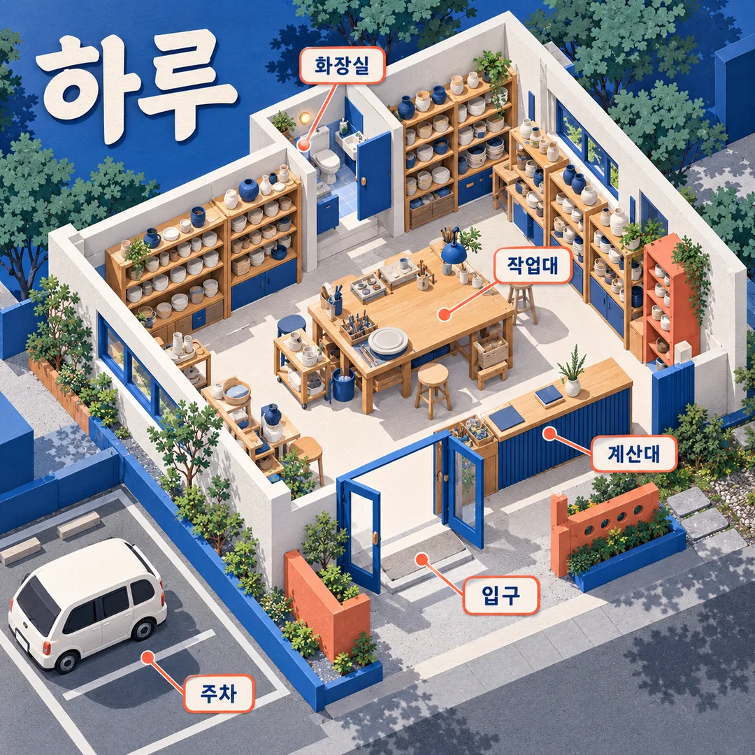
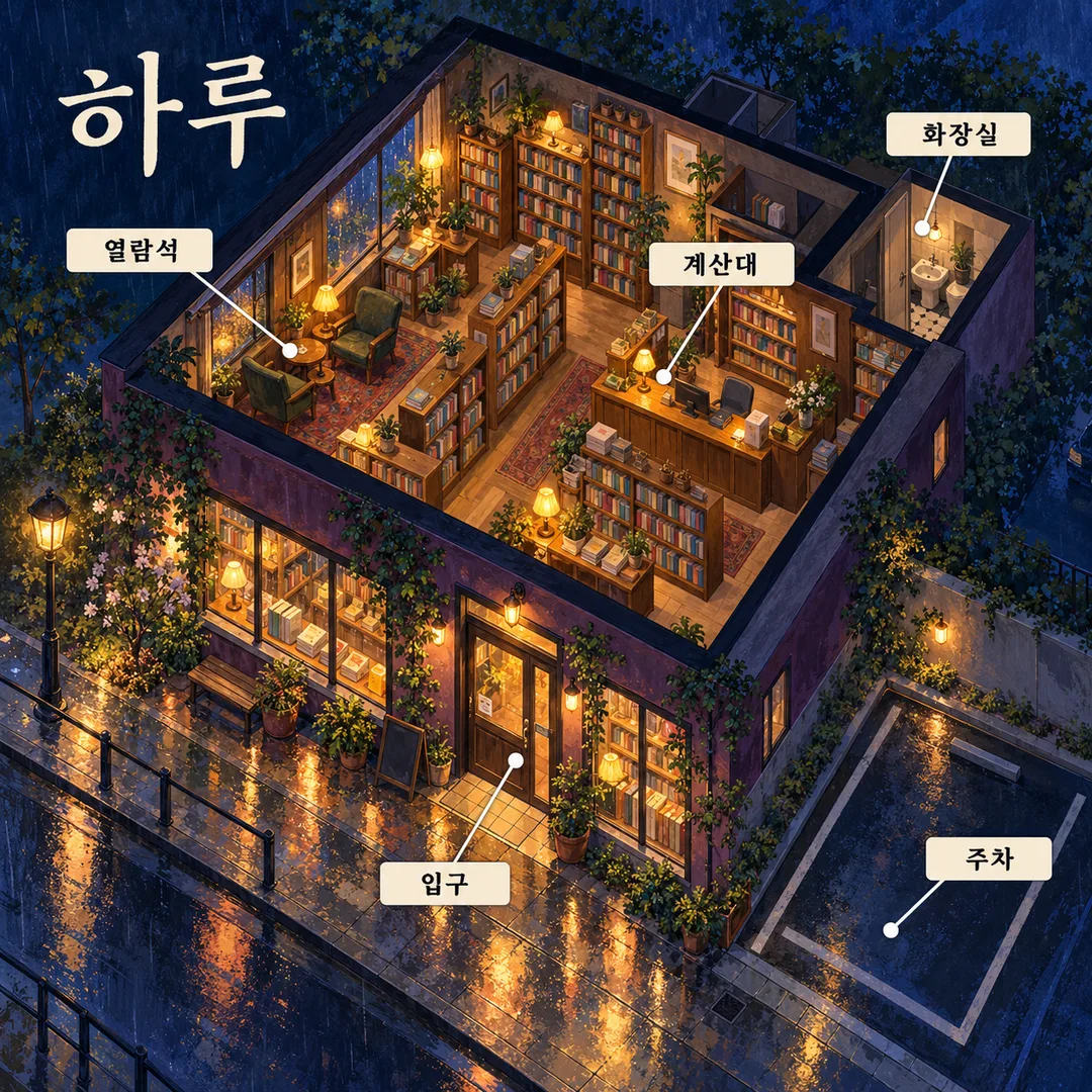
- 4그대로 보내면 썸네일 예시처럼 나와요
- 5카드에 맞는 실제 사진을 같이 넣으면 그 사진이 반영돼요 — 배경 카드는 배경 사진, 인물 · 음식 카드는 그 사진 선택
직접 해 봤어요
- 시험일
- 2026-10-29
- 도구
- ChatGPT 이미지 모델(코덱스에서 실행) — 무료 ChatGPT와 같은 모델, 한도만 다름
- 결과
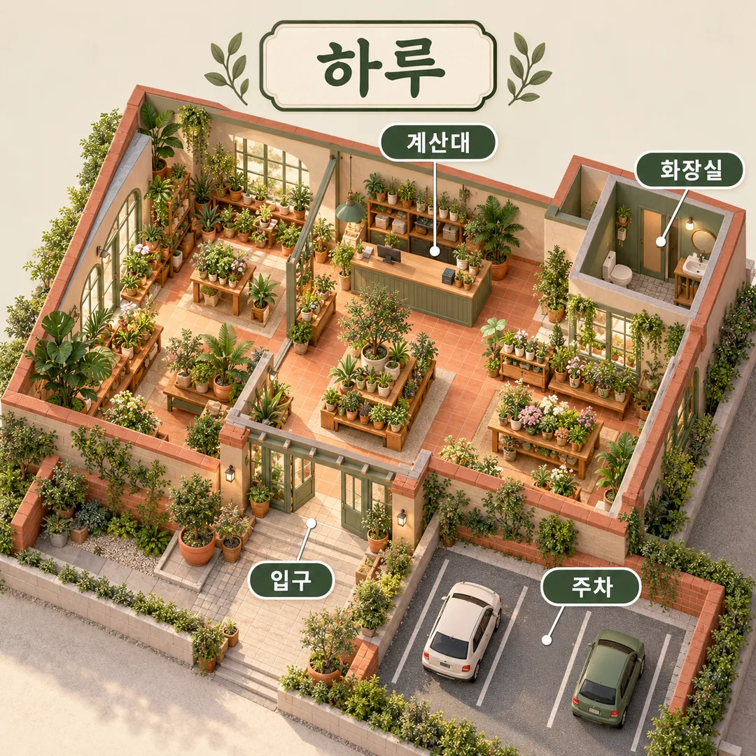
- 통과
- 지켜진 것
- ‘하루’, ‘입구’, ‘계산대’, ‘화장실’, ‘주차’가 각각 한 번씩 정확하게 표시됨. 지붕을 제거한 아이소메트릭 식물 가게 한 장이며 테라코타 바닥과 세이지 계열 가구가 보임. 안내선 네 개가 교차하지 않고 각각 열린 입구, 계산 카운터, 변기와 세면대가 있는 별도 공간, 건물 밖 주차면을 가리킴. 입구의 열린 문에서 실내 통로로 연결됨. 사람·추가 문구·주소·방위표·로고·워터마크 없음. 정사각형이며 휴대폰 폭으로 축소해도 제목과 네 시설명을 읽을 수 있음.
- 안 된 것
- 없음
- 이렇게 하면 나아요
- 수정 없이 위 예시 입력으로 1회 통과했어요. 다른 이름·업종·위치 지정은 이번에 시험하지 않았어요. 실제 매장에 쓰기 전에는 그림의 시설 위치와 실제 동선을 대조하세요.
프롬프트 원문 보기 2,946자
Generate this image now. Draw it directly; return one finished image without explanation.
Output size 1080x1080 pixels, 1:1 square card. Keep the same top-to-bottom order but compress the zones to fit the square: the illustration becomes smaller and every text line stays fully readable.
Create ONE full-bleed original isometric miniature wayfinding map, default square 1:1 unless the shared size line specifies otherwise. No mockup, inset paper, collage or multiple results.
PLACE: "【가게】". NAME: "【장소 이름】". MARKERS: "【표시할 곳】". PALETTE: "【색】".
Use a coherent architectural cutaway with roof removed, readable rooms, connected walkways, visible entrance and parking outside the boundary. Interpret supplied positional descriptions as layout instructions, not printed text. Keep entrance, checkout and toilet distinct. Preserve all supplied spatial relationships; do not invent an address, street direction, actual floor plan or additional facilities. This is a conceptual map from written inputs, not a surveyed navigation map. Ignore attachments.
Render miniature architectural map craft appropriate to the place: plant shops use sunlit tactile terracotta and sage miniature materials; workshops use cool crisp matte paper construction and cobalt/coral details; bookstores use hand-painted gouache, midnight navy and amber evening light. Other places use daylight tactile miniature materials. These are automatic material and lighting responses within one isometric wayfinding result, never a style menu. Supplied colors override these palette defaults. No recognizable building or product designs.
Print only the supplied name as title and 3–6 marker names in Korean language. Labels are large clear high-contrast plaques; thin noncrossing leader lines end on their matching feature. Draw each feature once; do not double labels. No extra prose, numbers, dates, decorative writing, compass or unprovided measurements. Keep title and labels legible at phone size. For portrait output keep essential text below top 12% and above bottom 15%.
If place is empty use a plant shop; if name is empty use 하루. If markers are empty use 입구, 계산대, 화장실, 주차. Split markers by commas; render 3–6 requested facilities, use first six if more, and complete fewer than three with distinct generic entrance, checkout or restroom facilities only when missing. No invented claims about an actual site. If color is empty choose materials suited to place.
No real brands, logos, famous people, characters, artist imitation, signatures or watermarks. Use fictional original architecture, furniture and unbranded products; no people. Check every printed character against the input before delivering; fix spelling, overlaps and incorrect endpoints in the generated image. Return one completed map.

[Final output format]
Output size 1080x1080 pixels, 1:1 square card. Keep the same top-to-bottom order but compress the zones to fit the square: the illustration becomes smaller and every text line stays fully readable.
This selected output format takes priority over any fixed canvas size or aspect ratio elsewhere in this template. Adapt the composition, text zones and margins to the selected canvas without stretching or cropping essential content. Device safe areas apply only when a device is selected. Never print these format instructions on the image.
결과 어땠어요?
이 카드도 많이 사용해요
쓰는 법 · 자주 묻는 것
처음 오는 손님에게 가게 구조와 편의시설을 한눈에 보여 주는 미니어처 안내 지도예요. 식물 가게, 도자기 공방, 동네 서점처럼 장소의 성격을 적으면 지붕을 열어 안쪽을 보여 주는 아이소메트릭 구도로 완성해요. 사진은 필요 없으며 첨부 사진은 사용하지 않아요. 완성된 프롬프트를 그림 AI에 한 번 붙여 넣어 지도 한 장을 요청하세요. 기본은 정사각형 1:1이고 비율은 공통 크기 선택에서 바꿔요.
꼭 채울 칸은 가게, 장소 이름, 표시할 곳의 세 개예요. 가게에는 업종을, 장소 이름에는 그림에 찍을 이름을 적으세요. 표시할 곳은 입구, 계산대, 화장실, 주차처럼 3~6개를 쉼표로 나눠 적어요. 위치를 정하려면 ‘입구: 앞쪽, 화장실: 뒤쪽 오른편’처럼 이름 뒤에 배치를 덧붙이세요. 배치 설명은 글자로 찍지 않고 공간 구성에 반영해요. 여섯 개를 넘으면 앞의 여섯 개만 쓰며 세 개보다 적으면 빠진 기본 시설로 보완해요.
색은 원하는 조합을 적는 선택 칸이에요. 식물 가게는 햇살과 흙빛 미니어처 재질, 공방은 또렷한 종이 건축 느낌, 서점은 밤의 따뜻한 불빛과 붓결로 장소에 맞춰 달라져요. 입력한 색이 기본 색보다 우선해요. 가게를 비우면 식물 가게, 이름을 비우면 하루, 표시를 비우면 입구, 계산대, 화장실, 주차가 나와요. 색을 비우면 장소에 어울리게 정해요.
결과에서 이름과 시설명을 확대해 한 글자씩 읽고 안내선 끝점이 맞는지 확인하세요. 주차는 건물 밖에 있고 입구에서 실내로 길이 이어져야 해요. 틀린 글자나 시설 위치를 짚어 같은 조건으로 다시 요청하면 돼요. 실제 도면이나 측량 자료를 반영하는 카드는 아니므로 실제 매장에 게시하기 전에는 시설 위치와 동선을 직접 대조하세요. 사진이나 주소로 실제 지리를 추정하지 않아요. 가상 건축과 상표 없는 소품을 쓰며 기존 로고, 유명 건물, 작가 이름은 넣지 마세요. 이 카드는 프롬프트를 제공해요. 외부 서비스의 요금과 이용 조건은 해당 서비스에서 확인하세요.