
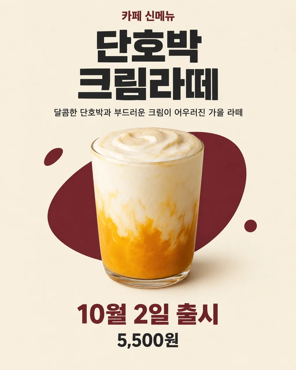
전체 · 광고/포스터 · 신메뉴·신상품
020신메뉴 출시 포스터 — 카페 · 분식 · 치킨 · 피자 · 빵집
음식 사진이 있든 없든 메뉴 이름과 설명으로 만드는 신메뉴 출시 홍보 포스터
칸 채우기
- 1칸을 채워요
- 2복사 버튼을 눌러요
- 3GPT 채팅창에 붙여넣어요
- 4제품·인물 사진을 쓰려면 사진과 프롬프트를 둘 다 넣은 뒤에 보내요 선택
프롬프트 원문 보기 9,276자
Before drawing, if a food photo is attached, use that photo as the sole source of truth for the food. Only if no food photo is attached, search the web for real photographs of "【메뉴 이름】" as actually served in Korea; use them to reference its real ingredients, colors, textures, portion presentation, and plating, but never add a detail or serving size that is not supported by the menu name and one-line description.
Generate this image now. Draw it directly - do not describe it, explain it, or ask questions.
Output size 2480x3508 pixels, A4 portrait, 300dpi, print-ready poster.

[Purpose]
Create a finished Korean launch poster for a new menu item at a small local 【업종】. The poster must work both when the owner attaches a real food photo and when no photo is supplied. It should make a passerby or social-media viewer read the menu name first, understand what the item is from the one-line description, and notice the launch date immediately. The result must look ready to print or post, not like a mockup, mood board, menu template, or design proposal.

[Scene]
Use a clean, appetizing editorial poster composition with one dominant food subject in the middle and generous clear space around every text block. Build the background from warm cream with one deep burgundy or forest-green accent shape and a few small abstract paper-cut marks. Adapt only the graphic mood to 【업종】: calm café warmth for 카페, lively red accents for 분식, bold dark accents for 치킨, warm tomato-red and golden-crust accents for 피자, or soft wheat-colored warmth for 빵집. Do not show a storefront, signboard, staff member, customer, mascot, character, logo, package, branded cup, branded plate, or delivery box. Do not infer or display a shop name.

The main food occupies roughly 38-72% of the canvas height on portrait outputs. Present one clear serving at a neutral visual scale. Do not add rulers, hands, coins, utensils used as scale references, portion labels, dimensions, volume, weight, number of pieces, or words such as 대왕, 미니, 점보, 한입, 1인분, or 곱빼기 unless those facts appear verbatim in the menu name or the one-line description. A small plain plate, tray, cup, or sheet of unbranded parchment may be used only when necessary to hold the food; it must not imply an unprovided serving size.

[Attached photo]
Branch A — if a food photo is attached with this prompt: treat that attached photo as the sole source of truth for the food. Keep the exact same food, ingredients, toppings, garnish, sauce, color, cooking state, shape, quantity, portion, container, arrangement, and visible size relationships. Preserve unusual imperfections that identify the real item. Cut out or clean the background only as needed for the poster, but do not beautify the food by adding steam, cheese pull, syrup, cream, fruit, herbs, seeds, powder, sauce, filling, extra pieces, larger volume, or any ingredient that is not visibly present. Do not replace the container, change the crop in a way that hides the product, enlarge individual pieces, or turn the real food into an illustration. Render it as faithful commercial food photography, not a stylized reinterpretation.

Branch B — if no food photo is attached: create the food only from the literal information in the menu name and the one-line description. Every depicted ingredient, topping, filling, sauce, garnish, flavor cue, cooking method, color cue, and container-specific detail must be explicitly named or unavoidably required by those two strings. If a detail is not stated, omit it. Do not guess common recipes or typical accompaniments for 【업종】. For example, do not automatically add parsley, sesame seeds, cheese, eggs, pickles, dipping sauce, whipped cream, fruit, ice, steam, side dishes, or packaging. If the description is too short to establish exact ingredients, show a simple, honest, scale-neutral depiction of the named menu with no speculative toppings or cutaway filling. Never invent a serving count, cup capacity, diameter, height, weight, portion size, or comparative size.

[One-line description]
The one-line description is "【한 줄 설명】". If it is exactly "알아서 골라줘", never print those words; write one appetizing Korean line yourself (15-25 characters) for the menu "【메뉴 이름】" in the voice of a 【업종】: 카페 is soft and cozy, 분식 is friendly and playful with a little spice, 치킨 is crispy, loud, and made for a cold beer, 피자 is generous, cheesy, and made for sharing, 빵집 is warm and fresh-from-the-oven. Describe only taste, texture, or mood that the menu name itself implies; never invent ingredients, sizes, health effects, rankings, or superlatives like 최고 or 1등.

[Text layout]
Arrange the following zones from top to bottom on portrait outputs. For a landscape output, keep the same reading order in a left text column and place the food on the right. Render these exact Korean strings and no substitutes:
- 5-10%: "【업종】 신메뉴" — small bold Korean sans-serif, deep burgundy or forest green, centered, with no badge or box behind it
- 12-28%: "【메뉴 이름】" — the largest text, heavy Korean sans-serif, two lines only if necessary, dark charcoal, centered, wide letterforms and tight but readable line spacing
- 31-39%: the one-line description — medium Korean sans-serif, dark charcoal, centered, maximum two lines, with comfortable side margins
- 42-74%: the food subject only; keep this zone free of lettering and decorative marks over the food
- 78-86%: "【출시일】" — bold Korean sans-serif, the second-largest information line, deep burgundy or forest green, centered
- 89-95%: "【가격】" — heavy Korean sans-serif, dark charcoal, centered, visually smaller than the launch date but easily readable

[Style]
Create a polished independent-shop food poster with restrained contemporary Korean editorial design. Use flat printed color fields, crisp typography, a realistic and appetizing food subject, and deliberate whitespace. The palette must remain limited to warm cream, dark charcoal, and one accent color chosen for the selected 【업종】. The food must remain the only detailed photographic object. Abstract accents may be simple curves, dots, or torn-paper forms, never ingredient-shaped decorations that could falsely suggest what is in the menu. Keep the composition useful across A4, social posts, stories, thumbnails, and square cards while preserving the specified hierarchy.

[Visual hierarchy]
First read: "【메뉴 이름】". Second read: the food and "【출시일】". Third read: the one-line description and the price. The menu name must be readable at phone-thumbnail size. Keep a clear gap of at least one full capital-letter height between text zones. The food may overlap abstract background shapes but may never overlap text. If the menu name or explanation becomes long, reduce only that block enough to fit; never crop, abbreviate, rewrite, or cover it. Do not make the price more prominent than the menu name or launch date.

[Lighting and texture]
For an attached photo, preserve the photo's real direction of light and surface texture, adding only a subtle grounding shadow compatible with that light. For a generated food image, use soft window-like light from the upper left, natural shadows, realistic moisture and crumb texture only where the stated menu logically requires them, and no excessive gloss. Generated food must look like a real photograph taken with a camera, matching the real-photo references: natural imperfections, real crumb and surface grain, uneven edges, true colors — not the smooth, glossy, over-perfect look of AI-generated food. Keep the cream background matte like quality uncoated poster paper. Avoid dramatic spotlighting, heavy haze, steam effects, lens flare, sparkle, neon, or glowing edges.

[Text rules]
Render only the Korean strings inside double quotes in [Text layout], including the user's digits and punctuation. Reproduce the business type, menu name, launch date, price, and any description the owner wrote exactly as entered. Do not correct spelling, shorten a phrase, change spacing, add a shop name, add a phone number, translate anything, invent a slogan, or repeat any phrase. Draw every Korean syllable and every price digit with clean complete strokes. If no price line appears in [Text layout], leave that space closed naturally; do not add an empty box, placeholder, symbol, currency mark, or gap.

[Avoid]
invented ingredients, toppings, garnish, filling, sauce, sides, packaging, quantity, portion size, physical dimensions, weight, volume, serving count, or exaggerated product scale; changing any visible food detail in an attached photo; turning an attached photo into a drawing; generic recipe assumptions; shop names, contact details, addresses, logos, brands, trademarks, celebrities, copyrighted characters, mascots, song lyrics, health benefits, diet claims, medical claims, quality superlatives, origin claims, awards, discount claims, fake reviews, or original-price comparisons; misspelled Korean, changed numbers, extra writing, English words, meaningless tiny text, duplicate phrases; price badges, text boxes, ribbons, seals, speech bubbles, frames, borders, QR codes, watermarks; utensils or hands implying size; clutter, floating ingredients, ingredient explosions, cheese pulls not present in the source, excessive steam, glow, neon, gradients inside letters, 3D letters, text outlines, hard drop shadows, or decorations covering text
이 카드도 많이 사용해요
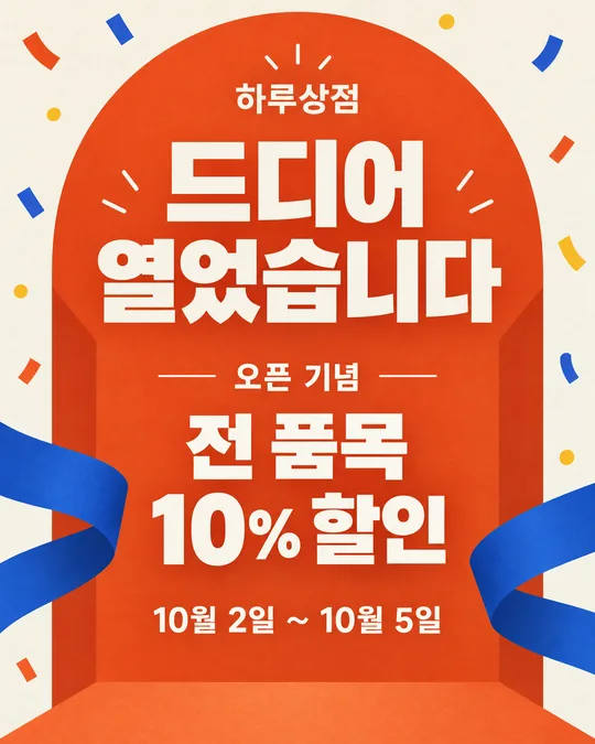
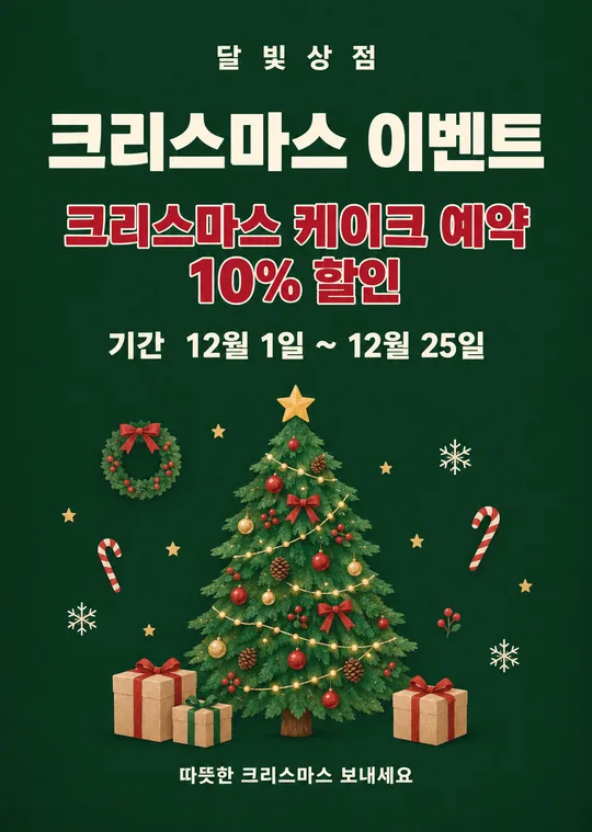
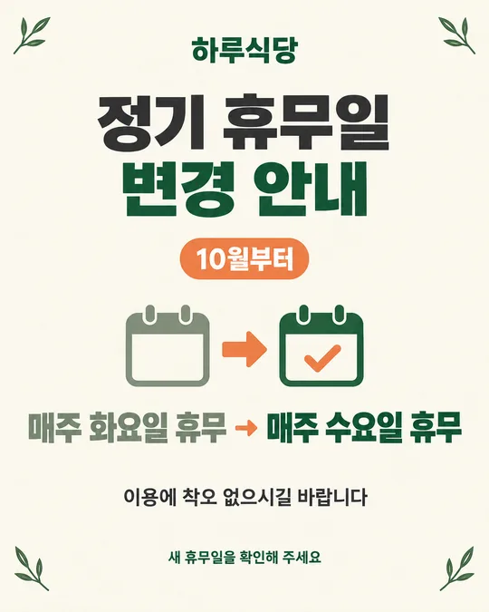
쓰는 법 · 자주 묻는 것
이런 때 쓰세요
새 음료, 떡볶이, 치킨, 피자, 빵처럼 새로 내놓는 메뉴를 손님께 처음 알릴 때 쓰는 포스터예요. 카페 · 분식 · 치킨 · 피자 · 빵집 가운데 업종을 고르고 메뉴 이름, 설명, 출시일만 적으면 됩니다. 완성 그림은 가게 출입문과 계산대 옆에 붙이거나 인스타, 당근 가게 소식에 바로 올릴 수 있어요.
직접 찍은 음식 사진이 있으면 그 사진을 그대로 살려 포스터로 만들고, 사진이 없으면 적어 둔 메뉴 이름과 한 줄 설명만 보고 음식을 그립니다. 사진이 꼭 있어야 하는 카드는 아니므로 출시 전 촬영을 못 했을 때도 쓸 수 있어요. 다만 설명에 쓰지 않은 재료나 크기는 AI가 알아서 보태지 않도록 프롬프트에서 막아 두었습니다.
사진이 없으면 GPT가 그리기 전에 그 메뉴의 실제 음식 사진을 웹에서 찾아보고 재료 · 색 · 질감 · 양 · 담음새를 참고해요. 적지 않은 재료나 크기를 보태지 않으면서 AI 그림 특유의 매끈하고 가짜 같은 질감 대신 실제 카메라 사진처럼 그려요. 직접 찍은 사진을 올렸다면 그 사진이 웹 사진보다 우선이에요.
칸 채우는 법
- 업종: 카페 · 분식 · 치킨 · 피자 · 빵집 중 하나를 고르세요. 음식 자체를 바꾸는 칸이 아니라 포스터의 색과 인상을 맞추는 칸이에요.
- 메뉴 이름: 손님에게 실제로 보여 줄 이름을 그대로 적으세요. 띄어쓰기와 받침까지 포스터에 들어갑니다.
- 한 줄 설명: 실제로 들어간 재료와 조리 특징만 짧게 적으세요. 문구가 떠오르지 않으면 보기 맨 앞의 알아서 골라줘를 누르세요. 고른 업종과 메뉴 이름에 맞춰 카페는 포근하게, 분식은 발랄하게, 치킨은 바삭하고 시원하게, 피자는 푸짐하게, 빵집은 갓 구운 느낌으로 한 줄을 지어 줘요. 사진 없이 만들 때는 이 문장이 그림의 재료 목록 역할도 해요. 보이지 않는 속재료나 제공하지 않는 곁들임은 적지 마세요.
- 가격: 실제 판매 가격을 넣고 싶을 때만 적으세요. 비우면 가격 줄 전체가 빠집니다. 할인 전 가격이나 비교 가격은 실제로 받았던 근거가 있을 때만 쓸 수 있으므로 이 카드에서는 넣지 않아요.
- 출시일: 「오늘 출시」, 「10월 2일 출시」처럼 손님이 바로 이해할 말로 적으세요. 날짜와 요일을 함께 쓴다면 달력에서 한 번 확인하세요.
- 화면 비율: 인쇄는 A4, 인스타 게시물은 4:5, 스토리와 릴스는 9:16, 유튜브 썸네일은 16:9, 블로그 썸네일은 1:1이 알맞아요.
음식 사진을 같이 넣고 싶을 때
사진은 선택이에요. 실물과 같은 모양을 보여 주고 싶다면 밝은 곳에서 메뉴 하나가 온전히 보이게 찍은 사진을 준비하세요. 그다음 순서를 지켜 주세요.
- GPT 채팅창에 음식 사진을 올립니다. 아직 보내지 마세요.
- 같은 입력 칸에 이 페이지에서 복사한 프롬프트를 붙여넣습니다.
- 사진과 프롬프트가 둘 다 들어간 것을 확인한 뒤 보냅니다.
사진만 먼저 보냈다면 다음 메시지에 프롬프트를 붙이고 끝에 「위 사진으로 그려줘」라고 적으세요. 사진에 없는 토핑, 소스, 장식, 양, 그릇을 새로 만들지 말라는 지시가 들어 있어요. 그래도 결과에서는 실물의 개수와 모양을 꼭 다시 비교하세요.
사진 없이 만들 때
메뉴 이름과 한 줄 설명을 구체적으로 적을수록 실제 메뉴에 가까워져요. 「가을 라떼」보다 「단호박과 우유로 만든 부드러운 라떼」가 낫습니다. 반대로 실제로 쓰지 않는 재료를 분위기 때문에 적으면 그림에도 들어갈 수 있어요. 양, 지름, 중량, 조각 수를 알려 주지 않았다면 AI가 크기를 지어내지 않도록 기준 물체와 크기 표현을 빼도록 해 두었습니다.
그림이 나오면 꼭 볼 것
먼저 메뉴 이름, 출시일, 가격 숫자를 한 글자씩 대조하세요. 그다음 사진을 넣었다면 음식의 개수, 토핑, 소스, 용기, 색이 실물과 같은지 확인하세요. 사진 없이 만들었다면 한 줄 설명에 없는 재료가 그려지지 않았는지 보세요. 없는 재료 하나라도 보이면 그대로 게시하지 말고 고쳐야 합니다.
음식의 크기도 살펴보세요. 실제보다 과장돼 보이거나 손, 포크, 컵 같은 비교 물체 때문에 크기가 정해져 보이면 그 물체를 빼 달라고 하세요. 중량이나 용량을 적지 않았다면 포스터에도 그런 숫자가 없어야 해요.
틀린 곳 고치는 법
같은 채팅창에서 바꿀 곳 하나와 그대로 둘 곳을 함께 말하면 됩니다.
메뉴 이름은 그대로 두고, 사진에 없는 파슬리만 빼줘
출시일을 「10월 5일부터 판매」로 고쳐줘. 음식과 나머지 글자는 그대로
여러 곳을 한꺼번에 고치면 잘 나온 글자나 음식 모양까지 바뀔 수 있어요. 한 번에 한 군데씩 고치고, 수정된 그림에서도 모든 글자와 재료를 다시 확인하세요. 같은 오류가 세 번 이어지면 새 채팅에서 원본 사진과 프롬프트를 다시 함께 보내는 편이 빠릅니다.
자주 묻는 것
- 설명 문구를 못 쓰겠어요. 한 줄 설명 아래 알아서 골라줘를 누르세요. 업종과 메뉴 이름을 보고 맛 · 식감 · 분위기로 한 줄을 지어요. 없는 재료나 「최고」 같은 과장은 넣지 않아요.
- 음식 사진이 꼭 필요한가요? 아니요. 사진이 있으면 실물을 그대로 쓰고, 없으면 메뉴 이름과 한 줄 설명에 적힌 내용만 바탕으로 그립니다.
- 사진 없이도 실제 메뉴와 똑같이 나오나요? 설명하지 않은 모양까지 정확히 맞출 수는 없어요. 실제 모양이 중요하면 완성 메뉴를 직접 찍어 함께 올리는 것이 가장 안전합니다.
- 설명에 없는 재료가 나왔어요. 같은 대화에서 「한 줄 설명에 없는 재료는 모두 빼줘」라고 요청하고, 새 그림을 실제 레시피와 다시 대조하세요.
- 가격을 빼도 되나요? 네. 가격 칸을 비우면 가격 줄이 통째로 빠지고 다른 내용이 자연스럽게 자리를 채웁니다.
- 가게 이름과 연락처는 어디에 쓰나요? 이 카드는 신메뉴 자체에 집중하도록 두 항목을 받지 않습니다. 가게 계정에 올리거나 매장 안에 붙여 출처가 분명한 곳에서 쓰세요.
- 무료 GPT에서도 만들 수 있나요? 네. 다만 무료 계정은 이미지 생성 횟수에 제한이 있을 수 있으니 메뉴 이름, 날짜, 가격을 먼저 확인한 뒤 한 번에 보내세요.