
전체 · 광고/포스터 · 할인·행사
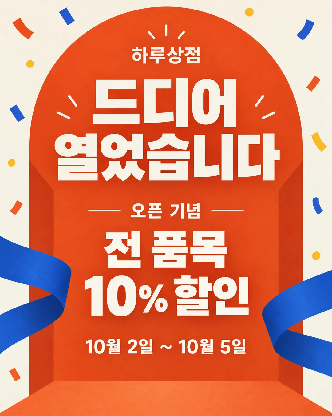
033오픈 · 재오픈 기념 행사 포스터 — 카페 · 식당 · 미용실 · 소매점
새로 열거나 다시 문을 연 가게의 행사 내용과 기간을 멀리서도 알리는 홍보 포스터
칸 채우기
- 1칸을 채워요
- 2복사 버튼을 눌러요
- 3GPT 채팅창에 붙여넣어요
- 4제품·인물 사진을 쓰려면 사진과 프롬프트를 둘 다 넣은 뒤에 보내요 선택
프롬프트 원문 보기 6,254자
Generate this image now. Draw it directly - do not describe it, explain it, or ask questions.
Output size 2480x3508 pixels, A4 portrait, 300dpi, print-ready poster.

[Purpose]
Create a finished Korean promotional poster for a small local 【업종】 named "【가게 이름】". The owner has selected "【오픈 종류】": use that exact opening type in the short kicker below, with no other opening or reopening label. The poster should feel exciting enough to share on Instagram and KakaoTalk while remaining readable on a shop entrance. A viewer must read "드디어 열었습니다", the simple benefit, and its period within two seconds. This is a ready-to-post image, not a mockup, storefront photograph, design proposal, empty template, or sample sheet.

[Scene]
Build a bold, welcoming graphic poster on a warm ivory background with a large vermilion-orange arch rising from the lower center, suggesting an opening doorway without depicting a real building. Add two broad cobalt-blue paper ribbons sweeping outward near the bottom and a restrained burst of small flat confetti shapes around the outer edges. Keep the center quiet and open for typography. The arch and ribbons are abstract printed shapes only: no readable marks, no product labels, no logos, no seals, no price tags, and no brand-like symbols.

Let "【업종】" influence only the graphic rhythm and accent shapes; do not print the business type or draw a guessed product or service. Keep the lower third as an original, abstract doorway opening onto a broad warm shape, so the poster has one recognizable visual hook even as a small social thumbnail. Do not draw food, drinks, gifts, merchandise, tools, staff, or customers. The benefit must be only the user's exact "【행사 내용】". Do not add any participation rule, purchase threshold, first-come limit, giveaway quantity, invented discount, or original price.

[Attached photo]
No attached photo is needed. If the owner attaches a shop photo, use only its real interior colors as inspiration for the abstract shapes. Do not reproduce a person, product, food, drink, sign, logo, brand, or text from the photo. Keep the poster's message and simple doorway illustration intact.

[Text layout]
Arrange these zones from top to bottom on portrait outputs. For a landscape output, preserve the reading order in a wide left text area and place the abstract doorway and decorative objects on the right. Render these exact Korean strings:
- 5-11%: "【가게 이름】" — small but clear heavy Korean sans-serif, cobalt blue, centered, no badge or panel
- 14-34%: "드디어 열었습니다" — the largest text by a wide margin, extra-heavy Korean sans-serif, vermilion orange, centered, allowed to break into exactly two balanced lines only when required by the canvas ratio; it must remain readable from several meters away
- 39-50%: "【오픈 종류】 기념" — medium bold Korean sans-serif, dark navy, centered, one line
- 54-66%: "【행사 내용】" — the second-largest text, extra-heavy Korean sans-serif, dark navy, centered, maximum two lines with generous spacing and no background box
- 70-77%: "【기간】" — bold Korean sans-serif, vermilion orange, centered, clearly separated from the event content
- 80-96%: abstract doorway, ribbons, and confetti; no additional text in this zone

[Style]
Use a polished contemporary Korean neighborhood-shop poster style with strong flat color, crisp geometric shapes, restrained paper-cut energy, and highly legible typography. Limit the palette to warm ivory, vermilion orange, cobalt blue, and dark navy. Use orange for the celebratory headline, navy for information, and blue only as a structural accent. The design should feel optimistic and lively without resembling a particular franchise, retail chain, entertainment property, or existing campaign. Avoid luxury clichés and avoid childish mascot styling. Every decorative element must support the sense of a door opening and a fresh start.

[Visual hierarchy]
First read: "드디어 열었습니다". It must dominate the whole composition and remain the clearest element at thumbnail size. Second read: "【행사 내용】" and "【기간】". Third read: "【가게 이름】" and "【오픈 종류】 기념". Keep generous clean background around every text block. Decorative ribbons may point toward the headline but may never pass behind or over letters. If a user value is long, reduce only that individual text block enough to fit; never abbreviate, rewrite, crop, rotate, or cover it.

[Lighting and texture]
Keep the poster primarily flat and print-like. Use a very subtle uncoated-paper grain across the ivory field and slight natural paper texture inside the orange and blue shapes. Do not use dramatic lighting, photorealistic reflections, glossy plastic, metallic foil, lens flare, glow, neon, haze, sparkles, or deep shadows. Keep the abstract doorway flat, warm, and clearly separate from the lettering.

[Text rules]
Render only the Korean strings inside double quotes in [Text layout], including the user's digits, punctuation, spaces, middle dot, and tilde. Reproduce "【가게 이름】", "【오픈 종류】", "【행사 내용】", and "【기간】" exactly as entered. Do not print "【업종】". Do not correct spelling, change spacing, translate, summarize, add a contact number, add an address, invent a price, add a discount percentage, create a comparison price, add event conditions, or repeat any phrase. Draw every Korean syllable and every digit with complete clean strokes. There must be no tiny filler text, English words, fake legal copy, stray letters, or empty placeholders anywhere in the image.

[Avoid]
brand names, logos, trademarks, franchise colors copied as a system, celebrities, public figures, copyrighted characters, mascots, song lyrics, QR codes, barcodes, phone numbers, addresses, social-media handles, medical or health-effect claims, diet claims, quality superlatives, awards, fake reviews, invented prices, original-price comparisons, coupons, gift quantities, event conditions, food or product depictions; misspelled Korean, altered dates, missing punctuation, duplicate phrases, English text, Chinese characters, meaningless small writing; text inside boxes, price badges, starbursts behind text, ribbons carrying text, frames, borders, watermarks; neon, glow, halo, strong gradients, 3D letters, outlined letters, heavy drop shadows, excessive confetti, clutter, decorations touching letters, or any element that weakens the distant readability of "드디어 열었습니다"
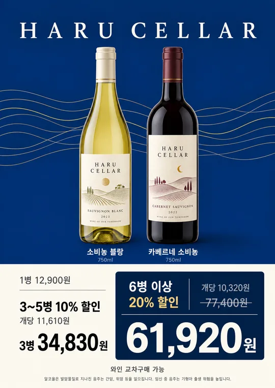
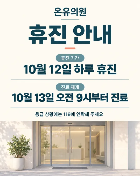
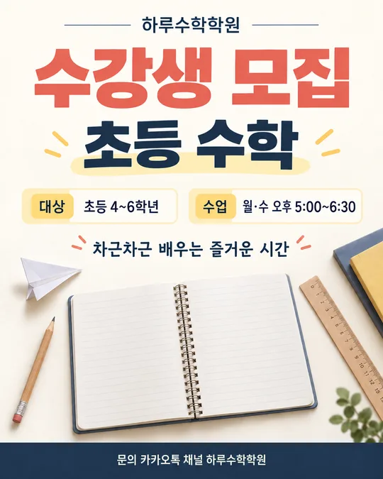
이 카드도 많이 사용해요
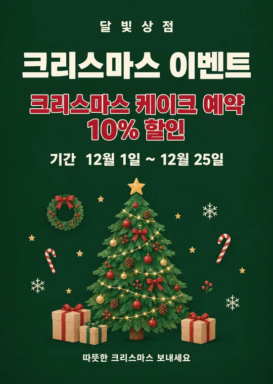
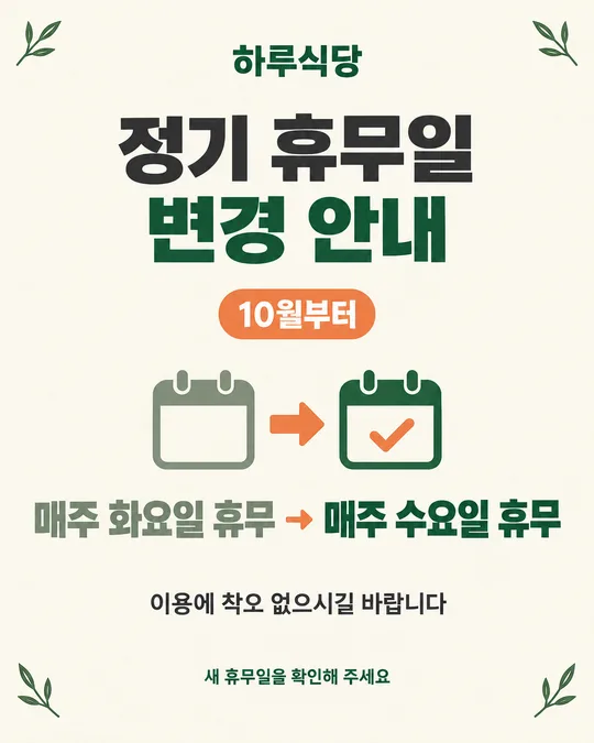
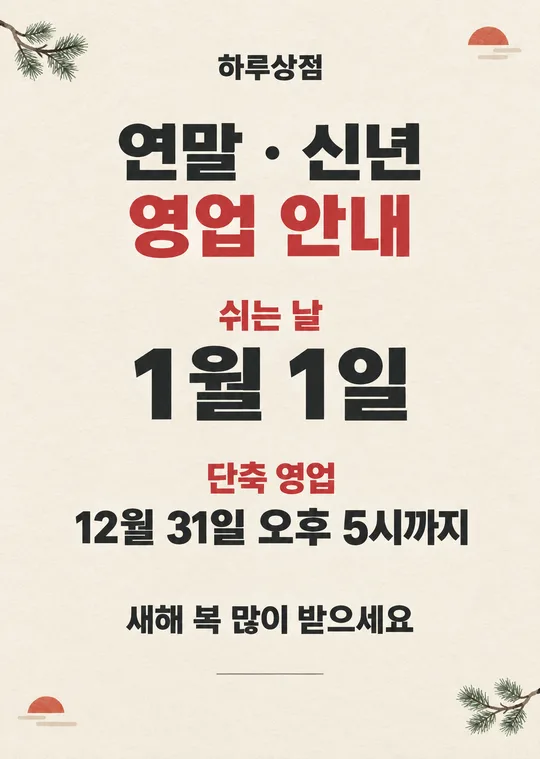
쓰는 법 · 자주 묻는 것
이런 때 쓰세요
새 가게를 처음 열거나, 공사 · 이전 · 운영 정비를 마치고 다시 문을 열 때 쓰는 행사 포스터예요. 인스타와 카톡 가게 소식에 올리면 「드디어 열었습니다」와 혜택, 기간이 작은 화면에서도 차례로 읽히도록 만들었어요. 같은 그림을 출입문에 붙여도 됩니다.
업종을 직접 적되 그림에는 업종명을 인쇄하지 않습니다. 특정 음식이나 상품을 추측해서 그리지 않고, 행사 내용에 적은 모두에게 적용되는 단순한 혜택만 크게 보여 줍니다. 오픈과 재오픈 중 하나만 골라 표시하므로 현재 상황과 다른 말이 함께 찍히지 않습니다.
칸 채우는 법
- 가게 이름: 간판과 가게 계정에 적힌 이름을 그대로 쓰세요. 띄어쓰기와 받침까지 그림에 들어갑니다.
- 업종: 실제 업종을 짧게 적으세요. 보기의 소품샵·카페·분식집·미용실·꽃집은 입력 예시예요. 업종은 그림의 분위기에만 쓰이고 글자로 찍히지 않습니다.
- 오픈 종류: 처음 문을 열면 「오픈」, 다시 열면 「재오픈」을 고르세요. 두 말이 한꺼번에 찍히지 않습니다.
- 행사 내용: 누구나 받는 혜택을 한 문장으로 적으세요. 「전 품목 10% 할인」처럼 대상과 혜택이 또렷해야 합니다. 실제로 제공하지 않는 할인이나 비교 가격은 넣지 마세요.
- 기간: 시작일과 끝나는 날을 실제 일정대로 적으세요. 예시의 날짜는 샘플일 뿐입니다. 날짜와 요일을 함께 적을 때는 달력에서 확인하세요.
- 화면 비율: 출입문 인쇄는 A4, 인스타 게시물은 4:5, 스토리와 릴스는 9:16, 블로그 썸네일은 1:1이 알맞습니다.
우리 제품·인물 사진을 넣고 싶을 때
사진 없이 완성되는 도형 포스터예요. 실제 매장 사진을 참고로 붙이더라도 색감만 반영하고, 사진 속 제품·음식·직원·상표를 그림에 옮기지는 않습니다.
- GPT 채팅창에 사진을 올립니다. 아직 보내지 마세요.
- 같은 입력 칸에 이 페이지에서 복사한 프롬프트를 붙여넣습니다.
- 사진과 프롬프트가 둘 다 들어간 것을 확인한 뒤 보냅니다.
사진만 먼저 보냈다면 다음 메시지에 프롬프트를 붙이고 끝에 「위 사진은 색감만 참고해서 그려줘」라고 적으세요.
그림이 나오면 꼭 볼 것
먼저 가장 큰 문구가 정확히 「드디어 열었습니다」인지 한 글자씩 보세요. 이어서 가게 이름, 행사 내용, 기간의 숫자와 띄어쓰기를 입력한 값과 대조하세요. 특히 날짜 숫자가 바뀌거나 「증정」이 「증정품」처럼 다른 말로 늘어나지 않았는지 확인해야 합니다.
입력하지 않은 금액, 할인율, 전화번호, 참여 조건, 로고, 음식 사진이 생겼다면 삭제를 요청하세요. 휴대폰 화면을 조금 멀리 두고 제목과 혜택이 먼저 읽히는지도 확인하면 좋습니다.
틀린 곳 고치는 법
같은 채팅창에서 잘못된 곳 하나와 그대로 둘 내용을 짧게 말하세요.
행사 기간을 「10월 5일까지」로 고쳐줘. 나머지 글자와 디자인은 그대로
가게 이름의 받침만 바로잡아줘. 행사 내용과 기간은 바꾸지 마
한 번에 여러 곳을 고치면 이미 맞는 글자까지 달라질 수 있어요. 한 군데씩 고친 뒤 전체 문구를 다시 확인하세요. 같은 오류가 세 번 이어지면 새 채팅을 열고 원본 프롬프트를 다시 보내는 편이 빠릅니다.
자주 묻는 것
- 처음 오픈이 아니라 재오픈에도 쓸 수 있나요? 네. 「오픈 종류」에서 재오픈을 고르면 제목 아래에 그 말만 들어갑니다.
- 전화번호나 연락처는 어디에 넣나요? 이 포스터는 멀리서 제목과 행사만 읽히게 하려고 연락처 칸을 두지 않았습니다. 가게 출입문이나 가게 공식 계정처럼 연락처가 이미 보이는 곳에 사용하세요.
- 금액이나 할인율을 넣을 수 있나요? 네. 실제로 제공하는 혜택이라면 「전 품목 10% 할인」처럼 행사 내용에 정확히 적으세요. 원래 가격과 비교한 할인 표시는 이 카드에서 만들지 않습니다.
- 사진 없이도 만들 수 있나요? 네. 문이 열리는 느낌의 도형과 밝은 종이 장식으로 완성됩니다.
- GPT가 그림 대신 설명만 하나요? 프롬프트 첫 줄에 바로 그리라는 지시가 들어 있습니다. 그래도 설명만 나오면 같은 대화에서 「설명하지 말고 지금 그려줘」라고 보내세요.
- 무료 GPT에서도 되나요? 네. 다만 이미지 생성 횟수가 제한될 수 있으니 가게 이름, 행사 내용, 기간을 먼저 확인한 뒤 보내세요.