
전체 · 광고/포스터 · 알바·채용
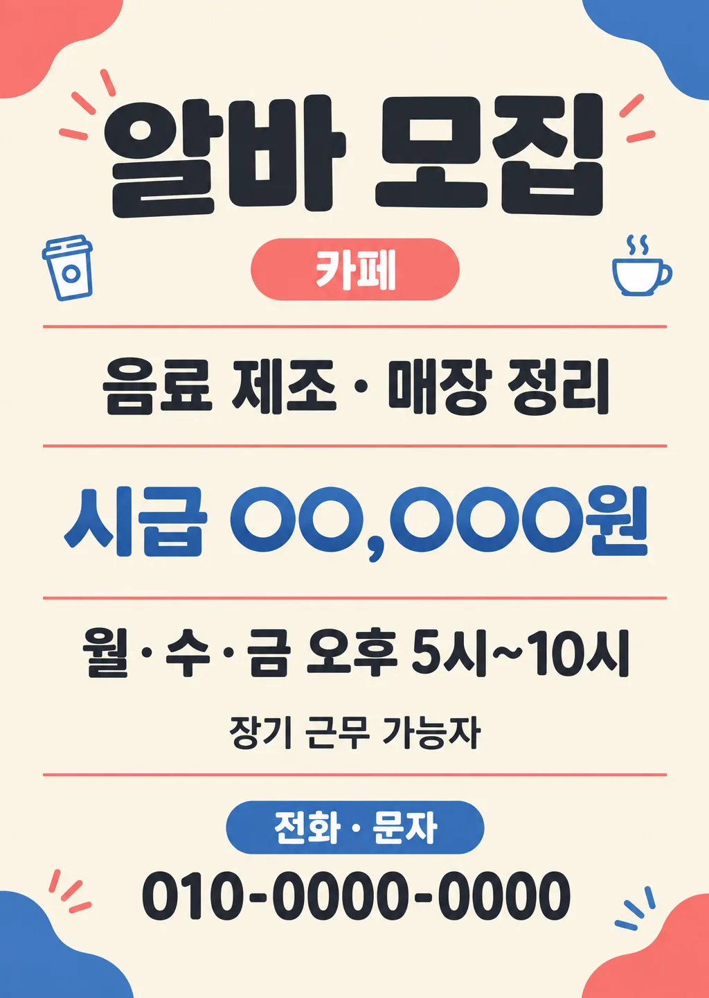
011알바·직원 모집 공고 포스터
업종과 하는 일, 급여, 근무 시간을 적으면 출입문 A4와 알바 앱 4:5용 알바·직원 모집 공고를 만드는 카드
칸 채우기
- 1칸을 채워요
- 2복사 버튼을 눌러요
- 3GPT 채팅창에 붙여넣어요
- 4제품·인물 사진을 쓰려면 사진과 프롬프트를 둘 다 넣은 뒤에 보내요 선택
프롬프트 원문 보기 8,231자
Generate this image now. Draw it directly - do not describe it, explain it, or ask questions.
Output size 2480x3508 pixels, A4 portrait, 300dpi, print-ready poster.

[Purpose]
Create one finished Korean recruitment poster (part-time or staff) for a small shop owner. The canvas size above decides the use: a print size becomes a notice for a shop entrance, and a vertical screen size becomes an image for a part-time job app or shop social account. It must work for any small business the owner writes in the industry field—restaurant, cafe, convenience store, salon, academy, gym, and so on—based solely on the supplied industry and duties. The job conditions must be readable within seconds, with the supplied pay, work schedule, and contact route treated as practical information rather than decoration. Deliver only the flat completed poster artwork, never a photographed mockup.

[Scene]
Design a clean, welcoming recruitment notice with a broad top headline zone, one compact central information panel, and a clear contact action at the bottom. Use a balanced neighborhood-shop visual language: simple geometric blocks, friendly rounded forms, restrained paper-cut accents, and two to four tiny generic line icons distributed subtly around the edges that suit the supplied industry and duties (for example a takeaway cup for a cafe, a book for an academy, scissors with a comb for a salon). Keep them small and similar in emphasis. These icons are unlettered visual cues, not logos, mascots, product packages, or branded objects. The industry may slightly influence one accent color, but the overall composition and hierarchy stay the same for every business. Keep a calm continuous background behind every character. Do not use photographs of workers, uniforms, storefronts, food, drinks, shelves, hairstyles, or a single dominant trade-specific scene.

Arrange the information as a concise vertical reading path. The headline appears first. Beneath it, show the selected industry as a small category line, then the duties, pay, and days/time as distinct rows. If the optional preference is supplied, give it one separate row; if it is absent, remove that row completely and close the space. Place the contact method and supplied contact number together in the final action area, with the method first and the number directly below it. Do not print field labels such as input instructions, placeholders, or the selected canvas size.

[Attached photo]
No attached photo is needed. If an image is attached anyway, ignore it and create the original flat recruitment poster described here. Do not reproduce a real shop logo, exterior, worker, product, uniform, character, or branded package from any attachment.

[Text layout]
Render these exact Korean strings, without the surrounding quotation marks. Keep all text inside approximately 7% safe margins at any canvas size. Paint the background fully to every canvas edge. Adapt spacing to the selected aspect ratio without changing, shortening, or inventing any text.
- 7-18%: "【모집】" — the largest text, bold Korean sans-serif, centered.
- 21-27%: "【업종】" — a small centered industry line, visually separate from the headline.
- 32-44%: "【하는 일】" — a prominent duties line or two carefully balanced lines.
- 49-58%: "【급여】" — large, bold, and easy to compare at a glance; reproduce the owner's exact entry without calculating or suggesting any amount.
- 62-71%: "【요일/시간】" — one clear schedule line, or two balanced lines only if needed to preserve every character.
- 74-81%: "【우대 사항】" — one smaller optional line. When no value is supplied, omit the entire line and redistribute the surrounding space naturally.
- 84-89%: "【연락 방법】" — a clear contact-method line.
- 90-95%: "【연락처】" — the supplied number or contact string, bold and highly legible directly beneath the method.
Never render the labels 모집, 업종, 하는 일, 급여, 요일/시간, 우대 사항, 연락 방법, 연락처, or 크기 unless those exact words are part of a value the owner supplied. Never render braces, percentages, bullets, section names, or layout instructions.

[Style]
Use a modern Korean neighborhood-shop poster style with strong editorial clarity rather than a corporate hiring template. Choose a warm cream or very pale neutral background, deep charcoal lettering, and two restrained accent colors such as coral and cobalt. Use the accents for thin dividers, small corner shapes, and the small line icons only. The main information panel may be defined by spacing and fine rules, not by a stack of heavy boxes. Use a bold rounded Korean sans-serif for the headline and a crisp, highly legible Korean sans-serif for all conditions. Keep this core style whatever the industry; do not switch to a trade-specific look such as rustic food styling, coffee-shop aesthetics, retail shelf graphics, or beauty-editorial styling.

[Visual hierarchy]
The eye must read in this order: recruitment headline, duties, pay, schedule, then contact action. Make the pay and contact number the strongest factual anchors after the headline, while preserving generous separation so the two are never confused. The selected industry is supporting context, not the main headline. Make the duties readable without shrinking them into fine print. Treat the optional preference as secondary. The contact method must clearly govern the line beneath it: 전화 · 문자 means the supplied number is for calling or text messages, 카톡 means the supplied entry is a KakaoTalk ID or open-chat address, and 방문 문의 means the supplied contact entry is supporting information for an in-person inquiry. Do not add a phone icon if 카톡 or 방문 문의 is selected, and never draw a KakaoTalk logo. Maintain enough internal padding that app thumbnails remain readable and A4 printing does not place text near trim edges.

[Lighting and texture]
Use flat, even color with no lighting effects. If paper texture is present, make it extremely subtle and keep it away from thin Korean strokes and digits. All text must remain sharp at small-screen size and after ordinary A4 printing. Use no perspective, depth-of-field, cast shadow, reflective surface, glow, grain over lettering, or photographed paper wrinkles. The canvas must be completely opaque and evenly filled from corner to corner.

[Text rules]
Copy every supplied value exactly, including Korean consonants, vowels, final consonants, digits, punctuation, separators, spaces, and time notation. The owner alone supplies the pay: reproduce only that supplied string and never generate, infer, recommend, correct, compare, or append any monetary amount. Do not add any wage guidance, legal guidance, annual figure, currency conversion, bonus, allowance, or benefit. Render only the supplied values listed in [Text layout]. Do not add a shop name, slogan, address, role title, application deadline, age, gender, experience requirement, employment promise, benefit, or personality claim. Do not paraphrase duties or turn the optional preference into a mandatory condition. If the optional preference is absent, omit it completely without a blank label, dash, placeholder, empty panel, or invented replacement. Keep contact method and contact number as two separate lines. Do not translate any visible text into English.

[Avoid]
No dominant trade-specific photo or scene; industry cues stay as tiny line icons. No real brand marks, franchise colors copied as trade dress, app logos, social-media logos, QR codes, barcodes, uniforms, name tags, copyrighted characters, celebrity faces, or trademarked packaging. Do not use the term "로켓". Do not add "사장님 마인드", "가족 같은 분위기", or any similar workplace-culture claim. No invented wage, changing wage digits, yearly wage statement, crossed-out amount, comparison amount, discount badge, or promotional price styling. No extra recruiting claims such as immediate hiring, guaranteed employment, easy work, beginner welcome, flexible schedule, meals provided, or four-insurance coverage unless the owner explicitly supplied that exact wording in an allowed field. No tiny legal footnotes, decorative pseudo-text, English words, random letters, misspelled Korean, blank squares, empty cards, neon, bloom, gradients behind text, glare, lens flare, watermarks, signatures, frames, wall mockups, hands holding the poster, app-screen mockups, clipped text, or unpainted margins.
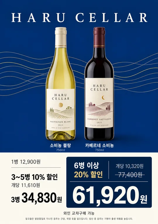
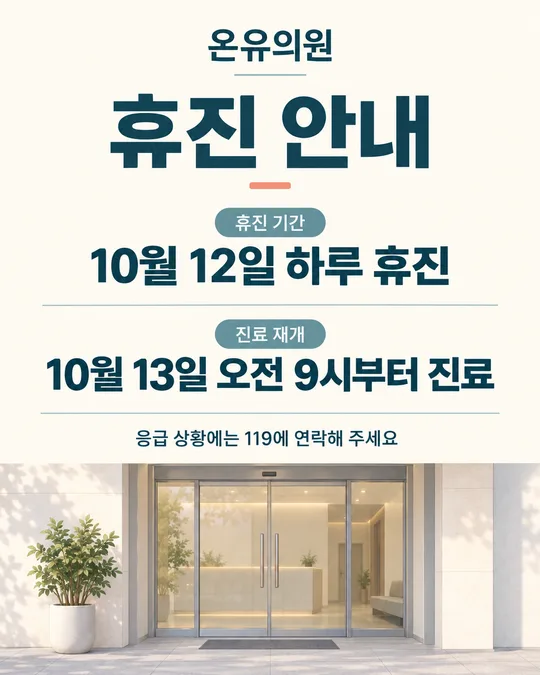
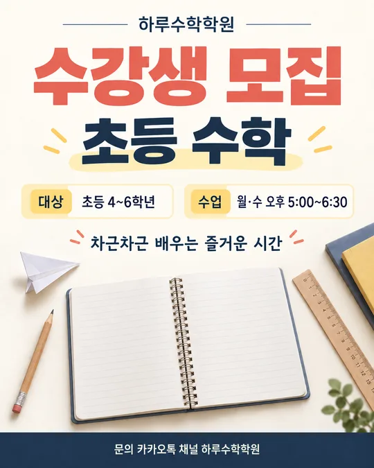
이 카드도 많이 사용해요

쓰는 법 · 자주 묻는 것
이런 때 쓰세요
가게 출입문에 붙일 알바 모집 공고와 알바 앱에 올릴 세로 이미지를 직접 만들 때 쓰는 카드예요. 카페, 식당, 편의점, 미용실, 학원처럼 업종을 직접 적고 실제로 맡길 일과 근무 조건을 적으면 한눈에 읽히는 모집 포스터가 나와요. 음식이나 제품 사진을 크게 쓰지 않고, 적은 업종에 맞는 작은 선 그림만 가장자리에 곁들여 글자가 먼저 읽히게 했어요.
출입문에 붙일 거면 화면 비율에서 A4를, 알바 앱이나 가게 SNS에 올릴 거면 4:5를 고르세요. 두 가지가 다 필요하면 화면 비율만 바꿔 각각 한 번씩 만들면 돼요. 앱마다 이미지가 잘리는 위치나 등록 기준은 다를 수 있으니 올리기 전 미리보기를 확인해 주세요.
칸 채우는 법
- 모집: 아르바이트면 「알바 모집」, 정규·계약 직원이면 「직원 모집」을 고르세요. 포스터 맨 위 큰 제목이 돼요.
- 업종: 가게 업종을 그대로 적으세요. 「카페」 「치킨집」 「수학학원」 「네일숍」처럼 짧게 쓰면 포스터 윗줄에 작게 들어가요.
- 하는 일: 지원자가 맡을 일을 짧고 구체적으로 적으세요. 보기에서 가까운 문구를 누른 뒤 실제 업무에 맞게 고치면 돼요.
- 급여: 「시급 12,000원」 「월 250만 원」처럼 공고에 표시할 금액과 단위를 직접 적으세요. 이 카드는 금액을 제안하거나 자동으로 채우지 않아요. 적은 숫자가 그대로 들어갔는지 결과에서 반드시 대조하세요.
- 요일/시간: 요일과 시작·종료 시간을 함께 적으세요. 교대 시간이나 휴게 시간이 따로 있다면 한 칸에 억지로 길게 넣기보다 모집 글 본문에서 보충하는 편이 읽기 좋아요.
- 우대 사항: 꼭 필요한 경우에만 적으세요. 비우면 그 줄 전체가 빠집니다. 사실과 다른 조건이나 지원자를 오해하게 할 표현은 넣지 마세요.
- 연락 방법·연락처: 전화 · 문자, 카톡, 방문 문의 중 하나를 고르고 연락처 칸에 실제 번호를 적으세요. 카톡을 골랐다면 카톡 아이디나 오픈채팅 주소를 적으면 돼요. 방문 문의라도 확인용 번호를 함께 적어 두면 지원자가 헛걸음하기 전에 물어볼 수 있어요.
- 화면 비율: 출입문 인쇄물은 A4, 알바 앱용 세로 이미지는 4:5를 고르세요.
그림이 나오면 꼭 볼 것
가장 먼저 급여 숫자와 단위를 한 글자씩 확인하세요. 이어서 요일, 시작 시간, 종료 시간, 연락처를 입력값과 대조하세요. 이미지 생성 과정에서 숫자 하나가 바뀌면 모집 조건 자체가 달라집니다. 카톡이나 방문 문의를 골랐는데 전화 아이콘이 붙지 않았는지, 카카오톡 로고가 그려지지 않았는지도 보세요.
가장자리의 작은 그림이 글자보다 먼저 눈에 띄면 다시 만드는 편이 좋아요. A4는 시험 출력 한 장을 실제 붙일 거리에서 읽어 보고, 4:5는 휴대폰 미리보기에서 급여와 연락처가 선명한지 확인하세요.
틀린 곳 고치는 법
그림을 만든 같은 대화에서 틀린 위치와 정확한 문구를 함께 말하세요. 예를 들어 「급여 줄을 제가 입력한 문구 그대로 고치고, 다른 글자와 배치는 유지해 주세요」 또는 「연락 방법은 '카톡', 그 아래는 제가 입력한 아이디로 고쳐 주세요」처럼 요청하면 돼요. 수정 뒤에는 고친 곳만 보지 말고 급여, 일정, 연락처를 처음부터 다시 대조하세요. 다른 줄이 함께 바뀌었을 수 있습니다.
자주 묻는 것
- A4와 4:5를 한 번에 받을 수 있나요? 같은 입력값을 유지한 채 화면 비율만 A4와 4:5로 바꿔 두 번 만드세요. 비율이 달라서 각각 생성해야 글자가 잘리지 않아요.
- 업종 목록에 우리 가게가 없어요. 목록이 따로 없어요. 업종 칸에 가게 업종을 그대로 적으면 그에 맞는 작은 그림이 곁들여져요.
- 가게 이름은 어디에 적나요? 이 카드는 모집 조건을 빠르게 읽히게 만드는 용도라 가게 이름 칸을 두지 않았어요. 필요한 가게 정보는 알바 앱의 업체 정보나 모집 글 본문에서 안내하세요.
- 지원 업무가 여러 개인데 한 줄에 넣어도 되나요? 가운데점으로 두세 가지를 짧게 나누세요. 문장이 너무 길면 포스터 글자가 작아지므로 자세한 업무는 모집 글 본문에서 설명하는 편이 좋아요.
- 전화번호를 공개하고 싶지 않으면 어떻게 하나요? 연락 방법에서 카톡을 고르고 카톡 아이디나 오픈채팅 주소를 적으세요. 임의의 번호를 넣지는 마세요.
- 무료 GPT에서도 만들 수 있나요? 사용 중인 계정에 이미지 만들기가 열려 있다면 프롬프트를 붙여 넣어 보세요. 이용 가능 여부와 남은 한도는 계정 화면에서 확인하면 됩니다.