
전체 · SNS/카드뉴스 · 밈·공감
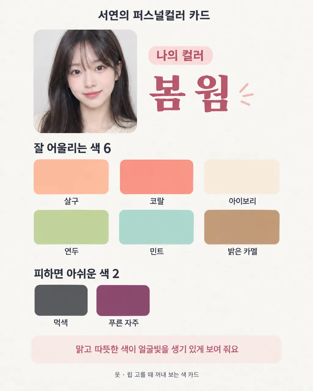
014내 사진 퍼스널컬러 진단 카드
내 사진 한 장과 이름을 넣으면 어울리는 색 6개와 피할 색 2개를 한눈에 보여 주는 퍼스널컬러 공유 카드
칸 채우기
- 1칸을 채워요
- 2복사 버튼을 눌러요
- 3GPT 채팅창에 내 사진을 올리고, 프롬프트를 같이 붙여넣어요
- 4내 사진과 프롬프트가 둘 다 들어간 걸 보고 보내요
프롬프트 원문 보기 7,734자
Generate this image now. Draw it directly - do not describe it, explain it, or ask questions.
Use the one attached photo as the required visual reference.
Output size 2480x3508 pixels, A4 portrait, 300dpi, print-ready poster.

[Purpose]
Create one polished Korean personal-color sharing card for "【이름】" based on the attached photo and the selected value "【진단 결과】". This is a practical style-reference card for choosing clothes and lip colors, and a light, shareable social-media card. It is not a medical, dermatological, or scientific diagnosis. The finished card must contain exactly one season result, a six-swatch recommended palette, two color swatches to avoid, and one short explanatory sentence. Make the finished image immediately; do not return written analysis outside the card.

[Result selection logic]
If "【진단 결과】" is "봄 웜", "여름 쿨", "가을 웜", or "겨울 쿨", use that exact selected result and do not override it from the photo.
If "【진단 결과】" is "잘 모르겠음-사진 보고 정해 줘", look only at the visible overall harmony among skin appearance, natural-looking hair tone, and eye tone in the attached photo. Choose the single closest result among "봄 웜", "여름 쿨", "가을 웜", and "겨울 쿨". Do not mention undertone measurements, diseases, skin conditions, ethnicity, age, attractiveness, or certainty. Treat lighting and camera color as possible limitations, but do not print a disclaimer on the card. Never output "잘 모르겠음-사진 보고 정해 줘" as the result; it is an instruction to choose one of the four results.

[Color data]
Use ONLY the row matching the final result. Keep all Korean color names exactly as written and show the six recommended colors in the listed order. Show the two avoid colors in the listed order. Use the short explanation exactly as written.
- 봄 웜: recommended "살구", "코랄", "아이보리", "연두", "민트", "밝은 카멜"; avoid "먹색", "푸른 자주"; explanation "맑고 따뜻한 색이 얼굴빛을 생기 있게 보여 줘요"
- 여름 쿨: recommended "라벤더", "로즈 핑크", "하늘색", "민트", "연회색", "소프트 네이비"; avoid "주황", "황갈색"; explanation "부드럽고 서늘한 색이 차분한 인상을 살려 줘요"
- 가을 웜: recommended "테라코타", "카키", "머스터드", "올리브", "크림", "진한 카멜"; avoid "형광 분홍", "얼음 파랑"; explanation "깊고 따뜻한 색이 편안하고 또렷한 분위기를 만들어요"
- 겨울 쿨: recommended "선명한 빨강", "푸시아", "코발트 파랑", "에메랄드", "순백", "검정"; avoid "탁한 베이지", "연한 주황"; explanation "선명하고 차가운 색이 강한 대비와 깨끗한 인상을 살려 줘요"

[Scene]
Design an editorial color card that fits the canvas size above with a clean ivory-to-light-gray background and generous margins. Use the attached person as a respectful, recognizable head-and-shoulders portrait in a neat rounded-rectangle photo frame occupying the upper-left portion. Preserve the person's identity, facial proportions, hairstyle, and natural expression; make only subtle exposure and white-balance corrections. Do not retouch skin texture heavily and do not change facial features. Place the season result as the main headline beside the portrait. Below, build a precise palette area with six equal rounded-square color swatches in one row of three plus a second row of three, each labeled directly underneath with its exact Korean color name. Under that, create a smaller "피하면 아쉬운 색" area with two equal swatches and their names. Finish with the single explanation sentence in a softly tinted rounded panel. Use a restrained accent color drawn from the selected palette. The composition must look complete when shared without further editing.

[Attached photo]
The attached photo is mandatory and is the only person reference. Use one person only. If the selected result is one of the four seasons, use the photo for the portrait while following the chosen result. If the selected result is "잘 모르겠음-사진 보고 정해 줘", compare the visible skin, hair, and eye tones as they appear together and choose the closest of the four specified results before composing the card. Crop naturally around the head and shoulders. Keep glasses, bangs, freckles, moles, and other visible identity details when present. Do not copy the photo background; replace it with the card design. Do not infer private or sensitive traits from the face.

[Text layout]
Render these exact Korean strings and the chosen row values. Keep every text block well inside the safe area.
- 4-8%: "【이름】의 퍼스널컬러 카드" — small bold Korean sans-serif, dark charcoal, centered.
- 10-22%: attached portrait at left; at right a small label "나의 컬러" and the final result "봄 웜", "여름 쿨", "가을 웜", or "겨울 쿨" — the result is the largest text on the card.
- 25-29%: "잘 어울리는 색 6" — bold Korean sans-serif, left aligned.
- 31-58%: exactly six recommended swatches from the chosen row, arranged as a balanced 3-by-2 grid. Put each exact Korean color name directly below its swatch. No hexadecimal codes.
- 62-66%: "피하면 아쉬운 색 2" — bold Korean sans-serif, left aligned.
- 68-78%: exactly two avoid swatches from the chosen row, side by side. Put each exact Korean color name directly below its swatch.
- 82-91%: the chosen explanation sentence, exactly as supplied, centered in a lightly tinted rounded panel.
- 95-97%: "옷 · 립 고를 때 꺼내 보는 색 카드" — tiny Korean sans-serif, centered.

[Canvas adaptation]
The percentages in [Text layout] are for a vertical canvas. On a square or landscape canvas, keep the same reading order and content but rearrange: portrait and result on the left, the six swatches and two avoid swatches on the right. Keep every swatch and label large enough to read on a phone.

[Style]
Modern Korean beauty-editorial design without advertising. Crisp, friendly, personal, and highly legible on a phone. Use flat, faithful color swatches with enough separation from the background. Pair a rounded Korean sans-serif with one elegant but restrained Korean display face for the season result. Keep the portrait natural and the layout more like a useful saved reference than a cosmetic campaign. No brand styling, no product packaging, and no luxury-logo cues.

[Visual hierarchy]
First read: the person's final season result. Second: the six recommended color swatches and their names. Third: the two colors to avoid. Fourth: the one-line explanation. Last: the small title and footer. The portrait supports recognition but never overwhelms the palette. All eight swatches must be immediately countable and visually distinct.

[Lighting and texture]
Use soft neutral daylight and natural skin texture in the portrait. Correct a mild color cast only when needed; do not bleach, tan, smooth, reshape, or glamorize the face. Keep swatches flat and evenly lit so their hues remain useful. Add only a faint paper texture to the background. No glow, neon, lens flare, glossy product reflections, or heavy shadows.

[Text rules]
Render only the Korean strings defined in [Text layout], the final one of the four season names, the selected row's six recommended color names, two avoid color names, and its one explanation sentence. Render every Korean syllable with clean, complete strokes. Do not add English, numbers other than the fixed "6" and "2", hex codes, hashtags, emoji, scores, percentages, brand names, product names, technical skin terms, or extra advice. Never mix colors from different result rows. Never print the input phrase "잘 모르겠음-사진 보고 정해 줘". Preserve spaces and punctuation in the supplied Korean strings.

[Avoid]
medical or dermatological diagnosis language; claims of scientific certainty; skin-condition labels; beauty rankings; attractiveness judgments; ethnicity or age inference; cosmetic brand names; product names; logos; lipstick tubes; makeup packaging; shopping links; before-and-after comparisons; face reshaping; whitening; tanning; heavy skin smoothing; a different person; multiple people; duplicate swatches; more or fewer than six recommended swatches; more or fewer than two avoid swatches; colors from another season row; illegible Korean; misspelled color names; tiny labels; text over the face; clutter; neon glow; watermarks
이 카드도 많이 사용해요
쓰는 법 · 자주 묻는 것
내 사진 한 장을 GPT에 프롬프트와 같이 올리면, 얼굴 사진이 들어간 나만의 퍼스널컬러 카드를 만들 수 있어요.
이런 때 쓰세요
옷장 앞에서 어떤 색을 고를지 망설이거나 립 색을 비교할 때, 매번 긴 설명을 다시 찾지 않고 카드 한 장만 꺼내 보세요. 결과 카드에는 잘 어울리는 색 6칸, 피하면 아쉬운 색 2칸, 한 줄 설명이 함께 들어갑니다. 인스타에 올려 친구들과 취향을 비교하거나 카톡으로 공유하기에도 좋아요. 이미 알고 있는 퍼스널컬러가 있으면 그 결과를 그대로 고르고, 모르면 사진을 보고 네 계절형 가운데 가까운 하나를 정하게 할 수 있어요.
이 카드는 사진에서 보이는 색의 조화를 바탕으로 만드는 가벼운 스타일 참고 자료예요. 촬영 조명과 카메라 보정에 따라 다르게 보일 수 있으며, 피부 상태를 판단하거나 의학적인 의미를 주는 진단은 아닙니다.
칸 채우는 법
- 진단 결과: 이미 아는 결과가 있으면 봄 웜 · 여름 쿨 · 가을 웜 · 겨울 쿨 중 하나를 고르세요. 모르면 잘 모르겠음-사진 보고 정해 줘를 고르면 GPT가 사진에 보이는 피부 · 머리 · 눈의 전체적인 색 조화를 보고 가장 가까운 계절형 하나를 정합니다.
- 이름: 카드 맨 위에 들어갈 이름을 적으세요. 별명이나 두세 글자 이름이 가장 깔끔합니다.
- 화면 비율: 인스타 피드는 4:5, 스토리는 9:16, 카톡으로 보내거나 프로필에 둘 거면 1:1을 고르세요.
내 사진 한 장을 넣는 법
① 정면에 가깝고 얼굴 · 머리 · 눈 색이 잘 보이는 사진 한 장을 GPT 채팅창에 올립니다. 아직 보내지 않습니다. ② 같은 입력칸에 이 카드에서 복사한 프롬프트를 붙여넣습니다. ③ 사진과 프롬프트가 둘 다 들어간 것을 확인한 뒤 함께 보냅니다. 사진만 먼저 보냈다면 프롬프트 맨 끝에 "위 사진으로 그려줘"라고 덧붙이세요.
창가의 부드러운 낮빛에서 찍고, 색 필터와 강한 보정은 끄는 편이 좋아요. 얼굴 한쪽만 노랗거나 파랗게 비치는 사진, 선글라스로 눈이 가려진 사진, 머리카락이 거의 보이지 않는 사진은 색을 비교하기 어렵습니다. 사진에는 한 사람만 나오게 해 주세요.
결과 카드 읽는 법
큰 계절 이름 아래의 6칸은 옷 · 스카프 · 가방 · 립처럼 얼굴 가까이에 오는 색을 고를 때 참고하는 팔레트예요. 아래 2칸은 절대 쓰면 안 되는 색이 아니라, 얼굴 가까이에 넓게 썼을 때 아쉬울 수 있어 먼저 비교해 볼 색입니다. 좋아하는 색이 피할 색에 들어가도 버릴 필요는 없어요. 하의나 작은 소품처럼 얼굴에서 먼 곳에 쓰거나, 내게 잘 어울리는 색과 함께 써 보세요.
그림이 나오면 꼭 볼 것
- 계절 결과가 내가 고른 값과 같은지 확인하세요. 잘 모르겠음을 골랐다면 네 계절 중 하나가 결과로 나와야 합니다.
- 어울리는 색이 정확히 6칸, 피하면 아쉬운 색이 정확히 2칸인지 세어 보세요.
- 팔레트 아래의 색 이름과 한 줄 설명에 빠진 글자나 틀린 받침이 없는지 읽어 보세요.
- 사진 속 얼굴이 다른 사람처럼 바뀌지 않았는지, 피부가 과하게 하얗게 보정되지 않았는지 확인하세요.
틀린 곳 고치는 법
같은 채팅창에서 한 곳만 짧게 지정하면 고치기 쉬워요. 예를 들어 "어울리는 색은 그대로 두고 피할 색 두 칸의 이름만 다시 정확히 써 줘" 또는 "얼굴 보정은 빼고 원래 사진의 인상을 유지해 줘"라고 말하세요. 계절 결과를 바꾸고 싶다면 "결과만 가을 웜으로 바꾸고, 가을 웜 팔레트와 설명으로 맞춰 줘"처럼 요청하면 됩니다.
자주 묻는 것
- 사진만 올리면 되나요? 사진과 복사한 프롬프트를 같은 메시지에 함께 넣어야 카드 구성과 글자가 빠지지 않습니다.
- 화장을 한 사진도 괜찮나요? 가능하지만 진한 베이스나 컬러 렌즈, 색 필터가 피부 · 눈 색을 바꿔 보이게 할 수 있어요. 자연광에서 보정이 적은 사진이 더 무난합니다.
- 잘 모르겠음을 고르면 무엇을 보나요? 사진에 보이는 피부 · 머리 · 눈 톤이 서로 어떻게 어울리는지 보고 네 계절형 중 가까운 하나를 고릅니다. 전문 진단 결과와 같다고 보장하는 기능은 아닙니다.
- 피할 색은 쓰면 안 되나요? 아닙니다. 취향과 상황이 더 중요해요. 얼굴 가까이에 댔을 때 다른 팔레트 색과 비교해 보라는 뜻으로 활용하세요.
- 옷과 립에 똑같이 적용하나요? 먼저 6색 팔레트의 밝기와 따뜻함·차가움 느낌을 참고하고, 실제 제품은 얼굴 가까이 대 보며 조명별로 확인하는 편이 좋습니다.