
전체 · 광고/포스터 · 휴무·영업 안내
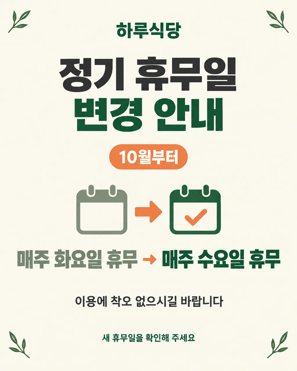
030정기 휴무 변경 공지 포스터 — 음식점 · 카페 · 미용실 · 동네 가게
바뀌는 정기 휴무 요일과 적용 시점을 손님께 또렷하게 알리는 안내 포스터
칸 채우기
- 1칸을 채워요
- 2복사 버튼을 눌러요
- 3GPT 채팅창에 붙여넣어요
- 4제품·인물 사진을 쓰려면 사진과 프롬프트를 둘 다 넣은 뒤에 보내요 선택
프롬프트 원문 보기 6,346자
Generate this image now. Draw it directly - do not describe it, explain it, or ask questions.
Output size 2480x3508 pixels, A4 portrait, 300dpi, print-ready poster.

[Purpose]
Create a finished regular-closure-change notice for the shop "【가게 이름】". It must work without further editing in two real situations: printed as an A4 portrait notice on the entrance door, or posted as a 4:5 portrait image on Naver Place and Instagram. A customer should understand in one glance that the shop's recurring closed day has changed, exactly what the old and new schedules are, and exactly when the change begins. This is an everyday business notice, not a holiday closure poster and not an event advertisement.

[Scene]
Use a calm warm-ivory paper background with a restrained dark-green and muted-orange palette. Build the composition around one large, clean schedule-change symbol in the middle: two simple calendar-leaf shapes connected by a thick right-pointing arrow. The left calendar represents the former schedule and is muted gray-green; the right calendar represents the new schedule and is clear dark green with a small orange check mark. These calendar shapes are purely decorative and must contain no numbers, weekday letters, grids, dates, or fake writing. Add only a few small line-art leaves at the outer corners to make the notice friendly for restaurants, cafes, salons, studios, and neighborhood shops. Keep generous empty space around every text block. Do not draw clocks, monthly calendars, numbered date tiles, storefront logos, products, people, food, branded objects, or QR codes.

[Attached photo]
No photo is required. If a photo is attached, do not use it and do not imitate any logo, person, character, product package, or trademark from it. Follow the clean graphic poster scene described above.

[Text layout] top to bottom, as % of canvas height. Render these exact Korean strings:
- 5-10%: "【가게 이름】" - centered, medium-size bold Korean sans-serif, dark green
- 14-28%: two-line title, line 1 "정기 휴무일", line 2 "변경 안내" - centered, very large heavy Korean sans-serif; line 1 dark charcoal and line 2 dark green, both lines equal in visual width
- 33-39%: "【언제부터】" - centered inside a small muted-orange rounded capsule, bold Korean sans-serif; treat this only as the user's exact start-time phrase and do not expand or reinterpret it
- 43-66%: the main schedule-change block. Place "【바뀌는 날】" as one prominent centered line or, only if needed for legibility, split it at the user's arrow into two lines while preserving every character and the exact left-to-right order. Use heavy Korean sans-serif, with the text before the arrow in muted gray-green, the arrow in muted orange, and the text after the arrow in dark green. The decorative calendar-leaf shapes and arrow may sit behind or beside this block but must never introduce additional letters, dates, or weekdays
- 73-79%: "【한마디】" - centered, medium Korean sans-serif, dark charcoal, on its own independent line so this entire line can disappear when the optional field is blank
- 88-94%: "새 휴무일을 확인해 주세요" - centered, small bold Korean sans-serif, dark green

[Style]
A polished Korean neighborhood-shop notice with the clarity of professional wayfinding graphics. Use flat vector shapes, crisp edges, quiet colors, and abundant breathing room. The overall feeling is trustworthy, considerate, and practical rather than festive. The ivory background should resemble uncoated premium paper very subtly, but remain nearly flat so small mobile screens and ordinary office printers reproduce it cleanly. Use only Korean sans-serif typography: heavy weight for the title and schedule, medium weight for supporting lines. The design must remain equally useful at A4 door-print size and 4:5 mobile-feed size.

[Visual hierarchy]
First read: "정기 휴무일 변경 안내". Second read: the complete user-entered string "【바뀌는 날】", with the new schedule visually stronger than the former one. Third read: "【언제부터】". Fourth read: the shop name, optional message, and final reminder. The schedule-change line is the factual center of the poster and must be readable from several steps away. Decorative calendars and leaves remain subordinate. Keep at least one full capital-letter height of empty space between every text zone. When adapting between A4 and 4:5, preserve this hierarchy and all exact text; only adjust spacing and illustration scale.

[Lighting and texture]
Use even print-style color with no directional lighting. Allow only a faint natural-paper grain visible at close range. No glow, shine, glass effect, metallic effect, shadows behind text, dramatic vignette, gradients, neon, sparkles, or photorealistic objects. If the calendar shapes need separation, use a single flat color difference or a very soft short contact shadow that never touches the lettering.

[Text rules]
Render only the Korean strings inside double quotes in [Text layout], including the user's exact punctuation, spacing, middle dots, numerals, and arrow if present. The only factual schedule information allowed is what appears verbatim in "【바뀌는 날】" and "【언제부터】". Never calculate, infer, invent, normalize, or add a calendar date, month, year, weekday, holiday, opening time, or reopening date. Do not convert a phrase such as "다음 달부터" into a named month. Do not turn a weekday into a date. Do not place any letters or numbers inside the decorative calendar shapes. Never repeat a phrase. Draw every Korean syllable with complete, clean strokes and preserve the exact old-to-new direction written by the user. If the optional one-line message does not appear in [Text layout], omit its entire line and close the vertical gap naturally without adding replacement copy.

[Avoid]
invented dates or weekdays; calculated calendar information; changed old-to-new order; reversed arrow; missing schedule text; paraphrased user input; extra business hours; reopening claims; monthly calendar grids; numbers or weekday labels inside illustrations; fake tiny text; misspelled or broken Korean; duplicated phrases; English text; Chinese or Japanese characters; logos; delivery-app marks; trademarks; brand names; QR codes; barcodes; celebrities; recognizable people; copyrighted characters; mascots; song lyrics; product packaging; decorative handwriting; text outlines; 3D text; gradient text; large panels behind every line; neon; glow; clutter; borders that may be cropped; watermarks
이 카드도 많이 사용해요

쓰는 법 · 자주 묻는 것
이런 때 쓰세요
매주 쉬는 요일을 바꿨는데 단골손님이 예전 요일만 기억하고 있다면 이 공지가 필요해요. 음식점, 카페, 미용실, 공방처럼 정기 휴무가 있는 가게에서 출입문 안내와 온라인 공지를 한 번에 만들 수 있어요. 예전 휴무일과 새 휴무일을 화살표로 이어 보여 주기 때문에 긴 설명을 읽지 않아도 바뀐 내용을 바로 알아볼 수 있습니다.
A4를 고르면 출입문에 인쇄해 붙이기 좋은 세로 포스터가 되고, 4:5를 고르면 네이버 플레이스 소식이나 인스타그램 게시물에 바로 올리기 좋은 비율이 됩니다. 명절처럼 한 번만 쉬는 날이 아니라, 앞으로 반복되는 정기 휴무가 바뀔 때 쓰는 카드예요.
칸 채우는 법
- 가게 이름: 간판과 네이버 플레이스에 적힌 이름 그대로 써 주세요.
- 바뀌는 날: 예전 휴무와 새 휴무를 한 줄에 함께 적으세요. `매주 화요일 휴무 → 매주 수요일 휴무`처럼 화살표 앞에는 예전 일정, 뒤에는 새 일정을 씁니다.
- 언제부터: `10월부터`, `다음 달부터`, `이번 주부터`처럼 손님에게 이미 확정해서 안내할 표현만 적으세요.
- 한마디: 넣고 싶을 때만 쓰세요. 비워 두면 그 문장 한 줄이 통째로 빠집니다.
- 크기: 문에 붙일 종이는 A4, 네이버 플레이스와 인스타그램 게시물은 4:5를 고르세요.
날짜와 요일은 그림 AI가 계산하지 않습니다. 칸에 쓴 내용만 그대로 옮기도록 되어 있으니, 요일이나 적용 시점은 가게 달력과 운영 계획을 먼저 확인한 뒤 적어 주세요. `다음 달부터`처럼 상대적인 표현을 쓰면 그림도 그 표현 그대로 씁니다.
우리 제품·인물 사진을 넣고 싶을 때
이 카드는 제품이나 인물 사진 없이 쓰도록 만든 안내 포스터예요. 사진을 함께 넣으면 중요한 휴무 정보보다 사진이 먼저 보이거나, 사진 속 로고와 글자가 엉킬 수 있습니다. 가게 사진을 보여 주고 싶다면 이 공지 그림은 그대로 만든 뒤 네이버 플레이스나 인스타그램 게시물의 다음 장에 사진을 따로 올리는 편이 읽기 쉽습니다.
그림이 나오면 꼭 볼 것
완성된 그림을 저장하기 전에 네 군데를 한 글자씩 확인하세요. 가게 이름이 맞는지, 예전 휴무일과 새 휴무일의 순서가 뒤집히지 않았는지, 화살표가 새 휴무일 쪽을 향하는지, 적용 시점이 적은 그대로인지 봅니다. 장식용 달력 그림 안에는 숫자나 요일이 없어야 해요. AI가 임의로 날짜를 더했다면 그대로 쓰지 마세요.
틀린 곳 고치는 법
같은 채팅창에서 틀린 부분 하나만 짧고 정확하게 말하세요.
`화요일`을 `수요일`로 바꾸지 말고, 입력한 문장 그대로 다시 써 줘. 다른 곳은 그대로 둬.
화살표 방향만 왼쪽에서 오른쪽으로 고쳐 줘. 글자는 바꾸지 마.
한꺼번에 여러 곳을 고치면 잘 나온 글자까지 달라질 수 있어요. 두세 번 고쳐도 날짜나 요일을 계속 지어내면 새 채팅창에서 프롬프트를 다시 보내는 편이 빠릅니다.
붙이는 곳과 올리는 법
A4는 출입문 유리 안쪽에 바깥을 향하게 붙이고, 기존 영업시간 안내와 너무 멀리 떨어뜨리지 마세요. 4:5 그림은 네이버 플레이스 소식과 인스타그램 피드에 올리면 됩니다. 게시물 본문에도 바뀐 휴무일을 글자로 한 번 더 적어 두면 검색하거나 화면 읽기 기능을 쓰는 손님도 내용을 확인하기 쉬워요.
자주 묻는 것
- 그림이 날짜와 요일을 알아서 맞춰 주나요? 아니요. 이 카드는 달력을 계산하지 않고 사용자가 칸에 적은 표현만 씁니다. 실제 일정은 가게 달력으로 먼저 확인해 주세요.
- 정확한 날짜 없이 `10월부터`라고만 써도 되나요? 네. 손님에게 그렇게 안내하기로 정했다면 입력한 문구 그대로 포스터에 들어갑니다.
- 한마디를 비워도 되나요? 네. 선택 칸이라 비우면 해당 문장 줄 전체가 빠집니다.
- 네이버와 인스타그램에 같은 그림을 써도 되나요? 네. 4:5를 고르면 두 곳의 세로 게시물로 쓰기 편합니다.
- 무료 GPT에서도 만들 수 있나요? 네. 다만 이미지 생성 횟수 제한이 있을 수 있으니, 보내기 전에 휴무 요일과 적용 시점을 다시 확인하세요.