

487레트로 작은 꽃무늬 패턴
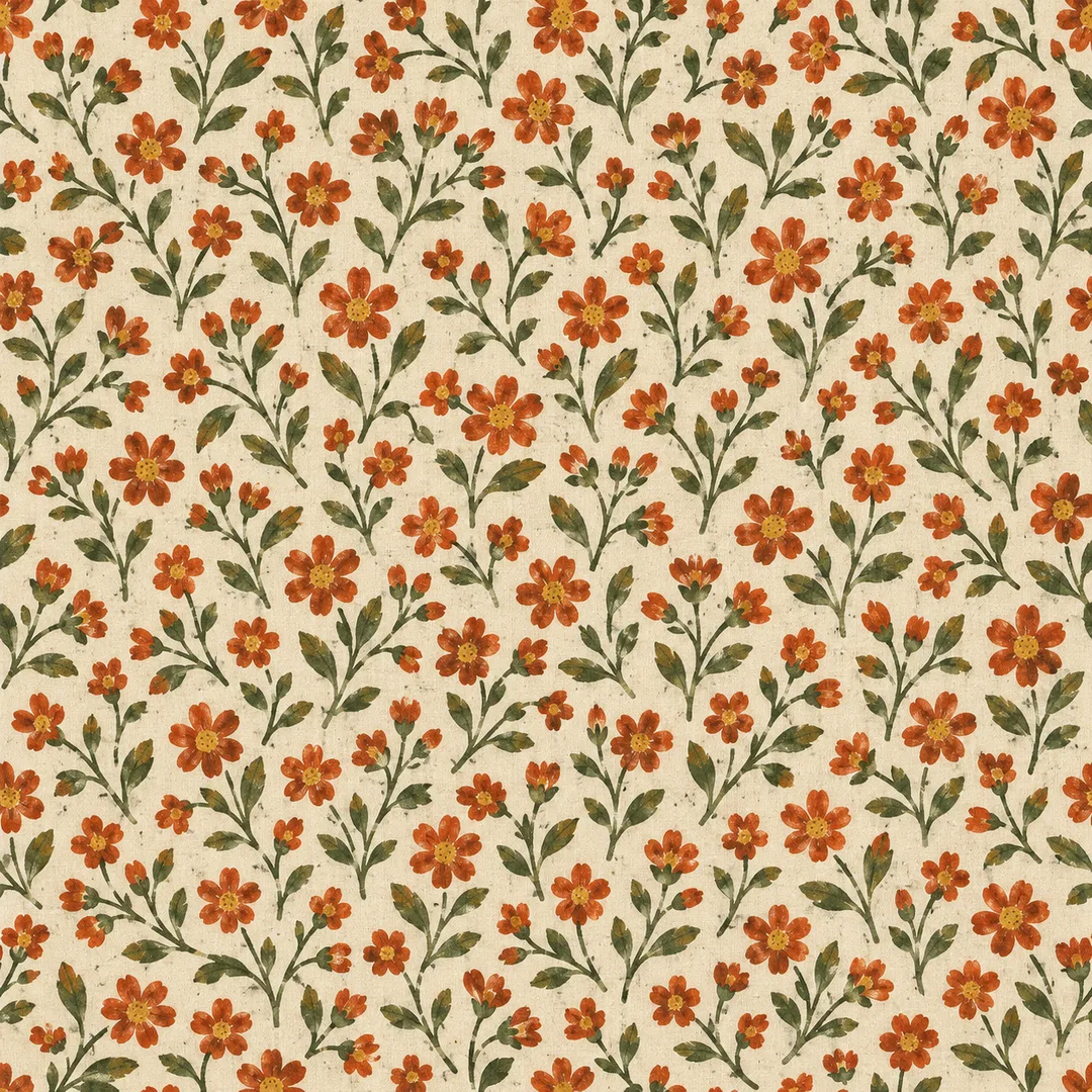
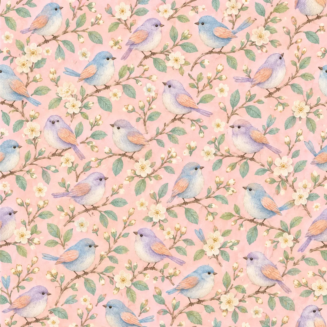
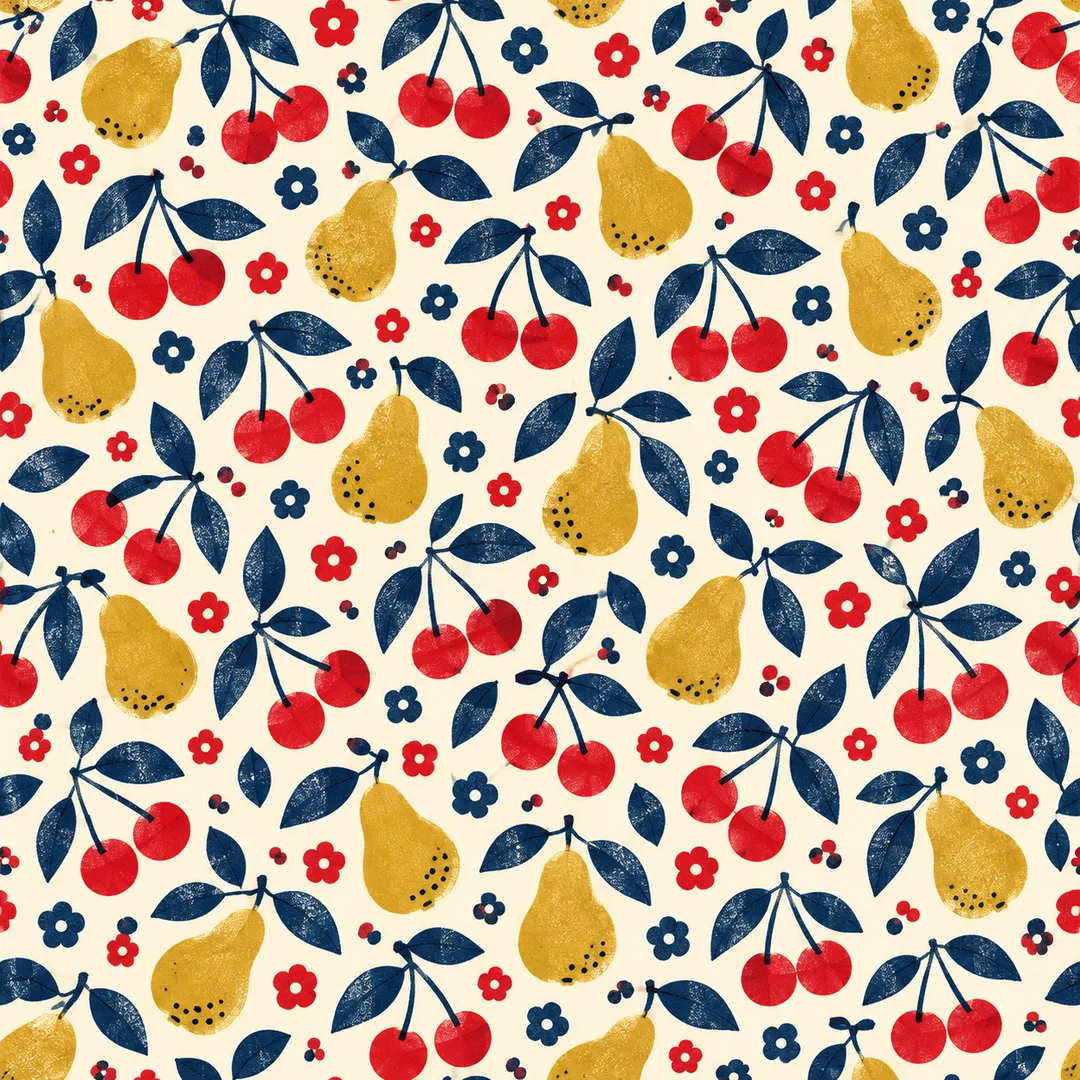
옛 천의 잔꽃 감성을 담은 작은 반복 무늬 배경을 만들어요. 꽃·새·과일과 색, 그림체를 골라 보세요.
받는 것
- 작은 모티프의 레트로 반복 무늬 배경 한 장
- 가장자리까지 채운 평면 패턴, 글자 없음
ChatGPT 무료 OK
칸 채우기
- 1칸을 채워요
- 2복사 버튼을 눌러요
- 3GPT 채팅창에 붙여넣어요
- 4그대로 보내면 썸네일 예시처럼 나와요
- 5카드에 맞는 실제 사진을 같이 넣으면 그 사진이 반영돼요 — 배경 카드는 배경 사진, 인물 · 음식 카드는 그 사진 선택
프롬프트 원문 보기 2,019자
Generate this image now. Draw it directly, without explanation or questions.
Output size 1080x1080 pixels, 1:1 square card. Keep the same top-to-bottom order but compress the zones to fit the square: the illustration becomes smaller and every text line stays fully readable.

Create ONE seamless small-scale retro textile repeat pattern tile. Default square 1:1 unless the selected size specifies another ratio. Full-bleed flat artwork, uniform density, many tiny motifs and narrow balanced gaps, no central focal point, no vignette, no fabric folds or product mockup.
Palette: "【색】". Interpret the first color as background and the others as motif inks. If blank use 크림 · 주황 · 올리브.
Motif: "【무늬】". Use only the selected primary motif: 꽃 = small blossoms and leafy sprigs; 새 = tiny songbirds, twigs and small supporting flowers; 과일 = tiny cherries, pears and leaves with small supporting flowers. If blank use 꽃.
Style: "【그림체】". Apply only the selected treatment: 빈티지 = nostalgic gouache and gently worn cotton printing texture; 파스텔 = soft chalk and colored-pencil edges; 리소 = limited-color overlapping ink shapes, slight registration offset and fine print grain. If blank use 빈티지.
Keep a cohesive nostalgic small-motif pattern in every treatment. Vary sprig angles and bird directions naturally while keeping a balanced repeating rhythm. Opposite left/right and top/bottom edges must match in position, shape, color and texture; wrap clipped motifs onto the opposite edge without a visible seam or repeated density bands. Maintain evenly colored background to the edges. Invent original illustrations. No text, letters, numbers, signature, watermark, logo, real brand, existing character, recognizable person, border, panels, tiled preview or product design. Output only the finished tile. Field labels are instructions, never printed content.

[Final output format]
Output size 1080x1080 pixels, 1:1 square card. Keep the same top-to-bottom order but compress the zones to fit the square: the illustration becomes smaller and every text line stays fully readable.
This selected output format takes priority over any fixed canvas size or aspect ratio elsewhere in this template. Adapt the composition, text zones and margins to the selected canvas without stretching or cropping essential content. Device safe areas apply only when a device is selected. Never print these format instructions on the image.
결과 어땠어요?
이 카드도 많이 사용해요
쓰는 법 · 자주 묻는 것
옛날 손수건이나 작은 꽃무늬 천 같은 배경이 필요할 때 쓰세요. 화면 전체를 작은 모티프가 고르게 채우는 평면 무늬 한 장을 만듭니다. 휴대폰 배경, 디지털 다이어리의 바탕, 포장지 디자인 구상에 어울려요. 천을 찍은 사진이나 제품 목업이 아니라 무늬 자체가 나옵니다.
색에는 바탕색을 먼저, 무늬에 쓸 색을 뒤에 적으세요. 「크림 · 주황 · 올리브」는 따뜻한 천 느낌, 「분홍 · 하늘 · 민트」는 부드러운 느낌에 잘 맞아요. 무늬는 꽃·새·과일 중에서 고르며, 꽃은 잎과 꽃송이, 새는 작은 가지와 꽃, 과일은 잎과 작은 꽃을 곁들입니다. 그림체는 낡은 인쇄 질감의 빈티지, 색연필 느낌의 파스텔, 겹친 잉크 느낌의 리소로 달라져요. 선택 칸을 비우면 크림·주황·올리브, 꽃, 빈티지가 적용됩니다. 꼭 채울 칸은 없어요.
프롬프트를 복사해 그림 AI에 한 번 붙여 넣으면 한 장을 요청합니다. 기본은 정사각형이며 다른 비율은 사이트의 공통 크기에서 고르세요. 이름이나 문구를 인쇄하는 카드가 아니므로 「하루」 같은 이름도 그림에 넣지 않습니다. 예시 1은 빈티지 꽃, 예시 2는 파스텔 새, 예시 3은 리소 과일이며 목록 표지는 별도로 만든 꽃무늬입니다.
그림이 나오면 네 변의 잘린 꽃과 잎이 반대쪽에서 같은 위치로 이어지는지 보세요. 반복 사용 전에는 쓰려는 앱에서 나란히 놓아 이음새와 줄무늬가 생기지 않는지 확인하세요. 생성형 이미지의 가장자리가 항상 정확히 맞는 것은 아니며, 어긋나면 같은 프롬프트로 다시 생성하세요. 후보정을 요구하지 않습니다. 무늬가 답답하면 색의 대비를 낮추고, 흐리면 바탕과 무늬 색을 더 다르게 적어 보세요. 글자·숫자·서명·로고가 생겼다면 다시 생성하세요. 특정 회사의 원단이나 포장 디자인을 재현하는 용도로 쓰지 마세요.