

095리소그래프 포스터 제목과 날짜를 두세 색 잉크로
같은 소재를 두 잉크 판으로 나눠 포개거나 펼치는 리소그래프 행사 포스터예요.
ChatGPT 무료 OK
칸 채우기
- 1칸을 채워요
- 2복사 버튼을 눌러요
- 3GPT 채팅창에 붙여넣어요
- 4그대로 보내면 썸네일 예시처럼 나와요
- 5카드에 맞는 실제 사진을 같이 넣으면 그 사진이 반영돼요 — 배경 카드는 배경 사진, 인물 · 음식 카드는 그 사진 선택
프롬프트 원문 보기 3,175자
Generate one finished risograph event poster now, as flat portrait artwork, default 3:4. The signature is an INK-PLATE DUET: a single event motif rebuilt from two complementary stencil silhouettes, one in each principal ink. The subject comes from the motif input, not a generic decorative background.
Output size 1080x1440 pixels, 3:4 portrait, social media post.
TITLE "【제목】"
DATE "【날짜】"
STENCIL SUBJECT "【판 소재】"
INKS "【색】"
PLATE ARRANGEMENT "【분판 배치】"

Build the selected plate architecture first:
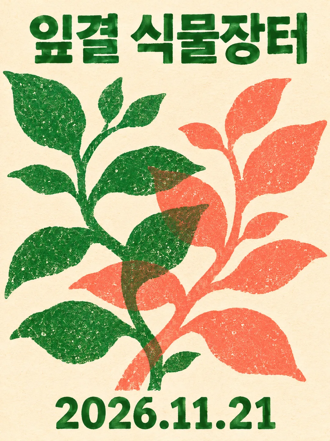
포개기: unite both stencils into ONE monumental central emblem. First-ink silhouette and second-ink silhouette interlock and overlap through its middle, creating a visible third mixed-color intersection. Leave the title above this joined emblem and date below. No detached left/right specimens.
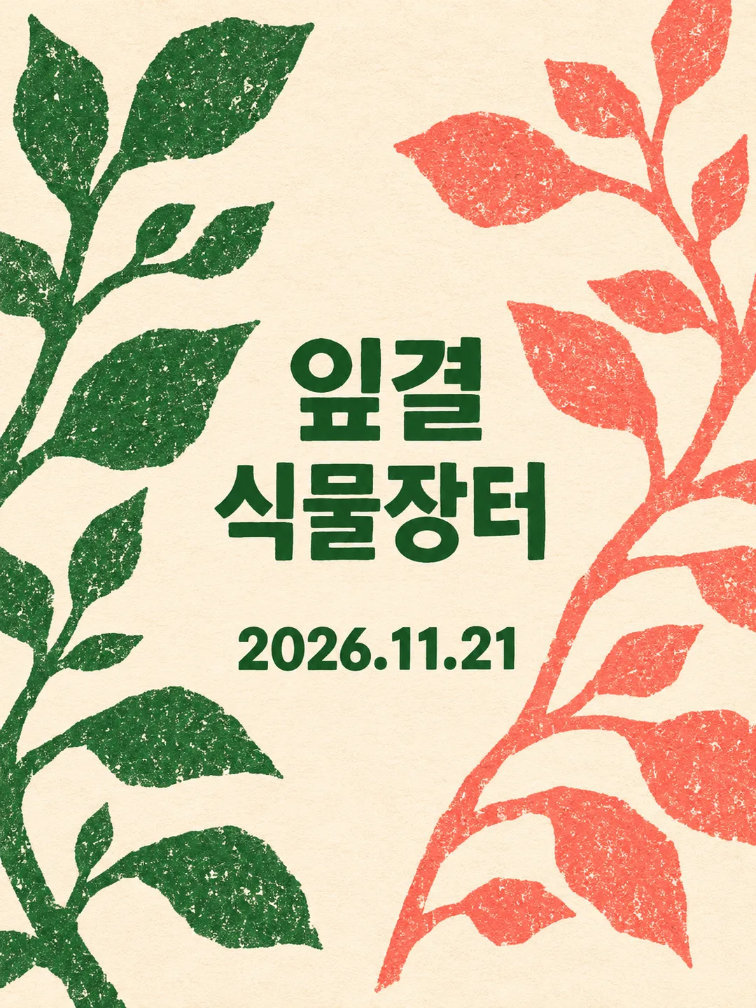
펼치기: pull the two stencils completely apart into LEFT and RIGHT wings with a broad unprinted vertical corridor between them. First ink occupies the left wing; second ink occupies the right. Set the title in horizontal short lines within that central corridor and the date beneath the title in the corridor. The wings never touch each other. Do not retain a central emblem. This is one designed poster, never a comparison sheet or two separate posters.

Draw the supplied subject using chunky cut-stencil contours and coarse ink flecks. For a plant subject, make complementary branching leaf silhouettes, not two copies of a complete potted plant. For paper crafts, use folded and cut paper profiles; for music, use resonant abstract instrument silhouettes. Never print the subject description or arrangement names. Title and date are the ONLY visible text, each once, precisely as entered, in their supplied language. Keep type solid and clear of overprint textures. Empty date removes its entire line without inventing a date. Empty subject takes its cue from the title.

Uncoated warm ivory paper is unprinted substrate. Use the first two supplied spot inks for the two silhouettes; an optional third ink is reserved for the title and date. With two inks, use the darker one for text. Blank inks default to forest green and coral. One supplied ink receives a contrasting second; ignore colors beyond the third. The intersection in joined mode is an overprint mixture, not an extra ink. Papery tooth, dry grain and softly imperfect stencil edges; small registration errors belong only to the artwork, never to letters. No smooth gradients or photographic material. Keep all wording comfortably inside the trim, allow peripheral silhouettes to crop at the edges.

No plate numbers, swatches, arrows, production notes, invented venue, prices, logos, artist references, QR patterns, watermarks or room mockups. Use original fictional event artwork. No reference photograph needed. Return only the finished poster; this is a raster simulation, not a set of press separations.

[Final output format]
Output size 1080x1440 pixels, 3:4 portrait, social media post.
This selected output format takes priority over any fixed canvas size or aspect ratio elsewhere in this template. Adapt the composition, text zones and margins to the selected canvas without stretching or cropping essential content. Device safe areas apply only when a device is selected. Never print these format instructions on the image.
결과 어땠어요?
이 카드도 많이 사용해요
쓰는 법 · 자주 묻는 것
두 잉크만 썼는데 교차점은 갈색이 됐어요
초록과 산호색으로 「잎결 식물장터」를 두 번 만들었더니, 양쪽으로 뻗은 잎가지가 중앙에서 엇갈렸어요. 잎과 줄기가 겹친 곳에는 갈색 계열의 혼합색이 보였고, 겹치지 않은 잎은 원래 색으로 남았어요. 별도의 갈색 잉크를 넣은 것이 아니라 두 판을 겹쳐 찍은 듯한 표현이에요. 제목은 위, 날짜는 아래에서 그림과 떨어져 읽혔어요.
잎가지를 벌리니 가운데가 제목 자리가 됐어요
「분판 배치」만 「펼치기」로 바꾸자 초록 가지는 왼쪽, 산호색 가지는 오른쪽으로 갈라졌어요. 중앙의 교차점은 사라지고 그 빈 통로에 「잎결 / 식물장터」와 날짜가 들어갔어요. 같은 색과 같은 소재인데, 포개기는 겹친 그림을 먼저 보고 펼치기는 가운데 글을 먼저 읽게 해요. 두 판의 간격을 숫자로 조절하는 단추가 아니라 글과 그림의 자리를 함께 바꾸는 단추예요.
「판 소재」에는 한 장의 판으로 잘라 낼 수 있는 윤곽을 적어요. 이번 잎가지는 잎과 줄기가 넓어서 겹침이 읽혔어요. 잎맥이나 작은 꽃술처럼 가는 선을 주인공으로 삼으면 이번에 보인 굵은 색면 효과와 달라질 수 있어요. 종이전이나 음악 소재는 아직 생성 시험을 하지 않았어요.
펼친 그림에서는 잎 끝이 잘렸어요
변화 그림의 바깥쪽 잎과 줄기는 화면 밖으로 이어졌어요. 식물 도감처럼 가지 전체를 보존하는 배치가 아니라, 종이 가장자리까지 잉크 판을 펼치는 포스터예요. 가지 끝도 필요하면 「가운데 글 통로는 유지하고 바깥 잎 끝만 화면 안으로 넣어 줘」라고 요청하세요. 두 번째 포개기 결과에서는 글자 안에도 잉크 얼룩이 조금 생겼지만 제목과 날짜는 읽혔어요.
이번 검증은 한국어 식물장터·두 잉크·세로 화면 세 장이에요. 세 번째 잉크와 다른 언어의 실제 출력은 시험하지 않았어요. 결과물은 리소그래프 질감을 흉내 낸 단일 이미지이며, 인쇄기용 분판 데이터는 아니에요.