
전체 · SNS/카드뉴스 · 정보·꿀팁
007이번 주 3가지 정리 카드뉴스 — 가게 공지 · 업계 소식 · 꿀팁
알릴 것 세 가지만 적으면 번호 · 아이콘 · 한 줄 설명까지 갖춘 세로 카드뉴스 한 장 — 가게 공지 · 이번 달 변경 · 업계 소식 · 꿀팁 정리
칸 채우기
- 1칸을 채워요
- 2복사 버튼을 눌러요
- 3GPT 채팅창에 붙여넣어요
- 4제품·인물 사진을 쓰려면 사진과 프롬프트를 둘 다 넣은 뒤에 보내요 선택
프롬프트 원문 보기 8,280자
Generate this image now. Draw it directly - do not describe it, explain it, or ask questions.
Output size 2480x3508 pixels, A4 portrait, 300dpi, print-ready poster.

[Purpose]
Create one complete Korean three-point information card, ready to save and share as a social-media post or print as a notice. It must work equally well for a shop owner announcing changes and for an individual summarizing industry news, practical tips, or a community announcement. Present exactly three supplied points on one finished canvas. Make the information understandable at a glance on a phone, with a clear reading path and enough space to read each explanation comfortably. Do not invent facts, promotional promises, dates, prices, sources, or additional points.

[Scene]
Build a flat vector infographic on a quiet solid background. At the top, place one small pill-shaped category label, followed by a large headline. Stack exactly three identical rounded rectangular cards vertically in the middle: equal widths, equal heights, matching corner radii, matching faint borders, and equal gaps. Inside each card, reserve the left column for a large two-digit number, the broad middle column for a bold subheading above a smaller explanation, and the far-right column for one simple line icon that matches that point. Keep all three columns aligned across the stack. Below the third card, draw one fine horizontal rule and place the closing sentence beneath it. Allow a small bottom margin for an optional signature. No photographic subject or uploaded image is needed.

[Text layout]
Render these exact Korean strings, without the surrounding quotation marks. The following percentages describe the top-to-bottom structure of the canvas. Keep generous outer margins of approximately 7% and adapt spacing to the requested size while retaining the three-card vertical stack.
- 5-10%: Place "【무슨 소식】" inside the small pill-shaped label. Use compact bold Korean sans-serif type, with comfortable padding on every side.
- 13-27%: Set "【큰 제목】" as the largest text on the page. Allow a natural break into no more than two lines, without splitting a Korean word awkwardly. Align its left edge with the card stack.
- 32-46%: First card, with the large number "01" on the left and the supplied point "【첫째】" in the middle. Split this point at the em dash: render the text before the em dash as the bold subheading, then render the text after it as a smaller explanation on its own line below. Do not print the separating em dash. At the far right, draw exactly one simple, unlettered line icon relevant to this point.
- 49-63%: Second card, with the large number "02" on the left and the supplied point "【둘째】" in the middle. Apply the same em-dash split into a bold subheading and a separate smaller explanation below it. Omit the separating em dash from the artwork. Place one simple, unlettered line icon for this point at the far right.
- 66-80%: Third card, with the large number "03" on the left and the supplied point "【셋째】" in the middle. Again place everything before the em dash in a bold subheading and everything after it on a smaller explanation line below. Do not display the separating em dash. Include one simple, unlettered line icon at the far right, chosen only for this point.
- 84%: Draw one thin horizontal rule, aligned with the outer edges of the card stack.
- 87-92%: Render "【한 줄 결론】" below the rule, clearly legible and smaller than the main headline. Keep it on one line, using the full available width within the safe margins.
- 95-97%: Render "【가게 · 채널 이름】" as a small, quiet signature at the very bottom, never in the headline, pill label, or numbered cards.

[Style]
Use a flat vector infographic style with bold Korean Gothic sans-serif lettering. Keep the subheadings firm and distinct, the explanations lighter in weight but fully readable, and the large numbers clean and simple. Each card has gently rounded corners and a very faint thin border. Default to a warm cream background, near-white cards, charcoal lettering, and a restrained warm brown accent. Use a consistent line weight for the three icons; each icon is one small outline drawing without words, letters, logos, or extra symbols. For example, a plain cup can suggest a drink, a clock without numerals can suggest opening hours, and a plain reusable tumbler can suggest a takeaway offer. Choose icons from the actual supplied content, without forcing shop imagery into a personal news summary.
Color feel: "【색 느낌】".
Use the color feel above to choose one palette (if none is given, choose the palette that best fits the content), and paint its base tone across the ENTIRE canvas edge to edge as a solid, fully opaque background - no transparency, no unpainted margin, no black bars along any side. Each palette is a fixed pair of background and text colour, and every line of text sits on that painted background with strong contrast: warm cream = warm cream background with deep brown text; black tech = near-black background with white text and bright blue accents; navy business = deep navy background with white text; natural green = very pale green background with deep green text; soft pink = pale pink background with deep magenta text. Light background means dark text, dark background means light text - never text close in colour to its background. The three numbered cards are one step lighter or darker than the background so they read as separate panels. Never print the palette name.

[Visual hierarchy]
The main headline is the first read. The next read is the orderly sequence of numbers and bold subheadings, from the top card down to the bottom card. The smaller explanations provide the details immediately beneath their own headings. The icons support recognition without competing with the words. The closing sentence comes next and any bottom signature remains secondary. Keep equal internal padding in every card. Preserve a visible gap between the number column, text column, and icon column. If a point is long, first make better use of the text-column width and then modestly reduce text size consistently across the three cards. Never crop, silently shorten, or transfer words to another card.

[Lighting and texture]
Use even, flat color with a clean matte finish. No realistic lighting is needed. Keep the background and text areas smooth, with no grain that interrupts Korean strokes. Separate the cards through their fill and faint borders rather than heavy shadows. Do not add gradients that reduce text contrast, glossy highlights, reflections, illuminated edges, or dramatic depth.

[Text rules]
Render only the supplied display strings and the fixed sequence numbers. Preserve all supplied Korean syllables, spacing, punctuation, dates, amounts, and units exactly, except for replacing the three separating em dashes with the required heading-to-explanation line breaks. Digits already present in supplied dates, prices, or titles must remain exactly as supplied; they are content, not invented statistics. Keep every point paired with its own number and icon. Never translate or paraphrase the text. Do not print field names, section headings, instructions, braces, or color-choice labels. If the bottom signature is absent, leave a clean margin without an empty label or invented business name. Do not add a shop identity anywhere else. Check all Korean consonants, vowels, and final consonants for complete strokes, and keep all lettering clear of borders and icons.

[Avoid]
Never leave a transparent background, an unpainted canvas, black letterbox bars, or empty margins, and never use text in a colour close to its own background. No neon, bloom, glowing edges, lens flare, excessive shadows, empty square placeholders, placeholder rectangles, decorations covering text, or non-Korean lettering. The fixed numbers "01", "02", and "03" are allowed, as are digits explicitly supplied within the exact Korean content; never invent other numbers. No fake graph numbers, fabricated charts, real company logos, trademarks, celebrity faces, recognizable branded characters, phone or laptop mockup frames, photos, watermarks, lettering inside icons, multiple icons per card, additional cards, duplicated points, cropped explanations, or ornamental clutter. Do not add food efficacy claims, disease claims, or invented discount comparisons.
이 카드도 많이 사용해요
쓰는 법 · 자주 묻는 것
이런 때 쓰세요
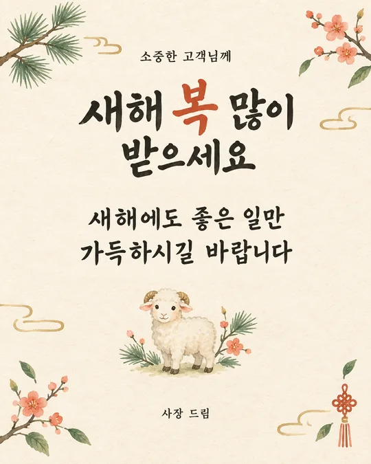
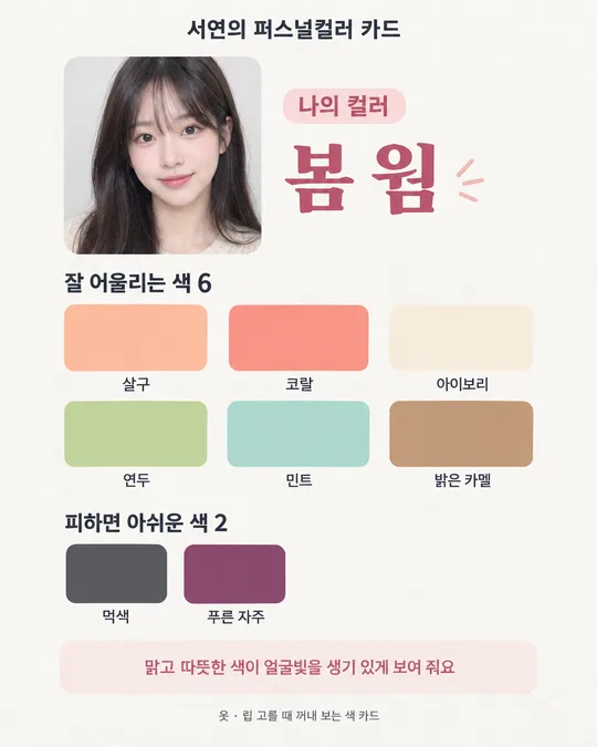
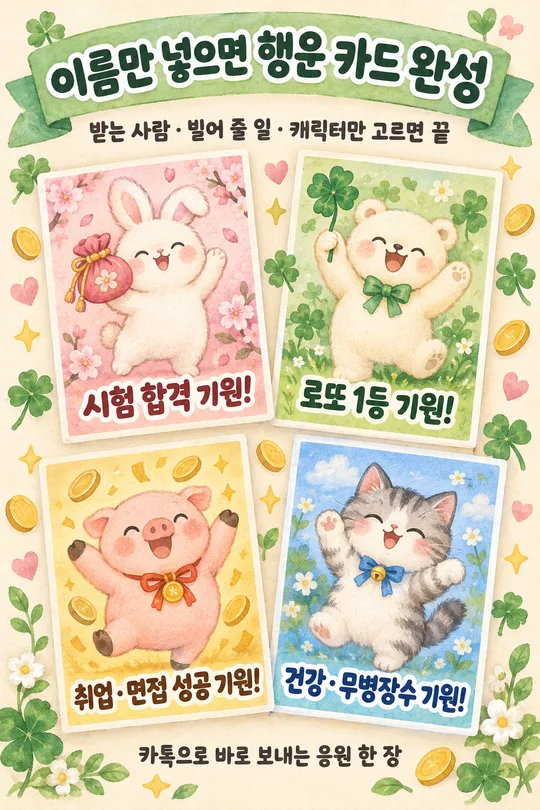
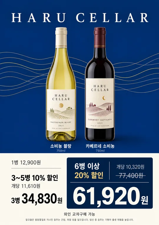
이번 달부터 바뀌는 영업시간, 쉬는 날, 가격 조정을 한 장에 묶어 알릴 때 쓰세요. 카페에서는 새로 나온 음료 세 가지를 각각 한 칸에 소개하고, 동네 가게에서는 포장 할인과 주차 안내까지 함께 전할 수 있어요. 손님이 방문하기 전에 알아야 할 내용을 먼저 골라 주세요.
개인 채널이라면 업계 소식 세 건의 핵심을 정리하거나, 길게 쓴 블로그 글과 스레드에서 실천할 꿀팁 세 가지만 뽑아 보세요. 동호회에서는 모임 장소 변경, 신청 마감, 준비물을 차례로 넣으면 돼요. 소식의 출처와 적용일은 원문에서 먼저 확인하고, 자세한 내용은 게시물 본문에 덧붙여 주세요.
칸 채우는 법
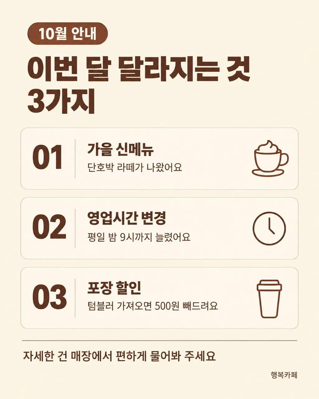
- 무슨 소식: 위쪽 작은 라벨이에요. 「10월 안내」처럼 기간이나 소식의 종류를 짧게 적으세요.
- 큰 제목: 세 항목을 함께 부를 제목이에요. 「이번 달 달라지는 것 3가지」처럼 무엇을 읽게 될지 알려 주세요.
- 첫째: 가장 먼저 알아야 할 내용을 「가을 신메뉴 — 단호박 라떼가 나왔어요」처럼 적으세요. 줄표 앞은 굵은 소제목, 뒤는 작은 설명 줄로 나뉘어요.
- 둘째: 다음 내용을 「휴무 안내 — 매주 월요일 쉬어요」처럼 넣으세요. 첫째와 같은 「소제목 — 설명」 모양을 지켜 주세요.
- 셋째: 마지막 정보도 줄표를 넣어 적으세요. 할인이라면 누가 어떤 조건으로 받는지 짧게 밝혀 주세요. 세 칸 모두 설명은 25자 안쪽이면 줄을 나누기 편해요.
- 한 줄 결론: 읽은 뒤 할 일을 적으세요. 가게 소식은 문의 안내, 개인 꿀팁은 실천을 권하는 말이 어울려요.
- 색 느낌: 다섯 가지 중 하나를 고르세요. 비우면 기본 크림 계열로 만들어요. 어두운 색을 골랐다면 작은 설명까지 잘 읽히는지 살펴보세요.
- 가게 · 채널 이름: 맨 아래에만 작게 들어가요. 개인 이름 대신 채널 이름을 넣어도 되고, 표시할 이름이 없으면 비워 두세요.
칸을 다 채우면 프롬프트를 복사해 이미지 만들기가 가능한 GPT 대화에 붙여 넣으세요. 사진은 준비하지 않아도 돼요. 예시의 날짜와 금액은 그대로 쓰기 전에 실제 안내할 내용으로 바꿔 주세요.
그림이 나오면 꼭 볼 것
왼쪽 번호가 위에서부터 01, 02, 03인지 보세요. 첫째의 설명이 둘째로 넘어가거나 세 칸의 글자가 서로 섞이지 않았는지 입력한 문장과 맞춰 읽어 주세요. 날짜, 영업시간, 가격 숫자는 한 자리씩 확인하세요. 줄표 앞뒤가 굵은 소제목과 작은 설명으로 나뉘었는지, 오른쪽 아이콘에 쓸데없는 글자나 로고가 없는지도 살펴보세요. 휴대폰 화면 크기로 줄였을 때 설명이 읽혀야 해요.
틀린 곳 고치는 법
그림을 만든 대화에서 「둘째 칸 글자가 잘렸어요, 짧게 줄여서 다시 그려 주세요. 설명은 '평일 밤 9시까지 열어요'로 써 주세요」라고 이어서 말하세요. 바꿀 문장까지 정해 주면 뜻이 달라지는 일을 줄일 수 있어요. 숫자가 틀렸다면 「셋째 칸의 금액을 '500원'으로 고치고 나머지는 유지해 주세요」처럼 위치와 정확한 값을 함께 적으세요. 고친 그림도 세 칸 전체를 다시 읽어 주세요.
자주 묻는 것
- 세 가지 말고 네 가지도 되나요? 이 카드는 세 칸에 맞춰져 있어요. 네 번째 내용은 게시물 본문에 덧붙이거나, 내용을 나누어 별도 이미지로 정리해 주세요.
- 무료 GPT로도 되나요? 이용 중인 무료 계정 화면에서 이미지 만들기를 사용할 수 있다면 프롬프트를 보내 보세요. 사용 가능 여부와 한도는 해당 화면의 안내를 확인해 주세요.
- 가격을 적어도 되나요? 실제 판매할 가격과 적용 조건을 정확히 적으세요. 할인 전 원래 가격은 실제로 받던 가격만 쓰세요. 음식은 맛과 재료로 소개하고, 면역·혈압·다이어트·병에 관한 효능 표현은 넣지 마세요.
- 인쇄해도 되나요? 크기를 A4로 골라 만든 뒤 원본 이미지를 저장해 출력하세요. 먼저 한 장 뽑아 작은 설명과 테두리가 선명한지 확인해 주세요.
- 매달 같은 모양으로 만들 수 있나요? 지난 그림과 프롬프트를 보관하고 같은 대화에서 바뀐 문장만 지정해 보세요. 「세 카드 위치와 색은 유지해 주세요」라고 덧붙이면 좋아요. 결과가 완전히 같지는 않을 수 있으니 간격과 글자 크기를 비교해 주세요.