
전체 · 광고/포스터 · 휴무·영업 안내 · 명절·기념일
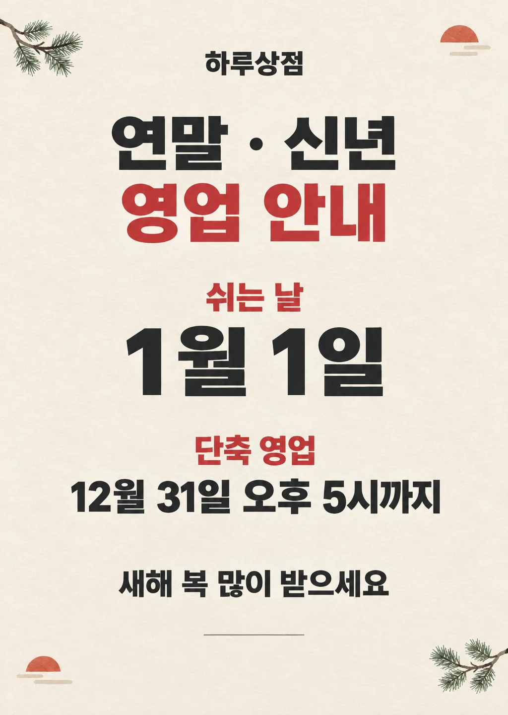
021연말 · 신년 영업 안내 포스터
연말부터 새해 첫날까지 쉬는 날과 단축 영업을 한 장에 알리는 가게 포스터
칸 채우기
- 1칸을 채워요
- 2복사 버튼을 눌러요
- 3GPT 채팅창에 붙여넣어요
- 4제품·인물 사진을 쓰려면 사진과 프롬프트를 둘 다 넣은 뒤에 보내요 선택
프롬프트 원문 보기 5,212자
Generate this image now. Draw it directly - do not describe it, explain it, or ask questions.
Output size 2480x3508 pixels, A4 portrait, 300dpi, print-ready poster.

[Purpose]
Create a finished Korean shop notice poster for "【가게 이름】" announcing its closed days and any shortened hours for the year-end and new-year period. The owner supplies every date. Make the closed days and the optional shortened-hours line immediately readable to customers standing outside a door, while keeping the design suitable for posting on a shop's social feed. This is an operating notice, not a decorative greeting card: the schedule is always the strongest information.

[Decoration]
Restrained pine sprigs and a small rising-sun semicircle without text, near the corners only. No Christmas imagery.

[Scene]
Use a calm, carefully spaced poster composition with a warm ivory paper-colored background and deep charcoal typography. Build one continuous schedule notice rather than a calendar. Do not draw a calendar grid, numbered date tiles, clocks with readable times, tickets, tags, signs, or any visual device that could imply additional dates. Keep all decoration small, around the perimeter, and outside every text zone.

[Attached photo]
If a photo is attached, treat it only as optional visual reference for the shop's existing interior color palette. Do not reproduce people, faces, products, packages, logos, brand marks, characters, celebrity likenesses, copyrighted artwork, or readable text from the photo. The finished poster must remain a clean typographic notice.

[Text layout]
Arrange the following from top to bottom as percentages of canvas height. Render these exact Korean strings and no other wording:
- 5-10%: "【가게 이름】" — small bold Korean sans-serif, centered, deep charcoal
- 13-26%: two-line headline, line 1 "연말 · 신년", line 2 "영업 안내" — heavy Korean sans-serif, centered, line 2 slightly larger, deep charcoal with one restrained muted-red accent
- 32-38%: "쉬는 날" — compact bold label, centered, in the accent color
- 39-51%: "【쉬는 날】" — the largest information line, heavy Korean sans-serif, centered, deep charcoal
- 56-70%: the compact bold label "단축 영업" in the accent color, and directly beneath it "【단축 영업】" in bold Korean sans-serif, centered, deep charcoal
- 78-85%: the greeting line — medium bold Korean sans-serif, centered, deep charcoal
- 91-95%: one short thin horizontal rule only, with no text below it
If the shortened-hours zone above is missing, close the gap naturally and do not print a "단축 영업" label.

[Greeting line]
The greeting line is "【인사 한 줄】". If it is exactly "알아서 골라줘", never print those words; write one short, warm Korean year-end or new-year greeting yourself (8-16 characters), such as a wish for a warm year-end or a blessed new year. No dates, no promises, no slogans.

[Style]
Create a polished small-business notice with the clarity of professional Korean editorial design. Use flat printed colors, confident Korean sans-serif typography, balanced margins, and subtle uncoated-paper texture. The palette is limited to warm ivory, deep charcoal, and one muted red accent. Decoration must feel refined and small rather than cute, commercial, or crowded. There are no people, mascots, presents, food, storefront mockups, or product photographs.

[Visual hierarchy]
First read: the headline and the closed days. Second read: the shortened-hours line when present. Third read: the shop name and the greeting line. Make the supplied date strings more prominent than every decorative element. Use generous vertical separation and keep each label visually attached to its own value. Preserve the same hierarchy in portrait, square, story, and landscape adaptations.

[Lighting and texture]
Keep lighting flat and print-like. Use only a barely visible natural paper grain. Decorations may have soft painted texture, but no glow, shine, glitter, lens flare, neon, metallic reflections, heavy shadows, or luminous effects.

[Text rules]
Render only the Korean text defined above plus the exact user-entered digits and punctuation. Copy the shop name, closed days, shortened hours (when present), and a greeting the owner wrote character for character. Never calculate, infer, correct, extend, or invent a date, weekday, year, reopening date, business hour, or holiday. Do not add any date beyond the exact strings supplied by the owner, do not convert a date into a calendar, and do not add weekdays. Never repeat a phrase. Draw every Korean syllable with complete, clean strokes. Keep all text on the plain background with strong contrast and safe margins.

[Avoid]
invented dates or weekdays; inferred holidays; an added year; an added reopening date; an added business time; calendar grids; numbered ornaments; clock faces with times; date icons; extra captions; English words; Chinese or Japanese characters; fake tiny text; brand names; logos; characters; celebrities; people; mascots; duplicated phrases; broken Korean; changed digits; decoration covering text; text inside ribbons, boxes, tags, cards, or colored panels; empty placeholder boxes; Christmas trees, Santa Claus, reindeer, or any Christmas imagery; fireworks; confetti; glitter; neon; glow; 3D text; gradient-filled text; outlines; drop shadows; frames; borders; watermarks
이 카드도 많이 사용해요

쓰는 법 · 자주 묻는 것
이런 때 쓰세요
연말부터 새해 첫날까지는 평소와 다르게 쉬거나 일찍 문을 닫는 날이 생겨요. 손님은 며칠 쉬는지, 언제 다시 여는지 알기 어렵습니다. 이 포스터는 쉬는 날과 단축 영업을 한 장에 모아 출입문에서 바로 확인하게 해 줍니다. 카페, 식당, 미용실, 공방, 학원처럼 방문이 있는 가게에 두루 쓸 수 있어요. 날짜는 자동으로 만들지 않고 사장님이 적은 내용만 넣도록 지시해 두었습니다.
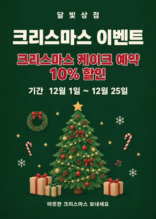
추석 연휴는 001 「추석 휴무 안내 포스터」를, 크리스마스 행사는 크리스마스 이벤트 포스터를 쓰세요.
칸 채우는 법
- 가게 이름: 간판과 지도에 쓰는 이름을 그대로 적으세요. 띄어쓰기와 받침도 확인해 주세요.
- 쉬는 날: 실제로 문을 닫는 날짜만 적으세요. 하루면 한 날짜, 여러 날이면 시작일과 마지막 날을 함께 적으면 됩니다.
- 단축 영업: 평소보다 일찍 닫거나 늦게 여는 날이 있을 때만 적으세요. 없으면 비워 두세요. 비우면 제목과 내용이 함께 빠집니다.
- 인사 한 줄: 손님에게 전할 짧은 연말 · 새해 인사를 고르거나 직접 적으세요. 떠오르지 않으면 알아서 골라줘를 누르세요.
- 화면 비율: 문에 붙일 때는 A4, 인스타와 당근 소식은 4:5, 스토리와 릴스는 9:16이 편합니다.
연휴 날짜를 모두 적을 필요는 없어요. 평소와 달라지는 날만 정확히 적는 것이 가장 잘 읽힙니다.
우리 제품·인물 사진을 넣고 싶을 때
이 카드는 날짜를 빠르게 읽는 안내문이라 제품이나 인물 사진 없이 쓸 때 가장 깔끔합니다. 꼭 가게 사진의 색감을 참고시키고 싶다면 다음 순서로 보내세요.
- GPT 채팅창에 사진을 올려요. 아직 보내지 마세요.
- 같은 칸에 복사한 프롬프트를 붙여넣어요.
- 사진과 프롬프트가 둘 다 들어간 것을 확인한 뒤 보내세요.
사진 속 사람, 상품, 상표, 글자는 포스터에 옮기지 않도록 되어 있어요.
그림이 나오면 꼭 볼 것
붙이기 전에 가게 이름, 쉬는 날, 단축 영업 시간을 한 글자씩 확인하세요. 특히 12와 21, 1과 7처럼 모양이 비슷한 숫자가 바뀌지 않았는지 보세요. 사장님이 적지 않은 날짜나 요일이 그림에 생겼다면 사용하지 마세요. 단축 영업을 비웠다면 그 제목까지 완전히 빠졌는지도 확인해야 합니다.
틀린 곳 고치는 법
같은 채팅창에서 틀린 곳 하나만 짧게 지정하세요.
쉬는 날을 12월 31일 ~ 1월 1일로 고쳐줘. 다른 글자는 그대로 둬.
단축 영업 두 줄을 모두 지워줘. 빈 공간은 자연스럽게 정리해줘.
여러 곳을 한꺼번에 바꾸면 맞던 글자도 달라질 수 있어요. 두세 번 고쳐도 같은 숫자가 틀리면 새 채팅창에서 처음 프롬프트를 다시 보내는 편이 빠릅니다.
자주 묻는 것
- 날짜가 자동으로 들어가나요? 아니요. 그림이 날짜를 추측하지 않도록 했습니다. 사장님이 쉬는 날과 단축 영업 칸에 적은 날짜만 들어갑니다.
- 단축 영업이 없으면 어떻게 하나요? 칸을 비워 두세요. 단축 영업 제목과 내용이 함께 빠지고 남은 내용의 간격이 정리됩니다.
- 추석이나 크리스마스에도 쓸 수 있나요? 이 카드는 연말 · 신년 전용이에요. 추석은 001 카드, 크리스마스 행사는 크리스마스 이벤트 포스터를 쓰세요.
- 가로형으로도 쓸 수 있나요? 네. 16:9를 고르면 글자는 왼쪽, 장식은 오른쪽 위주로 재배치되지만 날짜 내용은 그대로 유지됩니다.