4041950年代の手描きロゴ
店名をそのまま、流れるオリジナルの筆文字ロゴに。
受け取れるもの
- 店名を主役にした手描きロゴ一枚
ChatGPT 無料 OK
項目を入力
- 1項目を入力します
- 2コピーを押します
- 3GPTのチャットに貼り付けます
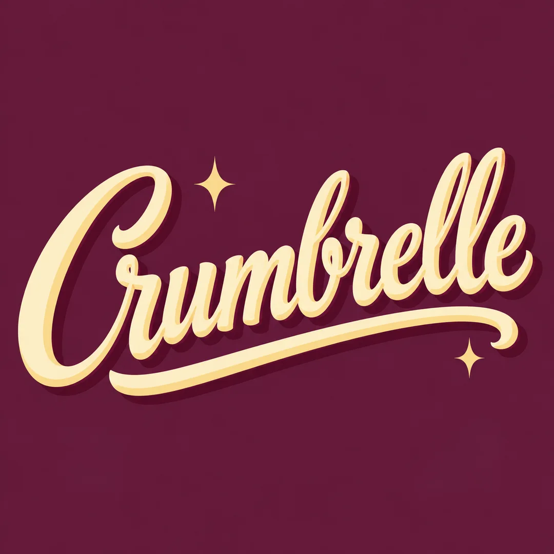
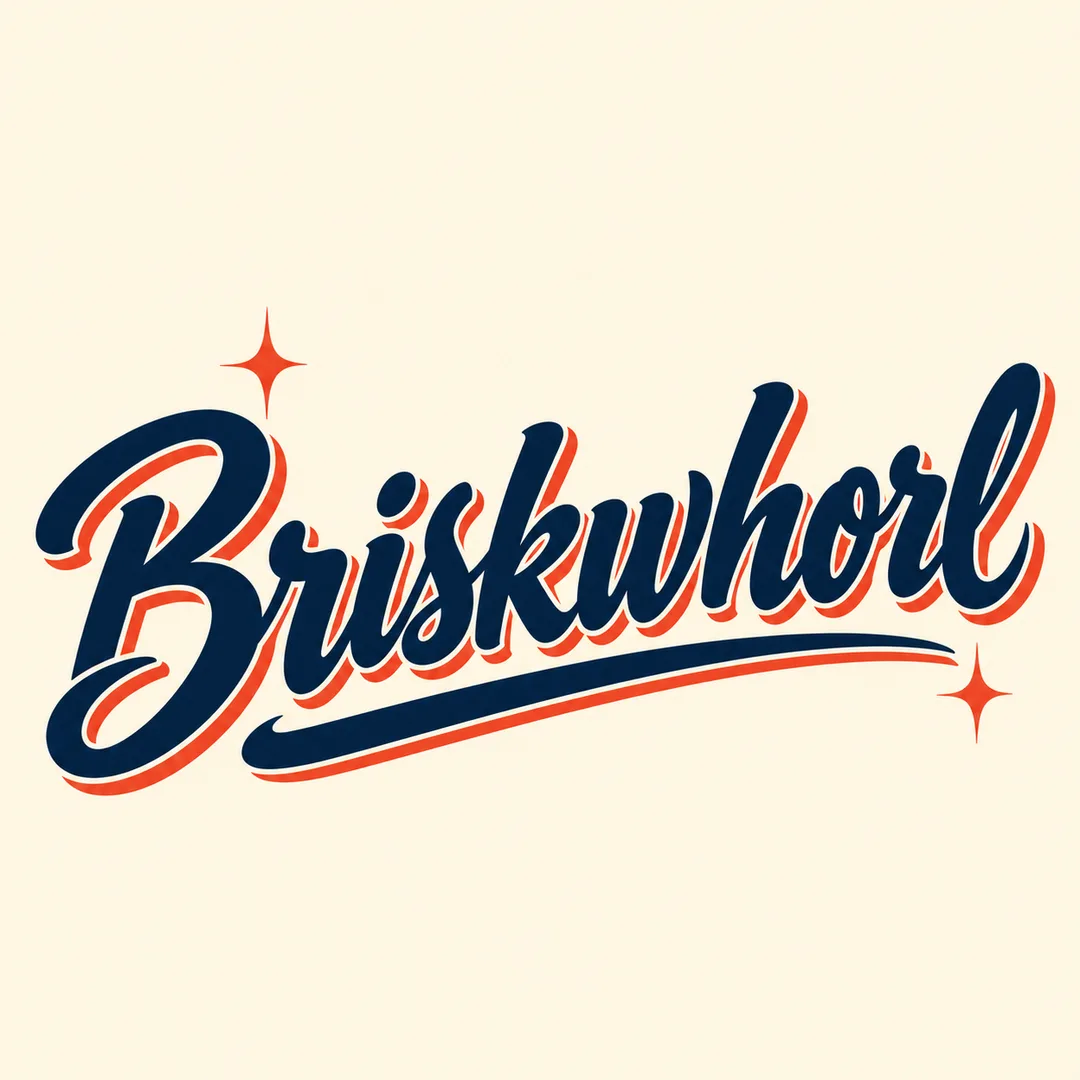
- 4そのまま送ると、サムネイルの例のような画像になります
- 5カードに合う実際の写真を一緒に入れると反映されます。背景カードなら背景の写真、人物・料理カードならその写真 任意
プロンプト全文を見る 2,216文字
Generate exactly one finished original 1950s diner hand-lettered sign logo image. Output the image directly, no explanation. Canvas: 出力サイズは1080×1080ピクセル、1:1の正方形にしてください。文字を読みやすく配置してください。.
Shop name: "【店名】"
Business: "【業種】"
Colors: "【色】"
Print the shop name exactly once, preserving every character, case, space and punctuation in its original writing system. Never translate or romanize it. This exact name is the ONLY text in the image; do not print the business, labels, slogans, dates, prices or any other words. If the name is empty ask for it; if business is empty use a soda bar; if colors are empty use coral, deep teal and warm ivory.
Create custom 1950s brush-script sign lettering: confident thick downstrokes, delicate connecting upstrokes, open counters, a lively slanted baseline, restrained dimensional painted offset shadow and one elegant underline swash. For Hangul or Japanese preserve intact readable character structures rather than forcing Latin cursive. Make the lettering large and dominant, with a clean solid background extending to every edge. Keep the complete lettering and swash visible with comfortable breathing room; adapt to the chosen canvas without cropping. This is flat finished brand artwork, not a photographed sign or mockup. Use the business and palette to determine the mood and custom letter anatomy: a soda bar feels quick and buoyant, a bakery soft and graceful, a barbershop crisp and bold. Add at most two small geometric sparkle accents; no objects, food, mascots or illustrated scenes. Avoid neon tubes, chrome, rounded 1970s bubble lettering, distressed texture, badge borders and generic font typesetting. Never imitate an existing brand, logo, artist or signature. All design elements must be original. Before returning, compare the rendered name character by character against the input and correct omissions, substitutions and duplicates.

[Final output format]
出力サイズは1080×1080ピクセル、1:1の正方形にしてください。文字を読みやすく配置してください。
This selected output format takes priority over any fixed canvas size or aspect ratio elsewhere in this template. Adapt the composition, text zones and margins to the selected canvas without stretching or cropping essential content. Device safe areas apply only when a device is selected. Never print these format instructions on the image.
結果はどうでしたか?
こちらのカードも人気です
使い方・よくある質問
店名を主役にした、1950年代のダイナー風手描きロゴを作ります。太い下向きの筆線、細い接続線、流れる下線で、看板や店舗紹介画像、包装シールのデザイン案に使える一枚にまとめます。
必須欄は店名と業種の二つです。店名は大文字小文字、空白、記号まで表示したい表記のまま入力してください。業種は印字せず、文字の印象に反映します。ソーダバーは軽快に、洋菓子店は優雅に、理髪店は力強く仕上げます。色には背景を含む三色を入力します。空欄ならコーラル、濃いティール、温かいアイボリーです。業種が空欄ならソーダバーとして扱い、店名がなければ質問します。
写真は不要です。画像AIへ一度貼り付けると一枚のロゴ画像を作ります。初期比率は1:1、一覧表紙は2:3です。店名は翻訳もローマ字化もしません。日本語と韓国語は文字構造を保つ指示を含みますが、このカードの実画像試験は欧文名で行いました。
表紙は架空のソーダバーFizzamble、別の作例は架空の洋菓子店Crumbrelleと理髪店Briskwhorlです。新しく考案したデザイン用名称であり、商標調査済みの名称ではありません。商用利用前に使用する名称の権利を確認してください。画像はラスター形式の構想案で、製作用ベクターデータや商標登録を保証しません。
完成後は拡大し、一文字ずつ照合します。影や下線で文字の内側が塞がれていないかも確認してください。店名以外の文章は出力しません。誤字があれば正確な綴りを指定して再生成します。長い名前では装飾を増やすより短い正式表記が読みやすくなります。色を変えると同じ1950年代の筆文字の範囲で雰囲気が変わります。