
すべて · 広告・ポスター · 飲食店 · カフェ・スイーツ
325料理のラインアイコン — メニュー・シール・看板に使うすっきりした線のアイコン
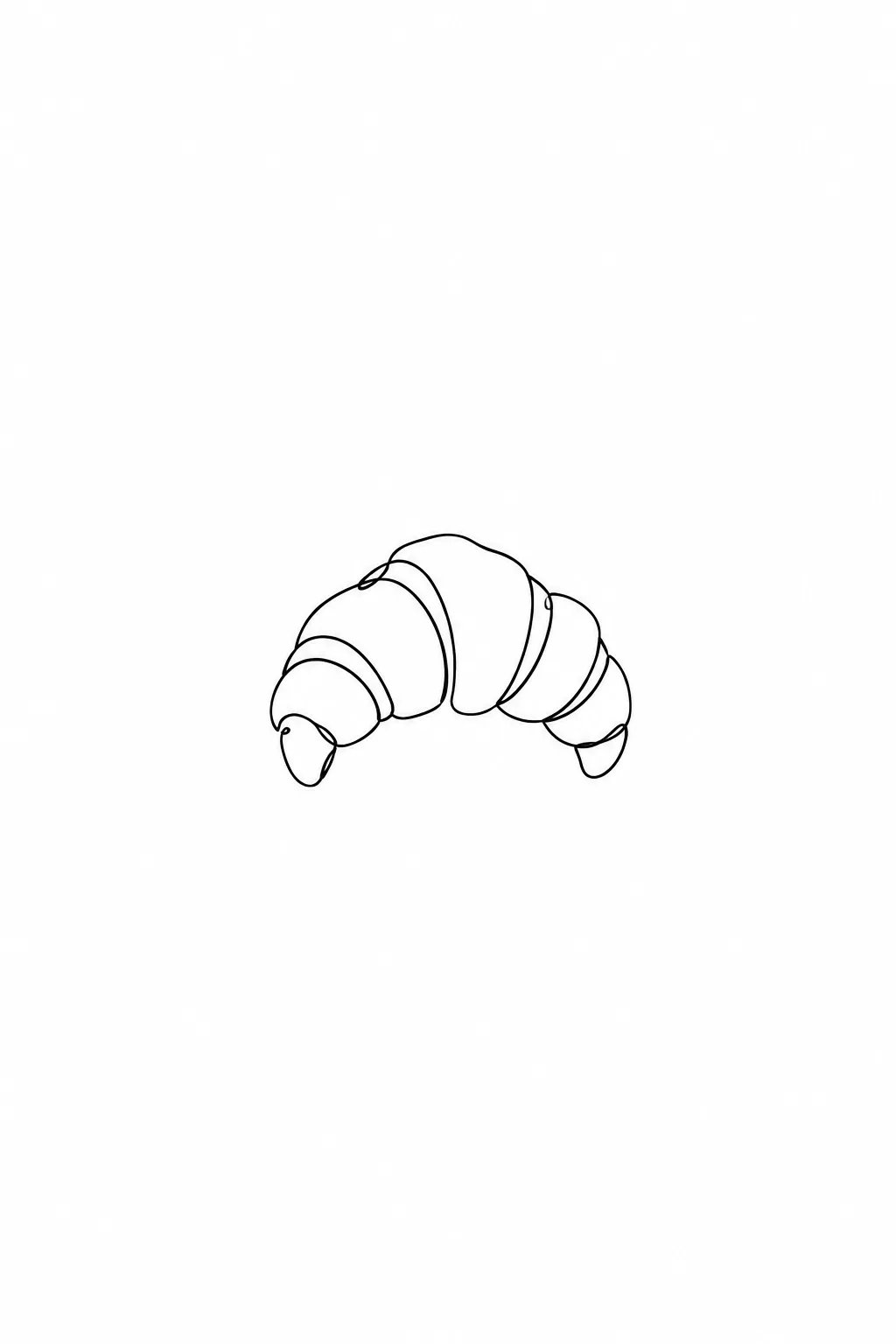
料理名一つで、白地に細く均一な線で描いた、シンプルでおしゃれな料理のラインアイコンになります。
受け取れるもの
- 料理のラインアイコン一枚
- 白地に細く均一な線
- 差し色を選ぶと小さなアクセント
ChatGPT 無料 OK
項目を入力
- 1項目を入力します
- 2コピーを押します
- 3GPTのチャットに貼り付けます
- 4そのまま送ると、サムネイルの例のような画像になります
- 5カードに合う実際の写真を一緒に入れると反映されます。背景カードなら背景の写真、人物・料理カードならその写真 任意
プロンプト全文を見る 2,357文字
Generate this image now. Draw it directly - do not describe it, explain it, or ask questions.
出力サイズは1080×1080ピクセル、1:1の正方形にしてください。文字を読みやすく配置してください。
Create one hand-drawn food icon on the requested canvas. The intended card format is 1:1.

FOOD SUBJECT: "【食べ物】"
If this line is missing or empty, draw a single croissant; do not invent or print a food name or any other text.

LINE COLOR selected: "【線の色】"
Interpret only the selected choice:
- 黒: Solid black pen line.
- 茶: Solid dark brown pen line.
- 紺: Solid dark navy pen line.
If this selection line is missing or empty, use 黒 only.

SINGLE ACCENT selected: "【差し色一つ】"
Interpret only the selected choice:
- なし: No colored accent; use the selected outline color only.
- 赤: Add exactly one tiny red filled dot as a restrained accent.
- 黄: Add exactly one tiny yellow filled dot as a restrained accent.
- 緑: Add exactly one tiny green filled dot as a restrained accent.
If this selection line is missing or empty, use なし only.

Represent the supplied food as one recognizable icon with a single continuous, flowing pen line. Use a consistent fine stroke, rounded turns, subtle hand-drawn irregularity, and only the few internal contours needed to identify the food. Simplify complex ingredients into their most recognizable silhouette and essential connected details. Avoid tangled lines or excessive retracing.

Center the icon on a pure white background with generous clear margins. Use no shading, hatching, gradients, texture, cast shadows, or large filled areas. If an accent is selected, place one tiny colored dot within or immediately beside the food; do not introduce another object or additional colored areas.

Show exactly one food icon. Add a simple serving container only if it is essential to identify the supplied food. Do not create an icon sheet, multiple views, a collage, or a background scene. No visible text of any kind, invented lettering, labels, logos, brands, or watermark.
The choice names in this prompt are internal labels only; never print them as text.

[Final output format]
出力サイズは1080×1080ピクセル、1:1の正方形にしてください。文字を読みやすく配置してください。
This selected output format takes priority over any fixed canvas size or aspect ratio elsewhere in this template. Adapt the composition, text zones and margins to the selected canvas without stretching or cropping essential content. Device safe areas apply only when a device is selected. Never print these format instructions on the image.
結果はどうでしたか?
こちらのカードも人気です
使い方・よくある質問
こんなときに
メニュー・包装シール・看板に入れるすっきりした料理アイコンが欲しいときに。細く均一な線だけで描いたクロワッサンやコーヒーが白地の真ん中に一つ。
欄の埋め方
料理名だけで大丈夫です。
出てきたら確認すること
- 線は複雑すぎませんか?文字は出ていませんか?
線の色と差し色
黒は白いメニューやレシートでいちばんはっきり、茶はパン屋やカフェのクラフト袋に、紺は落ち着いた上品な印象です。差し色を選ぶと、料理の中かすぐ横に小さな色の点が一つ入ります。
アイコンをそろえるには
メニューに並べるなら、線の色と差し色を全部同じにしましょう。同じ会話で「同じ線とスタイルで、今度はベーグル」と料理名だけ変えて頼むと、統一感が出ます。