
전체 · 광고/포스터 · 음식점·식당 · 카페·디저트
325음식 라인 아이콘 — 메뉴판 · 스티커 · 간판에 쓰는 깔끔한 선 아이콘
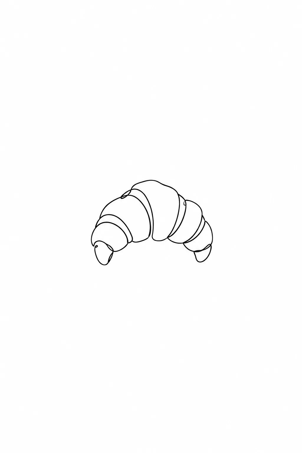
음식 이름 하나로 흰 바탕에 가는 선으로 그린 단순하고 세련된 음식 라인 아이콘이 나와요. 메뉴판 · 포장 스티커 · 간판에.
받는 것
- 음식 라인 아이콘 한 장
- 흰 바탕에 같은 굵기의 가는 선
- 점 색 하나를 고르면 작은 포인트
ChatGPT 무료 OK
칸 채우기
- 1칸을 채워요
- 2복사 버튼을 눌러요
- 3GPT 채팅창에 붙여넣어요
- 4그대로 보내면 썸네일 예시처럼 나와요
- 5카드에 맞는 실제 사진을 같이 넣으면 그 사진이 반영돼요 — 배경 카드는 배경 사진, 인물 · 음식 카드는 그 사진 선택
프롬프트 원문 보기 2,360자
Generate this image now. Draw it directly - do not describe it, explain it, or ask questions.
Output size 1080x1080 pixels, 1:1 square card. Keep the same top-to-bottom order but compress the zones to fit the square: the illustration becomes smaller and every text line stays fully readable.
Create one hand-drawn food icon on the requested canvas. The intended card format is 1:1.

FOOD SUBJECT: "【음식】"
If this line is missing or empty, draw a single croissant; do not invent or print a food name or any other text.

LINE COLOR selected: "【선 색】"
Interpret only the selected choice:
- 검정: Solid black pen line.
- 갈색: Solid dark brown pen line.
- 남색: Solid dark navy pen line.
If this selection line is missing or empty, use 검정 only.

SINGLE ACCENT selected: "【점 색 하나】"
Interpret only the selected choice:
- 없음: No colored accent; use the selected outline color only.
- 빨강: Add exactly one tiny red filled dot as a restrained accent.
- 노랑: Add exactly one tiny yellow filled dot as a restrained accent.
- 초록: Add exactly one tiny green filled dot as a restrained accent.
If this selection line is missing or empty, use 없음 only.

Represent the supplied food as one recognizable icon with a single continuous, flowing pen line. Use a consistent fine stroke, rounded turns, subtle hand-drawn irregularity, and only the few internal contours needed to identify the food. Simplify complex ingredients into their most recognizable silhouette and essential connected details. Avoid tangled lines or excessive retracing.

Center the icon on a pure white background with generous clear margins. Use no shading, hatching, gradients, texture, cast shadows, or large filled areas. If an accent is selected, place one tiny colored dot within or immediately beside the food; do not introduce another object or additional colored areas.

Show exactly one food icon. Add a simple serving container only if it is essential to identify the supplied food. Do not create an icon sheet, multiple views, a collage, or a background scene. No visible text of any kind, invented lettering, labels, logos, brands, or watermark.
The choice names in this prompt are internal labels only; never print them as text.

[Final output format]
Output size 1080x1080 pixels, 1:1 square card. Keep the same top-to-bottom order but compress the zones to fit the square: the illustration becomes smaller and every text line stays fully readable.
This selected output format takes priority over any fixed canvas size or aspect ratio elsewhere in this template. Adapt the composition, text zones and margins to the selected canvas without stretching or cropping essential content. Device safe areas apply only when a device is selected. Never print these format instructions on the image.
결과 어땠어요?
이 카드도 많이 사용해요
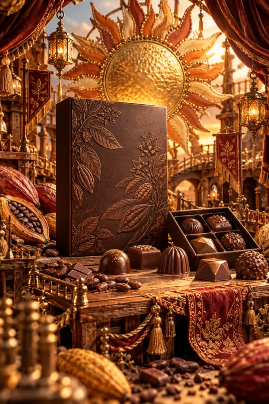
- 331미니어처 공방 상품 광고 — 우리 상품이 금속 장식 · 직물 · 작은 무대로 만든 수공예 세상 한가운데
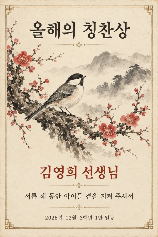
- 320수묵화 감사패 · 상장 — 매화 · 대나무 · 학 그림과 이름이 들어간 인쇄용 기념장 (스승의 날 · 퇴임 · 가족)
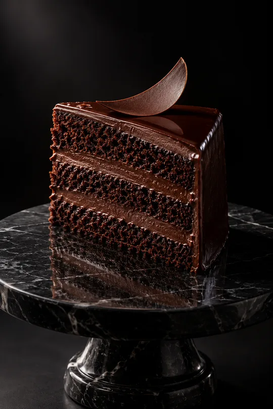
- 319다크 럭셔리 상품 사진 — 검은 스튜디오에서 한 줄기 빛을 받는 디저트 · 와인 · 향수 광고컷
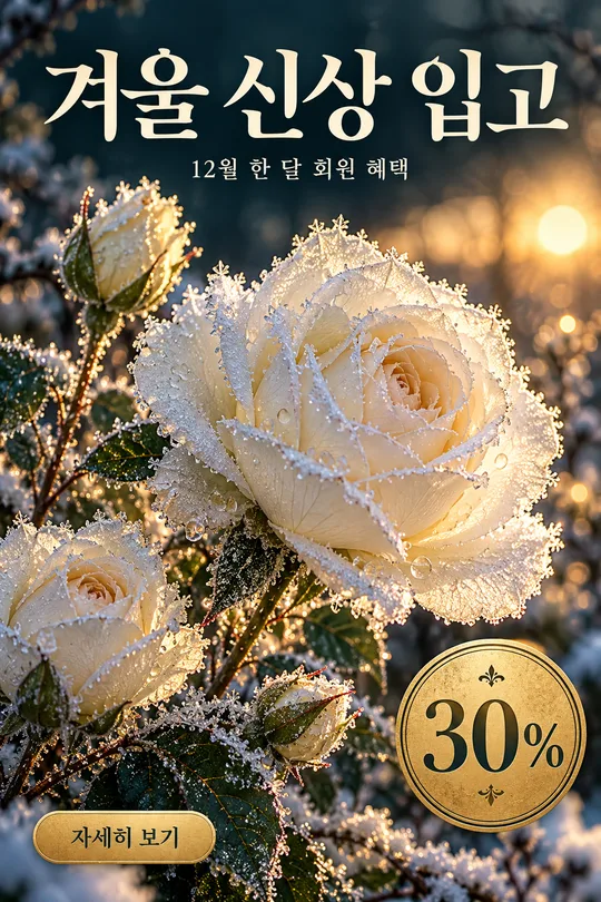
- 316겨울 꽃 홍보 포스터 — 서리 내린 꽃 클로즈업 위 가게 신상 · 회원 혜택 안내
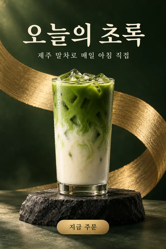
- 313메뉴 사진 헤드라인 광고 — 우리 메뉴 · 상품을 받침대 위 잡지 광고 포스터로 (카페 · 화장품 · 소품)
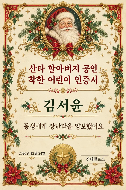
- 312산타 할아버지 착한 어린이 인증서 — 아이 이름이 들어간 크리스마스 인쇄용 상장
쓰는 법 · 자주 묻는 것
이런 때 쓰세요
메뉴판 · 포장 스티커 · 영수증 · 간판에 넣을 깔끔한 음식 아이콘이 필요할 때 쓰세요. 같은 굵기의 가는 선으로만 그린 단순한 크루아상 · 커피 · 케이크 그림이 흰 바탕 가운데 하나 나와요. 단순해서 작게 인쇄해도 또렷하고, 메뉴마다 하나씩 만들면 통일감 있는 아이콘 세트가 됩니다.
해외 프롬프트 판매 사이트에서 돈을 받고 파는 「프렌치 비스트로 음식 라인 아이콘」 형식이에요. 여기서는 무료입니다.
칸 채우는 법
음식 이름만 적으면 됩니다. 선 색은 검정(가장 깔끔), 갈색(빵집 · 카페), 남색 중에서, 점 색은 딸기 · 체리 같은 포인트를 한 곳에 넣고 싶을 때만 고르세요.
그림이 나오면 꼭 볼 것
- 선이 너무 복잡하지 않나요? 「더 단순하게, 선 하나로」라고 하면 줄어들어요.
- 글자가 생기지 않았나요?
자주 묻는 것
- 로고로 써도 되나요? 메뉴 아이콘으로는 바로 쓰고, 로고로 쓰려면 벡터로 다시 따서(일러스트 · 피그마) 쓰세요.