

095リソグラフ風のイベントポスター
二つのインク版を重ねるか左右に開き、タイトルの居場所まで変えるポスターです。
受け取れるもの
- 二つの版のシルエットで組み立てるイベントポスター1枚
- 中央で重なる図案、または文字を挟む左右の図案
- 紙の質感と特色インクの粒子が見える平面デザイン
ChatGPT 無料 OK
項目を入力
- 1項目を入力します
- 2コピーを押します
- 3GPTのチャットに貼り付けます
- 4そのまま送ると、サムネイルの例のような画像になります
- 5カードに合う実際の写真を一緒に入れると反映されます。背景カードなら背景の写真、人物・料理カードならその写真 任意
プロンプト全文を見る 3,183文字
Generate one finished risograph event poster now, as flat portrait artwork, default 3:4. The signature is an INK-PLATE DUET: a single event motif rebuilt from two complementary stencil silhouettes, one in each principal ink. The subject comes from the motif input, not a generic decorative background.
出力サイズは1080×1440ピクセル、3:4の縦型SNS投稿にしてください。
TITLE "【タイトル】"
DATE "【日付】"
STENCIL SUBJECT "【版のモチーフ】"
INKS "【インク】"
PLATE ARRANGEMENT "【版の配置】"

Build the selected plate architecture first:
重ねる: unite both stencils into ONE monumental central emblem. First-ink silhouette and second-ink silhouette interlock and overlap through its middle, creating a visible third mixed-color intersection. Leave the title above this joined emblem and date below. No detached left/right specimens.
開く: pull the two stencils completely apart into LEFT and RIGHT wings with a broad unprinted vertical corridor between them. First ink occupies the left wing; second ink occupies the right. Set the title in horizontal short lines within that central corridor and the date beneath the title in the corridor. The wings never touch each other. Do not retain a central emblem. This is one designed poster, never a comparison sheet or two separate posters.

Draw the supplied subject using chunky cut-stencil contours and coarse ink flecks. For a plant subject, make complementary branching leaf silhouettes, not two copies of a complete potted plant. For paper crafts, use folded and cut paper profiles; for music, use resonant abstract instrument silhouettes. Never print the subject description or arrangement names. Title and date are the ONLY visible text, each once, precisely as entered, in their supplied language. Keep type solid and clear of overprint textures. Empty date removes its entire line without inventing a date. Empty subject takes its cue from the title.

Uncoated warm ivory paper is unprinted substrate. Use the first two supplied spot inks for the two silhouettes; an optional third ink is reserved for the title and date. With two inks, use the darker one for text. Blank inks default to forest green and coral. One supplied ink receives a contrasting second; ignore colors beyond the third. The intersection in joined mode is an overprint mixture, not an extra ink. Papery tooth, dry grain and softly imperfect stencil edges; small registration errors belong only to the artwork, never to letters. No smooth gradients or photographic material. Keep all wording comfortably inside the trim, allow peripheral silhouettes to crop at the edges.

No plate numbers, swatches, arrows, production notes, invented venue, prices, logos, artist references, QR patterns, watermarks or room mockups. Use original fictional event artwork. No reference photograph needed. Return only the finished poster; this is a raster simulation, not a set of press separations.

[Final output format]
出力サイズは1080×1440ピクセル、3:4の縦型SNS投稿にしてください。
This selected output format takes priority over any fixed canvas size or aspect ratio elsewhere in this template. Adapt the composition, text zones and margins to the selected canvas without stretching or cropping essential content. Device safe areas apply only when a device is selected. Never print these format instructions on the image.
結果はどうでしたか?
こちらのカードも人気です

使い方・よくある質問
二色の交差点が茶色になりました
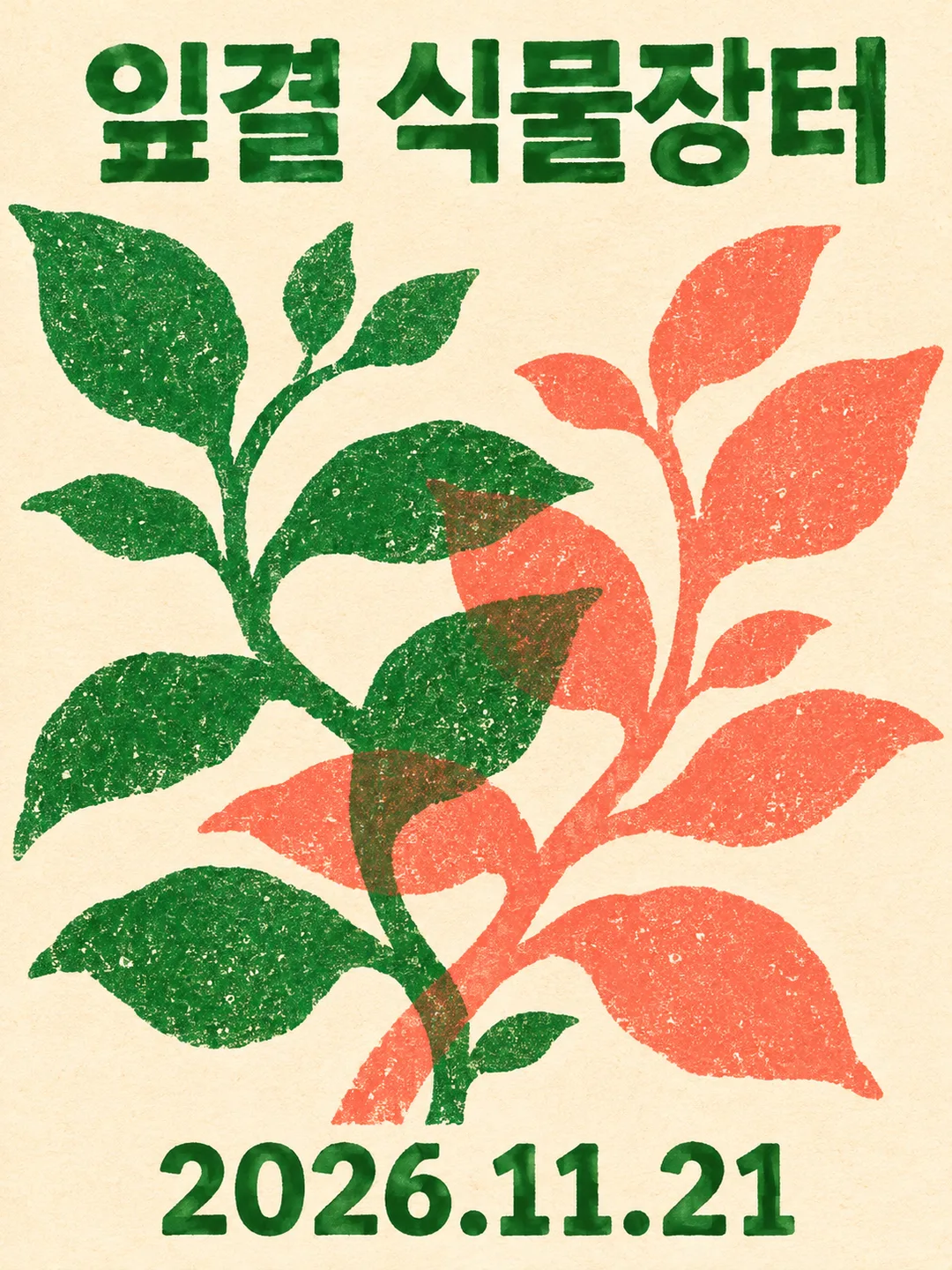
緑とコーラルで韓国語の植物市ポスターを二度生成すると、葉の枝が中央で交差しました。重なった箇所は茶色がかり、外側の葉には元の色が残りました。茶色のインクを追加したのではなく、二つの版を重ね刷りしたような表現です。タイトルは枝の上、日付は下に置かれました。
版を開くと、中央が文字の通り道に
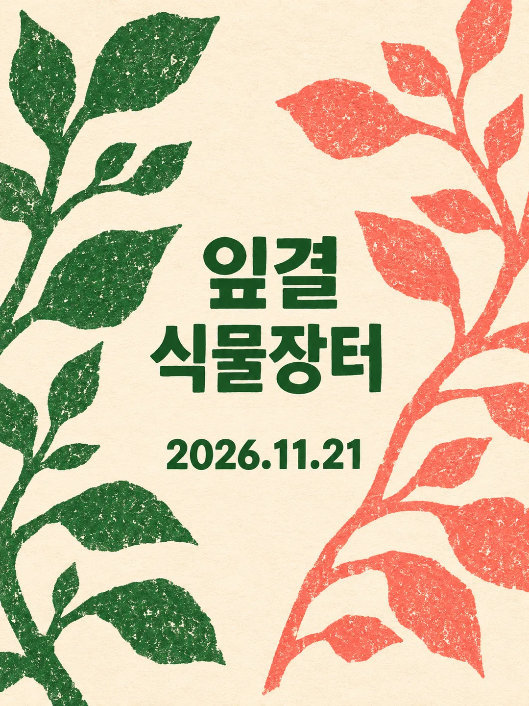
「版の配置」だけを「開く」に変えると、緑の枝は左、コーラルの枝は右へ分かれました。中央の交差がなくなり、空いた紙面に横書きの短い行でタイトル、その下に日付が入りました。「重ねる」では大きな図案が先に目に入り、「開く」では枝の間の文字を読む構成になります。間隔の数値ではなく、文字と図案の居場所を変える切り替えです。
版のモチーフには、紙から切り抜けるような太い輪郭を指定すると意図が伝わります。今回の葉と茎は面が広く、重なりが見えました。細い葉脈や小さな花のおしべでは、同じ色面効果にならない場合があります。紙や音楽のモチーフは今回生成していません。
開いた枝の先は画面の外へ
変更後の画像では、外側の葉先や茎が画面からはみ出しました。植物標本のように枝全体を収める構図ではなく、紙の端まで版を広げるポスターです。葉先も必要なら「中央の文字の通り道は保ち、外側の葉先だけ画面内に収めて」と追加してください。二枚目の重ねた画像では文字の内側にも少しインクむらがありましたが、タイトルと日付は読めました。
検証したのは、韓国語の植物市、二色、縦長の三枚です。三色目と英語・日本語での実際の生成は未検証です。仕上がりはリソグラフの質感を再現する単一画像であり、印刷機用の色分解データではありません。