
전체 · 광고/포스터 · 카페·디저트
369커피 감성 일러스트 — 일상의 한 장면을 레트로 포스터로
장면 단추와 문구 한 줄로 큰 글자와 촘촘한 일러스트가 있는 커피 포스터를 만들어요.
ChatGPT 무료 OK
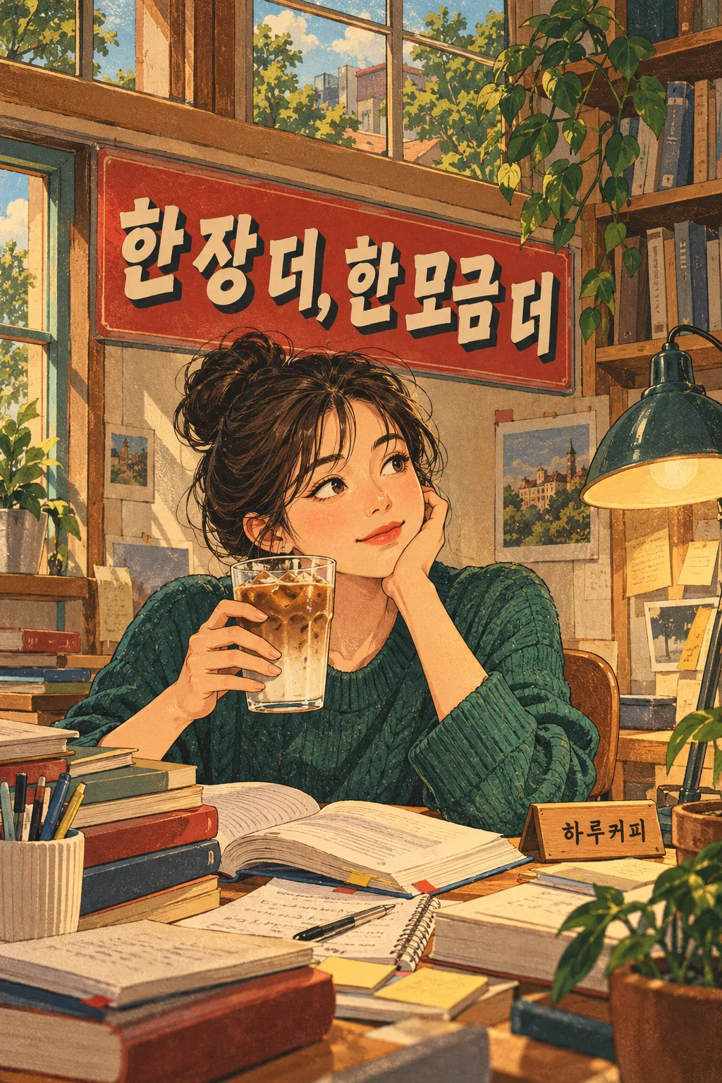
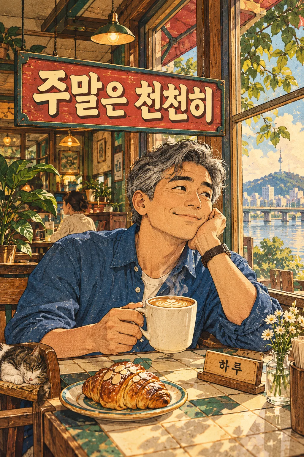
칸 채우기
- 1칸을 채워요
- 2복사 버튼을 눌러요
- 3GPT 채팅창에 붙여넣어요
- 4그대로 보내면 썸네일 예시처럼 나와요
- 5카드에 맞는 실제 사진을 같이 넣으면 그 사진이 반영돼요 — 배경 카드는 배경 사진, 인물 · 음식 카드는 그 사진 선택
프롬프트 원문 보기 3,294자
Generate this image now. Draw it directly; do not explain or ask questions.
Output exactly one finished 2:3 portrait image, 1024x1536 pixels. Keep all important text inside the central 73% of image height: leave the top 12% and bottom 15% free of essential lettering.
Create ONE finished retro editorial coffee illustration poster, full bleed. Never a collage, grid, magazine mockup or paper photographed on a surface.
SCENE: "【장면】"
PERSON: "【인물】"
COFFEE: "【커피】"
HEADLINE INPUT: "【한 줄 문구】"
NAME INPUT: "【가게 이름】"
Resolve HEADLINE once: if empty or "알아서 골라줘", choose one short Korean sentence suitable for the scene; otherwise use the input verbatim. Print only HEADLINE and the optional NAME, each exactly once. If NAME is blank, omit it without leaving an empty label. No other letters, numbers, labels or logos, including laptop screens, books and cups.
The four scene choices change only the action and props, never the illustration style: 출근 전 = fictional adult at a home desk with bag and morning window; 공부 중 = fictional adult student with open books, notes and desk lamp; 오후 휴식 = fictional adult leaning back at an office desk with laptop and leafy plant; 주말 카페 = fictional adult by a cafe window with tiled table and pastry.
Use expressive, slightly caricatured but anatomically coherent adults, appealing tired or relaxed expressions, purposeful hand gestures holding the selected plain unbranded drink. Person input changes appearance and clothing; blank uses a short-haired adult in a cream shirt. Coffee blank uses a hot black coffee in a plain ceramic mug. Scene blank uses 출근 전.
Original 1950s–1970s magazine cartoon illustration: confident dark brown ink contours, hand-painted opaque gouache shading, fine halftone and warm paper grain integrated into the artwork. Warm cream, brick red, mustard and muted teal, deep layered interiors, richly drawn folds, ceramics, stationery, wood grain, window reflections. Large illustrated person and cup dominate the middle/lower canvas; contextual furniture and meaningful props densely fill to all edges, without random filler. A bold red/teal header sign integrated into the scene carries very large cream Korean display lettering with dark offset shadow. Keep headline entirely within 15–34% canvas height, optional small name within 72–80%; all required text clear at thumbnail size. Text may wrap naturally into two lines but remains one sentence. No important text in top 12% or bottom 15%.
Render Korean syllables verbatim, preserving every final consonant. Original fictional person and original lettering; no borrowed slogans, existing brand cups, trademark packaging, recognizable characters, artist signature, watermark, health claims, prices or made-up offers. Output only this one polished image. IMPORTANT: top 15% contains illustrated ceiling/window scenery only, no letters. Bottom 20% contains illustrated tabletop objects only, no letters. Place the shop name on a small desk plaque directly beside the cup, not at the foot of the poster. Headline sign is compact, not oversized: it occupies only the band between 15% and 34% from the top.

[Final output format]
Output exactly one finished 2:3 portrait image, 1024x1536 pixels. Keep all important text inside the central 73% of image height: leave the top 12% and bottom 15% free of essential lettering.
This selected output format takes priority over any fixed canvas size or aspect ratio elsewhere in this template. Adapt the composition, text zones and margins to the selected canvas without stretching or cropping essential content. Device safe areas apply only when a device is selected. Never print these format instructions on the image.
결과 어땠어요?
이 카드도 많이 사용해요
쓰는 법 · 자주 묻는 것
어디에 쓰나요
카페 사장님의 SNS, 매장 벽, 직장인과 학생의 개인 피드에 쓸 커피 감성 포스터입니다. 큰 복고 문구 아래 표정 있는 인물과 커피잔, 책상·창문·작은 소품을 촘촘히 그립니다. 한 번 붙여 넣으면 선택한 장면의 완성 포스터 한 장이 나옵니다. 네 장 모음이 아니라 같은 그림체로 다른 장면을 만들 수 있는 카드입니다.
칸 채우기
꼭 채울 칸은 한 줄 문구 1개입니다. ‘월요일은 커피 먼저’처럼 짧은 문장이 작은 목록에서도 잘 읽힙니다. ‘알아서 골라줘’를 누르거나 비우면 장면에 맞는 짧은 한국어 문장을 정합니다. 장면은 출근 전·공부 중·오후 휴식·주말 카페 네 단추로 고르고, 동작과 배경 소품만 바뀝니다. 인물에는 머리·옷·표정을 적으세요. 비우면 크림 셔츠의 짧은 머리 성인입니다. 커피에는 음료와 컵을 함께 적으며 비우면 무지 머그의 따뜻한 블랙커피입니다. 가게 이름은 선택입니다. ‘하루커피’를 넣으면 작은 이름 표식이 생기고, 비우면 이름과 자리 표시 모두 빠집니다. 장면이 비면 출근 전입니다. 화면 비율은 공통 선택에서 고르며 표지 같은 세로형은 2:3입니다.
확인하고 고치기
큰 문구와 이름의 받침까지 한 글자씩 대조하세요. 손이 컵 손잡이를 자연스럽게 잡는지, 유리컵과 머그가 선택대로 다른지 확인하세요. 문구가 틀리면 해당 문장을 그대로 적어 다시 생성하고, 소품이 비면 장면과 관련된 책·가방·램프를 인물 칸에 덧붙이세요. 이름 없는 개인 SNS용은 가게 이름 칸을 지우면 됩니다. 커피 효능, 가격, 행사 문구는 자동으로 만들지 않습니다. 남의 브랜드 컵·캐릭터·포장을 넣지 말고 인쇄 전 글자와 해상도를 확인하세요. 외부 서비스의 요금과 이용 권한은 해당 약관에서 확인하세요.
예시와 자주 묻는 것
표지는 출근 전 직장인과 ‘월요일은 커피 먼저’, 하루커피입니다. 예시 1은 공부 중 성인 학생·아이스 라떼·‘한 장 더, 한 모금 더’, 하루커피입니다. 예시 2는 주말 카페의 회색머리 성인·따뜻한 라떼·‘주말은 천천히’, 하루입니다. 표지와 두 예시는 각각 독립 생성한 결과입니다. 사진 변환 카드가 아니므로 사진은 필요하지 않습니다. 네 장 시리즈를 원하면 장면을 바꿔 각각 생성하세요. 붙여넣기 한 번마다 결과는 한 장이며 그림체와 레이아웃은 유지됩니다.