
전체 · 인포그래픽/안내 · 메뉴판·가격표
009메뉴판 · 가격표 만들기 — 카페 · 분식 · 치킨 · 미용실
메뉴 이름과 가격만 적으면 벽에 붙이는 메뉴판 한 장 — 카페 · 분식 · 치킨 · 미용실 어디든, 손글씨 칠판부터 깔끔한 인쇄용까지 골라서
칸 채우기
- 1칸을 채워요
- 2복사 버튼을 눌러요
- 3GPT 채팅창에 붙여넣어요
- 4제품·인물 사진을 쓰려면 사진과 프롬프트를 둘 다 넣은 뒤에 보내요 선택
프롬프트 원문 보기 6,921자
Generate this image now. Draw it directly - do not describe it, explain it, or ask questions.
Output size 2480x3508 pixels, A4 portrait, 300dpi, print-ready poster.

[Purpose]
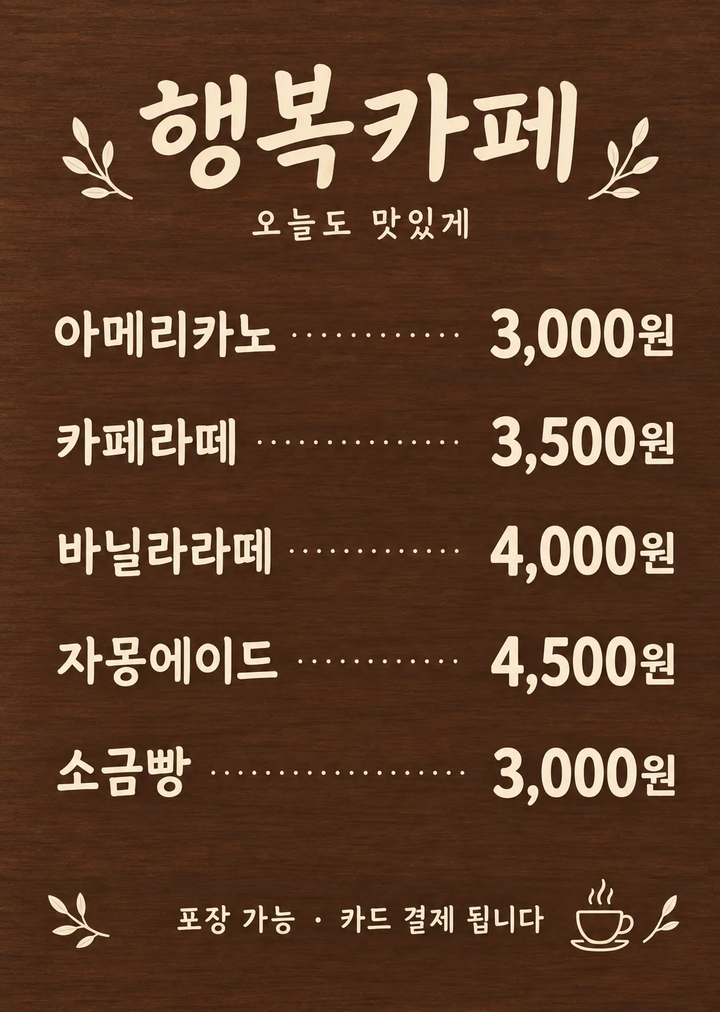
Create one finished Korean menu and price board for a small business owner, ready to print and display beside a checkout or entrance, or save as a shop announcement image. It must suit a cafe, snack shop, chicken shop, or hair salon according to the supplied entries. The customer must immediately understand which price belongs to which item. Price accuracy and legibility are the highest priorities. Deliver only the flat, complete artwork, without a wall, room, easel, frame, hand, or presentation mockup.

[Scene]
Build a single orderly board with a shop name at the top, an optional short subtitle beneath it, a spacious central menu list, and an optional footer. Keep the menu in one column of rows. Within each row, align the item name to the left and its price to the right on the same baseline. Connect them with a fine dotted leader, leaving clear gaps before and after the dots. All prices share one right edge. Use only the supplied entries, in their supplied order. If an optional entry is absent, close the gap and distribute the remaining rows evenly; never reserve an empty row or invent a replacement. This is a lettering-led design, not a food photograph. Small unlettered illustrative flourishes may occupy spare corners only when they do not compete with the list.

[Text layout]
Render these exact Korean strings, without the surrounding quotation marks. The percentages describe vertical zones; adapt the spacing to the requested aspect ratio while keeping all text inside approximately 7% safe margins. Paint the background through those margins to the canvas edges. Use the top 8-24% for the shop identity, the central 30-79% for the supplied rows, and the bottom 86-93% for any footer. When optional text is absent, rebalance the available space without adding a label.
At the top, center the shop name "【가게 이름】" in confident, clear Korean lettering.
Directly below the shop name, render "【맨 위 한마디】" as a smaller, quiet subtitle on its own line.
Menu row: "【메뉴 1】".
Menu row: "【메뉴 2】".
Menu row: "【메뉴 3】".
Menu row: "【메뉴 4】".
Menu row: "【메뉴 5】".
At the bottom, render "【맨 아래 안내】" as one clearly legible footer line.
For each supplied menu row, identify the final price amount and its Korean currency unit. Place that exact price at the right and the complete preceding item name at the left. Preserve any digits that belong to the item name. Replace only the separating space between name and price with the dotted leader layout. Never print row numbers, field labels, or the words used here to describe placement. Use consistent row spacing and matching type sizes across the whole menu. If an item name is long, widen its column or reduce the names consistently before reducing the price size; never crop or abbreviate the supplied wording.

[Style]
Use the following selected board treatment to determine both the background and lettering colors: "【판 느낌】".
Interpret only the chosen treatment. The warm wooden board uses a subdued wood-grain background with cream lettering; keep the wood dark enough for clear contrast. The black chalkboard uses a matte black background and white chalk lettering, with complete strokes and minimal chalk dust. The clean white paper uses a white background and deep gray lettering, with crisp Korean sans-serif type. The kraft brown paper uses a brown paper background and dark brown lettering, keeping the paper light enough for contrast. The modern dark metal uses a deep gray background with white lettering and restrained gold accents on fine rules or tiny decorative details. Do not turn price digits gold if this weakens their contrast. Cover the entire canvas edge to edge with the selected opaque material or base color. These five treatments correspond to the five choices in their listed order; never print a treatment name or a palette legend. Handwritten character may shape the headings, but price digits must remain simple and unambiguous.

[Visual hierarchy]
Make the prices the strongest and most reliable reading anchor, with bold, generously sized digits and a clearly visible currency unit. The shop name establishes identity at the top; item names remain large enough to match to their prices at a glance. The subtitle and footer are smaller and secondary. Dotted leaders should guide the eye quietly, never resemble decimal points inside a price, and never touch Korean strokes or digits. Keep the price column directly on the continuous background, without badges, boxes, or separate plates behind prices. Let the supplied row count determine the rhythm: three entries should look deliberately spacious, not unfinished; five entries should still have ample breathing room.

[Lighting and texture]
Use even, matte illumination with no perspective distortion. Wood grain, chalk texture, paper fibers, and metal finish should be subtle and subordinate to lettering. Keep texture especially quiet behind amounts and Korean syllables. Do not scratch, erase, distress, or break the strokes of any price. Maintain uniform contrast from the top to the bottom. The canvas must remain fully opaque and fully painted, including its corners, without blank strips outside the design.

[Text rules]
Copy every supplied item and amount exactly. Preserve every digit, comma, space within an item name, punctuation mark, and the currency unit "원"; never round, convert, recalculate, or substitute a price. Keep each amount paired with its original item. Render only the provided shop name, menu entries, and any provided subtitle or footer. Optional lines that are not supplied must disappear entirely, with no placeholder or guessed wording. Do not translate, paraphrase, duplicate, or add text. Check Korean consonants, vowels, and final consonants for intact strokes. Do not display braces, quotation marks enclosing inputs, instructions, or section headings. All visible lettering must be Korean, except the supplied price digits and the exact word "MENU" if it was supplied; retain punctuation needed by the supplied strings.

[Avoid]
Never invent an unlisted menu item or price, and never change any number. No food photographs; small original illustration ornaments are allowed only clear of the lettering. No real brand logos, trademarks, or the term "로켓". No original-price comparisons, crossed-out prices, or invented pre-discount prices. No neon, bloom, glowing edges, glare, lens flare, empty square placeholders, empty boxes, or decorations covering text. No non-Korean lettering except supplied price digits and supplied "MENU". No transparent background, unpainted canvas, or black letterbox bars; a selected black chalkboard must fill the whole canvas uniformly rather than sit inside black bars. No watermarks, signatures, extra captions, illegible digits, cropped currency units, rearranged price pairings, or additional rows.
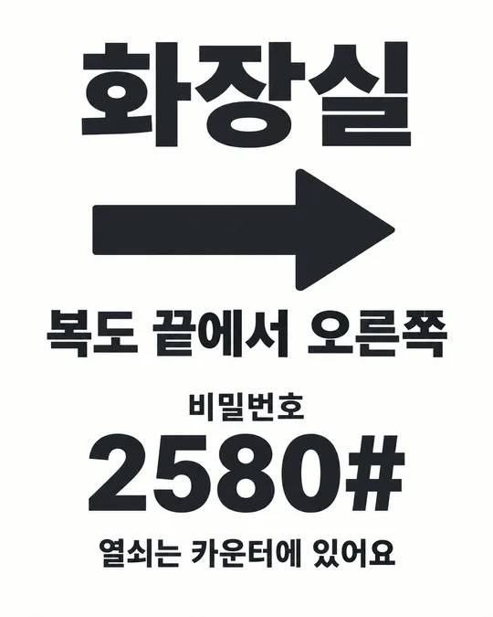
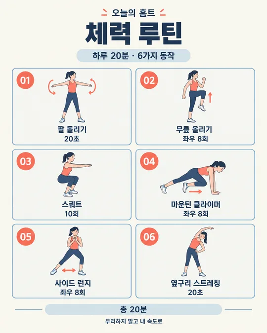
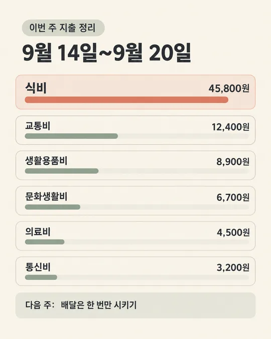
이 카드도 많이 사용해요
쓰는 법 · 자주 묻는 것
이런 때 쓰세요
계산대에서 같은 가격 질문을 자주 받거나, 새 메뉴를 종이에 써 붙이려는 사장님을 위한 카드예요. 카페 음료, 분식 메뉴, 치킨과 곁들임, 미용실 시술 가격을 세 가지부터 다섯 가지까지 한 장에 담아요. 이름은 왼쪽, 가격은 오른쪽에 놓고 점선으로 이어서 손님이 같은 줄을 따라 읽을 수 있게 만들어요.
A4로 뽑아 계산대 옆이나 출입문에 붙이고, 저장한 그림은 인스타 가게 소식에도 쓰세요. 배달앱 대표 사진으로 사용할 때는 해당 화면의 등록 조건과 잘리는 범위를 확인해 주세요. 종이 메뉴판은 가까이서 읽는 용도예요. 멀리서 봐야 하는 벽이라면 출력 크기와 글자 크기를 함께 키워 주세요.
칸 채우는 법
가게 이름을 바꾸고 메뉴 1~3에 각각 「메뉴 이름 가격원」 순서로 적으세요. 「아메리카노 3,000원」처럼 이름과 금액 사이를 띄우고 쉼표와 원까지 넣으면 돼요. 예시는 입력 모양을 보여 주는 값이니 우리 가게 금액으로 바꿔 주세요. 미용실도 같은 방식으로 시술 이름과 가격을 적으면 됩니다.
가격은 실제로 받는 가격만 적으세요. 원래 가격이나 할인 전 가격을 지어내 손님이 할인받는다고 오해하게 하면 표시광고법 문제가 됩니다. 이 카드는 현재 받는 가격만 안내해요. 거짓·과장 광고 금지 기준은 표시광고법 제3조에서 확인할 수 있어요.
메뉴 4와 메뉴 5는 필요 없으면 비우세요. 맨 위 한마디와 맨 아래 안내도 선택이에요. 비운 칸에 해당하는 줄은 프롬프트에서 빠지므로, 세 메뉴만 쓰는 가게에서도 빈 줄을 채울 필요가 없어요. 아래 안내에는 실제 포장 가능 여부나 정기 휴무처럼 확인된 내용만 적으세요.
판 느낌은 다섯 가지 중 하나를 고르면 돼요. 따뜻한 나무 칠판은 크림 글자, 검정 분필 칠판은 흰 글자, 흰 종이는 진한 회색 글자, 크래프트 종이는 진한 갈색 글자, 다크 메탈은 흰 글자와 금색 포인트로 구성돼요. 칸을 채운 뒤 프롬프트를 복사해 이미지 만들기가 가능한 GPT 대화에 붙여 넣으세요.
그림이 나오면 꼭 볼 것
가격 숫자를 하나씩 대조하세요. 입력한 금액과 그림 속 금액을 첫 메뉴부터 끝 메뉴까지 한 자리씩 맞춰 보세요. 숫자가 틀린 채로 붙이면 손님과 다툴 수 있어요. 쉼표와 「원」이 빠지지 않았는지, 옆 메뉴의 가격이 붙지 않았는지도 확인하세요.
가게 이름과 메뉴 철자, 점선이 연결되는 방향도 보세요. 비워 둔 메뉴가 새로 생기면 다시 고쳐야 해요. 출력 전에는 원본을 확대해 숫자 모양을 확인하고, 시험 출력 한 장을 실제 붙일 자리에서 읽어 보세요. 온라인에 올릴 때도 작은 화면에서 가격이 읽히는지 확인해 주세요.
틀린 곳 고치는 법
그림을 만든 대화에서 「둘째 메뉴 가격을 '3,500원'으로 고쳐 주세요. 메뉴 이름과 나머지 금액은 유지해 주세요」처럼 위치와 정확한 문구를 함께 말하세요. 점선이 글자에 붙었다면 「메뉴 이름과 점선 사이, 점선과 가격 사이 간격을 넓혀 주세요」라고 요청하세요. 수정하면서 다른 금액도 바뀔 수 있으니 새 그림의 가격을 전부 다시 대조하세요.
자주 묻는 것
- 메뉴가 10개인데요? 다섯 개씩 두 장으로 나누세요. 같은 판 느낌을 고르고 음료와 디저트처럼 묶으면 읽기 편해요. 한 칸에 여러 메뉴를 몰아넣으면 가격 짝이 흐트러질 수 있어요.
- 사진도 넣고 싶어요? 이 카드는 사진 없이 글자와 작은 일러스트 장식으로 만드는 메뉴판이에요. 음식 사진은 별도 소개 이미지로 두면 가격표의 글자 자리를 넉넉하게 쓸 수 있어요.
- 인쇄는 어디서 하나요? 원본 이미지를 저장해 가정용 프린터나 인쇄점에서 A4로 출력하세요. 인쇄점에는 「글자가 잘리지 않게 전체 그림을 넣어 주세요」라고 전하고, 대량 출력 전에 한 장을 확인하세요.
- 가격만 바꿔 다시 뽑으려면 어떻게 하나요? 저장해 둔 입력 내용에서 해당 금액을 고쳐 다시 복사하세요. 이전 그림과 함께 같은 대화에 보내며 배치와 색을 유지해 달라고 요청하고, 교체할 때 오래된 게시물과 매장 안내도 함께 확인하세요.
- 무료 GPT로도 되나요? 사용 중인 무료 계정에 이미지 만들기가 열려 있다면 보내 보세요. 이용 가능 여부와 남은 한도는 계정 화면의 안내를 확인해 주세요. 이 카드에 사진을 첨부할 필요는 없어요.