
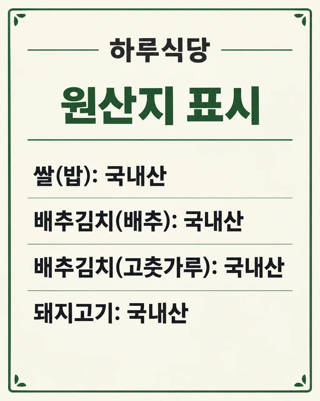
전체 · 인포그래픽/안내 · 매장 안내문
026원산지 표시판 만들기 — 음식점 · 카페 · 반찬가게
가게 이름과 확인한 품목별 원산지를 적으면, 입력한 줄만 그대로 담아 매장에 붙이는 원산지 표시판
칸 채우기
- 1칸을 채워요
- 2복사 버튼을 눌러요
- 3GPT 채팅창에 붙여넣어요
- 4제품·인물 사진을 쓰려면 사진과 프롬프트를 둘 다 넣은 뒤에 보내요 선택
프롬프트 원문 보기 7,268자
Generate this image now. Draw it directly - do not describe it, explain it, or ask questions.
Output size 2480x3508 pixels, A4 portrait, 300dpi, print-ready poster.

[Purpose]
Create one finished Korean country-of-origin notice board for a Korean shop owner, ready to print and display where customers can easily see it. This is a compliance-sensitive information board, not an advertisement. The owner has supplied the shop name and the complete origin statements after checking them. Accuracy is more important than decoration. Reproduce only those supplied statements, exactly as written, without researching, correcting, standardizing, completing, interpreting, or guessing any food item, ingredient, country, region, production method, punctuation mark, or legal requirement. Deliver only the flat, complete artwork. Do not show a wall, room, frame, clipboard, stand, hand, printer, storefront, or presentation mockup.

[Scene]
Design a calm, highly legible single-page notice with a clear title area and one vertical list. Use a restrained public-information layout suitable for a restaurant, cafe, food stall, butcher shop, or side-dish shop. Place the shop name at the top, followed by the fixed heading and then the supplied origin lines. Each non-empty source line must become exactly one visual row. Preserve the original order. The user may supply from one to eight lines. Adapt row height and spacing to the actual count: a short list should look intentionally spacious, while eight lines must remain comfortably readable. Do not create an empty row for a missing line. Do not split one supplied line into multiple entries, merge separate lines, alphabetize them, group them, add bullets that resemble text, or convert them into a table with invented columns. A thin rule may separate rows, but no decorative element may interrupt the reading path.

[Attached photo]
No attached photo is needed or expected. Do not invent food photographs, ingredient pictures, product packages, flags, maps, national emblems, certification seals, inspection marks, or shop logos. This must remain a lettering-led notice. If visual relief is necessary, use only tiny abstract line ornaments or a subtle border with no words and no national symbolism.

[Text layout]
Render these exact Korean strings without the surrounding quotation marks. Keep all lettering within approximately 7% safe margins and paint the background fully to every canvas edge. Use the top 7-18% for the shop identity, 20-29% for the fixed heading, and 33-91% for the supplied origin lines. Rebalance vertical spacing for the selected aspect ratio and actual number of lines without adding any content.
At the top, center the exact shop name "【가게 이름】" in clear Korean lettering.
Below it, render the fixed heading "원산지 표시" exactly once.
Below the heading, render the following owner-supplied multiline text exactly as entered:
"【품목과 원산지】"
Treat every line break in the supplied multiline text as a row boundary. Copy each non-empty line once and only once. Do not show the field names "가게 이름", "품목과 원산지", or "크기". Do not show instructions, braces, quotation marks, row numbers, sample values, placeholders, or labels such as "품목" and "원산지" unless the owner explicitly included those words in the supplied multiline text.

[Style]
Use a clean Korean public-notice aesthetic: a warm ivory or very pale neutral background, deep charcoal Korean type, one restrained dark green accent for the heading or thin rules, and a simple border. The style should feel trustworthy, orderly, and suitable for daily use in a real shop. Use crisp modern Korean sans-serif lettering. Avoid rustic handwriting because similar Korean syllables and country names must remain unmistakable. Keep the background quiet and opaque. Decorative details must be minimal, original, unbranded, and outside all text zones. The same treatment should work when printed on an ordinary office printer in color or grayscale.

[Visual hierarchy]
Make "원산지 표시" the strongest heading, with the shop name clearly visible but secondary. Make every supplied origin row large enough to read at a glance and give all rows equal importance; never emphasize one country or item over another. Use consistent alignment, line height, weight, and spacing across the list. Preserve punctuation such as colons, parentheses, commas, slashes, hyphens, and spaces exactly where the owner typed them. If a line is long, reduce all origin-row text slightly and consistently before changing margins. Never crop, abbreviate, wrap only the country name away from its item, or shrink a single row disproportionately. Ensure the list remains the visual center of the page.

[Lighting and texture]
Use flat, even, matte presentation with no perspective distortion, cast shadows, glare, bloom, neon, or spotlight effects. Any paper grain must be extremely subtle and must not pass through or weaken Korean strokes. Maintain strong contrast across the entire notice. The full canvas must be painted edge to edge without transparent corners, blank outer strips, letterboxing, or a photographed sheet floating on another background. Fine rules and the border must reproduce cleanly at the chosen print size.

[Text rules]
The owner-supplied multiline text is authoritative input for artwork transcription only. Copy it character for character and line for line. Do not verify it from memory, infer a missing origin, replace a country name, normalize terminology, correct spelling, add a parent ingredient, expand an abbreviation, translate text, or append legal wording. Never invent commonly used examples such as rice, kimchi, beef, pork, chicken, squid, or fish unless that exact wording appears in the supplied text. Never add "국내산", "수입산", a country, a percentage, a farm, a region, or a certification. Never change punctuation or rearrange item-origin pairings. Render only the exact shop name, the fixed heading "원산지 표시", and the non-empty lines supplied in "【품목과 원산지】". Check every Korean consonant, vowel, final consonant, digit, and punctuation mark for complete, legible strokes. If the supplied input contains fewer than eight lines, stop after the final supplied line. If it contains blank lines, omit those blank rows without replacing them. If it contains more than eight non-empty lines, do not invent a condensed ninth row or silently omit content; prioritize the first eight supplied non-empty lines because this card is designed for a maximum of eight.

[Avoid]
No invented or suggested origin information. No automatic corrections. No legal claims such as "법적 기준 충족", "인증", "검증 완료", or "안심". No flags, maps, national icons, government seals, certification marks, QR codes, barcodes, logos, delivery-app marks, brand names, trademarks, mascots, characters, celebrities, song lyrics, watermarks, signatures, or contact details. No food glamour photography, plates, ingredients, packages, price tags, menus, discounts, health claims, nutrition claims, or promotional slogans. No extra title, subtitle, footer, note, date, phone number, address, website, social handle, or fabricated disclaimer inside the image. No neon, glow, gradients behind text, distressed lettering, torn paper, chalk dust, empty square glyphs, illegible Hangul, cropped rows, duplicated rows, changed order, extra rows, or visible prompt syntax.
이 카드도 많이 사용해요
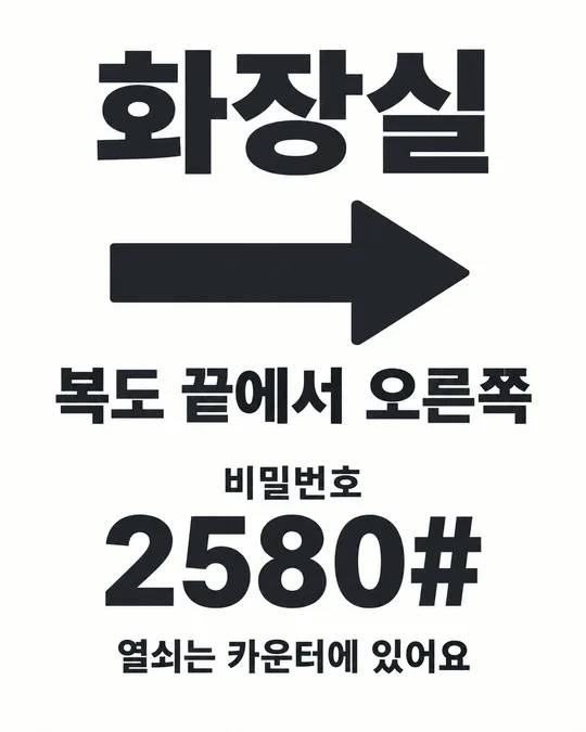
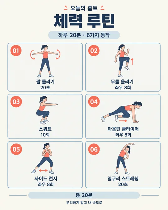
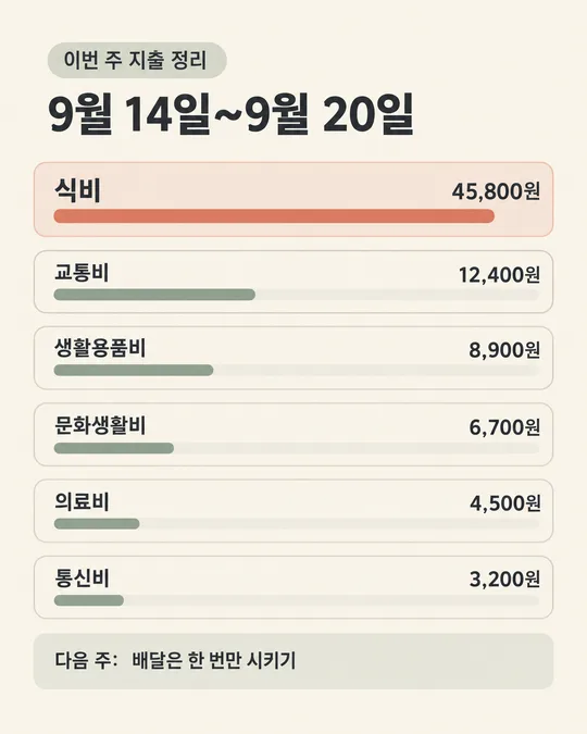
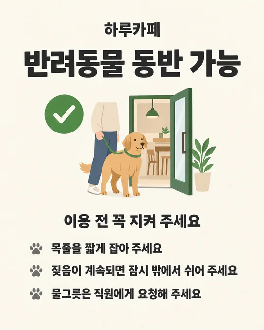
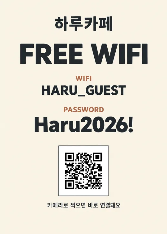
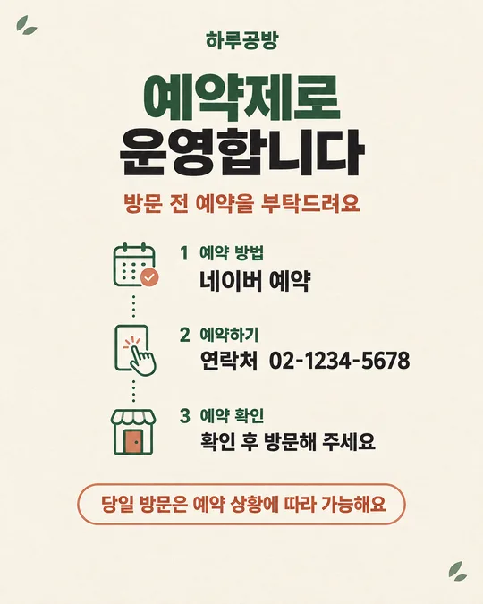
쓰는 법 · 자주 묻는 것
이런 때 쓰세요
음식점, 카페, 반찬가게처럼 손님이 원산지 정보를 확인해야 하는 매장에서 쓰는 인쇄용 안내 카드예요. 가게 이름과 사장님이 직접 확인한 「품목: 원산지」 내용을 넣으면, 한 줄에 하나씩 정돈한 표시판을 만들어요. 원산지가 바뀌거나 취급 품목이 달라졌을 때도 입력만 고쳐 다시 만들 수 있어요.
이 카드는 원산지를 찾아 주거나 판단해 주는 도구가 아니에요. 표시 의무와 내용은 사장님이 확인해야 합니다. 업종, 음식, 재료와 판매 방식에 따라 적어야 할 대상과 표현이 달라질 수 있으니 관할 기관의 최신 안내나 전문가에게 확인한 내용을 입력해 주세요.
칸 채우는 법
가게 이름에는 실제 매장명을 적으세요. 「품목과 원산지」에는 확인을 마친 문구만 넣고, 품목 하나마다 줄을 바꾸세요. 최대 여덟 줄까지 쓰는 카드예요. 예를 들어 김치의 원재료를 나누어 표시해야 한다고 확인했다면, 확인한 문구를 각각 별도 줄에 그대로 적으세요. 보기에 있는 내용은 입력 모양을 보여 주는 예일 뿐이며, 우리 가게의 사실로 간주하면 안 됩니다.
크기는 붙일 자리에 맞춰 고르세요. 매장 안에서 인쇄해 붙일 때는 A4가 무난하고, 화면이나 SNS에도 함께 올릴 때는 해당 화면에 맞는 비율을 선택할 수 있어요. 입력이 길수록 세로형 크기가 읽기 편합니다. 칸을 채운 뒤 프롬프트를 복사해 이미지 만들기가 가능한 GPT 대화에 붙여 넣으세요.
우리 제품·인물 사진을 넣고 싶을 때
이 안내문에는 제품 사진이나 인물 사진을 넣지 않는 편이 안전하고 읽기 쉬워요. 사진, 국기, 지도, 인증 마크가 들어가면 품목과 원산지 글자보다 눈에 띄거나 사실과 다른 의미를 줄 수 있어요. 가게 사진이나 음식 사진은 별도 홍보물에 사용하고, 이 표시판은 확인된 글자만 담는 용도로 유지하세요.
그림이 나오면 꼭 볼 것
완성 그림을 바로 붙이지 말고 입력한 원문과 한 글자씩 대조하세요. 품목과 원산지의 짝, 줄 순서, 괄호 안 재료명, 콜론과 쉼표, 국가명, 「산」 글자가 모두 같은지 보세요. 입력하지 않은 품목이나 원산지가 생기지 않았는지도 확인해야 해요. AI가 자연스럽게 보이도록 내용을 고쳐 썼더라도 틀린 결과이므로 사용하면 안 됩니다.
여덟 줄이 모두 들어갔는지, 긴 줄의 끝이 잘리지 않았는지, 작은 글자도 실제 붙일 거리에서 읽히는지 시험 출력으로 확인하세요. 원산지 정보가 바뀌면 예전 표시판을 계속 두지 말고 새 내용으로 교체하세요.
틀린 곳 고치는 법
그림을 만든 같은 대화에서 「셋째 줄을 '배추김치(고춧가루): 국내산'으로 정확히 고치고 다른 글자는 그대로 유지해 주세요」처럼 위치와 올바른 전체 문장을 함께 말하세요. 없는 줄이 추가됐다면 그 문장을 정확히 지목해 삭제해 달라고 하세요. 수정 뒤에는 고친 줄만 보지 말고 가게 이름부터 마지막 줄까지 다시 대조하세요. 다른 글자가 함께 바뀔 수 있기 때문이에요.
자주 묻는 것
- 어떤 품목을 표시해야 하나요? 이 카드는 법적 대상을 정하지 않아요. 우리 매장에 적용되는 표시 대상과 작성법을 최신 공식 안내나 관할 기관에 확인한 뒤, 확정한 문구만 입력하세요.
- 원산지를 모르면 보기에 있는 내용을 써도 되나요? 안 됩니다. 보기는 줄을 채우는 모양을 보여 주는 예시예요. 거래명세서, 납품 정보 등으로 확인한 실제 내용만 적으세요.
- 아홉 품목 이상이면 어떻게 하나요? 이 카드는 최대 여덟 줄이에요. 임의로 빼지 말고 필요한 표시 내용을 확인한 뒤 두 장으로 나누거나 더 큰 별도 양식을 사용하세요.
- 그림이 맞춤법을 고쳐 줬는데 써도 되나요? 먼저 그 수정이 법적으로나 사실상 맞는지 직접 확인해야 해요. 확인 전에는 사용하지 말고, 확정된 원문과 완전히 같은 결과만 출력하세요.
- 무료 GPT로도 만들 수 있나요? 사용 중인 계정에 이미지 만들기가 열려 있다면 시도할 수 있어요. 이용 가능 여부와 한도는 계정 화면에서 확인하고, 결과의 한글과 원산지는 반드시 직접 대조하세요.