
전체 · SNS/카드뉴스 · 밈·공감
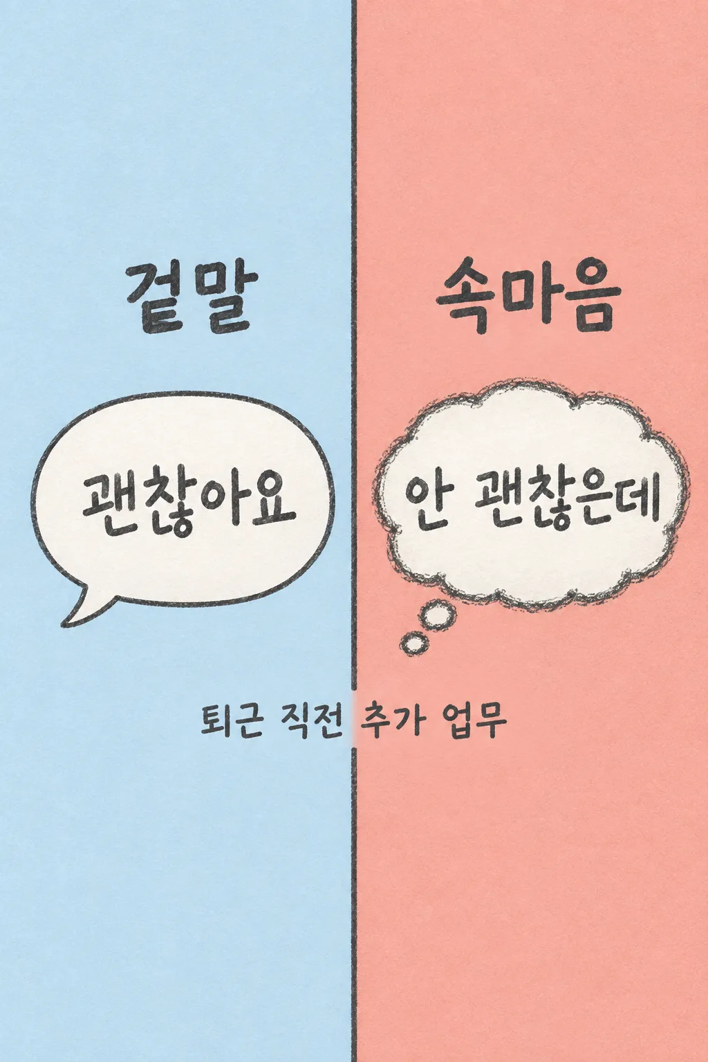
192겉말과 속마음
직장인·학생이 한 상황의 겉말과 속마음을 좌우 한 장으로 만들어 스레드·스토리에 올려요.
칸 채우기
- 1칸을 채워요
- 2복사 버튼을 눌러요
- 3GPT 채팅창에 붙여넣어요
- 4제품·인물 사진을 쓰려면 사진과 프롬프트를 둘 다 넣은 뒤에 보내요 선택
프롬프트 원문 보기 4,110자
Generate this image now. Draw it directly - do not describe it, explain it, or ask questions.
Output one landscape A3 poster, 420 x 297 mm, aspect ratio 1.414:1. Use the largest supported image resolution. Final print target is 4961x3508 pixels at 300dpi; keep all lettering at least 10 mm inside every paper edge. Preserve the wide composition and print-safe margins.

[Purpose]
Make one finished two-column social meme comparing words spoken aloud with a private thought in the same everyday situation. It is a single graphic, not a story sequence, comic strip or screenshot of an app.
[Scene]
Read the supplied situation "【상황】". Spoken-copy input is "【겉말】". Private-thought input is "【속마음】". If either copy input equals "알아서 골라줘", invent one short original line for that side, at most twelve Korean syllable blocks, as a fictional caption suggested by the situation. Otherwise print the user's exact words. Do not claim the generated line is a documented quote or describe anyone else's behavior. Keep the joke relatable rather than insulting a named person.
[Attached photo]
No photo is needed. Draw no person. The left side contains one clean speech bubble, and the right side one roughly pencil-drawn thought bubble with two connected small thought circles. The bubbles are graphic containers, not separate images.
[Text layout]
Split the entire canvas into equal LEFT ice-blue and RIGHT muted-coral halves, with one charcoal vertical divider. Exact headings "겉말" and "속마음" appear at y25-31% in their respective halves. Large spoken and private words appear inside their bubbles at y40-59%,up to three short lines per side, never crossing the divider. The exact context is printed once at y74-79%, centered across both halves on the background with no box. Keep top22% and bottom18% completely empty. All essential ink is between y25-80%.
[Style]
Fixed flat editorial graphic with graphite pencil letterforms, warm off-white bubble interiors, clean speech contour on the left and scratchy thought contour on the right. Slight paper grain. No character portrait, emoji collage, diagnosis gauge or additional panels.
[Visual hierarchy]
The two short messages are equally large and dominant. Column labels are secondary but instantly readable. Context is a single smaller readable line. Never add a generic meme title above the two labels.
[Lighting and texture]
Flat matte ink, soft paper texture and no3D lighting. Words remain dark and legible. Distinguish the clean contour from the scribbled contour without changing the layout.

[Text rules]
Use only the requested visible copy in the target language. Resolve an automatic-copy instruction into an original short line; never print the instruction itself. Preserve user-supplied names, spelling, numbers and punctuation. Input labels, section headings and placeholders are not visible copy. Every optional field stays on its own instruction line so that leaving it empty removes only that item. Never add a date, price, discount, quantity, prize, origin, business condition, scientific statistic or claim about a real person that the user did not provide. Personal inputs affect content only; keep this one art medium, one layout and one finished result type.

[Avoid and delivery]
Return exactly ONE complete raster image directly. All requested elements belong on the same canvas. Do not run code, provide an explanation instead of an image, create separate panels as separate files, require another message, offer variants, or ask the user to cut and assemble anything. No device mockup, promotional wrapper, brand logo, packaging imitation, existing fictional character, artist signature, celebrity or watermark. Finish the selected canvas edge to edge. Maintain the fixed composition when the selected aspect ratio changes by adapting spacing, without cutting important parts or adding a second result.

[Legibility]
Keep essential lettering inside x7-93% and y14-84% of the image. The upper12% and lower15% contain no important text. At a1024x1536 cover, all essential ink is below y215 and above y1290. Use clearly connected natural letters, comfortable spacing and strong contrast. Do not let faces, decorative marks, food highlights or shadows obscure the words. Large lettering must still identify this result in a three-column list. Handwritten copy is legible pencil handwriting, never tiny ornamental cursive.
이 카드도 많이 사용해요
쓰는 법 · 자주 묻는 것
입으로 한 말과 마음속 답장
한 상황에서 밖으로는 웃으며 말하고 마음속으로는 다른 답장을 떠올릴 때 쓰는 공유 카드입니다. 왼쪽에는 반듯한 말풍선, 오른쪽에는 연필로 조금 거칠게 그린 생각풍선이 나옵니다. 두 문장이 같은 크기로 나란히 보여서 긴 설명 없이 차이가 읽힙니다. 출근, 단체 채팅, 약속이나 발표처럼 친구들도 겪어 봤을 상황을 스레드나 인스타 스토리에 올려 보세요. 여러 컷으로 사건을 이어 가는 만화는 아닙니다.
상황은 한 가지로 적어요
상황 칸에는 두 말이 갈라지는 순간을 짧게 적으세요. 업무 내용을 길게 붙이거나 특정 동료의 이름을 적지 않아도 됩니다. 퇴근 직전 추가 업무처럼 한눈에 이해되는 단서가 좋습니다. 겉말과 속마음은 따로 입력하므로 두 문장을 한 칸에 몰아넣지 않습니다. 표지처럼 짧은 말일수록 작은 목록에서도 잘 읽힙니다.
문장이 떠오르지 않으면
겉말과 속마음 각각 알아서 골라줘를 선택할 수 있습니다. GPT가 상황에 어울리는 짧은 창작 문구를 제안해 그림 안에 넣습니다. 자동으로 만든 문장은 실제로 누가 한 말이라는 증거가 아닙니다. 자신의 말을 그대로 쓰고 싶으면 두 칸에 직접 적으세요. 다른 사람을 특정해 비난하는 문구 대신 자기 기분을 표현하면 공유하기에도 편합니다. 자동 선택이라는 글자 자체는 그림에 찍히지 않습니다.
한 번에 완성된 비교 그림
사진을 준비할 필요가 없습니다. 세 칸을 채우고 프롬프트를 복사해 GPT에 한 번 붙여넣어 보내세요. 두 풍선과 두 문장, 상황 한 줄을 한 화면 안에 직접 그립니다. 왼쪽과 오른쪽을 따로 받거나 이미지를 잘라 붙이는 단계가 없습니다. 연한 파랑과 차분한 산호색, 연필 글씨, 좌우 나눔은 고정되어 문구를 바꾸어도 같은 모양을 유지합니다.
좌우가 바뀌지 않았는지
왼쪽 겉말에 마음속 답장이 들어가지 않았는지 먼저 보세요. 두 문장이 경계선을 넘어 서로 섞이거나 같은 문장이 두 번 나오는지도 확인합니다. 상황은 아래에 한 번만 나오고, 입력 칸 이름이나 예시 목록이 더 붙으면 안 됩니다. 풍선은 장식이고 글자가 주인공입니다. 작은 사람 그림, 가짜 SNS 인터페이스나 임의의 멘탈 점수는 필요하지 않습니다.
글자가 길어지면 줄여요
문장이 너무 작게 나오면 말투를 바꾸기보다 불필요한 부분을 덜어 짧은 답장으로 적어 보세요. 잘못 쓴 글자는 왼쪽 또는 오른쪽을 지정하고 바꿀 문장을 정확히 요청합니다. 정상 결과는 첫 요청의 한 장으로 끝나며 보완 요청은 글자나 배치가 실패했을 때만 필요합니다.
자주 묻는 것
- 사진도 넣어야 하나요? 아니요. 문구만으로 완성되는 좌우 비교 카드입니다.
- 자동 문구가 실제 발언인가요? 아니요. 입력한 상황을 바탕으로 만든 창작 문구입니다.
- 그림체를 고를 수 있나요? 연필 글씨와 두 풍선 배치로 고정되어 있습니다.
- 무료 GPT에서 시험했나요? 표지는 지정 이미지 API로 확인했고 무료 GPT 화면의 실생성은 시험하지 않았습니다.