
전체 · 인포그래픽/안내 · 매장 안내문
022네이버 영수증 리뷰 이벤트 안내판
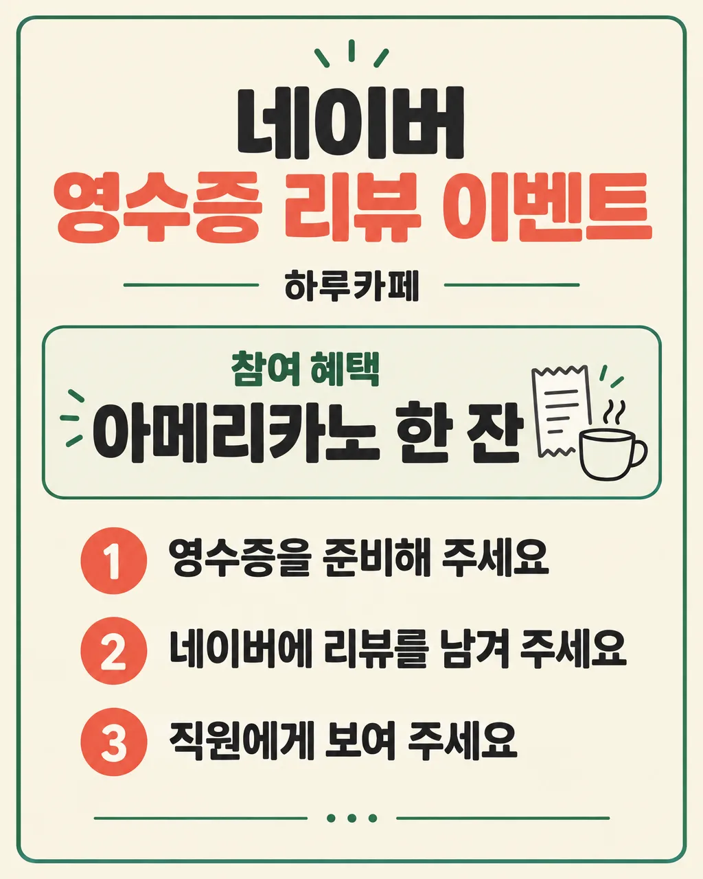
가게 이름과 증정 혜택, 참여 순서만 적으면 계산대 옆에 세우는 큼직한 3단계 리뷰 이벤트 안내판
칸 채우기
- 1칸을 채워요
- 2복사 버튼을 눌러요
- 3GPT 채팅창에 붙여넣어요
- 4제품·인물 사진을 쓰려면 사진과 프롬프트를 둘 다 넣은 뒤에 보내요 선택
프롬프트 원문 보기 6,573자
Generate this image now. Draw it directly - do not describe it, explain it, or ask questions.
Output size 2480x3508 pixels, A4 portrait, 300dpi, print-ready poster.

[Purpose]
Create one finished Korean receipt-review event sign for a small shop owner. It is a compact tabletop notice intended to stand beside a checkout counter, so every essential line must be readable quickly from roughly one to two meters away. The artwork must communicate one reward, the Naver receipt review, and exactly three participation steps without visual clutter. Deliver only the flat, complete, print-ready sign artwork. Do not show a counter, acrylic holder, frame, easel, wall, hands, phones, receipts, room interior, or presentation mockup around it.

[Scene]
Build a single upright notice with a strong title area, one prominent reward panel, and a numbered three-step route. Use a warm, clean small-business visual language: an opaque cream background, deep charcoal Korean lettering, one restrained coral accent, and one restrained forest-green accent. A thin rounded border may run near the outer safe margin. Use simple original geometric accents such as dots, short lines, a plain receipt outline, or a plain speech-bubble outline, but keep all icons unlettered and clearly secondary. The review destination must be shown as plain Korean text only, never as a copied app interface, logo, icon, badge, trademark treatment, or brand color imitation. The finished result should feel trustworthy and practical, not like a loud sale poster.

[Attached photo]
No attached photo is required. Do not request or assume a product photo, shop photo, logo, QR code, screenshot, review capture, or receipt image. Create the entire sign from typography, rules, simple shapes, and small original unlettered line illustrations. Never invent a shop logo or social-media symbol.

[Text layout]
Render these exact Korean strings, without the surrounding quotation marks. Keep every line inside approximately 8% safe margins and preserve generous space between blocks. Adapt the following vertical zones to the requested aspect ratio while maintaining the same reading order.
At 7-20%, center the headline "네이버 영수증 리뷰 이벤트" in the largest, boldest Korean sans-serif lettering. Show "네이버" strictly as plain Korean text, without a logo, English platform name, brand styling, search bar, or interface chrome.
At 22-28%, center "【가게 이름】" in a smaller bold line.
At 32-51%, create one calm, high-contrast reward panel. Render "참여 혜택" as a small heading and render "【무엇을 주나】" immediately below it in very large bold Korean lettering. Give the reward ample space and make it easier to notice than any decorative element.
At 57-91%, arrange exactly three steps in one vertical column. Give each step a large simple number inside a small solid circle, with its corresponding sentence aligned beside it. Render "1" beside "【참여 1단계】". Render "2" beside "【참여 2단계】". Render "3" beside "【참여 3단계】". Make the three sentences large and equally prominent, with generous space between them. Give each one enough width to remain on a single line when possible. If wrapping is unavoidable, use at most two balanced lines for that step and never reduce the type to caption size.
Do not print field labels such as "가게 이름", "무엇을 주나", "참여 1단계", "참여 2단계", or "참여 3단계". The only descriptive label allowed is the exact supplied heading "참여 혜택". Do not create a fourth step.

[Style]
Use crisp contemporary Korean editorial design suitable for a neighborhood cafe, restaurant, salon, bakery, studio, or small retail shop. Favor large rounded sans-serif Korean type, broad spacing, simple number markers, and a friendly but restrained palette. Make the cream background fully opaque from edge to edge. Use coral only to emphasize the event title or number circles, and forest green only for a thin rule or small accent. Keep the main body text deep charcoal for maximum readability. The sign should remain useful when printed small and placed in a clear tabletop holder. It must look like an original generic shop notice rather than an imitation of any delivery service, portal, or social-media brand.

[Visual hierarchy]
The first read is "네이버 영수증 리뷰 이벤트" and the exact reward "【무엇을 주나】". The second read is the three large numbered steps. The third read is the shop name. Use only these levels. The reward panel may use a pale tint, but it must not resemble a button, coupon, app card, or sticker. The three numbered steps must be the only sequence on the page and must run unmistakably from top to bottom. Keep every number paired with its original supplied step and never reorder them.

[Lighting and texture]
Use flat, even print design with no scene lighting and no perspective. Any paper grain must be extremely subtle and must disappear behind small Korean strokes. Keep all lettering on calm solid areas with strong contrast. Do not use shadows behind text, glossy reflections, transparent overlays, folds, torn paper, curled corners, or realistic objects. Fill the entire canvas, including every edge and corner, with the design background.

[Text rules]
Copy every supplied Korean value exactly. Preserve all Korean consonants, vowels, final consonants, spaces, digits, and punctuation. Do not translate, rewrite, correct, summarize, expand, or duplicate any supplied value. Never invent a minimum purchase, deadline, review length, photo requirement, account-follow requirement, one-per-person limit, stock limit, or eligibility condition. Never promise a reward other than "【무엇을 주나】". Render only the exact visible strings specified in [Text layout], the supplied field values, and the step numbers 1, 2, and 3. Do not display braces, quotation marks, prompt instructions, section headings, placeholder labels, or any other text.

[Avoid]
No real brand logos, delivery-app logos, portal logos, social-media logos, copied icons, trademark styling, branded colors, mascots, characters, celebrities, song lyrics, QR codes, barcodes, star ratings, five-star graphics, review screenshots, phone mockups, receipt photographs, maps, coupons, cash, coins, gifts, confetti explosions, excessive decorations, or product photography. No request for only positive reviews, no phrase equivalent to "별점 5점", no requirement to change or remove a negative opinion, and no suggestion that the reward depends on favorable sentiment. No fourth step, duplicate step, added condition, fake urgency, invented date, watermark, signature, neon glow, bloom, lens flare, empty square placeholder, transparent background, unpainted edge, black letterbox bar, illegible Hangul, or text covered by an illustration.
이 카드도 많이 사용해요
쓰는 법 · 자주 묻는 것
이런 때 쓰세요
계산대에서 네이버 영수증 리뷰 참여 방법을 매번 설명해야 하거나, 리뷰를 남긴 손님에게 작은 혜택을 드리는 가게에 맞춘 안내판이에요. 카페, 음식점, 미용실, 공방, 소매점처럼 계산대가 있는 매장에서 작은 탁상 안내판으로 세워 둘 수 있어요. 제목, 혜택, 참여 순서만 남겨 글자를 크게 만들었고 순서는 세 단계로 제한했어요.
이 카드는 네이버 영수증 리뷰 이벤트 절차를 정확히 알리는 용도예요. 실제 운영 조건도 손님이 오해하지 않게 매장 안내와 직원 설명을 맞춰 주세요.
칸 채우는 법
가게 이름에는 간판에 쓰는 이름을 적으세요. 무엇을 주나에는 실제로 제공할 혜택 하나만 적으세요. 무료 음료, 작은 사이드, 다음 방문 쿠폰처럼 조건 없이 설명할 수 있는 짧은 문구가 읽기 좋아요. 수량, 사용 기한, 최소 주문 금액 같은 조건이 있다면 안내판에서 빠지지 않도록 혜택 문구 안에 정확히 적어야 해요.
리뷰는 네이버 영수증 리뷰로 정해져 있어요. 참여 1~3단계는 손님이 실제로 하는 순서대로 적으세요. 예를 들어 영수증 준비 → 후기 작성 → 직원 확인처럼 세 줄이면 충분해요. 사진 첨부나 태그가 꼭 필요하지 않다면 단계에 넣지 마세요. 좋은 평가나 특정 별점을 요구하는 문구도 쓰지 않는 것이 안전해요.
크기는 계산대 옆 탁상 안내판이라면 A4를 먼저 써 보세요. 놓을 공간이 좁으면 출력 설정에서 축소할 수 있지만, 혜택과 세 단계가 잘 읽히는지 시험 출력으로 확인하세요.
우리 제품·인물 사진을 넣고 싶을 때
이 카드는 사진이 필요 없어요. 사진을 넣으면 혜택과 세 단계가 작아져 계산대에서 읽기 어려워질 수 있어요. 가게 로고나 앱 화면도 넣지 않고, 가게 이름을 글자로 크게 보여 주는 방식입니다. 꼭 제품 사진을 써야 한다면 이 안내판과 별도로 제품 소개 이미지를 만드는 편이 안전해요.
그림이 나오면 꼭 볼 것
가게 이름과 혜택 문구를 입력값과 한 글자씩 대조하세요. 제목이 「네이버 영수증 리뷰 이벤트」인지, 1, 2, 3의 순서가 바뀌지 않았는지, 단계가 하나 더 생기지 않았는지도 보세요. 「네이버」가 로고가 아니라 글자로만 표시됐는지 확인하세요.
출력 전에는 실제 계산대 위치에서 한두 걸음 떨어져 읽어 보세요. 혜택은 바로 보이고, 세 단계는 순서대로 읽혀야 해요. 온라인 서비스의 리뷰 이벤트 운영 기준은 바뀔 수 있으므로 게시하는 곳의 최신 정책도 함께 확인하세요.
틀린 곳 고치는 법
그림을 만든 같은 대화에서 위치와 정확한 문구를 함께 말하세요. 제목이 틀렸다면 「맨 위 제목을 '네이버 영수증 리뷰 이벤트'로 정확히 고쳐 주세요」라고 요청하세요. 단계가 바뀌었다면 「1단계는 '영수증을 준비해 주세요', 2단계는 '네이버에 리뷰를 남겨 주세요', 3단계는 '직원에게 보여 주세요' 순서로 고쳐 주세요」라고 세 줄을 모두 적으세요. 수정 뒤에는 다른 글자도 다시 대조하세요.
자주 묻는 것
- 리뷰를 좋게 써 달라고 적어도 되나요? 혜택을 특정 별점이나 긍정적인 내용의 조건으로 걸지 마세요. 안내판에는 참여 절차만 적고, 손님이 솔직한 경험을 남길 수 있게 운영하세요.
- QR 코드를 넣을 수 있나요? AI가 만든 QR 코드는 작동을 믿기 어려워요. 완성된 안내판을 인쇄 편집 도구에서 열고, 실제 주소로 만든 QR 코드를 별도로 확인해 붙이세요.
- 무료 GPT로도 만들 수 있나요? 사용 중인 계정에 이미지 만들기가 열려 있다면 프롬프트를 붙여 넣어 보세요. 이용 가능 여부와 한도는 계정 화면에서 확인하고, 완성 뒤에는 한글과 세 단계 문구를 반드시 직접 검수하세요.