
칸 채우기
- 1칸을 채워요
- 2복사 버튼을 눌러요
- 3GPT 채팅창에 붙여넣어요
- 4제품·인물 사진을 쓰려면 사진과 프롬프트를 둘 다 넣은 뒤에 보내요 선택
프롬프트 원문 보기 6,510자
Generate this image now. Draw it directly - do not describe it, explain it, or ask questions.
Output size 2480x3508 pixels, A4 portrait, 300dpi, print-ready poster.

[Purpose]
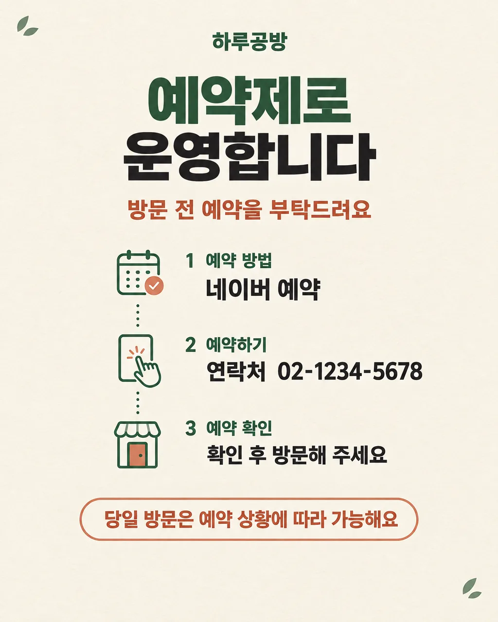
Create a finished Korean reservation-only operation notice for the shop "【가게 이름】". The same design must work in two real places: printed as an A4 notice on the entrance door and posted as a 4:5 image in the shop's Naver Place news. A passerby should understand within three seconds that advance booking is recommended, how to book, where to contact the shop, and whether a same-day walk-in may be accepted. This is not an advertisement and not a decorative social post; it is a practical customer instruction card whose exact Korean information is the main subject.

[Scene]
Use a warm ivory paper-colored background with a restrained forest-green and muted terracotta palette. Build a clean vertical information path using four simple, original line icons: a small calendar with a check mark for booking, a hand tapping a neutral rectangular screen for the selected booking method, a simple storefront door for visiting, and a speech bubble with a check mark for confirmation. Connect these icons with one thin dotted path that moves downward, making the order understandable without extra words. The icons must be generic and original: do not reproduce the Naver logo, Instagram logo, any app interface, trademark, brand color system, mascot, or recognizable commercial symbol. Add a very subtle paper grain and two or three tiny leaf-shaped accents only in unused corners. Keep the central information area calm, spacious, and highly legible. Do not place any illustration, texture, or connector behind letters.

[Attached photo]
If a photo is attached with this prompt, do not use it. This card does not need a product, portrait, storefront, logo, or reference photo. Create the notice only from the exact fields and layout instructions here. Never copy branding, characters, signage, or app graphics that may appear in an attached image.

[Text layout] top to bottom, as % of canvas height. Render these exact Korean strings:
- 5-9%: "【가게 이름】" - small bold Korean sans-serif, forest green, centered
- 12-23%: two-line title, line 1 "예약제로", line 2 "운영합니다" - very large heavy Korean sans-serif, near-black, centered; both lines aligned as one compact block, with "예약제로" in forest green and "운영합니다" in near-black
- 27-32%: "방문 전 예약을 부탁드려요" - medium bold Korean sans-serif, muted terracotta, centered
- 36-44%: "1  예약 방법" - bold Korean sans-serif, forest green, followed directly below by "【예약 방법】" in larger near-black heavy Korean sans-serif
- 48-56%: "2  예약하기" - bold Korean sans-serif, forest green, followed directly below by "연락처  【연락처】" in larger near-black heavy Korean sans-serif
- 60-68%: "3  예약 확인" - bold Korean sans-serif, forest green, followed directly below by "확인 후 방문해 주세요" in medium near-black Korean sans-serif
- 73-82%: "【당일 방문 가능 여부】" - one highly visible line of heavy Korean sans-serif inside a simple rounded terracotta outline badge with an ivory interior; this badge is the only outlined container in the design
- 84-100%: leave calm empty ivory space with no text

[Style]
A polished Korean small-business information card with the visual discipline of a modern public-service infographic. Use flat vector shapes, crisp geometric line icons, generous margins, and strong editorial spacing. The mood is warm, considerate, and trustworthy rather than strict or corporate. The background is warm ivory; primary text is near-black; forest green organizes headings and steps; muted terracotta highlights the request and the same-day visit status. Use only Korean sans-serif type, with heavy weight for the operational facts and medium weight for supporting instructions. Keep all corners gently rounded and all strokes consistent. For A4, preserve comfortable print margins of at least 7% on every edge. For 4:5, keep every text line and essential icon within the central safe area so the card remains readable in a Naver Place feed preview.

[Visual hierarchy]
First read: "예약제로 운영합니다". Second read: "【예약 방법】" and "연락처  【연락처】". Third read: "【당일 방문 가능 여부】". Fourth read: the three numbered step labels and the polite supporting messages. The title must occupy the strongest visual weight but must not crowd the shop name. The selected reservation method must be as easy to find as the contact information. The same-day status badge should be visually isolated with generous empty space above and below, not enlarged so much that it competes with the title. The four generic icons and dotted path support scanning but remain lighter and smaller than every essential text line.

[Lighting and texture]
Use flat, even print-style color with no dramatic lighting. Apply only a faint natural paper texture across the ivory background, subtle enough that small Korean strokes remain perfectly clean. Icons may have a tiny amount of soft dimensional shading, but there must be no glow, glossy app-like surface, metallic effect, realistic shadow, photographic depth, or luminous gradient. Maintain high contrast under indoor shop lighting and on a phone screen.

[Text rules]
Render only the Korean text inside the double quotes above, plus the field values inserted inside those quoted strings and the digits 1, 2, and 3. Do not change, shorten, paraphrase, repeat, or omit any character. Reproduce "【가게 이름】", "【예약 방법】", "【연락처】", and "【당일 방문 가능 여부】" exactly as entered, including spaces, digits, hyphens, and Korean letters. Do not add English, fake interface labels, QR codes, URLs, hours, dates, prices, slogans, small-print disclaimers, or unrequested booking instructions. Draw every Korean syllable with complete, clean strokes. All text must remain horizontal, sharply legible, and safely separated from icons and canvas edges.

[Avoid]
misspelled or broken Korean; changed phone digits or hyphens; omitted booking method; altered same-day visit policy; duplicated phrases; extra text; English words; fake tiny writing; QR codes; calendars containing dates or numbers; tables; dense flowcharts; more than three numbered steps; logos; brand marks; the Naver wordmark or green N symbol; the Instagram glyph or gradient; delivery-app imagery; copied app interfaces; characters; mascots; celebrities; song lyrics; people; product photos; storefront photos; empty boxes; multiple badges; cards or panels behind every line; decorations covering text; borders around the whole canvas; strong shadows; glow; neon; sparkle; 3D letters; gradient-filled letters; text outlines; watermarks
이 카드도 많이 사용해요
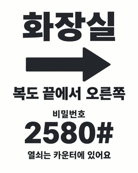
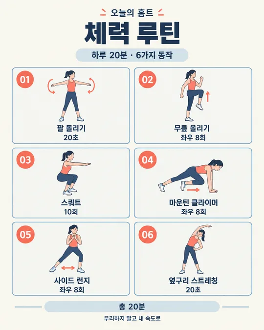
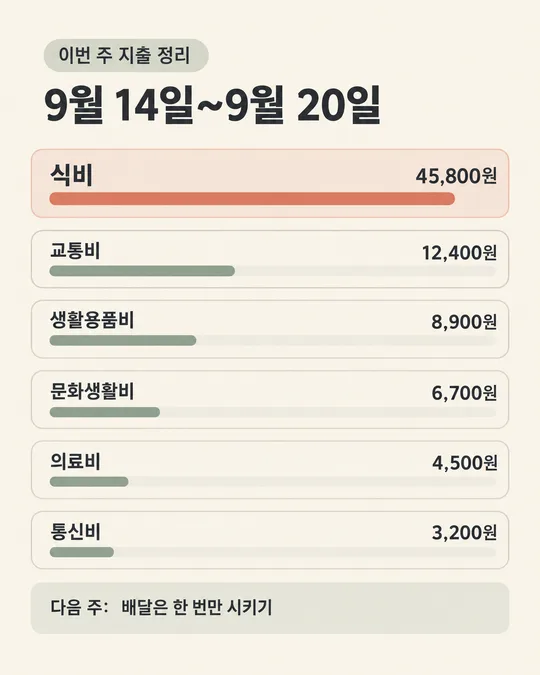
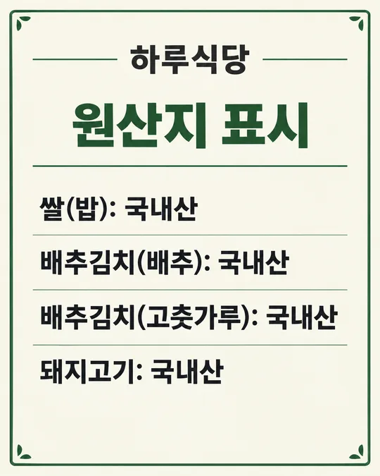
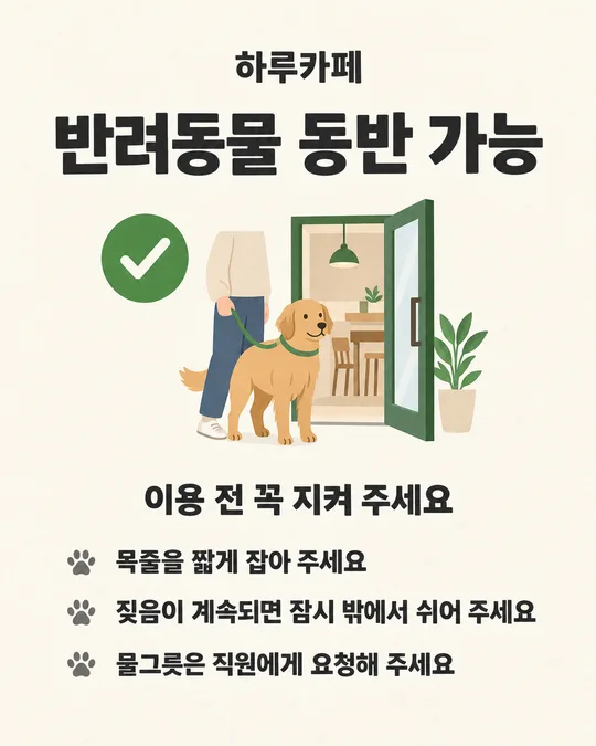
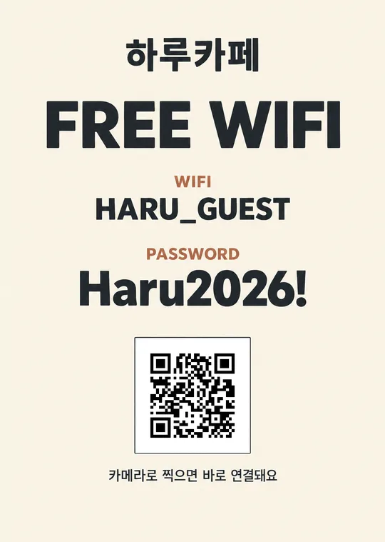
쓰는 법 · 자주 묻는 것
이런 때 쓰세요
예약제로 운영하는 식당, 카페, 미용실, 네일숍, 공방처럼 손님이 방문 전에 예약 방법을 알아야 하는 가게에 쓰는 안내 카드예요. 출입문에 붙여 두면 예약 없이 찾아온 손님에게 운영 방식을 바로 알릴 수 있고, 네이버 플레이스 새소식에 올리면 방문을 준비하는 손님이 미리 확인할 수 있어요. 예약 방법, 연락처, 당일 방문 가능 여부를 한 화면에 모아 두어서 같은 질문에 여러 번 답하는 일을 줄이는 데 도움이 됩니다.
이 카드는 광고보다 안내가 먼저 보이도록 만들었어요. 제목을 읽은 뒤 예약 방법, 연락처, 방문 가능 여부 순서로 자연스럽게 내려가므로 처음 온 손님도 해야 할 일을 쉽게 찾을 수 있습니다.
칸 채우는 법
- 가게 이름: 간판과 네이버 플레이스에 적힌 이름 그대로 써 주세요. 띄어쓰기와 받침도 같아야 해요.
- 예약 방법: 전화, 인스타 DM, 카카오톡, 네이버 예약처럼 실제로 받는 방법을 적으세요. 여러 곳에서 예약을 받더라도 가장 빠르게 답할 수 있는 대표 방법 하나가 안내하기 편해요.
- 연락처: 손님이 예약할 때 사용할 전화번호나 인스타 계정명을 적어 주세요. 네이버 예약을 골랐다면 네이버 플레이스에서 찾기 쉬운 대표 전화번호를 적으면 됩니다.
- 당일 방문 가능 여부: 실제 운영 방식과 맞는 문장을 고르세요. 예약 상황에 따라 달라진다면 가운데 문장이 가장 안전하고 정확해요.
- 크기: 가게 출입문에 인쇄해 붙일 때는 A4, 네이버 플레이스 새소식에 올릴 때는 4:5를 고르세요. 두 곳에 모두 쓸 때는 같은 내용을 크기만 바꿔 두 번 만들면 됩니다.
입력한 내용은 그대로 그림에 들어가요. 연락처 숫자와 계정명은 보내기 전에 한 번 더 확인해 주세요. 페이지에 적은 값은 저장되지 않으므로 새로고침하면 처음 상태로 돌아갑니다.
우리 제품·인물 사진을 넣고 싶을 때
이 안내 카드는 사진 없이 쓰도록 만든 디자인이에요. 제품이나 사장님 사진을 넣으면 예약 방법과 연락처가 작아져 출입문에서 읽기 어려워질 수 있어요. 가게 분위기를 보여 주고 싶다면 이 카드는 안내용으로 그대로 쓰고, 제품 사진이나 인물 사진은 네이버 플레이스의 다른 새소식에 따로 올리는 편이 좋습니다. 로고도 필수 정보는 아니므로 프롬프트에 임의로 덧붙이지 않는 것을 권해요.
그림이 나오면 꼭 볼 것
AI 그림은 한글과 숫자를 가끔 틀릴 수 있어요. 인쇄하거나 올리기 전에 아래 내용을 한 글자씩 확인해 주세요.
- 가게 이름의 띄어쓰기와 받침이 맞는지
- 예약 방법이 내가 적은 것과 같은지
- 연락처 숫자, 하이픈, 계정명이 정확한지
- 당일 방문 가능 여부가 실제 운영 방식과 같은지
A4로 만든 그림은 출입문에서 두세 걸음 떨어져 제목과 연락처가 읽히는지 확인하세요. 4:5 그림은 휴대폰 화면에서 축소했을 때도 예약 방법과 당일 방문 안내가 보이는지 확인하면 됩니다.
틀린 곳 고치는 법
같은 채팅창에서 틀린 부분 하나만 짧고 정확하게 말해 주세요.
연락처를 02-1234-5678로 고쳐줘. 나머지는 그대로 둬.
당일 방문 안내를 "당일 방문 불가"로 고쳐줘. 다른 글자는 바꾸지 마.
한 번에 여러 곳을 고치면 이미 맞게 나온 글자까지 달라질 수 있어요. 한 군데씩 고치고, 세 번 넘게 같은 글자가 틀리면 새 채팅창에서 칸을 다시 확인한 뒤 프롬프트 전체를 보내는 편이 빠릅니다.
자주 묻는 것
- 출입문과 네이버 플레이스에 같은 그림을 써도 되나요? 내용은 같게 쓰고 크기만 따로 고르세요. 출입문은 A4, 네이버 플레이스 새소식은 4:5가 읽기 편해요.
- 예약 방법을 두 개 넣어도 되나요? 대표 방법 하나를 고르는 것이 가장 분명해요. 두 방법을 꼭 함께 알려야 한다면 연락처 칸에 보조 방법을 짧게 덧붙이되, 글자가 길어지지 않게 확인하세요.
- 네이버 로고가 들어가나요? 아니요. "네이버 예약"이라는 안내 글자만 쓰고, 상표 로고나 앱 화면은 그리지 않도록 했어요.
- 무료 GPT에서도 만들 수 있나요? 네. 무료 이용자는 그림 생성 횟수 제한이 있을 수 있으니 가게 이름과 연락처를 먼저 확인한 뒤 한 번에 보내세요.
- 당일 방문 가능 여부가 자주 바뀌면 어떻게 하나요? 평소 기준으로 가장 자주 맞는 문장을 고르세요. 하루만 달라지는 내용은 네이버 플레이스 새소식의 본문에 별도로 적는 편이 관리하기 쉬워요.
- 그림 대신 설명만 나오면 어떻게 하나요? 같은 채팅창에 "설명하지 말고 지금 그림으로 만들어줘"라고 한 번 더 보내세요.