
전체 · 인포그래픽/안내 · 위치·주차
029화장실 위치 안내판 만들기
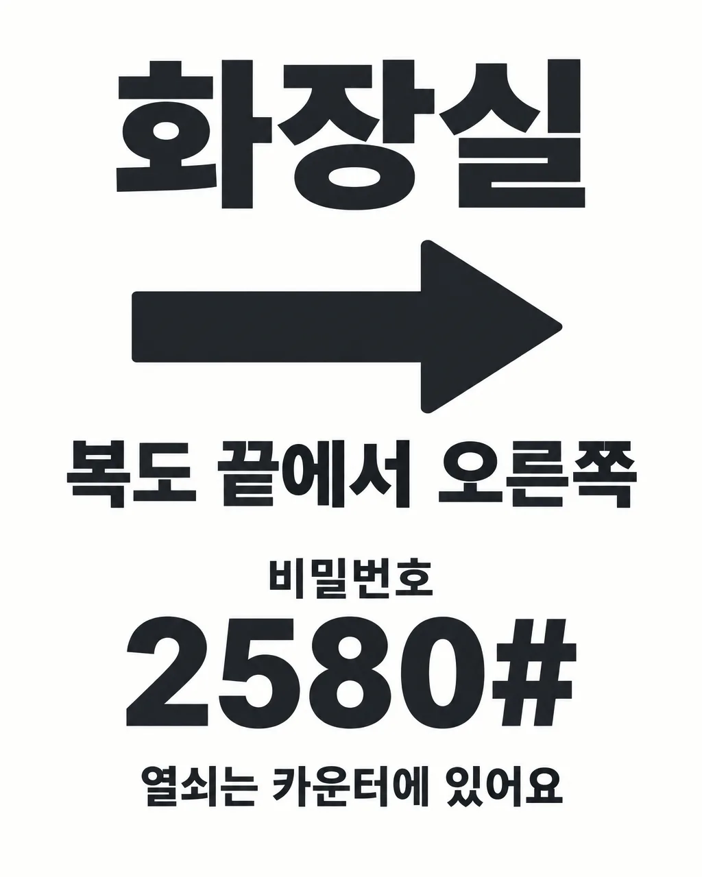
화장실 가는 길과 비밀번호를 크게 보여 주는 작은 벽 안내판 — 화살표 방향과 안내 문구만 채우면 바로 출력
칸 채우기
- 1칸을 채워요
- 2복사 버튼을 눌러요
- 3GPT 채팅창에 붙여넣어요
- 4제품·인물 사진을 쓰려면 사진과 프롬프트를 둘 다 넣은 뒤에 보내요 선택
프롬프트 원문 보기 6,992자
Generate this image now. Draw it directly - do not describe it, explain it, or ask questions.
Output size 2480x3508 pixels, A4 portrait, 300dpi, print-ready poster.

[Purpose]
Create one finished Korean restroom direction sign for a small shop owner, ready to print, trim if desired, and attach to a wall near the counter, corridor, stairway, or exit. This is a compact practical sign, not a poster, advertisement, map, or decorative illustration. A customer standing several steps away must instantly recognize that it points to the restroom, see the correct travel direction, and read the location instruction. If a door password is supplied, its digits must be exceptionally large and unambiguous. Deliver only the flat, complete artwork with no wall, frame, clipboard, hand, room, door mockup, perspective view, or staged interior.

[Scene]
Build one small-format sign around a single dominant directional arrow and very large Korean lettering. Infer the arrow direction only from the supplied location phrase "【위치 설명】". If the phrase says right or 오른쪽, use one clear right-pointing arrow; if it says left or 왼쪽, use one clear left-pointing arrow; if it says upstairs, 2층, or 올라가세요, use one clear upward or up-stair direction arrow; if it says downstairs or 내려가세요, use one clear downward direction arrow; if it says straight or 끝, point forward/up unless an explicit left or right direction is also present. Explicit direction words always override inference. Show only one main arrow so customers cannot follow conflicting symbols. Keep the design sparse, with broad clear space around the arrow and lettering. Do not draw a detailed floor plan. A tiny original, generic restroom pictogram may support recognition, but it must never replace the Korean heading or compete with the arrow.

[Attached photo]
No attached photo is required. Construct the sign only from the supplied text and selected feeling. Do not invent a storefront, building layout, person, mascot, logo, branded object, or location not stated by the user.

[Text layout]
Render these exact Korean strings and supplied values without the surrounding quotation marks. Keep every element inside approximately 7% safe margins while painting the selected background continuously to all four canvas edges.
Around the top 8-23%, render the fixed heading "화장실" in very large, bold Korean lettering.
Use the central 25-56% for one thick, unmistakable directional arrow and the exact location phrase "【위치 설명】". The arrow should be at least as visually strong as the heading, and the location phrase should be readable from several steps away.
Around 59-76%, render the small fixed Korean label "비밀번호" and directly beneath it render the exact supplied password "【비밀번호】" in extremely large, bold digits and symbols.
Around 82-91%, render the exact optional sentence "【이용 안내 한 줄】" as one clear supporting line.
The password and usage line are optional. If either value is absent, remove its entire line, its fixed label, and its reserved space, then enlarge and rebalance the heading, arrow, and location phrase. Never show an empty box, blank label, placeholder, or unexplained gap. Never print field names, braces, instructions, or the selected feeling.

[Style]
Use only the selected feeling "【느낌】". For "깔끔한 흰색", use an edge-to-edge warm-white background, deep charcoal lettering, a single dark accent color, crisp Korean sans-serif forms, and clean wayfinding geometry. For "검정 고대비", use an edge-to-edge matte near-black background with solid white lettering and arrow, plus at most one restrained yellow accent; keep all text brighter than texture. For "따뜻한 나무", use a quiet light natural-wood surface with near-black lettering and a solid arrow; keep grain very subtle and never let it cross or break a character. For "부드러운 파스텔", use one pale pastel background with deep charcoal lettering, a rounded but sturdy arrow, and only a few tiny abstract edge accents. Never present several style options, a palette key, or the feeling name. The result must remain a sober, useful shop sign even when the style is friendly.

[Visual hierarchy]
From a distance, the reading order must be: "화장실", the directional arrow, "【위치 설명】", then the optional password and optional usage note. Make the arrow broad, solid, and geometrically simple. Do not hide it inside a circle, speech bubble, illustration, or decorative badge. Use high contrast and generous spacing rather than many ornaments. When a password is present, make every digit much larger than the fixed label "비밀번호" and leave clear space between characters. Use a technical or monospaced numeral style that distinguishes digit 0 from uppercase O, digit 1 from lowercase l and uppercase I, digit 5 from uppercase S, and digit 8 from uppercase B. A restrained slashed zero is acceptable only when it remains unmistakably the supplied digit 0. Never transform letters to uppercase or substitute a similar glyph. Keep the optional usage note secondary but large enough to read at the sign's actual printed size.

[Lighting and texture]
Use flat, even, matte illumination without perspective distortion, drop shadows, bevels, embossing, glossy reflections, or photographic depth. Paper, wood, or pastel texture must remain subtle and low-contrast, especially behind the arrow, location phrase, and password. Maintain uniform contrast from edge to edge. Fully paint every margin and corner. The sign should reproduce cleanly on an ordinary printer and remain legible after being trimmed to a small wall plaque.

[Text rules]
Copy the location, the password (when present), and the guidance line (when present) exactly, character by character. Preserve every Korean syllable, digit, letter case, space, punctuation mark, hash sign, and asterisk. Never autocorrect, translate, paraphrase, shorten, censor, mask, or invent text. Render the fixed Korean heading exactly as "화장실" and, only when a password exists, the fixed label exactly as "비밀번호". Check all Korean consonants, vowels, and final consonants for complete strokes. Count password characters before rendering and visually verify the identical sequence afterward. Do not add male/female labels, accessibility claims, opening hours, contact details, store names, English words such as TOILET or WC, or any explanation not supplied. Do not duplicate a line.

[Avoid]
No QR code, barcode, matrix pattern, map, maze, multiple conflicting arrows, vague curved arrow, tiny arrow, room photograph, toilet photograph, person, mascot, real brand logo, delivery-app logo, trademark, copyrighted character, celebrity, song lyric, phone number, store name, promotion, price, or social handle. No ambiguous password glyphs, masked password dots, changed digits, missing symbols, decorative script for digits, excessive icons, ornate borders, stickers covering text, empty square placeholders, empty boxes, neon, bloom, glowing edges, glare, lens flare, transparent background, unpainted canvas, black letterbox bars, watermark, signature, extra caption, cropped lettering, or text touching the canvas edge.
이 카드도 많이 사용해요
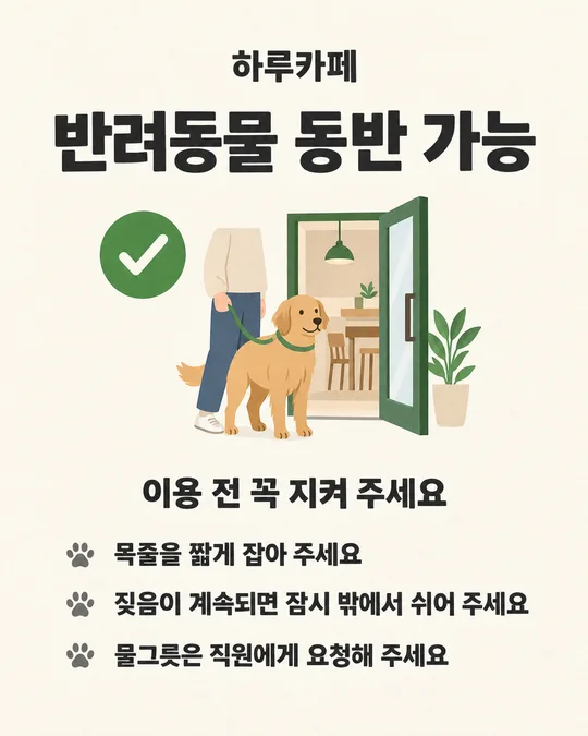
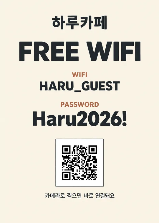
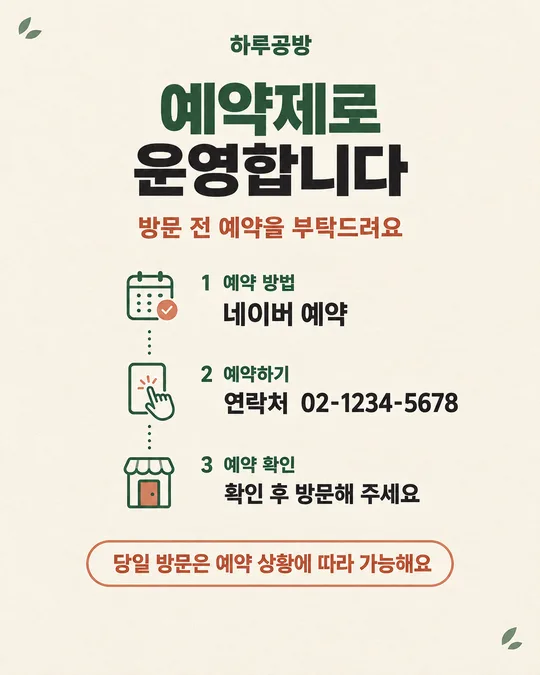
쓰는 법 · 자주 묻는 것
이런 때 쓰세요
손님이 화장실 위치를 자주 묻는 카페, 식당, 미용실, 공방처럼 작은 매장에 붙이는 안내판이에요. 「복도 끝에서 오른쪽」처럼 실제로 걸어갈 방향을 적으면, 큰 화살표와 짧은 문구가 중심인 완성 그림이 나옵니다. 계산대 앞에서 설명을 반복하지 않아도 되고, 출입문 밖이나 다른 층에 화장실이 있는 매장에서도 길을 짧고 분명하게 알려 줄 수 있어요.
벽에 붙이는 작은 판이므로 장식보다 먼 거리 가독성을 우선했어요. 화장실이라는 제목과 화살표가 먼저 보이고, 필요한 매장만 비밀번호와 이용 안내를 덧붙이는 구조예요. 가게 이름이나 연락처를 받지 않아 어느 매장에서도 불필요한 광고판처럼 보이지 않습니다.
칸 채우는 법
위치 설명에는 손님이 안내판 앞에 섰을 때 따라갈 길을 한 문장으로 적으세요. 「오른쪽」, 「왼쪽」, 「2층」처럼 방향을 분명히 넣는 편이 좋아요. 여러 번 꺾는 긴 길이라면 안내판 하나에 전부 적기보다 갈림길마다 한 장씩 만들어 붙이세요. 화살표는 위치 설명에 적힌 방향을 기준으로 그려지므로, 실제로 판을 붙일 자리에서 문장을 읽어 보고 입력해야 합니다.
비밀번호가 없는 화장실이면 칸을 비우세요. 번호가 있다면 문에 적힌 값을 띄어쓰기와 기호까지 그대로 옮기세요. 이용 안내 한 줄도 선택이에요. 열쇠를 받아야 하거나 직원에게 먼저 말해야 하는 경우처럼 손님이 출발하기 전에 알아야 할 내용만 짧게 적으세요. 느낌은 네 가지 중 하나를 고른 뒤 프롬프트를 복사해 이미지 만들기가 가능한 GPT 대화에 붙여 넣으면 됩니다.
그림이 나오면 꼭 볼 것
먼저 안내판을 붙일 위치에 서서 화살표가 실제 화장실 방향과 맞는지 확인하세요. 오른쪽과 왼쪽이 뒤바뀐 그림은 예뻐도 쓰면 안 됩니다. 위치 문구의 한글도 입력값과 한 글자씩 대조하세요. 출입문 밖 화장실이라면 건물 문이 잠기는 시간이나 이용 조건도 따로 확인하는 편이 안전해요.
비밀번호를 넣었다면 숫자와 기호를 처음부터 끝까지 하나씩 확인하세요. 특히 숫자 0이 영문 대문자 O처럼 보이지 않는지, 숫자 1이 소문자 l이나 대문자 I처럼 보이지 않는지 보세요. 작은 크기로 인쇄할 예정이면 화면을 축소해도 제목, 화살표, 숫자가 바로 읽히는지 확인하고 시험 출력 한 장을 실제 벽에 붙여 몇 걸음 물러나 보세요.
틀린 곳 고치는 법
그림을 만든 같은 대화에서 위치와 정확한 문구를 함께 말하세요. 예를 들어 「화살표를 오른쪽 방향으로 고쳐 주세요. '복도 끝에서 오른쪽'과 비밀번호 '2580#'은 그대로 유지해 주세요」처럼 요청하면 됩니다. 0과 O가 비슷하면 「비밀번호의 숫자 0에만 구별되는 형태를 쓰고 문자열은 바꾸지 마세요」라고 덧붙이세요. 수정 과정에서 맞던 글자도 달라질 수 있으므로 새 그림의 모든 문구와 방향을 다시 검사하세요.
자주 묻는 것
- 비밀번호가 없는데 빈칸이 남나요? 남지 않아요. 비밀번호 칸을 비우면 「비밀번호」라는 라벨과 해당 공간이 함께 빠지고, 나머지 요소가 넓게 다시 배치됩니다.
- 화장실이 두 번 꺾어야 나오면 어떻게 하나요? 첫 갈림길에는 첫 방향만 적은 안내판을 붙이고, 다음 갈림길에 두 번째 안내판을 붙이세요. 한 판에 여러 화살표를 넣으면 어느 길을 먼저 가야 하는지 헷갈릴 수 있어요.
- 남녀 화장실 표시도 넣을 수 있나요? 이 카드는 공용 위치 안내에 집중해요. 구분이 꼭 필요하면 위치 설명에 실제 표기를 짧게 넣되, 접근성 시설이 확인되지 않았다면 장애인 화장실 표시를 임의로 추가하지 마세요.
- 작게 출력해도 읽히나요? 먼저 A4로 시험 출력한 뒤 실제 붙일 크기로 줄여 보세요. 몇 걸음 떨어져 제목과 화살표, 비밀번호가 읽히지 않으면 판 크기를 키우는 편이 안전합니다.
- 무료 GPT로도 되나요? 사용 중인 계정에 이미지 만들기가 열려 있다면 프롬프트를 붙여 넣어 보세요. 이용 가능 여부와 남은 한도는 계정 화면에서 확인할 수 있으며, 사진 첨부는 필요하지 않아요.