All · Ads & posters · Logos & branding
547Name seal logo
Turn an exact short name into an original red carved-seal logo in a square or circle.
What you get
- One original carved-seal name logo
ChatGPT Free OK
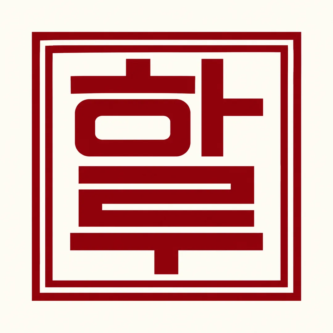
Fill in the fields
- 1Fill in the fields
- 2Copy the prompt
- 3Paste it into a GPT chat
- 4Send it as is and you get an image like the thumbnail example
- 5Attach a real photo that fits the card and it is used in the result: a background photo for background cards, a person or food photo for those cards Optional
Tested by us
- Test date
- 2026-10-29
- Tool
- ChatGPT image model (run in Codex) — cannot confirm if it is the same model as free ChatGPT from this execution info
- Result
- Pass
- What worked
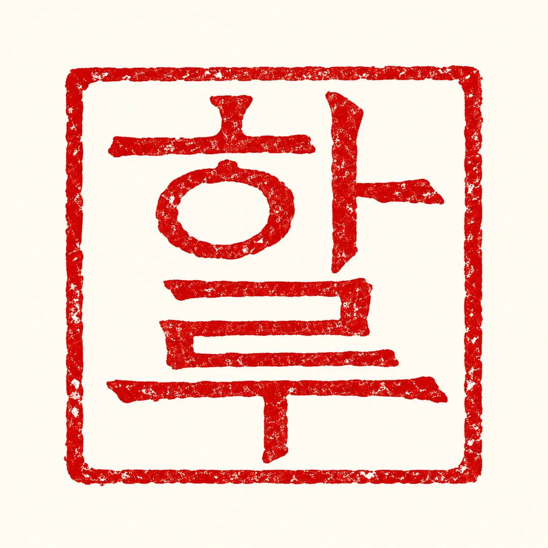
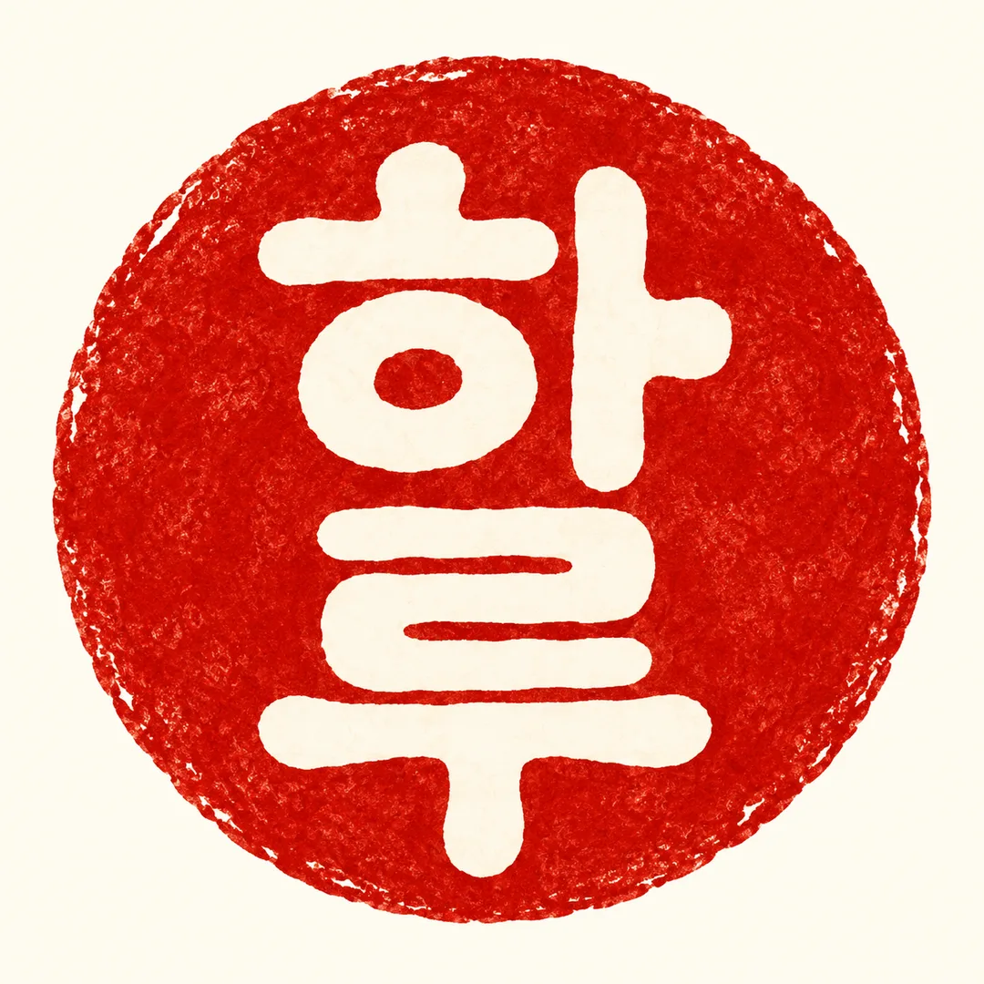
- Both results rendered the letters 하 (ㅎ·ㅏ) and 루 (ㄹ·ㅜ) legibly, arranged vertically. Inside a square border, one flat seal in shades of orange/vermilion, with an ivory background and an engraved ink texture. No extra phrases, numbers, props, or watermarks. The text is positioned below the top 12% and above the bottom 15%. Canvas is 1:1.
- What did not work
- None
- How to improve
- No confirmed improvement method. Running it once more with the same input did not change the pixel size. The values tested this time are only 하루, 네모, 주홍; other names, shapes, and colors are unverified.
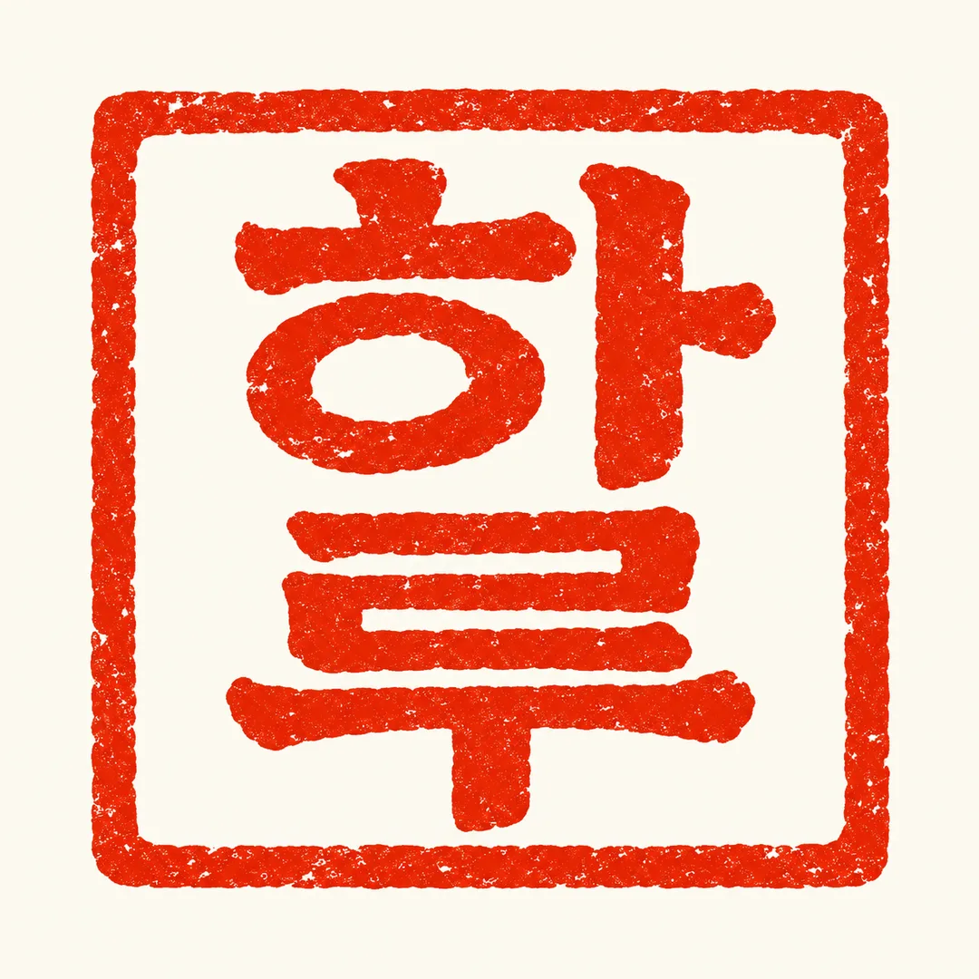
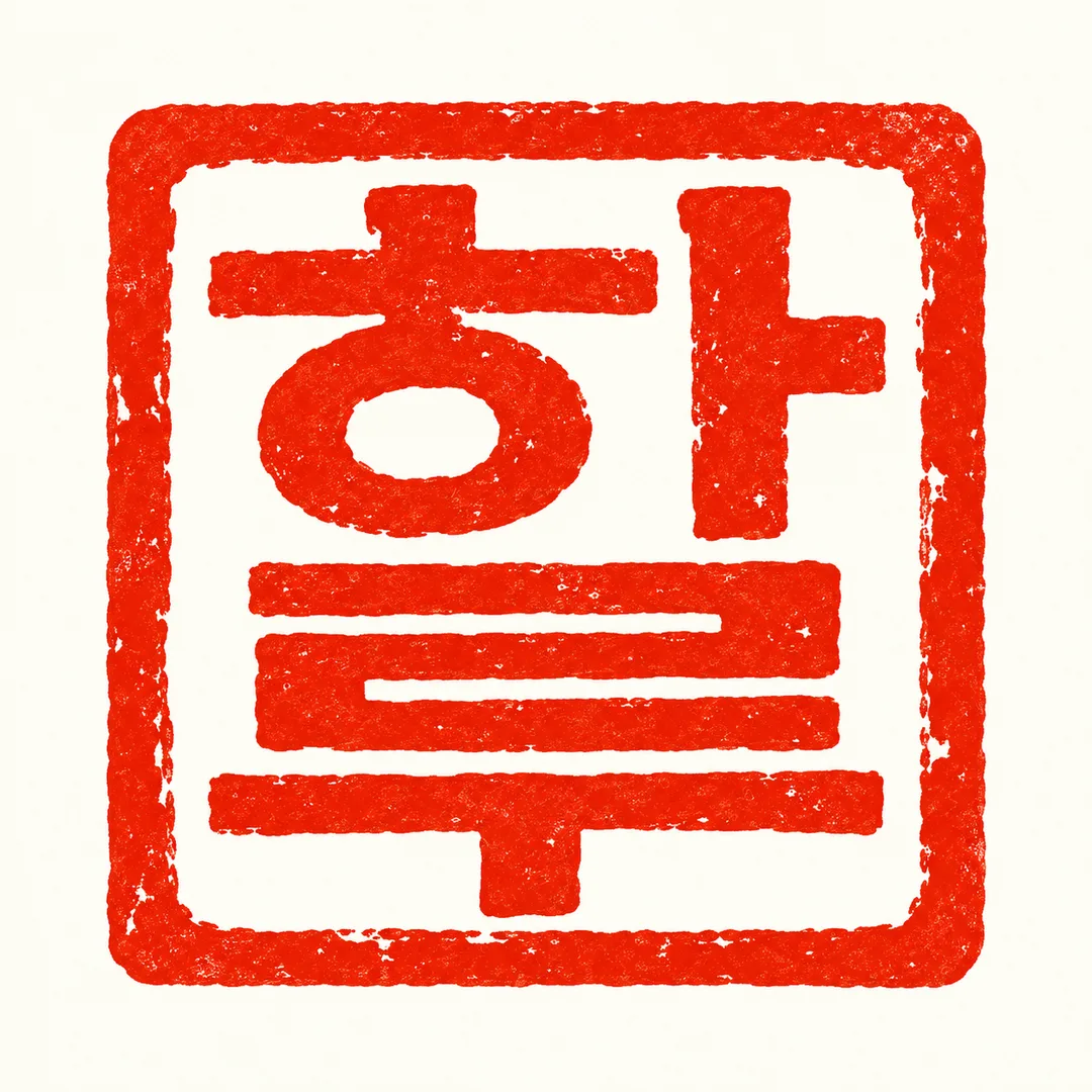
Full prompt 2,306 characters
Generate exactly ONE finished flat seal logo image now. No explanations or follow-up steps.
Output size 1080x1080 pixels, 1:1 square post. Keep all text fully readable.
NAME: "【Letters】"
SHAPE: "【Shape】" (default: Square)
INK: "【Color】" (default: Vermilion)
Use 2–4 input characters verbatim, preserving script, order, case and every stroke. Never translate, romanize or replace Hangul with Chinese characters. Preserve Hangul initial consonant, vowel and final consonant as recognizable components. For other scripts retain their actual glyphs rather than forcing Hangul shapes.
Create one original Korean carved-seal-inspired identity: bold balanced lettering, deliberate negative spaces and subtle carved ink edges. Two characters stack top-to-bottom; three follow a balanced clear reading order; four form a 2-by-2 grid, read left-to-right then top-to-bottom. Keep Latin words recognizable across the grid. Use a true square outer contour for the square option and a true circle for the circle option. The shape selection changes only the outline, not the output type. Match the selected single ink color. Default colors correspond to vermilion, crimson and burgundy respectively.
An ivory background fills the entire canvas. Enlarge the single seal to about 86% of canvas width within the central safe area; for a portrait ratio retain an actual square or circle, without stretching it. Keep all lettering below the top 12% and above the bottom 15%. No mockup, stamp tool, props, decorative illustration, extra text, numerals or watermark. Never imitate an existing brand, logo, real person's signature, character or artist's style. All shop identities and product applications are fictional original concepts.
Before returning the image, zoom mentally through each input character and check every component, especially Hangul vowels and final consonants. Correct substitutions, missing strokes and merged characters while retaining the selected outline and ink. Return the single finished logo only.

[Final output format]
Output size 1080x1080 pixels, 1:1 square post. Keep all text fully readable.
This selected output format takes priority over any fixed canvas size or aspect ratio elsewhere in this template. Adapt the composition, text zones and margins to the selected canvas without stretching or cropping essential content. Device safe areas apply only when a device is selected. Never print these format instructions on the image.
How did it turn out?
You may also like
How to use it · FAQ
Create an original seal-style identity for an independent maker, workshop or small shop. The output is one flat logo on a light background, with no photograph or product mockup. Use 1:1 by default; the separate listing cover demonstrates a portrait composition.
Only Letters is required. Use two to four characters without spaces, such as Haru. The name is never translated or replaced with Chinese characters. Hangul keeps its consonants, vowels and final consonants; Latin letters retain their exact spelling and case. Two characters stack vertically, three form a balanced readable sequence, and four use a two-by-two arrangement read left to right across each row. The letter construction takes inspiration from carved seals while retaining the original writing system.
Choose Square or Circle and one ink color: Vermilion, Crimson or Burgundy. Blank selections use Square and Vermilion. A custom color is interpreted as one ink, rather than a multicolor illustration. The finished seal fills the composition and contains no slogan, date or business illustration. The three gallery examples explore a delicate linear workshop seal, a friendly circular reversed tea-shop seal and a precise geometric studio seal. These are fictional identities; individual stroke details can vary between generations.
Check the spelling before generating. Afterwards, zoom in and compare every letter with the input, including small marks and counters. If strokes merge, ask for wider negative spaces while keeping the exact name. Check readability at profile-icon size before applying the design to packaging or stationery. The image is a concept, not a vector file or an engraving-ready cutting path. Confirm production specifications with your printer or seal maker and check similar trademarks before commercial use.