
すべて · 広告・ポスター · カフェ・スイーツ
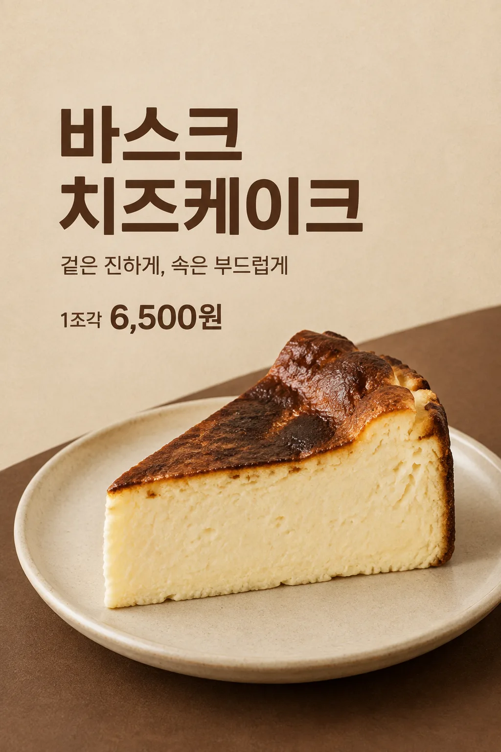
181バスクチーズケーキのポスター
お店のケーキ写真と実際の一切れの価格を使う、シンプルなカフェ用ポスターです。
項目を入力
- 1項目を入力します
- 2プロンプトをコピーします
- 3GPTのチャットにお店のバスクチーズケーキ一切れの写真一枚とプロンプトを一緒に送ります
- 4写真と文章の両方が入っていることを確認します
プロンプト全文を見る 5,853文字
Generate this image now. Draw it directly - do not describe it, explain it, or ask questions.
A3横、420×297mm、縦横比1.414:1のポスターを1枚作成してください。生成できる最大解像度を使い、印刷用の最終目標は4961×3508ピクセル、300dpiです。文字は紙の端から10mm以上内側に置いてください。

[Purpose]
Create one simple finished cafe poster featuring one slice of Basque cheesecake. It is an actual menu advertisement for the user's cafe, usable at the entrance or as an SNS post. Let the appetizing cut surface be the visual focus and keep the menu name, unit and actual selling price legible. This is one poster for one bakery/cafe item, with one fixed refined photographic layout.

[Scene]
Place exactly one substantial triangular cheesecake slice on one understated ceramic plate. Show its irregular dark caramelized upper surface and thick pale creamy cut side in a close three-quarter view. The side may have small natural pores and subtle cutting marks; it is dense cheesecake, not a layered sponge, flat bread, melted cream puddle or geometrically perfect plastic wedge. Preserve the structure and browning visible in the user's photo. Add no biscuit base, berries, mint, syrup, chocolate, utensils, drinks or new toppings unless they are visibly part of the attached cake. Do not duplicate slices to imply a bundle.

[Attached photo]
The user's own clear food photograph is REQUIRED. Preserve the actual cake shape, portion thickness, texture, toppings if present and natural color. Improve cropping inside the drawn composition and gentle lighting without changing what the shop sells. Do not borrow a bakery's brand, package, logo or price. If the reference is a slice, show that one slice; do not manufacture a whole cake or invent extra portions. For this fixed card, the food photo should clearly show the browned top and cut side together.

[Text layout]
Render visible text in Japanese. Fill the canvas with a softly textured warm oat background; a low curved espresso-brown tabletop rises behind the plate from the lower-right. Keep the top14% clear of words. Set "【メニュー名】" at x8-92%, y16-31%, as a large deep-espresso name block on at most two clean lines. At y34-39%, set "【コピー】" as a smaller restrained line. When the value is "おまかせ", compose one short sensory line supported by the photo, at most eighteen Japanese characters; never print the control and never invent ingredients, freshness schedules or claims of superiority. At x8-42%, y42-46%, print exactly "【販売単位】 【販売価格】" once, with the unit smaller and the price in flat bold sans-serif. Price is approximately one-third of the main name's letter height and has no plaque, starburst or extra background panel. The cake and plate occupy x10-95%, y49-84%. Leave all text below y1200 absent on a1024x1536 image.
If supplied, print "【店名】" once at x8-42%, y76-79%; if this line is removed or empty, do not add a fictional cafe signature or blank logo.

[Style]
One fixed simple cafe food-photography poster. Oat, warm cream and dark espresso are the only designed background/text colors; the cake keeps its actual natural colors. Plain substantial menu lettering, modest copy and a direct price line contrast with a generously scaled food close-up. No impact shouting, launch teaser, discount design, menu grid, framed recipe or coupon. Fit long menu names by natural line breaks rather than changing the entire layout.

[Visual hierarchy]
The large name is readable at catalog size, then the real cake texture attracts attention, then the accurate price and selling unit answer the practical question. Use the restrained curved table surface and the plate's soft contact shadow as density, without filling quiet space with badges or repeated words. The food cannot overlap any lettering. Never hide or shrink a customer-facing price condition into fine print. Never repeat the price in a headline or add a second offer.

[Lighting and texture]
Use soft warm side light to reveal the genuinely browned top and moist dense interior. The dark top has uneven toasted patches rather than uniform black paint; the pale cut side has credible thickness, slight pores and a clean but not sterile edge. The plate rests on a coherent surface with a soft shadow. No steam, cheese pull, sparkle, gloss glaze, deep-fried texture, fake crumbs or implausible extra layers. Deliver the poster artwork itself, without a cafe-wall or phone mockup.

[Text rules]
Render only the intended visible copy, never field labels or instruction headings. When a wording field equals "おまかせ", choose one short original line appropriate to the user's supplied context and do not print that control. Preserve exact provided spelling and numbers. Keep letters away from textures that reduce legibility. Personal inputs change the content, while the single medium and composition specified above stay fixed. Invent no dates, prices, benefits, availability, awards, endorsements or participation requirements.

[Binding headline safe area]
Top y0-210 is empty oat paper with absolutely no letters. Menu-name ink fits x80-945,y220-465, on two large lines. Copy ink y515-570. Unit and price ink y630-690. Food stays y760-1390 and must shrink rather than pushing the name upward. Optional cafe signature stays y1140-1190. No essential letter outside these text areas. Preserve the photograph-like cake thickness and irregular deeply toasted top.

[Avoid and delivery]
Generate exactly ONE completed image directly in this response. Use image generation, without executing code, outputting a script, producing separate pages, asking for another message or requiring cutting and assembly. No existing character, artist imitation, celebrity, branded packaging, publisher logo, watermark, browser frame or phone mockup. Keep essential lettering within 13-84% of height and at least 7% inside the side edges. Leave the upper 12% and lower 15% free of essential text. Finish the actual artwork edge to edge at the selected ratio. The image must be useful as delivered, rather than a presentation of several designs.
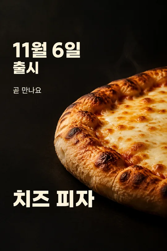
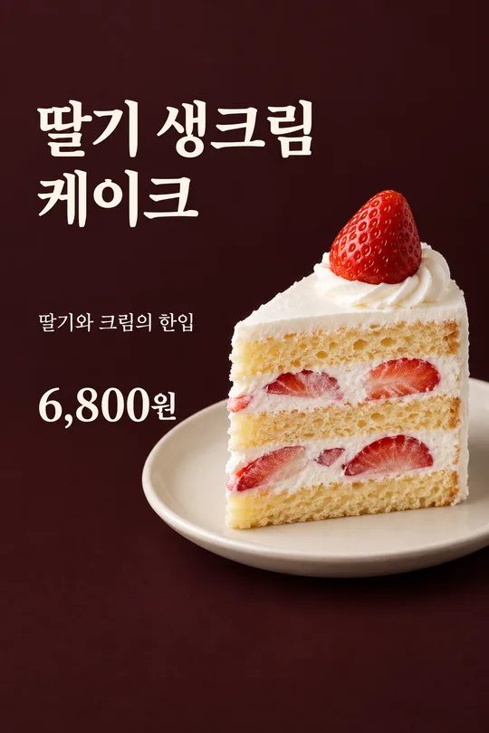
こちらのカードも人気です




使い方・よくある質問
こんなときに使えます
カフェの入口やレジ横で、バスクチーズケーキ一切れとその価格を知らせるポスターです。濃く焼けた表面と厚みのあるクリーミーな断面を写真の中心にします。大きなメニュー名と実際の価格があり、何を販売しているかすぐにわかります。新発売や割引を勝手に宣伝するカードではなく、普段販売するケーキをシンプルに見せる一枚です。完成画像はSNSの投稿にも使えます。
入力欄の使い方
メニュー名にはお店で使う正式な名前を書きます。販売単位と販売価格は別の欄です。一切れか一個か、その単位で実際にいくら受け取るかをご自身で入力してください。GPTが価格を決める欄ではありません。コピーの「おまかせ」を選ぶと、写真で確認できる質感に沿った短い一言を作ります。自分の言葉を入れることもできます。店名は任意で、空欄なら店名のないポスターになります。見本の価格は入力例で、実際のお店の販売条件ではありません。
料理写真と一緒に送ります
お店で実際に販売する一切れの写真を用意してください。上から表面だけを撮った写真より、焼き色と切った側面の両方が見える写真が適しています。GPTに写真を添付し、まだ送信しないでください。同じメッセージ欄にコピーしたプロンプトを貼り付けます。写真と文章の両方を確認して、一度送ります。先に写真を送った場合は「上の写真を使って描いて」と末尾に添えられます。他店の写真は構造を調べる参考用で、自分のお店の料理を代わりに表す写真ではありません。
完成後に確認すること
まず販売単位と価格を実際のメニューと照合してください。一切れの値段がホール全体の値段になったり、入力していない割引や発売日が追加されたりした画像は、そのまま使えません。茶色い表面と厚い断面が自然につながっていることも確認します。写真にないスポンジ層、ビスケットの土台、果物やソースが追加されてはいけません。皿の上は一切れだけで、同じケーキを複製しない構成です。料理が文字を隠さず、店名を空欄にした場合に架空の名前が入っていないかも見てください。
直したいところがあるとき
価格が違えば正しい金額と単位を一緒に書き、その行だけ修正してもらいます。ケーキが平たくなった場合は、元写真の厚みと焼き色を保つよう指定します。名前が長ければ実際のお店の短い表記にするか、二行に収めるよう依頼します。修正は最初のポスターができた後、必要な部分があるときだけの任意操作です。複数ページを作って切り貼りする手順はありません。
よくある質問
- 写真は必須ですか? はい。実際に売るケーキの厚みと材料を保つため、お店の写真を使います。
- 割引や発売日も作りますか? 作りません。入力したメニュー、単位、価格と短いコピーだけを載せます。
- 店名を省けますか? 店名を空欄にしてください。別のロゴやパッケージを作る構成ではありません。