
전체 · 광고/포스터 · 카페·디저트
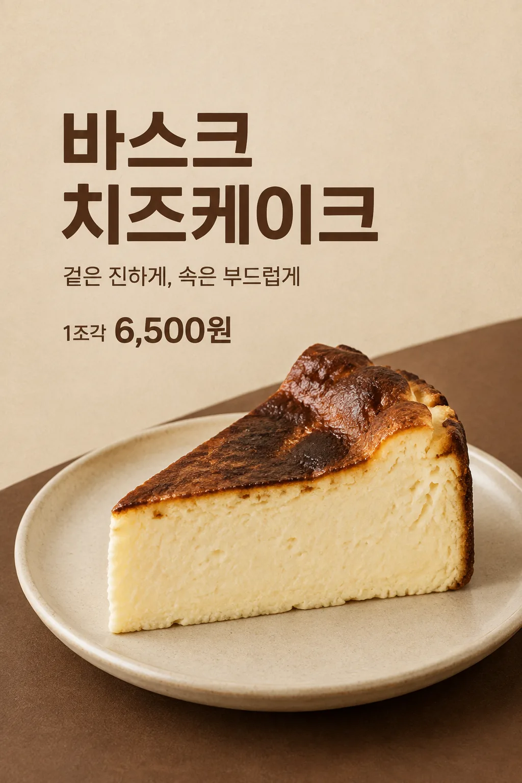
181바스크 치즈케이크 포스터
카페 사장님이 실제 바스크 치즈케이크 사진과 조각 가격을 출입문·SNS에 붙이는 심플 포스터예요.
칸 채우기
- 1칸을 채워요
- 2복사 버튼을 눌러요
- 3GPT 채팅창에 우리 가게 바스크 치즈케이크 조각 사진 1장을 올리고, 프롬프트를 같이 붙여넣어요
- 4우리 가게 바스크 치즈케이크 조각 사진 1장과 프롬프트가 둘 다 들어간 걸 보고 보내요
프롬프트 원문 보기 5,876자
Generate this image now. Draw it directly - do not describe it, explain it, or ask questions.
Output one landscape A3 poster, 420 x 297 mm, aspect ratio 1.414:1. Use the largest supported image resolution. Final print target is 4961x3508 pixels at 300dpi; keep all lettering at least 10 mm inside every paper edge. Preserve the wide composition and print-safe margins.

[Purpose]
Create one simple finished Korean cafe poster featuring one slice of Basque cheesecake. It is an actual menu advertisement for the user's cafe, usable at the entrance or as an SNS post. Let the appetizing cut surface be the visual focus and keep the menu name, unit and actual selling price legible. This is one poster for one bakery/cafe item, with one fixed refined photographic layout.

[Scene]
Place exactly one substantial triangular cheesecake slice on one understated ceramic plate. Show its irregular dark caramelized upper surface and thick pale creamy cut side in a close three-quarter view. The side may have small natural pores and subtle cutting marks; it is dense cheesecake, not a layered sponge, flat bread, melted cream puddle or geometrically perfect plastic wedge. Preserve the structure and browning visible in the user's photo. Add no biscuit base, berries, mint, syrup, chocolate, utensils, drinks or new toppings unless they are visibly part of the attached cake. Do not duplicate slices to imply a bundle.

[Attached photo]
The user's own clear food photograph is REQUIRED. Preserve the actual cake shape, portion thickness, texture, toppings if present and natural color. Improve cropping inside the drawn composition and gentle lighting without changing what the shop sells. Do not borrow a bakery's brand, package, logo or price. If the reference is a slice, show that one slice; do not manufacture a whole cake or invent extra portions. For this fixed card, the food photo should clearly show the browned top and cut side together.

[Text layout]
Render visible text in Korean. Fill the canvas with a softly textured warm oat background; a low curved espresso-brown tabletop rises behind the plate from the lower-right. Keep the top14% clear of words. Set "【메뉴 이름】" at x8-92%, y16-31%, as a large deep-espresso name block on at most two clean lines. At y34-39%, set "【문구】" as a smaller restrained line. When the value is "알아서 골라줘", compose one short sensory line supported by the photo, at most eighteen Korean syllable blocks; never print the control and never invent ingredients, freshness schedules or claims of superiority. At x8-42%, y42-46%, print exactly "【판매 단위】 【판매 가격】" once, with the unit smaller and the price in flat bold sans-serif. Price is approximately one-third of the main name's letter height and has no plaque, starburst or extra background panel. The cake and plate occupy x10-95%, y49-84%. Leave all text below y1200 absent on a1024x1536 image.
If supplied, print "【가게 이름】" once at x8-42%, y76-79%; if this line is removed or empty, do not add a fictional cafe signature or blank logo.

[Style]
One fixed simple Korean cafe food-photography poster. Oat, warm cream and dark espresso are the only designed background/text colors; the cake keeps its actual natural colors. Plain substantial menu lettering, modest copy and a direct price line contrast with a generously scaled food close-up. No impact shouting, launch teaser, discount design, menu grid, framed recipe or coupon. Fit long menu names by natural line breaks rather than changing the entire layout.

[Visual hierarchy]
The large name is readable at catalog size, then the real cake texture attracts attention, then the accurate price and selling unit answer the practical question. Use the restrained curved table surface and the plate's soft contact shadow as density, without filling quiet space with badges or repeated words. The food cannot overlap any lettering. Never hide or shrink a customer-facing price condition into fine print. Never repeat the price in a headline or add a second offer.

[Lighting and texture]
Use soft warm side light to reveal the genuinely browned top and moist dense interior. The dark top has uneven toasted patches rather than uniform black paint; the pale cut side has credible thickness, slight pores and a clean but not sterile edge. The plate rests on a coherent surface with a soft shadow. No steam, cheese pull, sparkle, gloss glaze, deep-fried texture, fake crumbs or implausible extra layers. Deliver the poster artwork itself, without a cafe-wall or phone mockup.

[Text rules]
Render only the intended visible copy, never field labels or instruction headings. When a wording field equals "알아서 골라줘", choose one short original line appropriate to the user's supplied context and do not print that control. Preserve exact provided spelling and numbers. Keep letters away from textures that reduce legibility. Personal inputs change the content, while the single medium and composition specified above stay fixed. Invent no dates, prices, benefits, availability, awards, endorsements or participation requirements.

[Binding headline safe area]
Top y0-210 is empty oat paper with absolutely no letters. Menu-name ink fits x80-945,y220-465, on two large lines. Copy ink y515-570. Unit and price ink y630-690. Food stays y760-1390 and must shrink rather than pushing the name upward. Optional cafe signature stays y1140-1190. No essential letter outside these text areas. Preserve the photograph-like cake thickness and irregular deeply toasted top.

[Avoid and delivery]
Generate exactly ONE completed image directly in this response. Use image generation, without executing code, outputting a script, producing separate pages, asking for another message or requiring cutting and assembly. No existing character, artist imitation, celebrity, branded packaging, publisher logo, watermark, browser frame or phone mockup. Keep essential lettering within 13-84% of height and at least 7% inside the side edges. Leave the upper 12% and lower 15% free of essential text. Finish the actual artwork edge to edge at the selected ratio. The image must be useful as delivered, rather than a presentation of several designs.
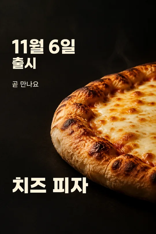
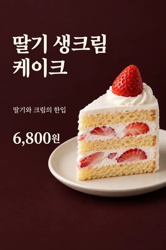
이 카드도 많이 사용해요




쓰는 법 · 자주 묻는 것
이런 때 쓰세요
카페 출입문이나 계산대 옆에서 바스크 치즈케이크 한 조각과 가격을 알릴 때 쓰는 포스터예요. 짙게 구운 윗면과 두꺼운 크림 단면이 사진의 중심이 됩니다. 큰 메뉴 이름과 실제 조각 가격을 읽고 무엇을 파는지 바로 알 수 있도록 구성했어요. 새 메뉴라고 외치거나 할인 행사를 꾸미는 카드가 아니라, 평소 판매하는 조각 케이크를 심플하게 보여 주는 한 장입니다. SNS 피드에도 같은 완성 이미지를 올릴 수 있습니다.
칸 채우는 법
메뉴 이름에는 매장에서 사용하는 실제 이름을 적으세요. 판매 단위와 판매 가격은 다른 칸입니다. 1조각인지 1피스인지, 그 단위로 손님에게 얼마를 받는지 직접 넣어 주세요. 이 값은 GPT가 알아서 정하지 않습니다. 문구에는 「알아서 골라줘」가 있어, 글을 쓰기 어려우면 사진에서 보이는 질감을 바탕으로 한 줄을 받을 수 있어요. 직접 쓴 문구도 넣을 수 있습니다. 가게 이름은 선택 칸이라 비우면 상호 없는 포스터가 됩니다. 보기의 가격은 입력 예시이며 실제 판매 조건을 뜻하지 않습니다.
음식 사진과 함께 보내는 법
우리 가게에서 실제 판매하는 조각 사진 한 장을 준비하세요. 갈색 윗면만 보이는 위쪽 사진보다, 윗면과 잘린 옆면이 함께 보이는 사진이 맞습니다. GPT 메시지에 사진을 올리고 아직 보내지 마세요. 같은 칸에 복사한 프롬프트를 붙여넣습니다. 사진과 글이 둘 다 있는 것을 보고 한 번 보내세요. 사진만 먼저 보냈다면 「위 사진으로 그려줘」를 끝에 덧붙일 수 있습니다. 남의 메뉴 사진은 음식 구조를 이해하는 참고용이지 우리 가게 결과를 대신하는 사진이 아닙니다.
그림이 나오면 꼭 볼 것
판매 단위와 가격을 실제 메뉴판과 먼저 대조하세요. 1조각 가격을 케이크 전체 가격처럼 표시하거나, 적지 않은 할인과 출시일이 생기면 그대로 쓰지 마세요. 음식은 갈색 윗면과 두께 있는 크림 단면이 자연스럽게 이어져야 합니다. 스펀지 층, 과자 바닥, 과일 장식이 우리 사진에 없다면 새로 붙어서는 안 됩니다. 접시 위 케이크는 한 조각이고 그림이 복제되지 않아야 해요. 큰 메뉴 이름과 가격이 음식에 가리지 않는지, 상호를 비운 경우 가짜 이름이 생기지 않는지도 확인합니다.
틀린 곳 고치는 법
가격이 틀리면 정확한 값과 단위를 같이 적고 해당 줄만 고쳐 달라고 하세요. 케이크가 납작해졌다면 원래 사진의 단면 두께와 굽기 색을 유지하라고 지정합니다. 글자가 너무 길면 메뉴의 실제 짧은 표기를 사용하거나 두 줄로 나눠 달라고 하세요. 처음부터 여러 장을 만든 뒤 자르는 과정은 없습니다. 추가 수정은 완성된 첫 결과에서 잘못된 부분이 보일 때만 하는 선택 사항입니다.
자주 묻는 것
- 케이크 사진이 꼭 필요한가요? 네. 실제로 판매하는 음식의 두께와 재료를 유지하려면 우리 가게 사진이 필요합니다.
- 할인이나 출시 예고도 자동으로 넣나요? 넣지 않습니다. 입력한 메뉴, 단위, 가격과 짧은 문구만 보여 줍니다.
- 상호 없이도 쓸 수 있나요? 가게 이름을 비우면 됩니다. 로고나 포장 디자인을 새로 만들지 않는 구성입니다.