
전체 · SNS/카드뉴스 · 밈·공감
415캘리그라피 한 줄 프사
내가 쓴 짧은 말을 붓글씨로 크게 담고, 동그란 프로필 안에도 온전히 남겨요.
받는 것
- 짧은 문구가 주인공인 붓글씨 이미지 한 장
- 중앙 안전 원 안의 글자와 선택한 작은 그림
- 이름 낙관을 선택해 넣는 완성 프사
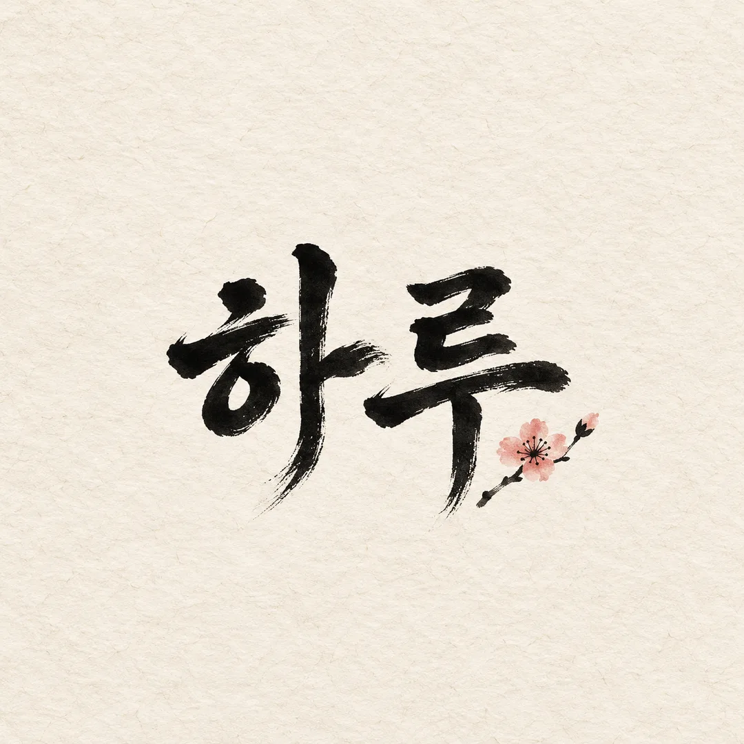
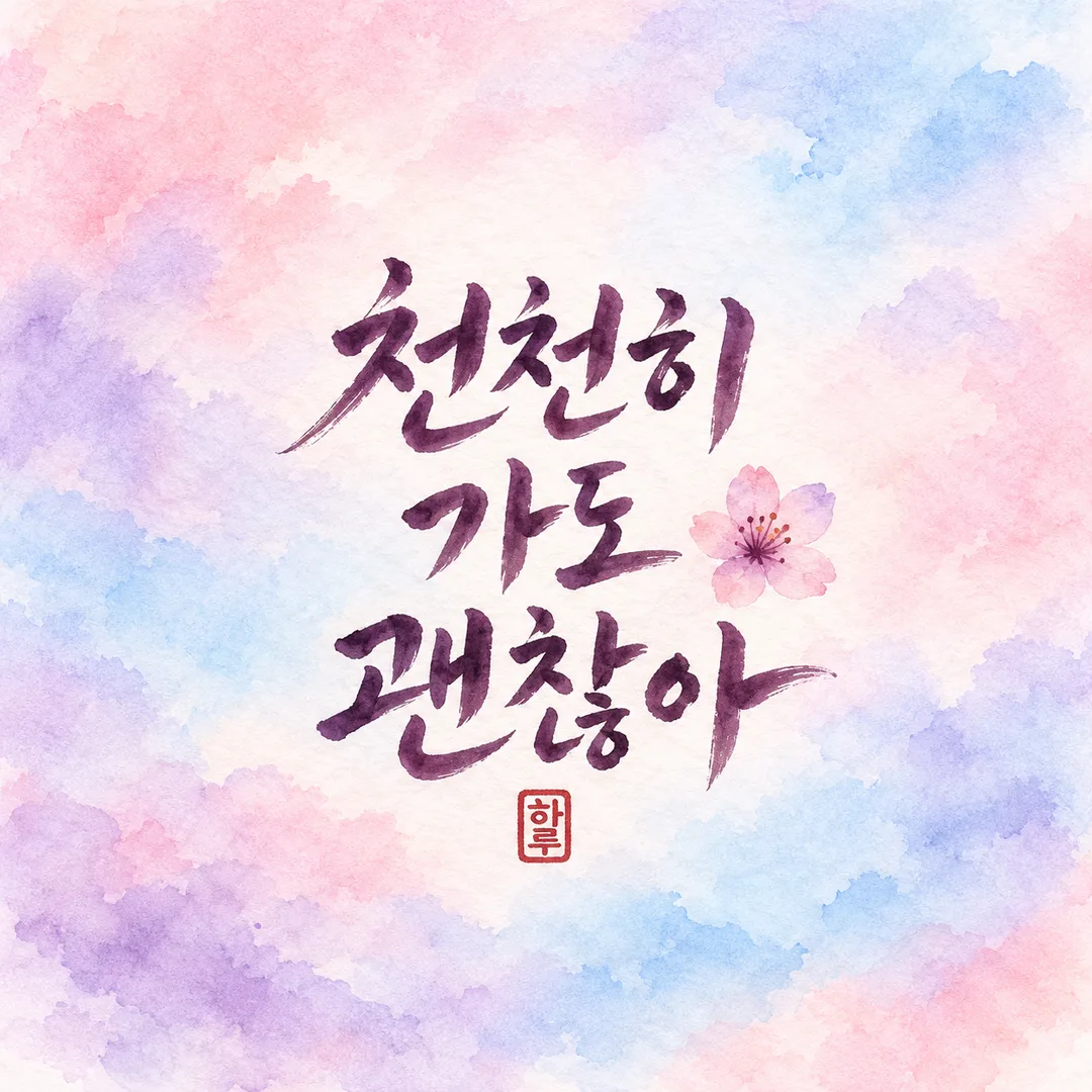
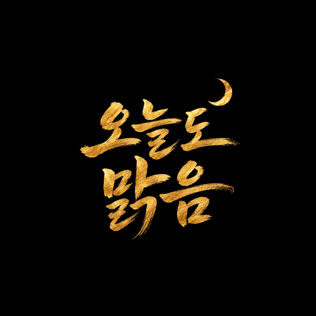
칸 채우기
- 1칸을 채워요
- 2복사 버튼을 눌러요
- 3GPT 채팅창에 붙여넣어요
- 4그대로 보내면 썸네일 예시처럼 나와요
- 5카드에 맞는 실제 사진을 같이 넣으면 그 사진이 반영돼요 — 배경 카드는 배경 사진, 인물 · 음식 카드는 그 사진 선택
프롬프트 원문 보기 3,142자
Generate this image now. Draw it directly - do not describe it, explain it, or ask questions.
Output size 1080x1080 pixels, 1:1 square card. Keep the same top-to-bottom order but compress the zones to fit the square: the illustration becomes smaller and every text line stays fully readable.
Create ONE finished hand brushed calligraphy profile artwork, square 1:1 by default. Full bleed background, no mockup, border, contact sheet or explanatory labels.
PHRASE: "【문구】". Render this supplied text verbatim: every character, final consonant, punctuation mark and space. Never translate, polish, shorten or add words. If blank or the choose-for-me option is selected, use "오늘도 맑음". Use 1–10 characters as the target length; preserve an already supplied longer phrase instead of truncating it.
ILLUSTRATION: "【작은 그림】". 알아서: choose exactly one tiny generic flower, moon or cloud. 없음: no illustration. 직접: use "【직접 고른 그림】" as a small secondary motif; if that input is blank, omit it. Default to 알아서. Ignore the custom input for other choices.
MOOD: "【분위기】". Apply ONLY the selected mood:
- 먹 붓글씨 한지: warm ivory hanji fibers, deep black dry brush, ink-pressure variation.
- 수채 번짐 파스텔: pastel blush, lavender and sky-blue watercolor bleed on paper, dark plum readable brush lettering.
- 금박 검정 배경: matte deep black background with warm metallic gold leaf brush lettering, subtle irregular foil texture.
Default to 먹 붓글씨 한지. All choices remain the same product: one handmade brush-lettered phrase avatar.
SEAL: "【낙관 도장 넣기】". Only 예 adds one small red decorative square name seal, exact text "【도장 글자】"; if seal text is blank use "하루". 아니오 omits the seal regardless of supplied name. Default 예. Preserve the full supplied name; recommend one or two characters but never silently truncate it. This is a decorative name stamp, not an artist signature.
COMPOSITION: lettering is the hero, generous thick-thin brush strokes, readable letter structures rather than tangled flourishes. Put EVERY lettering stroke and the whole seal inside an invisible centered safe circle whose diameter is 80% of the shorter canvas dimension; do not draw this circle. Keep every lettering stroke and seal inside x=25%..75%, y=25%..75% of the centered square defined by the shorter canvas dimension, guaranteeing extra inner margin. Motif is much smaller than the lettering and does not overlap it. For long phrases, wrap only at existing word spaces, representing each space by a line break; never split a word or alter character order. On other ratios keep the same central safe circle and extend the background naturally.
TEXT QA before finishing: enlarge and compare each character with the input including complex final consonants and spaces; correct any missing or merged strokes. Check the tiny seal too. Output only the final single image, no QA annotations.
No real logos, brand marks, copied signatures, famous characters, real people or watermark. No additional text. No photo is needed.

[Final output format]
Output size 1080x1080 pixels, 1:1 square card. Keep the same top-to-bottom order but compress the zones to fit the square: the illustration becomes smaller and every text line stays fully readable.
This selected output format takes priority over any fixed canvas size or aspect ratio elsewhere in this template. Adapt the composition, text zones and margins to the selected canvas without stretching or cropping essential content. Device safe areas apply only when a device is selected. Never print these format instructions on the image.
결과 어땠어요?
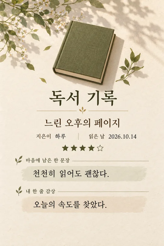
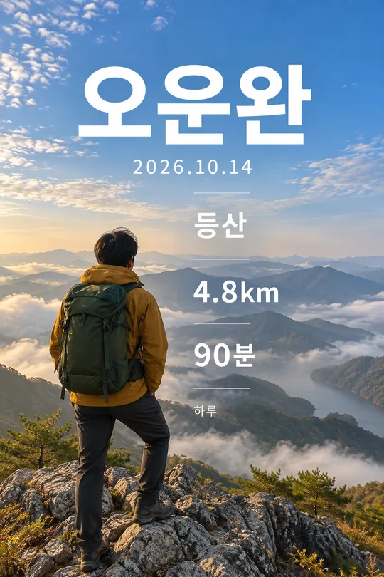
이 카드도 많이 사용해요

쓰는 법 · 자주 묻는 것
짧은 말로 만드는 나만의 프사
대화방이나 사진 공유 프로필에 올릴 붓글씨 한 장을 만듭니다. 폰 화면에 작게 보여도 읽히도록 문구가 주인공이고, 작은 그림은 글자보다 작게 곁들입니다. 배경은 화면 끝까지 이어지고 휴대폰 목업이나 홍보 문장은 들어가지 않습니다.
칸 채우는 법
꼭 채울 칸은 문구 하나입니다. 1~10자로 적고 띄어쓰기까지 원하는 대로 넣으세요. 보기의 「오늘도 맑음」을 쓰거나 「하루」처럼 이름을 넣어도 됩니다. 문구를 비우거나 「알아서 골라줘」를 선택하면 「오늘도 맑음」으로 만듭니다. 문구는 다듬거나 번역하지 않고 입력 그대로 씁니다. 작은 그림의 「알아서」는 꽃·달·구름 중 어울리는 하나, 「없음」은 장식 없는 글씨, 「직접」은 직접 고른 그림 칸을 사용합니다. 직접을 골라도 그 칸이 비면 장식을 빼고 완성합니다. 분위기는 세 보기 중 하나만 적용하며, 비우면 먹 붓글씨 한지입니다. 낙관은 예일 때만 찍고 도장 글자가 비면 하루를 씁니다. 아니오는 이름이 적혀 있어도 도장을 빼며, 이름은 한두 자가 가장 잘 읽힙니다.
사용과 확인
기본 1:1로 프롬프트를 한 번 복사해 그림 AI에 붙여 넣으세요. 결과에서 문구의 획·받침·띄어쓰기와 작은 낙관까지 확대해 원문과 대조하세요. 특히 「맑음」의 ㄺ, 「괜찮아」의 ㄴㅎ이 빠지지 않았는지 봅니다. 동그란 프로필 미리보기에서도 글자 끝과 낙관이 잘리지 않아야 합니다. 다른 비율을 골라도 글자와 도장은 중앙 안전 원 안에 모입니다. 틀렸다면 잘못된 글자를 원문과 함께 짚어 같은 구도로 다시 요청하세요. 작은 글씨가 읽히지 않으면 문구를 줄이거나 장식 없음을 골라 다시 만드세요. 긴 말은 단어 사이에서 줄을 바꿀 수 있지만 단어 내부를 쪼개거나 문구를 줄이지 않습니다.
자주 묻는 질문
사진은 필요하지 않습니다. 낙관은 실제 작가 서명이 아닌 입력 이름의 장식 도장입니다. 유명 로고·서명·실존 인물 대신 직접 정한 말과 일반적인 꽃·달·구름을 쓰세요. 한 번 붙여 넣으면 완성 이미지 한 장을 받으며, 따로 잘라 붙이거나 후보정할 필요가 없습니다.