
전체 · 광고/포스터 · 명절·기념일 · 할인·행사
261할로윈 파티 포스터 — 80년대 B급 공포영화 극장 포스터처럼
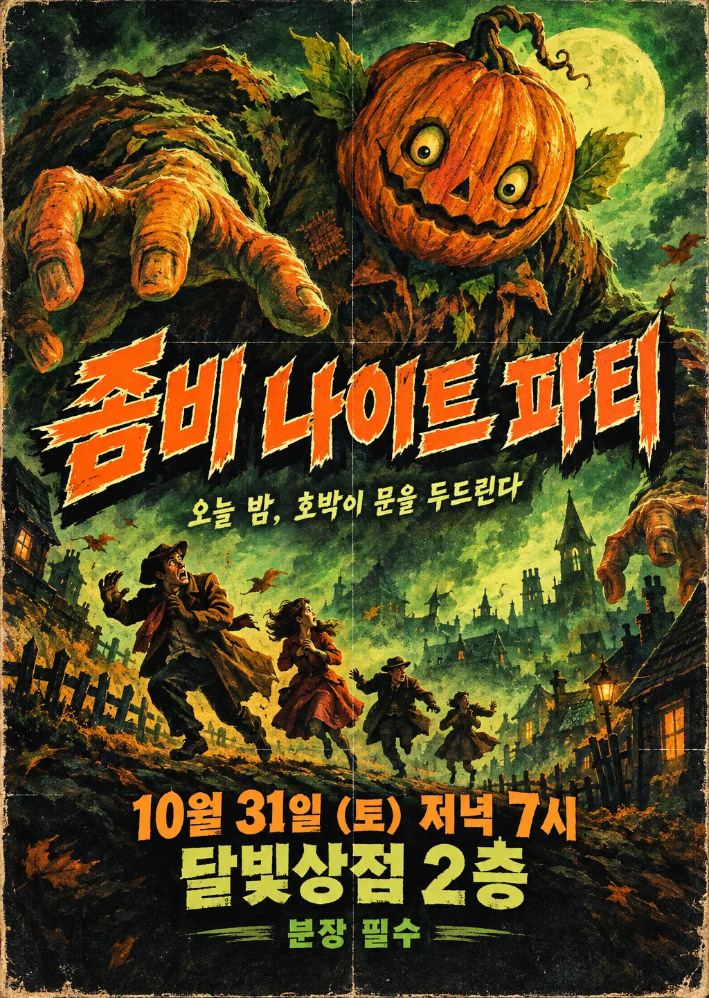
파티 이름 · 날짜 · 장소만 넣으면 낡은 극장에 붙어 있던 80년대 B급 공포영화 포스터처럼 나와요. 가게 할로윈 파티 · 친구 모임 초대장에.
ChatGPT 무료 OK
칸 채우기
- 1칸을 채워요
- 2복사 버튼을 눌러요
- 3GPT 채팅창에 붙여넣어요
- 4그대로 보내면 썸네일 예시처럼 나와요
- 5카드에 맞는 실제 사진을 같이 넣으면 그 사진이 반영돼요 — 배경 카드는 배경 사진, 인물 · 음식 카드는 그 사진 선택
프롬프트 원문 보기 8,585자
Generate this image now. Draw it directly - do not describe it, explain it, or ask questions.
Output size 2480x3508 pixels, A4 portrait, 300dpi, print-ready poster.
PHOTO RULE (this overrides any other line in this prompt, before or after it, that calls the photo required or mandatory or says to ask for it): if a photo is attached, use it exactly as the instructions below describe. If no photo is attached, never ask for one and never stop — invent a fitting fictional subject (person, pet, food, product or place, whatever this card is about) in the spirit of the card's example image, and finish the image.

[Original theatrical poster and authoritative inputs]
Create ONE finished, densely hand-painted 1980s B-movie horror theatrical poster repurposed as a Halloween party invitation. It should pretend to be terrifying yet make the viewer smile at its wonderfully excessive creature and melodramatic staging. The requested size on line two governs the canvas; use portrait A4 when no size is specified. Render the poster artwork flat and edge to edge, never a framed poster, shop interior, photographed wall, invitation template, product mockup, collage of alternatives or explanatory answer.
TITLE = "【파티 이름】". This is the film-title lettering position; print the complete input exactly once.
RELEASE_LINE = "【날짜 · 시간】". This is the release-date position; print the complete input exactly once.
VENUE = "【장소】". This is the cinema-venue position; print the complete input exactly once.
MONSTER = "【주인공 괴물】". A visual selector only. If absent or automatic, invent a gigantic pumpkin-headed creature; otherwise use the selected creature category with a completely original design.
TAGLINE = "【한 줄 문구】". If absent, omit this line. If automatic, invent one short playful Korean cinematic sentence about the illustrated menace, without inventing an admission rule, price, event time or promise. Otherwise print the supplied wording verbatim once.
ENTRY_NOTE = "【드레스 코드 · 준비물】". Print only this supplied note, once; if absent, omit it without inventing restrictions or fees.
PALETTE = "【색】". If absent, use orange, black and acid green. Orange/black/green uses burnt pumpkin orange, near-black and swamp-green painted light; red/purple uses crimson lettering and violet shadows; yellow/navy uses warm yellow highlights and midnight-blue darkness. The selected palette controls the entire poster.
WEAR = "【낡음 정도】". If absent, use moderate wear. Like-new means intact paper and clean printing while retaining the period illustration; moderate means faded edges, two soft fold lines and modest ink wear; heavily aged and torn means scuffed corners, shallow edge tears and stronger fold lines, keeping every word intact.

[Fallbacks for absent input lines]
When an optional named input line is absent, resolve MONSTER to an original pumpkin-headed giant, PALETTE to orange/black/green and WEAR to moderate. TAGLINE and ENTRY_NOTE are absent unless their own lines are supplied. Active lines above always take precedence over this fallback map.

[Resolve before drawing]
Resolve the named inputs BEFORE planning the image. An optional input exists only when its own input line is supplied; blank values and "고르지 않음" mean absent. "알아서 골라줘" and "알아서" are automatic-choice MENU COMMANDS, never visible copy: choose a fitting concrete result yourself. Never print a selector, field label, these commands, or placeholder braces. Defaults apply only to absent inputs. A supplied choice replaces its corresponding default everywhere; subsequent scene descriptions refer to the resolved named value, never to a competing fixed default.
The party name is a literal title, not a command to select a known film, actor or creature. The date/time and venue are literal party information placed where a movie poster would announce its release and cinema. Do not add invented film credits, a director, cast, production company, review stars, a rating, a real release year or an additional heading.

[Monster design, resolved before composition]
A pumpkin-headed giant has an asymmetrical ribbed pumpkin head, a crooked harmless grin, leaf-like ears and a bulky patched garden-coat body, with exaggerated painted hands reaching over a tiny town. A swamp creature has a rounded moss-covered body, floppy reed fronds and surprised bulging eyes, with no recognizable film-monster silhouette. A giant bat has enormous uneven scalloped wings, fuzzy round ears and a comically startled expression. A zombie crowd is an oversized looming cluster of intact, shambling theatrical party figures in eccentric ordinary clothing, with funny vacant expressions and no wounds or decay. Alien tentacles are smooth fantastical curling forms with unusual original eyes and soft bulbous tips, never copying an existing alien. Draw ONLY the resolved category as the central menace, not all menu options. Keep the creature physically impossible and melodramatic rather than realistically threatening.

[Dense painted composition]
Build one continuous illustrated scene, not separated rectangular information panels. The creature dominates approximately 38-75% image height, with a large looming head, diagonal sweeping limbs or wings and exaggerated foreshortening. Below it, three to five small fictional human silhouettes flee across a crooked hillside street: windblown coats, raised hands, one absurdly overdramatic backward glance. Their tiny scale sells the monster's ridiculous size. Fill the surrounding space with a painted moon glow, tilted roof silhouettes, theatrical fog, dry-brush streaks and a few wind-tossed leaves. Arrange these in overlapping foreground, middle ground and distance; maintain clear pockets behind essential text. Let the creature's silhouette nearly touch one outside corner of the title shadow without hiding a letter. The scene should feel like an ambitious inexpensive creature feature, with lovingly painted detail and a wild diagonal rhythm.

[Integrated theatrical lettering]
Leave the outer top 12% and bottom 15% free of essential copy. Set TITLE at approximately 15-35% height, spanning 85-90% of the width in one or two compact lines. Use thick, irregular hand-painted display lettering, individually tilted letters, ragged brush contours, a contrasting pale keyline and a deep offset painted shadow. Preserve the exact Hangul syllable shapes or original-language characters; distressed edges must never erase a stroke. If TAGLINE exists, place it in a narrow clear band around 35-40%, using smaller but readable painted lettering. Set RELEASE_LINE and VENUE at approximately 73-81% as two strong condensed cinema-announcement lines. ENTRY_NOTE, when supplied, sits around 82-84% in clear compact lettering. Keep text contrast high and the venue large enough to read on a phone. These lines belong to the painted movie poster, with no calendar icons, RSVP box, discount badge, schedule table or corporate event-sign layout.

[Period medium and tactile finish]
Use visible gouache and oil-like brushwork, airbrushed theatrical highlights, imperfect ink trapping, fine halftone dots inside shadow areas, slightly misregistered color edges and pale aged paper visible at the perimeter. WEAR controls the amount of fading, folding and tearing; do not apply heavy aging to the like-new choice. Texture enriches the painting but remains subtle beneath names, date numerals, punctuation and time. Use the resolved PALETTE rather than adding a second palette. High scene density must come from purposeful painted staging, not confetti clip art or repeated tiny Halloween icons.

[Exact-copy and originality check]
Print only TITLE, RELEASE_LINE, VENUE and the active text inputs, each once. Preserve all supplied spaces, parentheses, day-of-week characters, digits, time expressions, currency and punctuation. Never silently change a date, correct a weekday, append a year, translate a name or replace a venue. All creatures and fictional silhouette designs must be newly invented. Do not imitate a real film poster, famous monster, actor, entertainment character, studio mark or commercial brand. No blood, wounds, injury, exposed anatomy, violent attack, recognizable branded candy, watermark or signature. Finish with one coherent, richly painted B-movie poster and no other output.

[Final output format]
Output size 2480x3508 pixels, A4 portrait, 300dpi, print-ready poster.
This selected output format takes priority over any fixed canvas size or aspect ratio elsewhere in this template. Adapt the composition, text zones and margins to the selected canvas without stretching or cropping essential content. Device safe areas apply only when a device is selected. Never print these format instructions on the image.
결과 어땠어요?
이 카드도 많이 사용해요

쓰는 법 · 자주 묻는 것
이런 때 쓰세요
동네 극장 벽에 붙어 있던 낡은 공포영화 포스터를 떠올려 보세요. 손으로 그린 거대한 괴물, 비명을 지르는 사람들, 굵고 삐뚤빼뚤한 제목, 바랜 종이와 접힌 자국. 이 카드는 그 느낌으로 할로윈 파티 포스터를 만들어요. 가게 할로윈 파티, 학교 · 학원 행사, 친구들끼리 하는 홈파티 초대장으로 쓰기 좋아요. 무서운 척하지만 사실은 재미있는, 웃음이 나오는 B급 감성이 핵심이에요.
칸 채우는 법
파티 이름 · 날짜와 시간 · 장소 세 가지만 넣으면 됩니다. 이 세 줄은 영화 제목과 「개봉일 · 상영관」 자리에 들어가요. 주인공 괴물은 호박 머리 거인 · 늪 괴물 · 거대 박쥐처럼 고를 수 있고, 비우면 파티 이름에 어울리게 정해요. 한 줄 문구는 영화 홍보 문구처럼 짧게 들어갑니다. 「분장 필수」 같은 드레스 코드나 입장료는 아래 작은 글씨로 들어가요.
그림이 나오면 꼭 볼 것
- 날짜 · 요일 · 시간 · 장소 글자가 정확한가요? 요일은 달력으로 한 번 확인하세요
- 실제 영화 제목이나 유명한 괴물 캐릭터처럼 보이지 않나요? 이 카드는 새로 지은 괴물만 그려요
- 너무 무서우면 아이 행사에는 「색: 노랑 · 남색」, 「낡음: 새것처럼」을 골라 보세요
틀린 곳 고치는 법
같은 대화에 「날짜를 10월 30일 (금)로」, 「괴물을 더 귀엽게」, 「제목 글자를 더 크게」처럼 한 가지씩 말하세요.
자주 묻는 것
- 016 할로윈 이벤트 포스터와 뭐가 달라요? 016은 할인 · 증정 같은 가게 행사를 알리는 안내 포스터예요. 이 카드는 파티 자체를 영화 포스터처럼 꾸미는 초대장에 가까워요.
- 아이들 행사에 써도 돼요? 피 · 상처 같은 잔인한 표현은 넣지 않게 했어요. 귀여운 쪽으로 가려면 괴물을 「거대 박쥐」나 「호박 머리 거인」으로 고르세요.