
전체 · 광고/포스터 · 카페·디저트 · 음식점·식당
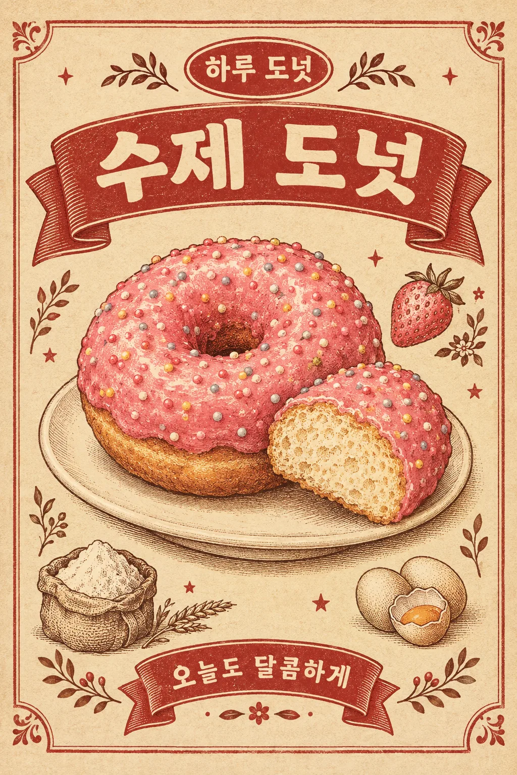
241복고 음식 삽화 포스터
누런 종이와 붉은 리본, 판화 같은 음식 그림으로 옛 식당 광고를 만들어요. 카페 벽과 피드에 어울려요.
받는 것
- 복고 음식 삽화 포스터 한 장
칸 채우기
- 1칸을 채워요
- 2복사 버튼을 눌러요
- 3GPT 채팅창에 붙여넣어요
- 4그대로 보내면 썸네일 예시처럼 나와요
- 5카드에 맞는 실제 사진을 같이 넣으면 그 사진이 반영돼요 — 배경 카드는 배경 사진, 인물 · 음식 카드는 그 사진 선택
프롬프트 원문 보기 3,814자
Generate this image now. Return exactly ONE complete image directly. Do not ask questions, browse for photos, return a plan or give a prompt instead of the image.

Output exactly one finished 2:3 portrait image, 1024x1536 pixels. Keep all important text inside the central 73% of image height: leave the top 12% and bottom 15% free of essential lettering.

[Input: values are the only facts and wording]
MENU: "【메뉴 이름】"
SHOP: "【가게 이름】"
COPY: "【짧은 문구】"
FOOD_DETAIL: "【재료와 모양】"
SMALL_ART: "【주변 재료 그림】"
ACCENT: "【포인트 잉크 색】"
SERVING: "【음식 담는 곳】"
DETAIL: "【종이 결 강도】"

[Fixed card design]
Design an original old neighborhood restaurant print advertisement, densely detailed vintage food illustration rather than a photo. Use warm yellowed cream paper, brick-red ink, cocoa contours and ACCENT as one food-related ink accent. If absent, choose that accent from FOOD_DETAIL. One main serving occupies about 55–60% of the poster. Draw the food volume, cut surface and texture with engraving-like hatching, slightly uneven flat ink fills and delicate stipple; no glossy plastic rendering.
A broad red ribbon in the upper area carries MENU in bold cream letters. A compact oval above carries SHOP. A short lower ribbon carries COPY once. Beside the main serving draw three or four small ingredient illustrations from SMALL_ART only; if absent derive only ingredients explicitly named in FOOD_DETAIL, never unrelated products. Place the food on SERVING if supplied; otherwise a simple cream plate. A fine ornamental border, tiny stars and botanical marks link the side illustrations and the ribbons. Keep food outlines and letter counters clear. Paper fibers and ink density follow DETAIL: subtle or evident, but neither choice erases letters. No false fold, ripped corner or heavy grime.
Only MENU, SHOP and COPY are printed. No invented slogans, translated subtitles, price, age claim, quality certification or brand imitation. The main food must remain much larger than decorations. The bottom feels completed by a ribbon and print ornament rather than an empty price panel.

[Button meanings, internal instructions only]
DETAIL: "은은하게" means subtle paper grain; "또렷하게" means visible paper grain.

[Missing inputs and finish]
An optional input line removed from this prompt is absent. Do not print its key, invent a substitute caption, ask for it or reserve an empty panel. Choose a fitting simple visual only where the fixed design explicitly permits an automatic default. Selected values alter content only; retain this card's single style and one composition. Every supplied visible string stays verbatim in its original script and currency, without translation. Ordinary automatic lettering, if explicitly allowed above, is Korean; internal English keys and button names are never captions.
Use the stated aspect ratio, adapting one coherent layout rather than stretching food or letters. Text-bearing posters keep important lettering within the central 16–83% of image height and 5–95% of width; extend food-related ornament, background, shadows or texture to the trim so these insets do not create empty bands. Keep all price digits and ingredient labels unobstructed. Text-free photographs fill the canvas naturally with their scene. No frame, phone, wall mockup, watermark or extra results.
No uploaded photo is needed: create a fictional food scene from these inputs. If a reference photo is attached, use it only for the stated food's visible shape and materials within this same drawing or photographic medium, without adding absent products or claiming exact portion preservation. Finish one image even when no photo is attached.

[Final output format]
Output exactly one finished 2:3 portrait image, 1024x1536 pixels. Keep all important text inside the central 73% of image height: leave the top 12% and bottom 15% free of essential lettering.
This selected output format takes priority over any fixed canvas size or aspect ratio elsewhere in this template. Adapt the composition, text zones and margins to the selected canvas without stretching or cropping essential content. Device safe areas apply only when a device is selected. Never print these format instructions on the image.
결과 어땠어요?
이 카드도 많이 사용해요


쓰는 법 · 자주 묻는 것
따뜻한 종이 위에 음식 그림을 크게
누런 종이 위에 도넛을 크게 그리고, 위에는 붉은 제목 리본, 주변에는 작은 딸기·달걀·밀가루 그림을 넣는 복고 포스터예요. 음식의 두께와 표면을 가는 판화 선으로 살려서 옛 동네 식당의 인쇄 광고 같은 느낌을 냅니다. 카페 벽의 장식 그림이나 도넛 신메뉴 피드에 쓰기 좋아요. 가격표와 다른, 그림 중심의 한 장입니다.
이름과 음식 모양을 채워요
메뉴 이름·가게 이름·짧은 문구·재료와 모양이 꼭 필요한 네 칸이에요. ‘분홍 딸기 코팅의 둥근 도넛, 작은 설탕 장식’처럼 색과 모양을 적으면 중앙 음식 그림이 정해져요. 큰 리본에는 메뉴 이름, 작은 타원에는 가게 이름, 아래 리본에는 짧은 문구가 들어갑니다. 글자가 많아지는 긴 설명보다 ‘오늘도 달콤하게’ 정도의 한 줄이 잘 어울려요.
주변 그림과 잉크를 조절해요
주변 재료 그림은 ‘딸기, 밀가루, 달걀’처럼 메뉴에 들어가는 재료 서너 개만 적어요. 비우면 재료와 모양에 적힌 것에서 골라 그립니다. 포인트 잉크 색은 음식에 어울리는 분홍·노랑·초록·주황 보기를 쓸 수 있어요. 음식 담는 곳에는 작은 접시나 나무 도마를 적어요. 종이 결 강도를 또렷하게 고르면 인쇄 결이 더 보이지만, 글자가 지워질 만큼 낡게 만들지는 않아요.
복고 글자와 재료를 대조하세요
칸을 채워 복사한 글을 GPT에 한 번 보내면 완성 포스터 한 장을 요청합니다. 결과에서 리본 위 메뉴 이름과 아래 문구를 읽고, 옆 그림이 중앙 음식과 관계있는 재료인지 확인하세요. 도넛보다 테두리가 커 보이면 ‘음식을 더 크게 하고 주변 장식만 줄여줘’라고 고쳐요. 그림을 사진처럼 바꾸기보다 해칭과 종이 결을 유지하는 편이 이 카드의 느낌을 살립니다. 실제 가게의 브랜드 로고와 같은 모양을 요구하지 않아도 가게 이름으로 충분히 완성돼요.