
전체 · 광고/포스터 · 음식점·식당
190돈가스 SNS 홍보
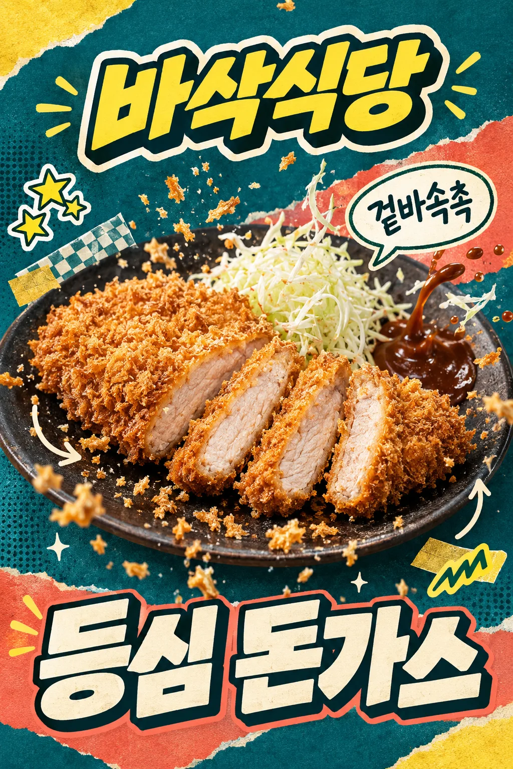
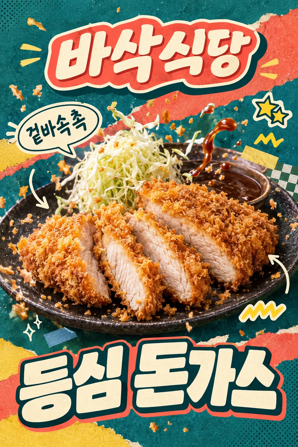
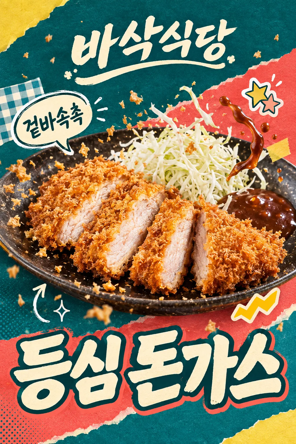
SNS 인스타 피드에 올리는 한 장. 가게 이름 로고와 튀는 재료·손그림 스티커, 큰 메뉴 이름으로 가격 없이 눈길을 잡아요.
결과 SNS 게시용 홍보 이미지 한 장 · 가게 이름 로고·콜라주·큰 메뉴, 가격 없음
칸 채우기
- 1칸을 채워요
- 2복사 버튼을 눌러요
- 3GPT 채팅창에 가게에서 실제 판매하는 돈가스 사진 1장을 올리고, 프롬프트를 같이 붙여넣어요
- 4가게에서 실제 판매하는 돈가스 사진 1장과 프롬프트가 둘 다 들어간 걸 보고 보내요
프롬프트 원문 보기 5,918자
Generate ONE finished raster image now, directly, without questions or explanation.
Output size 1080x1350 pixels, 4:5 portrait, Instagram standard.
[SOCIAL FEED — FIXED T1 + T3 COMPOSITION]
Make an exuberant Instagram food ad, default portrait 4:5. Combine the photographed moment of ingredients in motion (T1) WITH photo cutouts, hand-drawn speech bubbles and sticker collage (T3). The food is the dominant central hero; decorations must not make the meal look drawn.
[REAL FOOD IS THE HERO]
Use the attached merchant-owned food photograph as the only food reference. Preserve the actual serving size, slice count, irregular slice arrangement, meat thickness, coating and cooked interior. Keep an unsliced cutlet unsliced. The food stays photographic: golden coarse irregular bread flakes, a thin fried edge, moist pale fully cooked pork with fine fibers. A cross-section is visible only if it exists in the source. Preserve the actual vessel and existing sides. Do not add another serving, cheese, rice, drinks, new sides, packaging or a third-party logo. Warm soft side light and crisp close detail make the real food appetizing; never make identical repeated slices, a bread sandwich or a hollow fried shell.
[EXACT SHORT COPY]
Print the menu exactly once: "【메뉴 이름】". Do not abbreviate it.
Short copy input: "【한 줄 외침】". If it equals "알아서 골라줘", use "겉바속촉" only when the visible texture supports it; otherwise choose one equally short sensory phrase. Print the final phrase once. Never print field labels, placeholder braces or option names.
Render all lettering in Korean Hangul, preserving every supplied character and space.
[STORE NAME AS A DESIGNED LOGO — UPPER AREA]
Store name exactly "【가게 이름】", printed once, mandatory and prominent. Make the whole name a custom logo-shaped block in the upper area, never plain small type or a copied existing brand logo. Design choice: "【가게 이름 디자인】".
If "부드럽게": rounded handwritten lettering on a soft pastel ribbon with folded ends and a smooth cream keyline.
If "임팩트 있게": very bold slightly slanted connected display letters, a thick cream outline and a short hard-offset dark extrusion; a compact impactful sign or sticker silhouette.
If "타이포 디자인": bespoke lettering where the letters themselves form an illustrated restaurant logo, with restrained crumb-shaped stroke terminals and one integrated underline. Keep every glyph legible, never replace a character with a food icon.
If "알아서 골라줘": choose the bold-impact logo above for this composition. Apply this choice ONLY to the store-name block. Keep the same finished image type, food, menu placement, background and other decorations. Output one image, not a logo sheet or alternate layouts.
[MOTION AND TACTILE COLLAGE]
A huge cutlet-and-plate photograph, filling about 90% of the width, tilts gently through the middle. Freeze tiny real bread flakes in a lively arc. If brown cutlet sauce and shredded cabbage are already in the source, lift a small sauce ribbon and a few cabbage strands into the air beside their original side portions; keep the same ingredients and serving, with no added toppings. If either is absent, omit just that ingredient motion and keep the crumb burst. Sauce, crumbs and cabbage form real photographed layers in front of and behind the outer food contour, never through the lettering or meat face.
Use saturated deep teal paper, a broad coral torn-paper diagonal, lemon-yellow and cream fragments, faint halftone ink and paper fibers. Layer one checkered paper corner and two small tape tabs behind the food. Add three restrained graphic accents: one cream hand-drawn speech bubble carrying the exact short copy, one decorative star cluster sticker without a score or digits, and one small lemon zigzag sticker without text. Two loose appetite arrows and tiny sparkles give rhythm. The speech bubble sits beside the food, not in a giant headline that competes with it. Add no review rating, time limit, discount or unsupported promotional claim.
[HUGE MENU AT THE BOTTOM — NO PRICE SLOT]
Make the exact menu name occupy the lower 25–30% as monumental cream display lettering with a dark outline and a short coral offset. Use one line when it fits; for a long menu use a deliberate two-line title, still one menu occurrence. Letters may interact with the torn-paper edges, but every stroke stays readable. The menu is the main lower shape, not left-aligned text in a horizontal information band. There is NO price row, empty price space, currency, price digits, percentage, sale copy or number anywhere in the advertisement. Print only the store name, menu and short sensory copy; stars and other stickers are decorative marks.
[FULL CANVAS AND THUMBNAIL ADAPTATION]
Fill the canvas edge to edge; no outer border, white mat, photographed paper, device or wall mockup. At normal display ratios the upper logo stays fully inside x7–93%, y8–26%; food occupies the central y30–68%; the lower menu area fills y70–98%.
For a 2:3 site thumbnail only, protect the site's overlays: all essential ink, outlines and shadows must lie inside x7–93%, y14–84% (at 1024×1536, y215–1290). The lower menu region still uses the full lower 25–30% of the usable safe composition, around y64–84%; surrounding background and decorative shapes continue to the bottom edge. Keep the menu large by shortening the upper caption and allowing the plate rim to crop; never put the menu into a tiny strip. At 4:5 and print ratios retain the large lower menu region without a blank footer.
Deliver exactly one finished image. No watermark, franchise imitation, artist signature or instructions to assemble it.

[Final output format]
Output size 1080x1350 pixels, 4:5 portrait, Instagram standard.
This selected output format takes priority over any fixed canvas size or aspect ratio elsewhere in this template. Adapt the composition, text zones and margins to the selected canvas without stretching or cropping essential content. Device safe areas apply only when a device is selected. Never print these format instructions on the image.
결과 어땠어요?
이 카드도 많이 사용해요




쓰는 법 · 자주 묻는 것
인스타 피드에 올리는 한 장
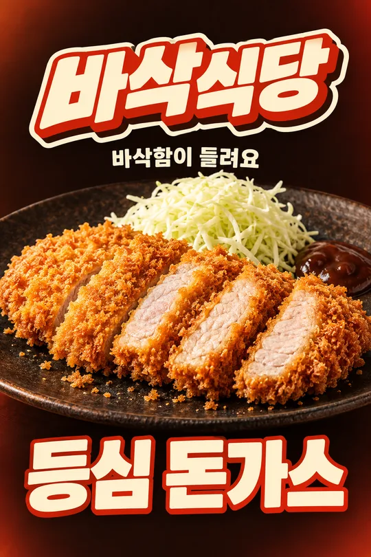
실사 돈가스에 빵가루·소스·양배추가 움직이는 순간과 손그림 스티커를 함께 붙이는 SNS 홍보 이미지예요. 청록 종이, 코랄 색면과 작은 스티커를 겹치되 음식이 가운데에서 가장 먼저 눈에 들어옵니다. 아래쪽은 큰 메뉴 이름으로 채우며 가격이나 할인 문구는 들어가지 않습니다. 기본 비율은 4:5예요.
가게 이름을 로고로 고르세요
가게 이름은 꼭 입력합니다. 보기의 ‘바삭식당’은 지어낸 예시이며 표지의 로고도 예시입니다. 부드럽게는 둥근 손글씨와 파스텔 리본, 임팩트 있게는 굵은 입체 글자·외곽선·기울임, 타이포 디자인은 글자 자체를 그림처럼 짜는 레터링 로고예요. 알아서 골라줘는 이 구도에 맞는 임팩트형을 고릅니다. 버튼은 위쪽 가게 이름 덩어리만 바꾸며 카드 전체는 같은 SNS 홍보 한 장입니다. 넘겨 보는 예시는 임팩트·부드럽게·타이포 순서입니다.
실제 음식 사진과 네 칸
가게 이름, 가게 이름 디자인, 메뉴 이름, 한 줄 외침을 채우세요. 메뉴는 실제 이름 그대로, 외침은 ‘겉바속촉’처럼 짧은 맛 표현을 씁니다. 가게에서 파는 사진을 첨부한 뒤 복사한 프롬프트를 함께 보내세요. 사진에 소스나 양배추가 있을 때만 그 재료의 작은 움직임을 만들고, 없으면 빵가루만 움직입니다. 원래 제공량·고기 두께·조각 수·곁들임은 유지합니다.
게시 전에 확인하세요
가게 이름과 메뉴를 한 글자씩 확인하고, 숫자·가격·할인 문구가 생기지 않았는지 보세요. 별 스티커는 장식이며 별점 숫자나 오늘 한정 조건은 만들지 않습니다. 작은 화면에서도 음식과 큰 메뉴가 먼저 읽혀야 해요. 글자가 틀리면 정확한 문구를 적고 그 부분만 고쳐 달라고 요청하세요. 예시 이미지는 API 생성 시안이며 실제 가게 사진 보존 성능을 확인한 결과는 아닙니다.