
전체 · 만화/일러스트 · 풍경
188내 여행 종이 조각 풍경
내가 찍은 여행 사진 한 장을 겹겹의 종이 풍경과 연필 기억으로 바꿔 SNS에 남겨요.
칸 채우기
- 1칸을 채워요
- 2복사 버튼을 눌러요
- 3GPT 채팅창에 내가 찍은 여행 풍경 사진 1장을 올리고, 프롬프트를 같이 붙여넣어요
- 4내가 찍은 여행 풍경 사진 1장과 프롬프트가 둘 다 들어간 걸 보고 보내요
프롬프트 원문 보기 5,429자
Generate this image now. Draw it directly - do not describe it, explain it, or ask questions.
Output one landscape A3 poster, 420 x 297 mm, aspect ratio 1.414:1. Use the largest supported image resolution. Final print target is 4961x3508 pixels at 300dpi; keep all lettering at least 10 mm inside every paper edge. Preserve the wide composition and print-safe margins.

[Purpose]
Create one completed layered-paper landscape from the user's own travel photograph, with one large pencil memory line. The user posts the finished artwork as a personal travel record. The entire scene is a single paper illustration, not a person portrait, animal origami, miniature toy, itinerary, collage or before-and-after presentation.

[Scene]
Translate the photograph's real viewpoint, skyline, buildings, water or paths, visible vehicle count and relative object positions into stacked matte paper planes. Preserve distinctive structures and all significant scene edges. Use thin cut-paper silhouettes and restrained layer separation, not large folded polygon facets. If people appear, retain their count, positions and clothing silhouettes. Fit a wide source into the selected canvas without deleting a landmark: extend only unmarked sky or plain ground as needed, never invent another building or attraction. The memory line is "【기억 한 줄】". If it equals "알아서 골라줘", create a short Korean reflective line of at most twelve syllable blocks about noticing this view, with no invented date, trip history or named location.

[Attached photo]
One travel photograph taken by the user is required. It determines the scenery, viewpoint and existing objects. Do not replace it with a generic Japanese street or guessed famous landmark. Use only the fixed paper medium to reinterpret it. Keep real source colors recognizable within a muted sage, teal, ivory and rust palette. Do not add readable station brands, company logos or new sign text. The source may contain an ordinary street, countryside or rail view, but it always becomes the same layered-paper landscape output.

[Text layout]
Open paper sky at the top; the large pencil memory line sits at y18-28%, separated from intricate scenery. The connected layered landscape fills y31-100%, using a broad foreground plane, middle buildings or terrain and a quiet distant skyline. Depth comes from stacked edges across the whole scene rather than separate square panels. Keep the actual photograph's spatial logic and sight lines.
Optional place only: render "【장소 이름】" on a small pencil line at y78-81%, on a quiet ground area.
Optional name only: render "【이름】" on a modest separate pencil line at y82-84%, without a label or empty tag.

[Style]
Fixed handcrafted layered-paper illustration with smooth cut silhouettes, fine fibers at the edges, matte colored paper and soft cast shadows between layers. Muted misty teal and sage dominate; ivory sky and small rust accents fit a calm trip memory. This is not watercolor, woodcut, crayon, origami, animation screenshot or a set of style options. Keep the medium and layout unchanged when the source landscape changes.

[Visual hierarchy]
The personal memory line reads immediately; the full connected landscape provides a place-specific visual record. Keep trees, roofs, rivers and roads clear at the small site-list size. Optional labels remain small and do not compete with the scene. There is no promotional card title or frame outside the artwork.

[Lighting and texture]
Soft grazing light shows thin paper edges and shallow shadows. Maintain logical foreground/middle/distance layering and natural muted scene color. No glossy plastic, exaggerated floating shapes, artificial glow, photorealistic food or heavy room background. Paper layers meet continuously across the artwork.

[Text rules]
Render visible lettering in Korean using large graphite pencil handwriting with dark connected strokes. Write the supplied memory exactly unless it is the automatic-choice control. Do not print the control itself, field labels, inferred geographic names, arrival dates, weather readings or facts about attractions. Optional place and personal name appear only when entered, on their own lines.

[Avoid]
No generic replacement destination, fabricated landmark, map, itinerary, multiple panels, source photo inset, desktop model, toy branding, animal origami, artist name, studio imitation, extra people or separate files to assemble. Deliver one finished landscape directly.

[Single-image delivery]
Deliver exactly one completed raster image, with one fixed medium and one fixed composition. All requested elements belong inside this single canvas. Generate it directly without running code, giving setup instructions, asking follow-up questions, presenting alternatives, or requiring the user to crop or combine files. Do not put the prompt, field names, placeholders, explanations or an advertising wrapper in the artwork. Keep the outer canvas fully finished edge to edge. Respect the selected aspect ratio by adapting spacing only; preserve the same result type and relative visual hierarchy.

[Legibility and factual discipline]
Keep every essential letter within 14-84% of the canvas height and 7-93% of its width. Leave the top 12% and bottom 15% free of important lettering. At 1024x1536, essential ink must stay between y215 and y1290. Use readable dark-on-light or light-on-dark contrast, actual connected letters and natural word spacing. Never fabricate dates, discounts, counts, rewards, statistics, origins, medical effects or business terms. Do not reproduce trademarks, famous people, named fictional characters, franchise imagery, artist signatures, watermarks, device mockups or official app interfaces.
이 카드도 많이 사용해요
쓰는 법 · 자주 묻는 것
여행 사진을 다른 재질로 남겨요
내가 걸었던 길이나 창밖에서 본 풍경을 종이가 겹겹이 놓인 한 장으로 바꾸는 카드예요. 작은 역, 골목, 바닷가, 산책길처럼 실제로 찍은 사진을 SNS에 기록하고 싶을 때 쓰세요. 사진과 그림을 위아래로 비교하는 형식이 아니라 풍경 전체가 종이 조각 일러스트로 바뀝니다. 건물과 길의 위치가 내 사진에서 왔기 때문에 같은 문구를 써도 사람마다 다른 여행 기록이 돼요.
어떤 사진을 고르나요
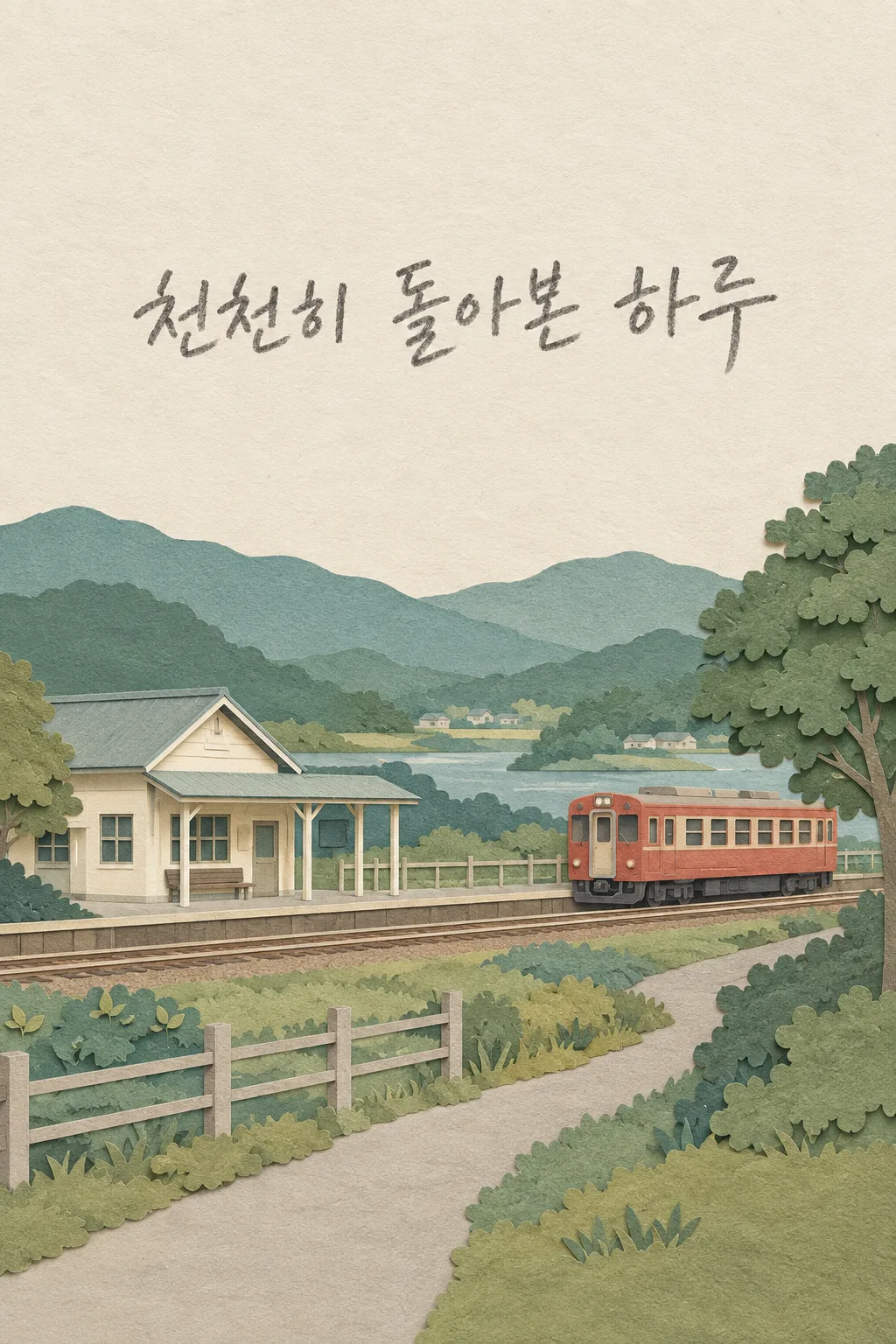
장소의 구도가 잘 보이는 사진 한 장을 준비하세요. 가까운 인물 얼굴만 있는 셀카보다 길, 건물, 산, 물 같은 풍경이 함께 보이는 사진이 맞습니다. 사진에 사람이 있어도 수와 위치를 유지하도록 요청하지만, 이 카드는 사람 초상보다 장소가 중심입니다. 다른 사람 사진을 자기 여행으로 쓰지 말고 직접 찍었거나 사용할 수 있는 사진을 고르세요. 표지의 작은 역과 열차는 종이 재질과 구성을 보여 주는 가상 예시이며 실제 여행 장소를 소개하는 사진은 아닙니다.
기억과 이름 입력
기억 한 줄에는 그 풍경을 보며 남기고 싶은 짧은 말을 적으세요. ‘알아서 골라줘’를 고르면 사진을 바라보는 느낌의 일반적인 한마디를 만들며, 다녀온 날짜나 없던 여행 이야기를 붙이지 않습니다. 장소 이름은 실제로 알고 있을 때만 적고, 모르면 비워 두세요. GPT가 사진만 보고 도시나 역 이름을 지어내지 않도록 요청합니다. 이름도 선택입니다. 두 칸을 비워도 큰 기억 한 줄과 풍경은 그대로 남아요. 그림체와 배치는 선택하지 않고 종이 풍경 한 가지로 고정돼요.
한 메시지로 보내세요
사진을 GPT 입력창에 올린 뒤 아직 보내지 마세요. 칸을 채운 프롬프트를 복사해 같은 입력창에 붙여넣고, 사진과 글이 둘 다 들어간 것을 확인한 뒤 한 번 보내세요. 사진만 먼저 보냈다면 끝에 ‘위 사진으로 그려줘’를 덧붙입니다. 사용자가 종이를 오리거나 여러 이미지를 합치는 작업은 필요하지 않아요. 완성된 그림 한 장을 그대로 받아 올립니다.
원래 풍경이 남아 있나요
생성 그림을 사진과 비교해 건물 위치, 길의 방향, 차량이나 사람 수, 산과 물의 모양을 보세요. 재질이 바뀌어도 다른 장소가 되면 안 됩니다. 넓은 사진은 빈 하늘이나 단순한 땅을 이어 세로 화면에 맞추도록 요청하고, 없는 건축물이나 유명 명소를 새로 만들지 않도록 합니다. 종이의 얇은 가장자리와 층 사이 그림자가 보여야 하며, 동물을 접은 종이접기나 책상 위 장난감 모형처럼 나오면 다른 결과입니다.
고칠 때는 사진의 기준을 말해요
역이 오른쪽으로 옮겨졌다면 ‘사진처럼 역은 왼쪽, 열차는 오른쪽에 유지해줘’처럼 위치를 지정하세요. 글씨가 작으면 기억 한 줄을 더 짧게 입력하고 크게 써 달라고 하세요. 날짜나 도시 이름을 추측해서 붙였으면 그 문구를 빼 달라고 요청합니다. 첫 메시지에서 완성 한 장이 나오는 것이 기본이며, 수정은 실패한 부분을 보완합니다.
자주 묻는 것
- 일본 여행 사진만 되나요? 어느 여행지든 내 사진의 장소를 유지한 종이 풍경으로 바꿉니다.
- 사진 원본도 같이 들어가나요? 원본 비교 칸 없이 풍경 전체가 종이 그림이 됩니다.
- 장소 이름을 모르면요? 비워 두면 이름을 추측하지 않고 그 줄만 생략합니다.