
전체 · 유튜브/썸네일 · 유튜브 썸네일 · 쇼츠·릴스 표지
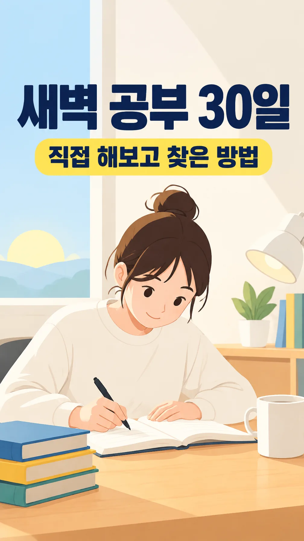
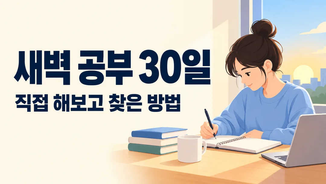
013브이로그 · 스터디 영상 썸네일 — 롱폼 가로 · 숏폼 세로, 작게 봐도 읽히는 큰 카피
영상 주제만 적으면 작은 화면에서도 한눈에 읽히는 큰 카피까지 지어 넣는 롱폼(가로) · 숏폼(세로) 썸네일
칸 채우기
- 1칸을 채워요
- 2복사 버튼을 눌러요
- 3GPT 채팅창에 붙여넣어요
- 4제품·인물 사진을 쓰려면 사진과 프롬프트를 둘 다 넣은 뒤에 보내요 선택
프롬프트 원문 보기 6,909자
Generate this image now. Draw it directly - do not describe it, explain it, or ask questions.
Output size 2480x3508 pixels, A4 portrait, 300dpi, print-ready poster.

[Purpose]
Create one finished Korean video thumbnail. Follow the canvas size above: a 9:16 portrait canvas is the cover of a short-form video (Shorts, Reels), and a 16:9 landscape canvas is the thumbnail of a long-form YouTube video. The entire design must succeed first as a tiny preview on a phone. Its single most important test is whether the big headline copy remains instantly readable after the image is reduced to thumbnail size. Make one complete image, not a mockup, storyboard, template sheet, comparison grid, or design proposal.

[Scene]
The video is about: "【영상 주제】". Interpret it as one clear visual idea that can be recognized in less than a second. Use one dominant subject or one compact group of closely related objects, placed away from the lettering. Build a simple background with broad color areas, controlled depth, and very few supporting details. The subject supports the headline but never competes with it. Do not require an uploaded photo and do not imitate a real creator, celebrity, public figure, channel identity, or existing thumbnail. For a person-related topic, use an original, non-identifiable generic adult illustration or an anonymous cropped figure rather than a recognizable face. For an object or place topic, use an original generic depiction without visible brands, trademarks, packaging, signs, or copyrighted characters.

[Headline copy]
The headline copy is: "【큰 카피】". Use it exactly as written, unless it is exactly "알아서 골라줘" — never print those words.
If no headline copy is quoted above, or it is "알아서 골라줘", write it yourself from the video topic: one punchy Korean hook of at most 8 characters excluding spaces that makes a viewer want to tap — a result, a number that is implied by the topic, a contrast, or a curiosity gap. Plain spoken Korean, no English, no emoji. Never invent prices, statistics, rankings, medical effects, financial promises, or facts the topic does not support.

[Text layout]
- The headline is the dominant text. It stays on one line, and its visible letter height is at least one quarter of the canvas height. Use extremely bold Korean Gothic sans-serif lettering with wide, complete strokes. Give it a clean safe zone with generous padding. It must never sit over the main subject, a face, a hand, a detailed object, or a busy texture.
- Render "【작은 글씨】" on its own line close to the headline, clearly secondary but still readable on a phone. Never join it to the headline and never let it reduce the headline below the required size.
- For a 9:16 canvas, keep the headline and the main subject inside the central 80% width and the middle 70% height, leaving the top and bottom app-button zones quiet. Stack the text in one compact block; keep the subject above or below that block without overlap.
- For a 16:9 canvas, keep every letter inside the central 86% width and 78% height. Prefer a strong two-zone composition: headline area roughly 55-62% of the width and subject area roughly 38-45%. Keep the lower-right corner free of text because the video length badge covers it.
- Do not print the video topic or the atmosphere choice as extra text. They are visual instructions only.

[Style]
Use the atmosphere "【분위기】" to select the visual treatment while preserving maximum readability. "밝고 친근한" uses a clean light background, cheerful saturated accents, rounded shapes, and very dark text. "강렬하고 긴급한" uses a dark or vivid solid background, sharp diagonal energy, one hot accent color, and white or near-white text without alarm symbols. "깔끔하고 전문적인" uses restrained navy, charcoal, cream, or white, precise spacing, minimal geometric structure, and high-contrast lettering. "따뜻하고 감성적인" uses warm cream, muted terracotta, soft natural light, and deep brown lettering while keeping edges crisp. "어둡고 몰입감 있는" uses deep charcoal or midnight blue, one luminous accent object, and solid white lettering, but no glow may touch or blur the text. Use at most three principal colors. Add a simple solid text backing shape only if the background cannot provide reliable contrast.

[Visual hierarchy]
The headline is the first read by a large margin and has the strongest contrast in the image. The main subject is the second read and explains the topic without covering any character. The optional small line is the third read. Leave open space around all four sides of the headline. If space becomes tight, simplify or shrink the subject first, remove decoration second, and drop the small line third. Never shrink the headline below one quarter of the canvas height. Check the composition at about 10% of full size: every headline syllable must remain distinguishable immediately.

[Lighting and texture]
Use controlled, directional light or flat graphic lighting appropriate to the atmosphere. Keep the region behind the headline smooth and quiet. Any texture must be broad and low-frequency so Korean strokes do not disappear when reduced. Preserve crisp edges, opaque colors, and clear separation between foreground and background. Avoid haze, grain, patterned wallpaper, scattered particles, lens effects, or detailed scenery behind the words. Do not use a transparent canvas, letterboxing, unpainted margins, or black bars.

[Text rules]
Render only the headline and the small line if one is given above. Preserve every Korean syllable, space, digit, and punctuation mark of supplied text exactly. Never translate, paraphrase, correct, extend, or repeat it. Do not invent episode numbers, view counts, dates, prices, arrows, badges, labels, category words, quotation marks, or English words. Do not print field names, braces, instructions, the topic, the atmosphere, or aspect-ratio text. Ensure all Korean consonants, vowels, and final consonants have complete strokes. The headline must remain one line; if it seems too long, use the available width, tighten spacing modestly, or simplify the picture rather than wrapping, cropping, or hiding any character.

[Avoid]
No real YouTuber, entertainer, celebrity, politician, influencer, or recognizable person. No company, channel, product, platform, or media brand logo; no trademarked packaging; no copied creator style; no copyrighted character; no fake interface, browser window, phone frame, play button, notification badge, or social-media icon. No text behind a person or object, no object crossing a letter, no face used as a text background, and no busy photograph behind the headline. No thin headline font, low contrast, tiny lettering, long paragraph, curved text, vertical Korean text, duplicate headline, excessive outline, excessive drop shadow, neon bloom, glowing letter edges, lens flare, motion blur, illegible handwriting, warped Hangul, placeholder text, watermark, border, collage, split-screen comparison, decorative clutter, or more than one dominant subject.
이 카드도 많이 사용해요
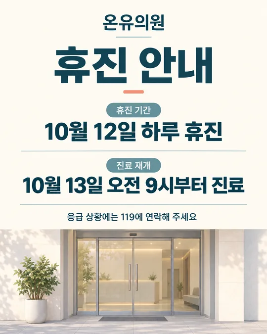
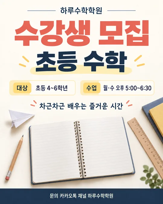

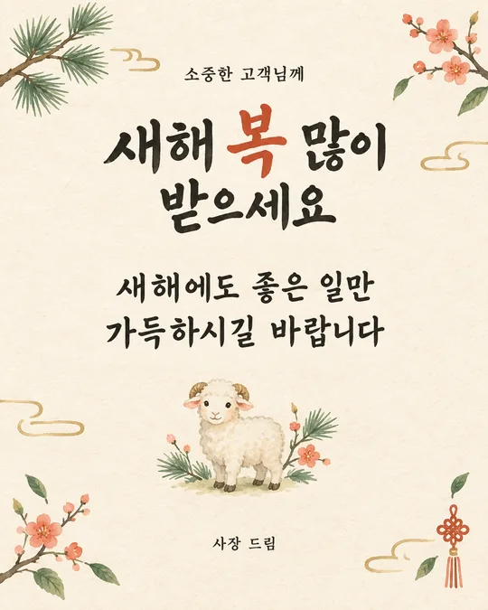
쓰는 법 · 자주 묻는 것
이런 때 쓰세요
영상 목록에서 손가락을 멈추게 하는 건 그림보다 크게 박힌 카피 한 줄이에요. 이 카드는 영상 주제만 적으면 작은 휴대폰 화면에서도 한눈에 읽히는 큰 카피를 붙인 썸네일을 만들어요. 카피가 떠오르지 않으면 큰 카피 칸을 비워 두세요. 주제를 보고 8자 안쪽의 짧은 카피를 지어 넣어요.
영상 썸네일은 보통 두 장이 필요해요. 숏폼(쇼츠 · 릴스)은 세로 9:16, 롱폼(유튜브 영상)은 가로 16:9예요. 같은 칸 그대로 화면 비율만 바꿔 한 번씩 뽑으면 같은 톤의 한 쌍이 나와요. 제목 글자는 화면 높이의 4분의 1 이상으로 잡고, 사람이나 물체가 글자를 가리지 않게 지시해 두었어요.
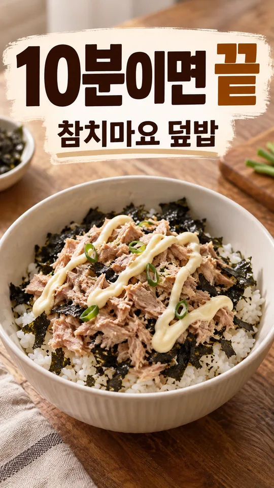
브이로그 · 공부 · 일상 · 여행처럼 사람과 하루가 주인공인 영상에 맞춰 두었어요. 요리 · 레시피 영상은 024 카드가 완성 요리를 더 먹음직스럽게 담아요. 실제 유튜버나 연예인의 얼굴, 다른 채널 로고, 브랜드 제품을 따라 만드는 용도에는 쓰지 마세요.
칸 채우는 법
- 영상 주제: 그림으로 보여 줄 내용을 적으세요. 「공부」보다 「새벽 5시 기상 공부 루틴」처럼 영상 내용을 알아볼 수 있게 쓰면 그림도 카피도 좋아져요. 주제 문장은 그림 안에 글자로 들어가지 않아요.
- 큰 카피: 직접 정했으면 적고, 아니면 알아서 골라줘를 누르거나 비워 두세요. 직접 적을 때는 띄어쓰기를 빼고 8자 이내가 좋아요. 두 문장을 붙이거나 설명을 모두 넣지 마세요.
- 작은 글씨: 큰 카피만으로 뜻이 모호할 때만 넣으세요. 비우면 그 줄은 빠지고 큰 카피와 그림이 더 넓게 보여요.
- 분위기: 주제와 채널에 맞는 한 가지를 고르세요. 어느 분위기를 골라도 글자와 배경의 명암 차이는 크게 유지해요.
- 화면 비율: 처음 값은 9:16 숏폼(세로)이에요. 롱폼 썸네일은 16:9를 고르세요. 두 가지만 보이게 해 두었어요.
가로 · 세로 한 쌍 만들기
- 칸을 채우고 화면 비율 9:16으로 복사해 GPT에 보내요. 세로 표지가 나와요.
- 같은 칸 그대로 화면 비율만 16:9로 바꿔 다시 복사해요.
- 같은 대화에 붙여 보내면 앞 그림과 색 · 카피가 이어진 가로 썸네일이 나와요. 카피를 비워 뒀다면 「앞 그림과 같은 카피로」라고 한 줄 덧붙이세요.
우리 제품·인물 사진을 넣고 싶을 때
내가 촬영한 제품이나 본인 사진을 주인공으로 쓰려면 ① 사진을 먼저 같은 대화에 올리되 아직 보내지 마세요. ② 같은 입력 칸에 이 카드에서 복사한 프롬프트를 붙여 넣으세요. ③ 사진과 프롬프트가 둘 다 들어간 것을 확인한 뒤 함께 보내세요. 사진만 먼저 보냈다면 프롬프트 맨 끝에 「위 사진을 주인공으로 쓰되 글자를 가리지 않게 그려줘」라고 덧붙이세요.
본인이 권리를 가진 사진만 사용하세요. 다른 유튜버, 연예인, 고객, 지나가는 사람의 사진을 허락 없이 넣지 마세요.
그림이 나오면 꼭 볼 것
완성 이미지를 휴대폰에서 화면 너비의 10% 정도까지 줄여 보세요. 그 크기에서도 큰 카피를 망설임 없이 읽을 수 있어야 해요. 입력한 한글을 한 글자씩 대조하고 받침, 띄어쓰기, 숫자도 살펴보세요. 카피를 맡겼다면 영상 내용과 맞는지, 과장된 약속이 들어가지 않았는지 보세요.
세로는 위아래 버튼 자리, 가로는 오른쪽 아래 영상 길이 표시 자리에 글자가 걸리지 않는지도 보세요. 로고, 재생 버튼, 조회 수처럼 요청하지 않은 요소가 생겼다면 삭제해 달라고 하세요.
틀린 곳 고치는 법
같은 대화에서 위치와 바꿀 문장을 정확히 짚어 주세요. 「큰 카피의 '공부' 받침이 틀렸어요. '새벽 공부 30일'로 정확히 고치고 다른 요소는 유지해 주세요」처럼 말하면 돼요. 지어 준 카피가 마음에 안 들면 「카피만 다른 걸로 세 개 제안하고, 두 번째로 다시 그려 줘」라고 하면 돼요.
축소했을 때 안 읽히면 「큰 카피 높이를 화면의 30%로 키우고, 배경을 단색으로 단순하게 바꾸며, 작은 글씨는 빼 주세요」라고 고쳐 보세요.
자주 묻는 것
- 카피를 꼭 직접 써야 하나요? 아니요. 큰 카피 칸을 비우면 영상 주제를 보고 8자 안쪽으로 지어 넣어요.
- 가로 · 세로를 한 번에 받을 수 있나요? 비율이 달라서 한 장씩 만들어요. 같은 대화에서 화면 비율만 바꿔 한 번 더 보내면 같은 톤으로 이어져요.
- 블로그 대표 이미지로도 쓸 수 있나요? 이 카드는 영상 썸네일 전용이에요. 블로그 대표 이미지는 보이는 크기와 잘리는 방식이 달라요.
- 큰 카피가 꼭 8자 이하여야 하나요? 작은 화면에서 한 줄을 크게 유지하기 위한 기준이에요. 더 길다면 핵심만 남기고 나머지는 작은 글씨나 영상 제목에 넣어 주세요.
- 조회 수를 높여 주나요? 읽기 쉬운 썸네일을 만드는 도구예요. 조회 수나 노출을 보장하지 않아요. 올린 뒤 실제 클릭률을 보고 카피를 바꿔 보세요.