
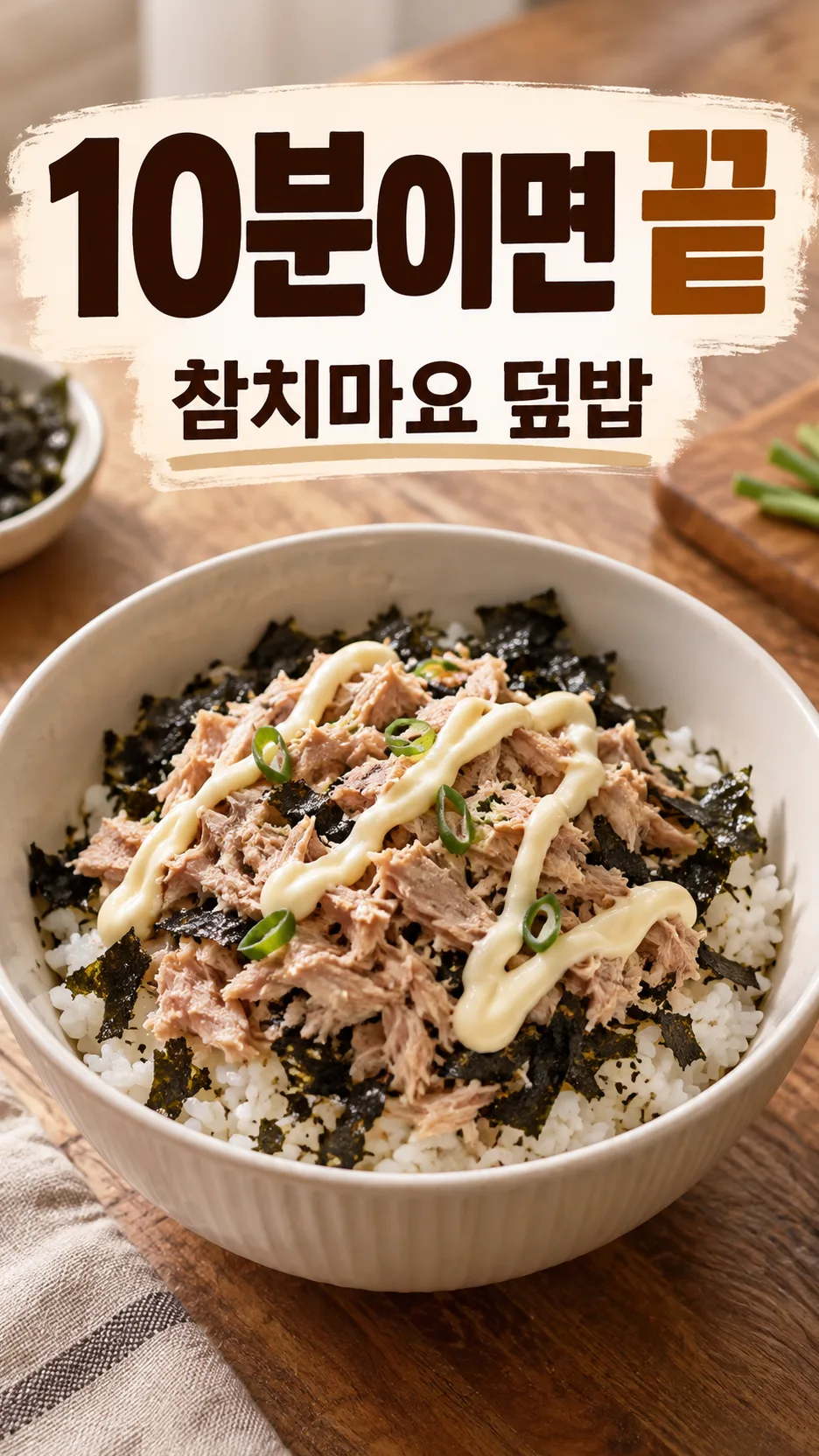
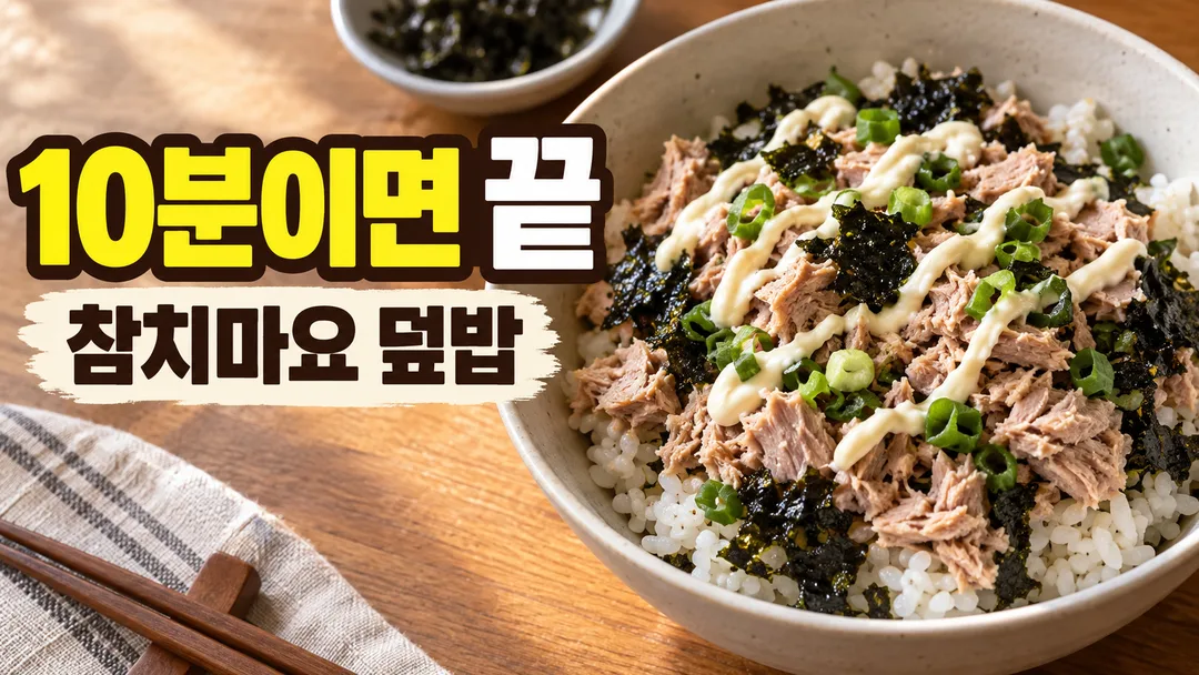
전체 · 유튜브/썸네일 · 유튜브 썸네일 · 쇼츠·릴스 표지
018요리 · 레시피 영상 썸네일 — 숏폼 세로 · 롱폼 가로, 완성 요리가 먼저 보이게
요리 이름만 적으면 완성 요리를 먹음직스럽게 크게 담고 큰 카피까지 지어 넣는 레시피 영상 썸네일 — 숏폼(세로) · 롱폼(가로)
칸 채우기
- 1칸을 채워요
- 2복사 버튼을 눌러요
- 3GPT 채팅창에 붙여넣어요
- 4제품·인물 사진을 쓰려면 사진과 프롬프트를 둘 다 넣은 뒤에 보내요 선택
프롬프트 원문 보기 5,887자
Before drawing, search the web for real photos of "【요리 이름】" as it is actually served in Korea, and use them as the reference for its look — the real ingredients, colors, textures, portion, and plating. Then generate the image directly - do not describe the search, explain it, or ask questions.
Output size 2480x3508 pixels, A4 portrait, 300dpi, print-ready poster.

[Purpose]
Create one finished Korean cooking and recipe video thumbnail. Follow the canvas size above: a 9:16 portrait canvas is the cover of a short-form recipe video (Shorts, Reels), and a 16:9 landscape canvas is the thumbnail of a long-form YouTube recipe video. It must win in a crowded mobile feed in two ways at once: the finished dish looks delicious at a glance, and the big headline copy is readable at a tiny size. Make one complete image, not a mockup, storyboard, recipe card, step-by-step grid, or design proposal.

[Dish]
The dish is: "【요리 이름】". Show the finished dish as the hero, filling roughly 40-50% of the canvas, in a cooking-video look: a 45-degree or close overhead angle, served in a simple plain bowl, plate, or pan that suits the dish, with appetizing details — gentle steam if it is served hot, glossy sauce, crisp edges, fresh garnish, a spoon or chopsticks lifting one bite if it helps. Keep the ingredients and colors true to how this Korean dish is really made; do not add toppings or ingredients the dish would not normally have. One or two small raw ingredients may sit near the edge as a hint of the recipe. No hands with faces, no people, no brand packaging, no labels, no restaurant logos.

[Headline copy]
The headline copy is: "【큰 카피】". Use it exactly as written, unless it is exactly "알아서 골라줘" — never print those words.
If no headline copy is quoted above, or it is "알아서 골라줘", write it yourself from the dish: one punchy Korean hook of at most 8 characters excluding spaces that makes a viewer want to cook it — ease, speed, a secret, a contrast, or a curiosity gap. Plain spoken Korean, no English, no emoji. Never invent a cooking time, calorie count, price, health effect, or ranking that the viewer did not supply; words like "초간단" or "황금비율" are fine, specific numbers are not.

[Text layout]
- The headline is the dominant text. It stays on one line in extremely bold Korean Gothic sans-serif with complete strokes, and its visible letter height is at least one fifth of the canvas height. Put it on a clean, calm area or a simple solid backing shape, never over the dish.
- Show the dish name as one smaller second line directly under the headline: "【요리 이름】". Skip this line only if the headline already contains the dish name.
- For a 9:16 canvas, keep all text inside the central 80% width and between 15% and 85% of the height so app buttons do not cover it. Put the text block in the upper half and the dish in the lower half, or the reverse, without overlap.
- For a 16:9 canvas, keep every letter inside the central 86% width and 78% height. Use a two-zone composition: text on one side roughly 45-55% of the width, the dish on the other side large and slightly cropped by the frame edge for impact. Keep the lower-right corner free of text because the video length badge covers it.

[Style]
Use the feel "【느낌】" and never print it. "따뜻한 집밥" uses a warm wooden table, soft window light, cream and warm brown tones, and deep brown or white lettering on a warm backing. "밝고 깔끔한" uses a bright white or pale pastel background, clean daylight, fresh colors, and very dark lettering. "강렬한 클로즈업" moves the camera very close so the dish fills more of the frame, with high contrast, a dark background, rich saturated sauce colors, and bold white or yellow lettering with a thick dark outline. "감성 카페" uses a muted linen or stone surface, soft diffused light, calm beige and sage tones, and refined dark lettering. Use at most three principal colors for graphics and text.

[Visual hierarchy]
First read: the headline. Second read: the delicious finished dish. Third read: the dish name line if shown. Nothing may cross a letter. Check the composition at about 10% of full size: the headline must still be readable and the dish must still be recognizable.

[Lighting and texture]
Use realistic food-photography lighting: soft key light from one side, gentle highlights on sauce and oil, natural shadows, true-to-life colors. Food must look fresh, warm, and edible — never plastic, waxy, oversaturated to the point of looking fake, or burnt. It must look like a real photograph taken with a camera, matching the real-photo references: natural imperfections, real grain of rice and sauce, uneven edges, true colors — not the smooth, glossy, over-perfect look of AI-generated food. Keep the area behind the text smooth and low-detail. The canvas must be fully painted edge to edge with no letterboxing or black bars.

[Text rules]
Render only the headline and the dish name line. Preserve every Korean syllable, space, digit, and punctuation mark of supplied text exactly. Never translate, paraphrase, correct, extend, or repeat it. Do not invent recipe steps, ingredient lists, times, calories, prices, episode numbers, view counts, arrows, badges, hashtags, English words, channel names, or shop names. Ensure all Korean consonants, vowels, and final consonants have complete strokes. The headline must remain one line.

[Avoid]
No people or faces, no real YouTuber, chef, celebrity, or recognizable person; no brand logo, trademarked packaging, food brand label, restaurant sign, or copied channel style; no fake interface, play button, phone frame, or social-media icon. No recipe card layout, step photos, collage, split screen, before-and-after, or multiple dishes competing. No text over the food, thin font, tiny lettering, curved or vertical Korean text, warped Hangul, neon glow, lens flare, watermark, border, or clutter. No unappetizing food: no raw-looking meat that should be cooked, no melted plastic look, no gray or muddy colors.
이 카드도 많이 사용해요

쓰는 법 · 자주 묻는 것
이런 때 쓰세요
요리 · 레시피 영상은 썸네일에서 완성 요리가 맛있어 보이는지가 절반, 큰 카피 한 줄이 나머지 절반이에요. 이 카드는 요리 이름만 적으면 완성 요리를 김 · 윤기 · 바삭한 가장자리까지 살려 크게 담고, 작은 화면에서도 읽히는 큰 카피를 붙여요. 카피가 떠오르지 않으면 큰 카피 칸을 비워 두세요. 요리를 보고 8자 안쪽으로 지어 넣어요.
레시피 영상도 보통 두 장이 필요해요. 숏폼(쇼츠 · 릴스)은 세로 9:16, 롱폼(유튜브 영상)은 가로 16:9예요. 같은 칸 그대로 화면 비율만 바꿔 한 번씩 뽑으면 같은 톤의 한 쌍이 나와요. 브이로그 · 공부 같은 영상은 016 「브이로그 · 스터디 영상 썸네일」 카드를 쓰세요.
GPT가 그리기 전에 그 요리의 실제 사진을 웹에서 찾아보고 그대로 참고해서 그려요. 그래서 AI 그림 특유의 매끈하고 가짜 같은 질감 대신, 실제로 찍은 음식 사진처럼 나와요.
칸 채우는 법
- 요리 이름: 「덮밥」보다 「참치마요 덮밥」처럼 구체적으로 적으세요. 그 요리를 실제 모습대로 그리고, 큰 카피 아래에 요리 이름을 작게 한 줄 넣어요(카피에 이미 요리 이름이 있으면 빼요).
- 큰 카피: 직접 정했으면 적고, 아니면 알아서 골라줘를 누르거나 비워 두세요. 띄어쓰기를 빼고 8자 안쪽이 좋아요. 조리 시간 같은 숫자는 직접 적었을 때만 들어가요. 비워 두면 숫자 없는 카피(「초간단」 「황금비율」 같은)로 지어요.
- 느낌: 따뜻한 집밥 · 밝고 깔끔한 · 강렬한 클로즈업 · 감성 카페 중 채널 톤에 맞는 것을 고르세요. 먹방처럼 강하게 보이고 싶으면 「강렬한 클로즈업」이 좋아요.
- 화면 비율: 처음 값은 9:16 숏폼(세로)이에요. 롱폼 썸네일은 16:9를 고르세요.
가로 · 세로 한 쌍 만들기
- 칸을 채우고 화면 비율 9:16으로 복사해 GPT에 보내요. 세로 표지가 나와요.
- 같은 칸 그대로 화면 비율만 16:9로 바꿔 다시 복사해요.
- 같은 대화에 붙여 보내면 앞 그림과 요리 · 색 · 카피가 이어진 가로 썸네일이 나와요. 카피를 비워 뒀다면 「앞 그림과 같은 카피로」라고 한 줄 덧붙이세요.
내가 만든 요리 사진을 넣고 싶을 때
직접 만든 요리 사진을 주인공으로 쓰려면 ① 사진을 먼저 같은 대화에 올리되 아직 보내지 마세요. ② 같은 입력 칸에 이 카드에서 복사한 프롬프트를 붙여 넣으세요. ③ 사진과 프롬프트가 둘 다 들어간 것을 확인한 뒤 함께 보내세요. 사진만 먼저 보냈다면 프롬프트 끝에 「위 사진의 요리를 그대로 주인공으로 쓰고 글자를 가리지 않게 그려줘」라고 덧붙이세요.
내 요리 사진을 쓰면 실제 영상과 썸네일이 같아서 보는 사람이 속았다고 느끼지 않아요. 가게 메뉴라면 실제로 나가는 모습과 크게 다르지 않은지 꼭 보세요.
그림이 나오면 꼭 볼 것
완성 이미지를 휴대폰에서 작게 줄여 보세요. 큰 카피가 바로 읽히고, 요리가 무엇인지 알아볼 수 있어야 해요. 입력한 한글은 받침과 띄어쓰기까지 한 글자씩 대조하세요. 요리에 실제로 안 들어가는 재료나 토핑이 그려지지 않았는지, 적지 않은 숫자(시간 · 칼로리 · 가격)가 생기지 않았는지도 보세요.
세로는 위아래 버튼 자리, 가로는 오른쪽 아래 영상 길이 표시 자리에 글자가 걸리지 않는지 확인하세요.
틀린 곳 고치는 법
같은 대화에서 위치와 바꿀 내용을 정확히 짚어 주세요. 「덮밥 위 파슬리는 빼고 김가루로 바꿔 주세요. 나머지는 그대로」나 「큰 카피를 '10분이면 끝'으로 정확히 고쳐 주세요」처럼 말하면 돼요. 요리가 덜 맛있어 보이면 「김이 나게, 소스에 윤기를 더해 주세요」라고 해 보세요.
자주 묻는 것
- 카피를 꼭 직접 써야 하나요? 아니요. 비워 두면 요리를 보고 지어 넣어요. 다만 조리 시간 같은 숫자는 직접 적었을 때만 들어가요.
- 가로 · 세로를 한 번에 받을 수 있나요? 비율이 달라서 한 장씩 만들어요. 같은 대화에서 화면 비율만 바꿔 한 번 더 보내면 같은 톤으로 이어져요.
- 가게 메뉴 홍보 영상에도 쓸 수 있나요? 네. 요리 이름에 메뉴 이름을 적으면 돼요. 가게 이름 · 가격은 넣지 않으니 영상 제목이나 본문에 적어 주세요.
- 요리가 실제와 다르게 나오면요? 내가 만든 요리 사진을 함께 올리면 가장 정확해요. 사진 없이 만들 때는 재료를 고쳐 달라고 같은 대화에서 요청하세요.
- 조회 수를 올려 주나요? 먹음직스럽고 잘 읽히는 썸네일을 만드는 카드예요. 조회 수나 노출을 보장하지 않아요.