
전체 · 유튜브/썸네일 · 유튜브 썸네일
378리뷰 · 언박싱 썸네일 — 얼굴과 제품을 크게, 카피는 한눈에
표정이 보이는 얼굴과 큼직한 제품, 짧고 굵은 카피로 완성하는 가로 리뷰 · 언박싱 썸네일
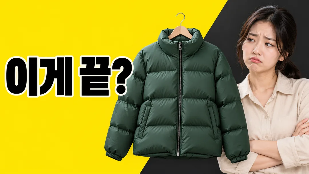
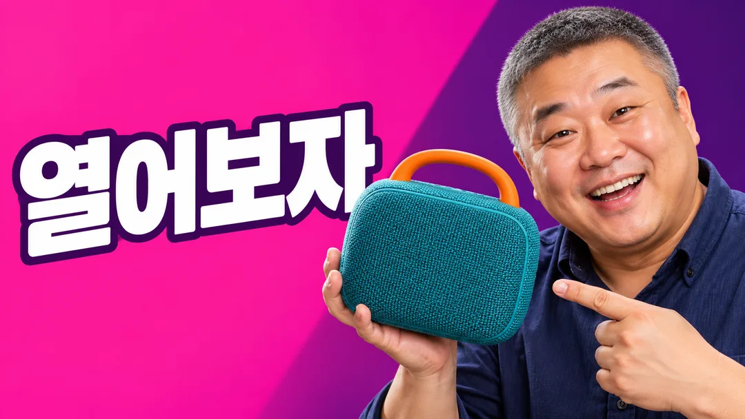
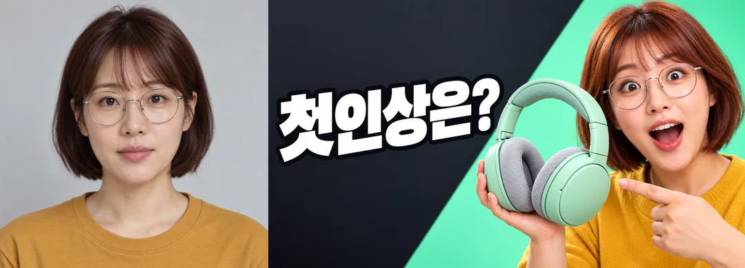
칸 채우기
- 1칸을 채워요
- 2복사 버튼을 눌러요
- 3GPT 채팅창에 붙여넣어요
- 4그대로 보내면 썸네일 예시처럼 나와요
- 5본인 얼굴 사진과 제품 사진을 프롬프트와 함께 첨부할 수 있어요. 없으면 가상 인물과 가상 제품을 만들어요.을 같이 넣으면 그 사진이 반영돼요 선택
프롬프트 원문 보기 4,350자
Generate one finished Korean product review / unboxing thumbnail directly, without explanations or questions.
Output size 2480x3508 pixels, A4 portrait, 300dpi, print-ready poster.
Use a single photorealistic studio-cutout style, full bleed, no mockup or grid. This card is designed for 16:9 landscape.

[Inputs]
Product: "【제품】". This guides the picture, not an extra printed title. If empty, do not invent the owner's product; request a product description.
Headline: "【큰 카피】". Define HEADLINE once: use supplied text verbatim, preserving every character and punctuation; if blank or exactly "알아서 골라줘", choose one short Korean curiosity hook without inventing facts. Never print the automatic-choice instruction. Aim for 3–6 visible characters excluding spaces and punctuation. Do not invent prices, discounts, rankings, performance or health benefits. If supplied copy includes an unsupported numeric or efficacy claim, omit that claim and choose a neutral curiosity hook from the product instead.
Expression: "【내 표정】"; if blank use "놀람". "놀람" means raised eyebrows, wide eyes, open mouth; "실망" means raised inner eyebrows and pursed lips; "웃음" means a warm enthusiastic smile. Keep facial anatomy plausible.
Colors: "【색】"; if blank use "파랑 · 하양". "파랑 · 하양" = deep cobalt background and white headline; "노랑 · 검정" = vivid yellow background and black headline; "분홍 · 하양" = saturated pink background and white headline; "민트 · 검정" = charcoal background, mint accent and white headline. Use a broad simple diagonal accent on the subject side; keep behind-text area quiet.

[Photo rule]
If an attached image shows the owner, preserve that exact person's face shape, eye spacing, nose, mouth, hair and glasses, changing only expression and appropriate studio lighting. Do not substitute another person or beautify away identifying features. If no face photo is attached, invent one original fictional adult who resembles no identifiable creator or celebrity. Vary fictional age, gender and hairstyle appropriately. If a product photo is attached, preserve its visible shape, proportions, color and materials, while removing brand logos and package lettering. If no product photo exists, invent an original generic unbranded item based on the product description, not a replica of recognizable branded product designs or packaging. Both photo types are optional and independent. No real YouTuber or celebrity face; use only authorized owner references. Do not print product names or brand/channel labels. For food-related products preserve physically plausible ingredients and container proportions, and do not invent ingredients, quantities or effects.

[Composition]
Left roughly 48–52% holds one enormous, extremely bold Gothic sans-serif HEADLINE on one line at middle height. Visible glyph height at least 25% of canvas height. Right third holds a close head-and-shoulders reaction face; center-right holds one oversized recognizable product with believable proportions. Product and face together form a single coherent thumbnail, never a collage of alternative designs. Place the product to avoid every letter and the face's eyes and mouth. If crowded, simplify/reduce product before reducing type. Keep all letters inside the central 90% width and 78% height and the bottom-right duration-badge area text-free. Crisp outlines may separate text from background without blurring strokes. Headline must remain readable at 320px width. Hands are optional; if present use natural anatomy and correct fingers.

[Finish]
Realistic skin, product materials and controlled studio light, crisp cutout edges, strong contrast, broad flat background extending to every edge. Render only HEADLINE in Korean; no subtitles, labels, translated duplicate lines, explanatory notes, UI, play button, price badge, unsupported claim, logo, watermark, signature, margin, frame, letterbox or comparison grid. Preserve complete glyphs, including final consonants where applicable. Deliver exactly one finished image, no code, manual compositing or retouching instructions.

[Final output format]
Output size 2480x3508 pixels, A4 portrait, 300dpi, print-ready poster.
This selected output format takes priority over any fixed canvas size or aspect ratio elsewhere in this template. Adapt the composition, text zones and margins to the selected canvas without stretching or cropping essential content. Device safe areas apply only when a device is selected. Never print these format instructions on the image.
결과 어땠어요?
이 카드도 많이 사용해요
쓰는 법 · 자주 묻는 것
신제품을 보여 주는 한 장
제품 리뷰나 언박싱 영상에서 얼굴의 반응과 제품 모양을 함께 보여 주는 가로 썸네일이에요. 온라인 판매자의 신상품 소개 영상에도 쓸 수 있어요. 얼굴은 오른쪽, 제품은 가운데 오른쪽, 큰 카피는 왼쪽에 놓아요. 배경은 단순하게 정리하고 굵은 글자로 대비를 줘요. 사진처럼 사실적인 한 가지 스타일로 완성하며, 비교표나 여러 장의 시안을 만들지 않아요.
네 칸 채우기
꼭 채울 칸은 3개예요. 제품에는 「하루커피 원두 봉투, 구릿빛 무지 봉투와 청록색 원형 봉인」처럼 물건과 눈에 보이는 특징을 적으세요. 제품명을 그림에 별도 제목으로 찍는 칸은 아니에요. 비우면 어떤 물건인지 정할 수 없으니 제품부터 적어 주세요. 큰 카피는 선택이에요. 띄어쓰기를 빼고 3~6자 정도로 쓰면 크게 읽히기 좋아요. 「향이 궁금」「열어보자」「첫인상은?」처럼 짧은 문장을 고르거나 알아서 골라줘를 누르세요. 비워도 제품에 맞는 호기심 문장을 하나 정해요. 내 표정은 놀람·실망·웃음 중에서 고르고, 색은 네 가지 배색 중 하나를 고르세요. 표정과 색을 비우면 놀람과 파랑·하양을 써요. 화면 비율은 공통 선택에서 16:9로 정해져 있어요.
얼굴과 제품 사진을 붙이는 법
본인 얼굴이 선명한 정면 또는 살짝 옆을 보는 사진을 준비하세요. 제품은 형태가 잘 보이는 사진이 좋아요. 그림 AI의 같은 입력 칸에 얼굴 사진·제품 사진과 복사한 프롬프트를 함께 넣고 한 번 보내면 완성 썸네일 한 장을 요청할 수 있어요. 얼굴 사진만 넣으면 얼굴 윤곽·눈·코·입·머리·안경을 유지하면서 표정을 바꾸고, 제품은 입력한 설명으로 만들어요. 제품 사진만 넣으면 제품 형태와 색을 유지하고 인물은 가상 성인으로 만들어요. 사진이 둘 다 없으면 모두 가상 대상이에요. 다른 유튜버나 연예인의 얼굴은 사용하지 마세요. 실제 브랜드 로고와 포장 문자는 따라 그리지 않으며 제품 이름을 새로 찍지 않아요. 사용 권한이 있는 사진만 첨부하세요.
예시와 확인
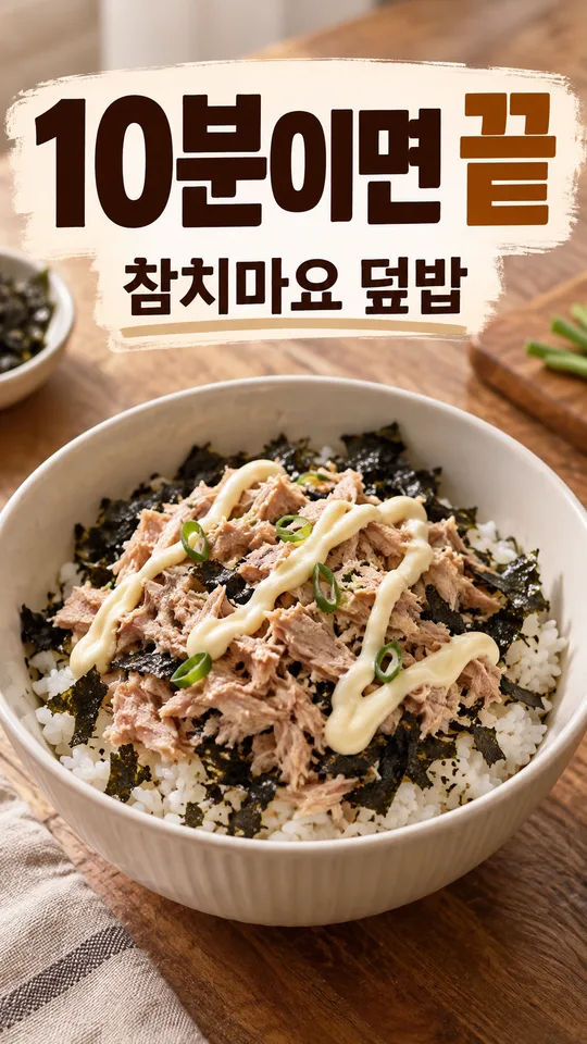
첫 예시는 하루 겨울 패딩·「이게 끝?」·실망·노랑과 검정이에요. 둘째는 하루 휴대용 스피커·「열어보자」·웃음·분홍과 하양이에요. 셋째 예시는 사진 반영 비교예요. 왼쪽에는 가상 하루 님의 원본 사진, 오른쪽에는 같은 얼굴을 놀람 표정으로 바꾼 하루 헤드폰·「첫인상은?」·민트와 검정 썸네일을 같은 높이로 나란히 놓았어요. 목록 표지는 가상 하루커피 원두 봉투·「향이 궁금」·놀람·파랑과 하양으로 별도로 만들었어요.
카피를 한 글자씩 대조하고 특히 「끝」과 「첫」의 받침을 확인하세요. 320px 너비로 작게 봐도 읽히는지, 제품이나 얼굴이 글자를 가리는지, 오른쪽 아래 영상 길이 자리에 글자가 있는지 보세요. 사진을 넣었다면 다른 사람처럼 바뀌지 않았는지 비교하세요. 잘못 나왔다면 같은 대화에 「카피를 '첫인상은?'으로 정확히 쓰고 제품과 얼굴은 그대로 유지해 줘」처럼 수정할 부분을 짚어 주세요. 후처리나 따로 글자 합성을 할 필요가 없도록 결과 한 장을 요청해요.
자주 묻는 것
사진은 필수가 아니에요. 카피를 맡겨도 가격 차이·순위·성능·건강 효과를 지어내지 않아요. 「3만원 차이」처럼 숫자를 쓰려면 비교한 실제 내용을 제품 칸에 함께 적으세요. 근거 없는 1위나 치료·효능 주장은 넣지 마세요. 큰 카피가 길면 먼저 짧게 고치는 게 좋아요. 이 카드는 조회 수나 클릭률을 보장하지 않아요. 완성 이미지를 사용하기 전에 외부 그림 서비스의 요금·약관도 해당 서비스에서 확인하세요.