
All · Ads & posters · Logos & branding
4041950s Diner Script Logo
Your exact shop name in original flowing brush lettering.
What you get
- One original shop-name brush-script logo
ChatGPT Free OK
Fill in the fields
- 1Fill in the fields
- 2Copy the prompt
- 3Paste it into a GPT chat
- 4Send it as is and you get an image like the thumbnail example
- 5Attach a real photo that fits the card and it is used in the result: a background photo for background cards, a person or food photo for those cards Optional
Full prompt 2,234 characters
Generate exactly one finished original 1950s diner hand-lettered sign logo image. Output the image directly, no explanation. Canvas: Output size 1080x1080 pixels, 1:1 square post. Keep all text fully readable..
Shop name: "【Shop name】"
Business: "【Business】"
Colors: "【Colors】"
Print the shop name exactly once, preserving every character, case, space and punctuation in its original writing system. Never translate or romanize it. This exact name is the ONLY text in the image; do not print the business, labels, slogans, dates, prices or any other words. If the name is empty ask for it; if business is empty use a soda bar; if colors are empty use coral, deep teal and warm ivory.
Create custom 1950s brush-script sign lettering: confident thick downstrokes, delicate connecting upstrokes, open counters, a lively slanted baseline, restrained dimensional painted offset shadow and one elegant underline swash. For Hangul or Japanese preserve intact readable character structures rather than forcing Latin cursive. Make the lettering large and dominant, with a clean solid background extending to every edge. Keep the complete lettering and swash visible with comfortable breathing room; adapt to the chosen canvas without cropping. This is flat finished brand artwork, not a photographed sign or mockup. Use the business and palette to determine the mood and custom letter anatomy: a soda bar feels quick and buoyant, a bakery soft and graceful, a barbershop crisp and bold. Add at most two small geometric sparkle accents; no objects, food, mascots or illustrated scenes. Avoid neon tubes, chrome, rounded 1970s bubble lettering, distressed texture, badge borders and generic font typesetting. Never imitate an existing brand, logo, artist or signature. All design elements must be original. Before returning, compare the rendered name character by character against the input and correct omissions, substitutions and duplicates.

[Final output format]
Output size 1080x1080 pixels, 1:1 square post. Keep all text fully readable.
This selected output format takes priority over any fixed canvas size or aspect ratio elsewhere in this template. Adapt the composition, text zones and margins to the selected canvas without stretching or cropping essential content. Device safe areas apply only when a device is selected. Never print these format instructions on the image.
How did it turn out?
You may also like

How to use it · FAQ
Turn a shop name into an original 1950s diner brush-script logo. Thick downstrokes, fine connections and an underline swash create a complete identity concept for a sign, profile image or packaging sticker.
Two fields are required: Shop name and Business. Enter the exact spelling, capitalization, spaces and punctuation you want to see. Business shapes the lettering mood but is never printed. Soda bars receive buoyant lettering, bakeries graceful strokes and barbershops bold, crisp forms. Colors describes three colors including the background. Leave it blank for coral, deep teal and warm ivory. An empty business defaults to a soda bar; an empty name prompts a question.
Paste once into an image AI without a photo to obtain one image. The default is square; the listing cover is portrait 2:3. Names remain in their original writing system. Instructions preserve readable Korean and Japanese character structures, but the actual image tests for this card used Latin names.
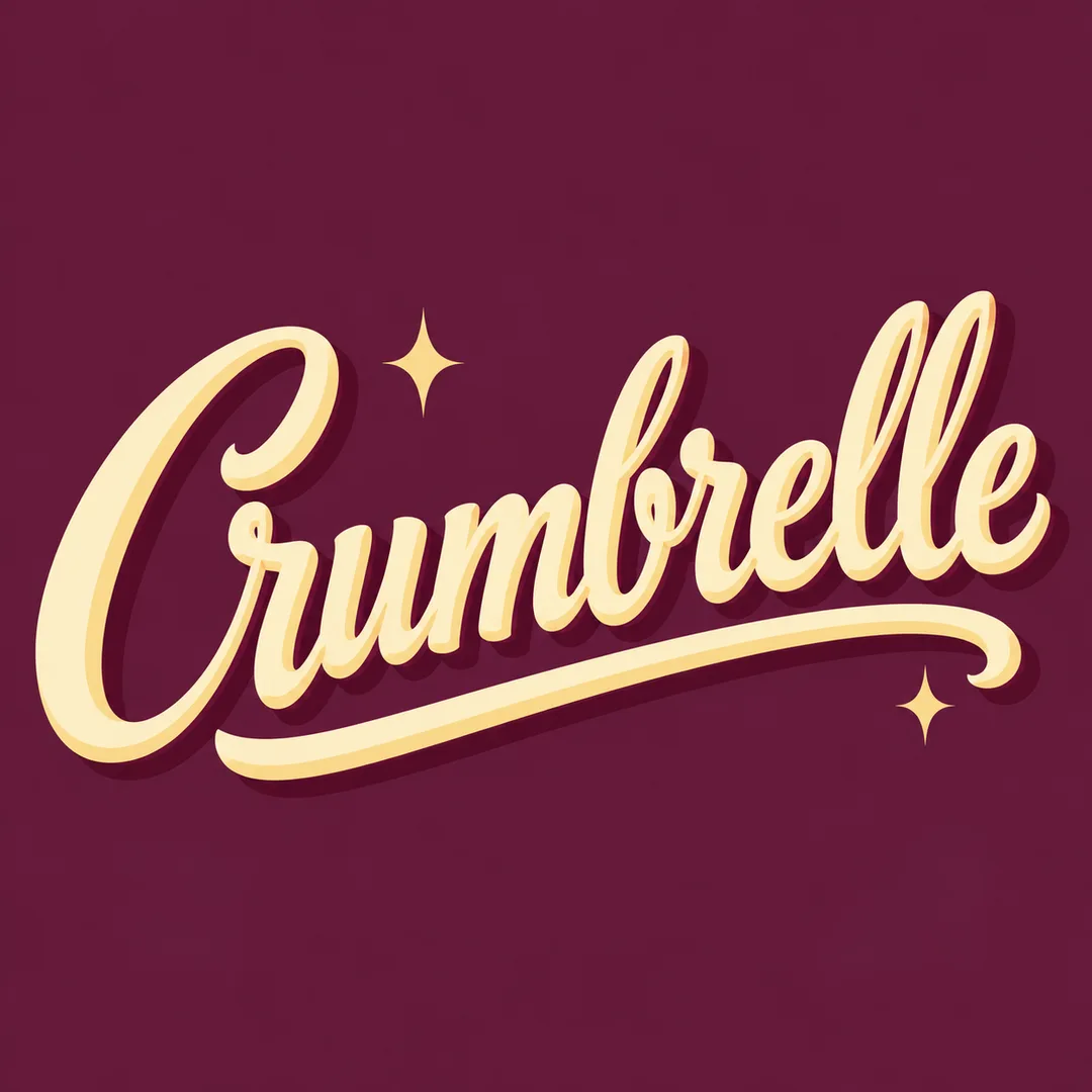
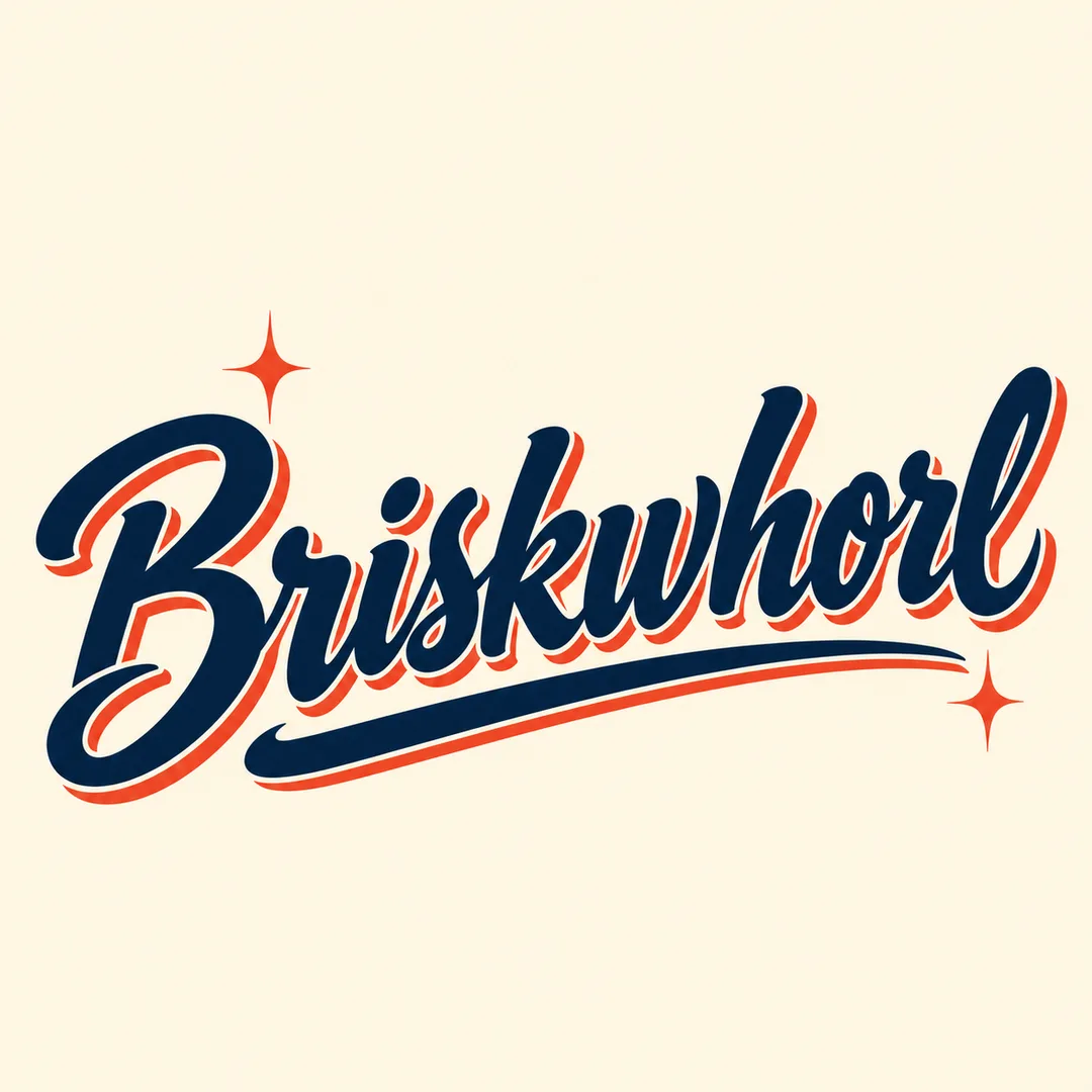
The cover depicts the fictional soda bar Fizzamble. Separate examples show the fictional bakery Crumbrelle and barbershop Briskwhorl. These newly invented design names have not been cleared through a trademark search. Check rights for your intended name before commercial use. This raster concept does not promise production vector files or trademark registration.
Enlarge the name and read every letter. Check that the shadow and swash leave counters open. The name must be the only text. If spelling fails, identify the exact letters and generate again. A shorter official name can improve readability. Changing the palette changes the mood within the same 1950s brush-lettering family.