
All · Ads & posters · Logos & branding
064Abstract geometric logo
A modern abstract mark expressing your business idea, with your exact name placed beside it.
What you get
- One simple abstract mark expressing the business idea
- Your exact name to the right of the mark
- One modern logo image in the selected material
ChatGPT Free OK
Fill in the fields
- 1Fill in the fields
- 2Copy the prompt
- 3Paste it into a GPT chat
- 4Send it as is and you get an image like the thumbnail example
- 5Attach a real photo that fits the card and it is used in the result: a background photo for background cards, a person or food photo for those cards Optional
Full prompt 6,398 characters
Generate this image now. Return exactly ONE finished logo image itself; draw it directly, without explanations or questions.
Output size 1080x1080 pixels, 1:1 square post. Keep all text fully readable.
The result is one resolved identity in one material, never an options sheet or multiple applications. Keep the entire logo in the central area, about 65-75% of canvas width. Leave generous quiet margins, with all essential lettering below the top 12% and above the bottom 15% of the canvas. Adapt this same identity to the chosen ratio.
Make an original professional brand identity, never imitate an existing brand's recognizable logo, mascot or typography. No slogan, unrelated writing, field labels, watermarks or trademark symbols. No props, hands, devices or collage. The substrate fills the image edge to edge.

[INPUTS FOR THIS IMAGE]
Brand name selected: "【Brand name】"
Set BRAND_NAME to this input. Copy its original script, exact spelling, case, spaces and punctuation once; never romanize or translate it. If explicitly asked to choose, invent one short original name. Do not print the field label.
Business type selected: "【Business type】"
Use BUSINESS_TYPE as the semantic brief for the abstract mark, not as additional printed text. If absent or asked to choose, infer one fitting business, default architecture.
Meaning of the mark selected: "【Meaning of the mark】"
Express this MEANING using a compact construction of two to four geometric components and deliberate negative space. If absent or asked to choose, derive a concrete geometric idea from BUSINESS_TYPE; for architecture use three offset planes around one central open square. Do not print the meaning.
Material selected: "【Material】"
MATERIAL controls the actual finish and substrate. Metallic foil uses its physical metal color; keep the chosen palette in the substrate or ink rather than painting over metal. A flat finish uses the chosen palette directly.
Interpret the selected choice as follows (use only the selected one):
- Black metal on beige wall: raised satin-black metal, crisp bevels and soft cast shadows on a warm beige plaster wall.
- Gold foil on green paper: real gold foil hot stamping slightly debossed into deep forest-green textured paper.
- Silver foil on black paper: silver foil pressed into thick matte black cotton paper, tiny edge highlights and a fine paper grain.
- Letterpress on cream paper: the chosen logo ink color pressed slightly into thick cream cotton paper, visible paper fibres and precise ink edges.
- Frosted acrylic sign: frosted acrylic on a cool light concrete wall, colored translucent logo and letters, restrained real depth and diffuse highlights; one continuous surface, no decorative frame.
- Flat: crisp opaque vector-like flat artwork on a clean solid background, no material lighting, no mockup, no gradients.
If the selection line is absent or empty, use Frosted acrylic sign only.
Colors selected: "【Colors】"
Use only this restrained palette plus necessary substrate tones. The selected material keeps its real physical color.
Interpret the selected choice as follows (use only the selected one):
- Orange + charcoal: warm orange for the mark and charcoal for the name on cool light concrete or pale grey.
- Mint + teal: mint and deep teal on light grey.
- Blue + navy: blue and navy on light grey.
- Black + white: black and white.
- Purple + grey: purple and cool grey.
If the selection line is absent or empty, use Orange + charcoal only.
Name typeface selected: "【Name typeface】"
The typeface may change, but never redesign, fuse or ornament multiple letters at once; spelling and readability come first.
Interpret the selected choice as follows (use only the selected one):
- Refined serif: refined high-contrast serif for Latin, elegant Myeongjo for Hangul, Mincho for Japanese, readable generous spacing.
- Clean sans serif: clean contemporary sans serif, balanced weight and optical kerning.
- Bold rounded: bold friendly rounded display lettering with open counters and intact characters.
- Bold angular: bold squared display lettering, clear letter structure, strong sign readability.
If the selection line is absent or empty, use Clean sans serif only.
Mark corners selected: "【Mark corners】"
Change the construction edge treatment while retaining the same compact semantic mark. Do not change the layout or add pictorial objects.
Interpret the selected choice as follows (use only the selected one):
- Crisp angles: clean purposeful geometric angles.
- Gently rounded: gently rounded joins while retaining the geometry.
- Soft curves: smooth curved geometric bands around clear negative space.
If the selection line is absent or empty, use Crisp angles only.

[RESOLVED DESIGN]
ONE original ABSTRACT GEOMETRIC MARK on the LEFT with BRAND_NAME on the RIGHT, a compact horizontal combination centered in the canvas. Abstract means simplified relationships of planes, bars or arcs, not a literal house, body, truck or leaf illustration and not woven letters. Use two to four deliberate components with consistent edge treatment, purposeful asymmetry, visual balance and at least one wide clear negative-space opening. The meaning must be visibly tied to the actual business brief; avoid an arbitrary generic swirl. For the architecture example, three offset folded planes shelter a single central square opening. Name lettering remains exact, default clean geometric sans serif with optical kerning, about as high as 40-55% of the mark height, readable at small size. Selected typeface replaces the default. The entire mark-and-name group spans about 75% of width. Apply the chosen finish to both elements as one real material application; default orange translucent mark and charcoal name on frosted acrylic against cool light concrete, believable subtle depth and diffuse highlights. No decorative screws, no frame, no second surface.
Before returning, compare every visible name character with BRAND_NAME, one by one, including Hangul final consonants and Japanese characters; repair spelling without changing the design. Print the name exactly once.

[Final output format]
Output size 1080x1080 pixels, 1:1 square post. Keep all text fully readable.
This selected output format takes priority over any fixed canvas size or aspect ratio elsewhere in this template. Adapt the composition, text zones and margins to the selected canvas without stretching or cropping essential content. Device safe areas apply only when a device is selected. Never print these format instructions on the image.
How did it turn out?
You may also like






How to use it · FAQ
Turn a business idea into geometry
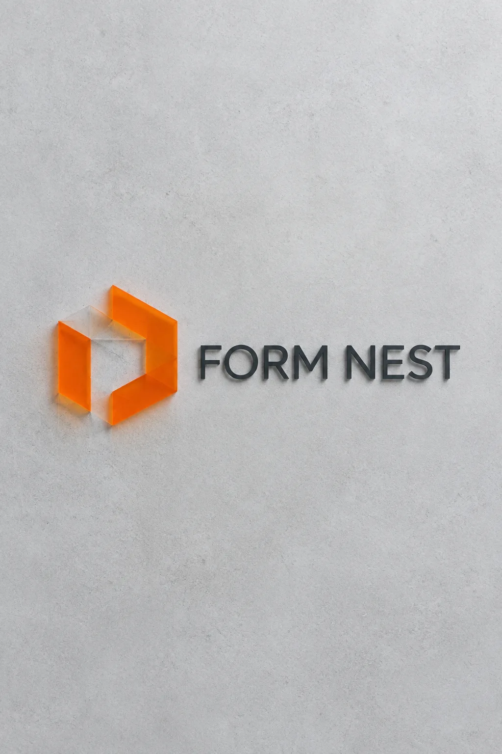
Use this for architecture, Pilates, logistics or data services where relationships and movement matter more than a literal animal or object. One abstract mark sits to the left of the name. The fictional FORM NEST example uses three offset planes sheltering an open central square, finished in orange and charcoal acrylic.
Start with name and business
Enter the exact name and a specific Business type. Architecture or data analytics gives a more useful brief than a vague company label. The business type is not printed. Meaning of the mark can describe balance, connection, growth or protected space. Choose for me, or an empty optional meaning, asks the prompt to derive a concrete geometry from your business.
Adjust edges and material
Crisp angles feel precise, rounded corners feel approachable, and soft curves emphasize movement. They change the mark while keeping the same left-mark/right-name layout. Six finishes, five palettes and four typefaces let you tune the visible result. Empty optional inputs use a fitting business meaning, orange and charcoal acrylic, clean sans serif and crisp angles. Foil keeps its metal color, with the palette mainly in the substrate.
Check meaning and negative space
Choose 1:1 and send the copied prompt without a photo. Compare each name character with the input, then shrink the mark to see whether the central opening survives. If it becomes a generic swirl, describe the geometric relationship: for architecture, three offset planes around an open square. If the name is small, ask to enlarge it while keeping it on the right. An acrylic mockup demonstrates the appearance. Before fabricating a sign, agree on material thickness, mounting and the flat drawing with the supplier.
Before commercial use, search KIPRIS and the relevant trademark database; for large signs or prints, have the logo redrawn as a clean vector.