All · Ads & posters · Sales & events
095Risograph event poster
Pull two stencil silhouettes together or apart to build an event poster from spot inks.
What you get
- One event poster built from two complementary ink stencils
- A joined emblem or separated wings around the title
- Grainy spot inks on warm paper, without a mockup
ChatGPT Free OK
Fill in the fields
- 1Fill in the fields
- 2Copy the prompt
- 3Paste it into a GPT chat
- 4Send it as is and you get an image like the thumbnail example
- 5Attach a real photo that fits the card and it is used in the result: a background photo for background cards, a person or food photo for those cards Optional
Full prompt 3,219 characters
Generate one finished risograph event poster now, as flat portrait artwork, default 3:4. The signature is an INK-PLATE DUET: a single event motif rebuilt from two complementary stencil silhouettes, one in each principal ink. The subject comes from the motif input, not a generic decorative background.
Output size 1080x1440 pixels, 3:4 portrait, social media post.
TITLE "【Title】"
DATE "【Date】"
STENCIL SUBJECT "【Stencil subject】"
INKS "【Inks】"
PLATE ARRANGEMENT "【Plate arrangement】"

Build the selected plate architecture first:
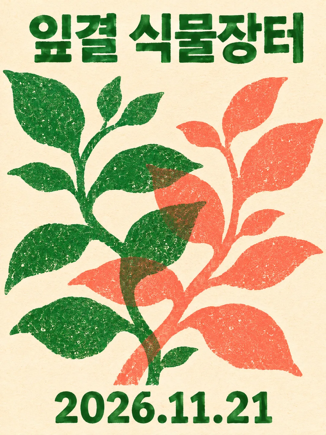
Joined: unite both stencils into ONE monumental central emblem. First-ink silhouette and second-ink silhouette interlock and overlap through its middle, creating a visible third mixed-color intersection. Leave the title above this joined emblem and date below. No detached left/right specimens.
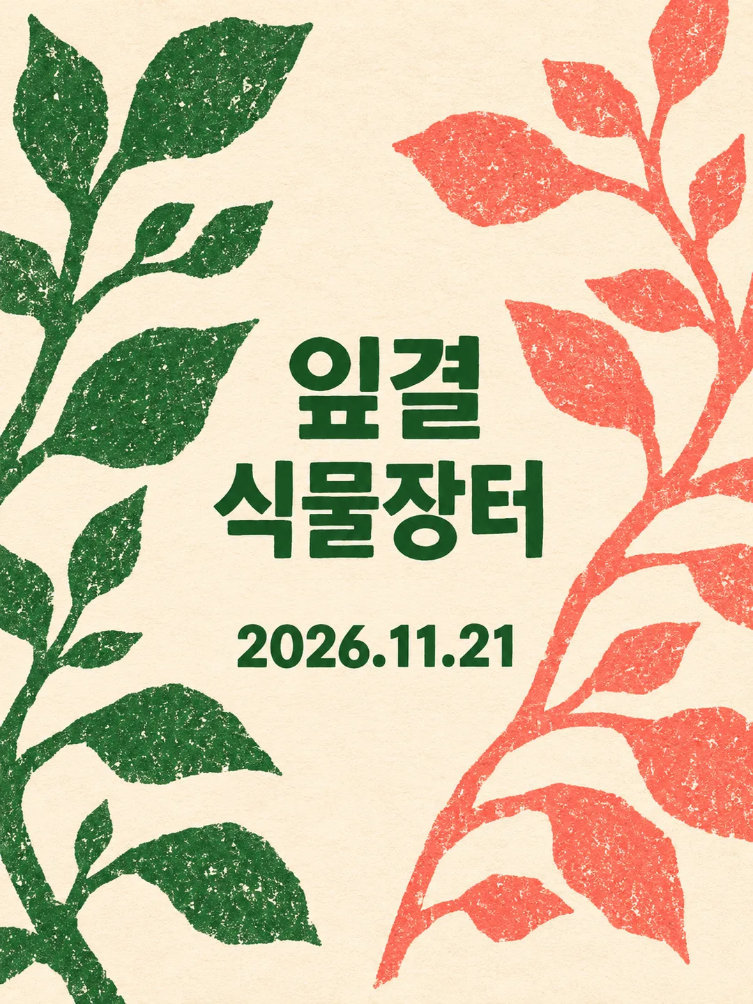
Separated: pull the two stencils completely apart into LEFT and RIGHT wings with a broad unprinted vertical corridor between them. First ink occupies the left wing; second ink occupies the right. Set the title in horizontal short lines within that central corridor and the date beneath the title in the corridor. The wings never touch each other. Do not retain a central emblem. This is one designed poster, never a comparison sheet or two separate posters.

Draw the supplied subject using chunky cut-stencil contours and coarse ink flecks. For a plant subject, make complementary branching leaf silhouettes, not two copies of a complete potted plant. For paper crafts, use folded and cut paper profiles; for music, use resonant abstract instrument silhouettes. Never print the subject description or arrangement names. Title and date are the ONLY visible text, each once, precisely as entered, in their supplied language. Keep type solid and clear of overprint textures. Empty date removes its entire line without inventing a date. Empty subject takes its cue from the title.

Uncoated warm ivory paper is unprinted substrate. Use the first two supplied spot inks for the two silhouettes; an optional third ink is reserved for the title and date. With two inks, use the darker one for text. Blank inks default to forest green and coral. One supplied ink receives a contrasting second; ignore colors beyond the third. The intersection in joined mode is an overprint mixture, not an extra ink. Papery tooth, dry grain and softly imperfect stencil edges; small registration errors belong only to the artwork, never to letters. No smooth gradients or photographic material. Keep all wording comfortably inside the trim, allow peripheral silhouettes to crop at the edges.

No plate numbers, swatches, arrows, production notes, invented venue, prices, logos, artist references, QR patterns, watermarks or room mockups. Use original fictional event artwork. No reference photograph needed. Return only the finished poster; this is a raster simulation, not a set of press separations.

[Final output format]
Output size 1080x1440 pixels, 3:4 portrait, social media post.
This selected output format takes priority over any fixed canvas size or aspect ratio elsewhere in this template. Adapt the composition, text zones and margins to the selected canvas without stretching or cropping essential content. Device safe areas apply only when a device is selected. Never print these format instructions on the image.
How did it turn out?
You may also like

How to use it · FAQ
Two inks left a brown intersection
With green and coral, two runs of the Korean plant-market example produced leaf branches crossing in the center. Their intersections turned brownish while the exposed leaves kept their original colors. This is simulated overprinting, rather than a separately requested brown ink. The title stayed above the branches and the date below them.
Opening the plates moved the words
Changing only Plate arrangement to Separated pulled green branches to the left and coral branches to the right. The intersection disappeared. The title wrapped into short horizontal lines in the central paper corridor, with the date underneath. Joined leads with a large crossing motif; Separated puts the words between the stencils. The switch changes the architecture, rather than asking for an exact numerical gap.
Choose a stencil subject with a substantial cuttable outline. Broad leaves and stems made the overlap visible in this test; delicate veins or tiny stamens may produce a different effect. Paper and music subjects have not been generated in this test.
The open arrangement cropped the outer leaves
Branches and leaf tips ran beyond the outside edges in the separated result. This is an edge-filling poster, rather than a botanical specimen sheet. To retain the tips, ask: “Keep the central text corridor and bring only the outer leaf tips inside the canvas.” The second joined image also put some ink mottling inside the lettering, though its title and date remained readable.
Testing covered three portrait images with Korean lettering and two inks. A third ink and actual English or Japanese output remain untested. The result is a single raster simulation of risograph printing, not press-ready color separations.