
項目を入力
- 1項目を入力します
- 2プロンプトをコピーします
- 3GPTのチャットに実際に販売するジャージャー麺の写真一枚とプロンプトを一緒に送ります
- 4写真と文章の両方が入っていることを確認します
プロンプト全文を見る 5,669文字
Generate this image now. Draw it directly - do not describe it, explain it, or ask questions.
A3横、420×297mm、縦横比1.414:1のポスターを1枚作成してください。生成できる最大解像度を使い、印刷用の最終目標は4961×3508ピクセル、300dpiです。文字は紙の端から10mm以上内側に置いてください。

[Purpose]
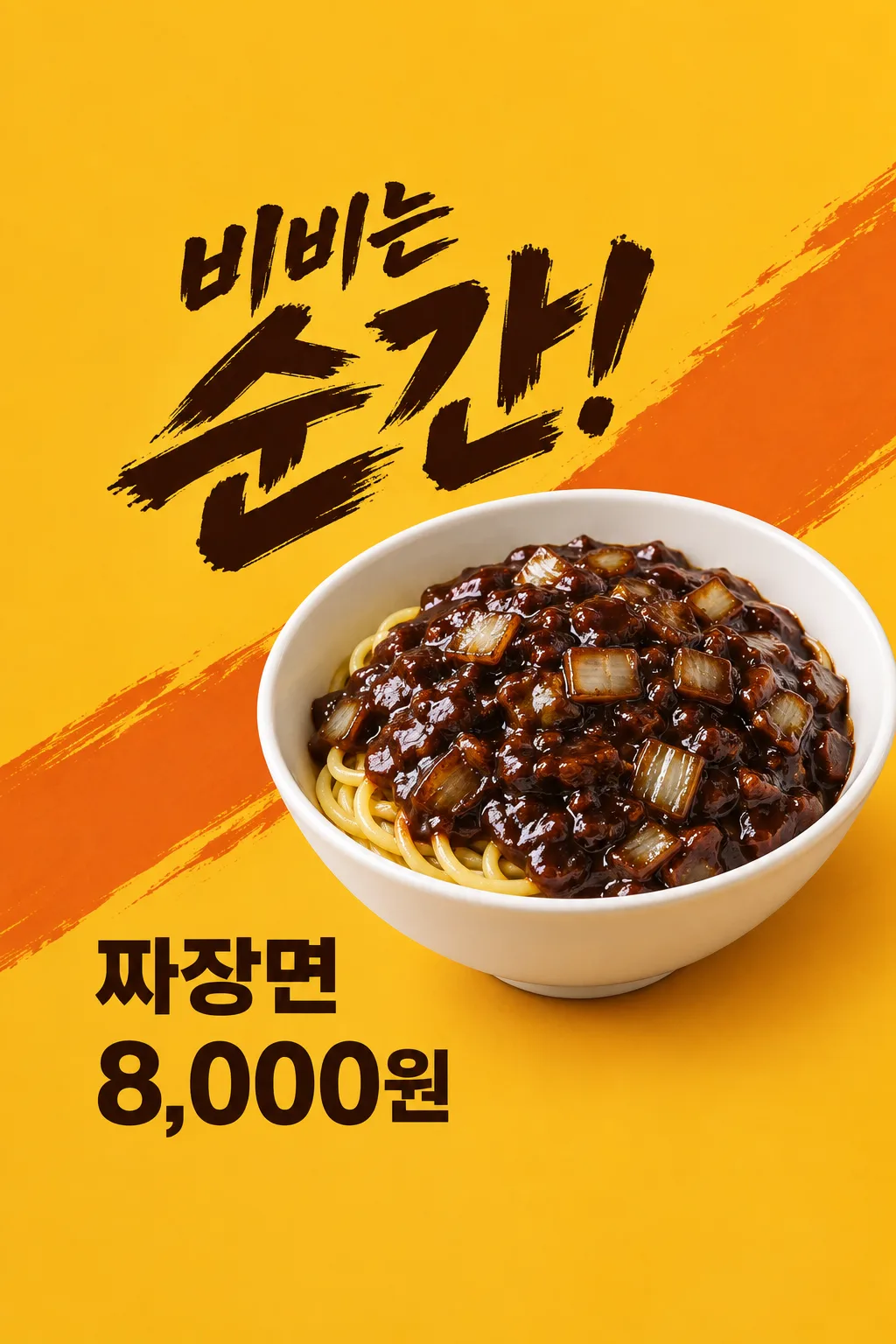
Create ONE finished Japanese impact-style food poster for a Korean Chinese restaurant's jajangmyeon. It is a menu advertisement to put in the shop window or post to the restaurant's social account. Use the attached actual food photo as the hero. This card always makes one close-up food poster with an energetic headline and one price, never a menu board, teaser, coupon, multiple dishes, different layout options or image set. Draw it directly without questions, code, another step or cropping instructions.

[Attached photo - required]
Use the restaurant's ONE attached photograph of its actual jajangmyeon. Preserve the actual portion, deep bowl shape, noodle thickness, sauce consistency, visible onion pieces and genuine garnish. Remove the surrounding table clutter and any package logos, but do not upgrade the portion or add ingredients. Keep round wheat noodles as soft irregular curves under dark brown-black glossy sauce. The sauce has irregular translucent onion chunks, gentle oil highlights and believable food texture. Noodles never form a woven mesh, repeated parallel grid, plastic tube lattice or geometric nest. A few modest highlights suggest a freshly served warm bowl. Do not add exaggerated steam, frozen airborne sauce, a noodle waterfall or an invented serving hand. Do not add pickled radish, dumplings, drink, egg, cucumber or another side dish unless it is genuinely part of the uploaded serving. The food must look appetizing before any decoration.

[Scene and composition]
One clean mustard-yellow to warm ocher background with two broad restrained burnt-orange diagonal graphic sweeps. The hero bowl is positioned right of center with a credible three-quarter viewing angle, around 45–76% canvas height; its rim and bottom remain physically coherent. It sits on a small real contact shadow, never floats. The composition is dynamic through the diagonal graphic direction and large type, not through impossible food motion. The photo is the single main visual. Leave no thick frame or mockup surround.

[Text layout and exact information]
Top 12% and bottom 15% contain background only, no essential words. Headline entirely at 13–43%, dark ink brush lettering with a small first phrase and a final emphatic word roughly twice the size. Headline input: "【短いキャッチ】". If it is "おまかせ", invent one short food-specific exclamation about mixing or the visible glossy bowl, at most fourteen Japanese characters. Do not print the instruction, claim superiority, state an ingredient not visible or repeat the menu name in the headline. If the user enters words, render them exactly and split only at a natural phrase boundary.
Optional actual shop name at 44–48%, ordinary legible type, printed once: "【店名】".
Menu label at the lower left, 69–76%, large clean sans-serif, exactly "【メニュー名】".
Single selling price directly below that label at 77.5–84.6%, bold sans-serif, exactly "【販売価格】".
Optional actual ordering contact at 49–58% in the clear left margin, one short legible contact block, exactly "【注文の連絡先】".
Omit removed optional lines entirely. Never invent a shop name, phone number or instruction if a line is missing. The price remains directly on the background with no rectangle, pill, sticker, badge, burst or plate behind it. No crossed-out original price or duplicate amount. Preserve the entered currency and separators exactly; do not convert prices.

[Style, hierarchy and light]
Appetizing Korean food photography combined with expressive dark brush headline and ordinary clear transaction lettering. Read the food and shout first, then menu and price, then supplied contact. The mustard field contrasts with glossy dark sauce; the white bowl separates the dish from the background. Warm side lighting keeps natural wet highlights and visible uneven onion shapes without making the food oily black plastic. Supporting graphics stay behind the bowl and never cross a letter, price digit or important food detail. Avoid stock red lanterns, stereotyped costumes, extra calligraphy seals, fake logos and neon glare.

[Text rules and avoid]
Every visible word is in Japanese except an entered business name or contact. Spell every character correctly. Print only the entered headline or chosen short headline, optional shop name, menu, one exact price and optional contact. Do not print field labels. Add no sale, date, limited quantity, opening event, free topping, minimum spend, delivery availability, origin, handmade claim, health benefit, review count or best-seller badge that the user did not supply. No watermarks, trademark packaging, URL, extra tiny copy or fake conditions. On a 1024x1536 canvas, all essential words stay between y=200 and y=1300. Return the single complete poster.

[Final layout matched to the approved result]
Keep the top 12% and bottom 15% free of every essential word. The angled two-level brush headline fits inside y=200 to y=670 on a 1024x1536 image, upper-left. The single bowl fits at y=550 to y=1140, predominantly on the right. The lower-left menu fits at y=1060 to y=1170 and the single price at y=1190 to y=1300. No text pixel above y=200 or below y=1300. For optional shop name and contact, use the clear LEFT area below the headline and beside the bowl, never the bottom band: shop name at y=680 to y=735, contact at y=760 to y=890, using at most two natural short lines if necessary. Shift the bowl slightly right to keep those optional words clear. Preserve the same mustard field, diagonal orange sweeps, two-level shout and one bowl; optional words do not create another design.
こちらのカードも人気です





使い方・よくある質問
こんなときに
韓国式ジャージャー麺一杯を店頭の窓やSNSで大きく見せたいときに使います。黄土色の背景と太い墨色の文字で目を引き、実際の料理写真、メニュー名、価格を続けます。シンプルな価格表とは違い、短い掛け声が主役になる広告です。メニュー全体や割引イベントの案内を作るカードではありません。
入力する情報
店名は実際の名前だけを入れ、不要なら空欄にします。メニュー名は添付した写真と一致させてください。価格にはその一杯を買うときの実際の金額と通貨を書きます。例の8,000ウォンは見本なので、必ずお店の価格に変えます。「おまかせ」なら混ぜたくなる瞬間を表す短いキャッチを作ります。自分で書いた文はそのまま出ます。連絡先も本当に注文を受けるものだけを入力します。
料理写真は必須です
麺、ソース、深い器の縁が見える明るい写真を用意してください。① GPTの入力欄に写真一枚を追加し、まだ送信しません。② 同じ欄に完成したプロンプトを貼ります。③ 両方が入ったことを確認して一度送ります。周りの物は整理しても、量や具材は実物のままです。先に写真だけ送った場合は、原文の最後に「上の写真を使って」と加えられます。
出来上がりの確認
麺は柔らかく曲がり、網目のように組まれていないことを確認します。玉ねぎの形は不規則で、黒いソースがプラスチックに見えないことも大切です。写真になかった卵、餃子、飲み物や付け合わせが増えていないか、器の縁と深さが自然につながっているか見てください。そのあとメニュー名と価格を照合します。価格は一度だけで、後ろに飾りの札は付きません。
掲示と修正
割引、期間、数量、出前条件は自動で作りません。勝手な条件が増えたら、実際の情報だけで全体を作り直します。料理の形がおかしいときは、より鮮明な店の写真を使ってください。金額の誤字は正しい表記を最後に指定し、一枚を再生成します。部分を切って組み立てる必要はありません。印刷する場合は、紙で価格や連絡先が読めるか確認してください。
よくある質問
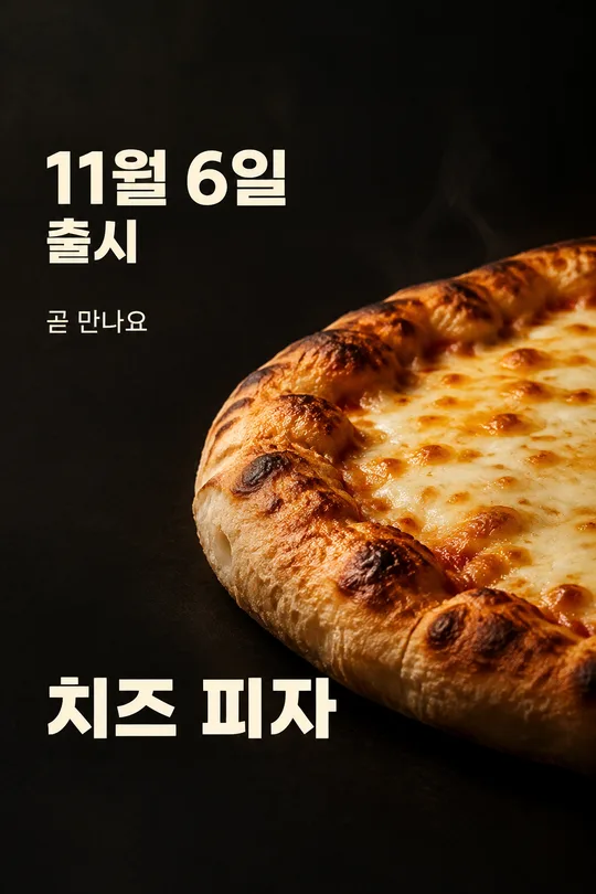
- 写真なしでも使えますか? 店舗の広告には実物の料理写真を入れてください。表紙は形を示す見本です。
- 割引も付きますか? いいえ。販売価格一つだけを表示します。
- 別の中華料理にも使えますか? このカードはジャージャー麺系に固定です。別の料理は専用カードを選んでください。