
전체 · 광고/포스터 · 음식점·식당
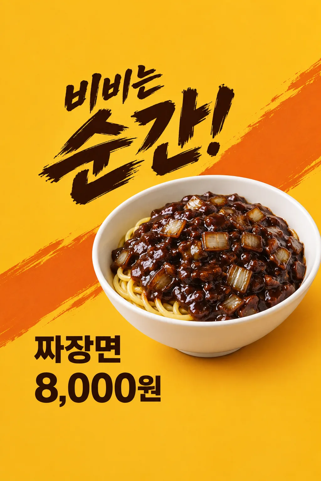
157짜장면 임팩트 포스터
중식 가게 사장님이 실제 짜장면 사진과 판매 가격으로 매장·SNS에 붙일 강한 한 장 광고를 만들어요.
칸 채우기
- 1칸을 채워요
- 2복사 버튼을 눌러요
- 3GPT 채팅창에 실제 판매하는 짜장면 사진 1장을 올리고, 프롬프트를 같이 붙여넣어요
- 4실제 판매하는 짜장면 사진 1장과 프롬프트가 둘 다 들어간 걸 보고 보내요
프롬프트 원문 보기 5,662자
Generate this image now. Draw it directly - do not describe it, explain it, or ask questions.
Output one landscape A3 poster, 420 x 297 mm, aspect ratio 1.414:1. Use the largest supported image resolution. Final print target is 4961x3508 pixels at 300dpi; keep all lettering at least 10 mm inside every paper edge. Preserve the wide composition and print-safe margins.

[Purpose]
Create ONE finished Korean impact-style food poster for a Korean Chinese restaurant's jajangmyeon. It is a menu advertisement to put in the shop window or post to the restaurant's social account. Use the attached actual food photo as the hero. This card always makes one close-up food poster with an energetic headline and one price, never a menu board, teaser, coupon, multiple dishes, different layout options or image set. Draw it directly without questions, code, another step or cropping instructions.

[Attached photo - required]
Use the restaurant's ONE attached photograph of its actual jajangmyeon. Preserve the actual portion, deep bowl shape, noodle thickness, sauce consistency, visible onion pieces and genuine garnish. Remove the surrounding table clutter and any package logos, but do not upgrade the portion or add ingredients. Keep round wheat noodles as soft irregular curves under dark brown-black glossy sauce. The sauce has irregular translucent onion chunks, gentle oil highlights and believable food texture. Noodles never form a woven mesh, repeated parallel grid, plastic tube lattice or geometric nest. A few modest highlights suggest a freshly served warm bowl. Do not add exaggerated steam, frozen airborne sauce, a noodle waterfall or an invented serving hand. Do not add pickled radish, dumplings, drink, egg, cucumber or another side dish unless it is genuinely part of the uploaded serving. The food must look appetizing before any decoration.

[Scene and composition]
One clean mustard-yellow to warm ocher background with two broad restrained burnt-orange diagonal graphic sweeps. The hero bowl is positioned right of center with a credible three-quarter viewing angle, around 45–76% canvas height; its rim and bottom remain physically coherent. It sits on a small real contact shadow, never floats. The composition is dynamic through the diagonal graphic direction and large type, not through impossible food motion. The photo is the single main visual. Leave no thick frame or mockup surround.

[Text layout and exact information]
Top 12% and bottom 15% contain background only, no essential words. Headline entirely at 13–43%, dark ink brush lettering with a small first phrase and a final emphatic word roughly twice the size. Headline input: "【한 줄 카피】". If it is "알아서 골라줘", invent one short food-specific exclamation about mixing or the visible glossy bowl, at most ten Korean syllables. Do not print the instruction, claim superiority, state an ingredient not visible or repeat the menu name in the headline. If the user enters words, render them exactly and split only at a natural phrase boundary.
Optional actual shop name at 44–48%, ordinary legible type, printed once: "【가게 이름】".
Menu label at the lower left, 69–76%, large clean sans-serif, exactly "【메뉴 이름】".
Single selling price directly below that label at 77.5–84.6%, bold sans-serif, exactly "【판매 가격】".
Optional actual ordering contact at 49–58% in the clear left margin, one short legible contact block, exactly "【주문 연락처】".
Omit removed optional lines entirely. Never invent a shop name, phone number or instruction if a line is missing. The price remains directly on the background with no rectangle, pill, sticker, badge, burst or plate behind it. No crossed-out original price or duplicate amount. Preserve the entered currency and separators exactly; do not convert prices.

[Style, hierarchy and light]
Appetizing Korean food photography combined with expressive dark brush headline and ordinary clear transaction lettering. Read the food and shout first, then menu and price, then supplied contact. The mustard field contrasts with glossy dark sauce; the white bowl separates the dish from the background. Warm side lighting keeps natural wet highlights and visible uneven onion shapes without making the food oily black plastic. Supporting graphics stay behind the bowl and never cross a letter, price digit or important food detail. Avoid stock red lanterns, stereotyped costumes, extra calligraphy seals, fake logos and neon glare.

[Text rules and avoid]
Every visible word is in Korean except an entered business name or contact. Spell every character correctly. Print only the entered headline or chosen short headline, optional shop name, menu, one exact price and optional contact. Do not print field labels. Add no sale, date, limited quantity, opening event, free topping, minimum spend, delivery availability, origin, handmade claim, health benefit, review count or best-seller badge that the user did not supply. No watermarks, trademark packaging, URL, extra tiny copy or fake conditions. On a 1024x1536 canvas, all essential words stay between y=200 and y=1300. Return the single complete poster.

[Final layout matched to the approved result]
Keep the top 12% and bottom 15% free of every essential word. The angled two-level brush headline fits inside y=200 to y=670 on a 1024x1536 image, upper-left. The single bowl fits at y=550 to y=1140, predominantly on the right. The lower-left menu fits at y=1060 to y=1170 and the single price at y=1190 to y=1300. No text pixel above y=200 or below y=1300. For optional shop name and contact, use the clear LEFT area below the headline and beside the bowl, never the bottom band: shop name at y=680 to y=735, contact at y=760 to y=890, using at most two natural short lines if necessary. Shift the bowl slightly right to keep those optional words clear. Preserve the same mustard field, diagonal orange sweeps, two-level shout and one bowl; optional words do not create another design.
이 카드도 많이 사용해요





쓰는 법 · 자주 묻는 것
이런 때 쓰세요
중식 가게의 창문이나 계산대 옆에 짜장면 한 그릇을 크게 보여 주고 싶을 때 쓰세요. 노란 바탕과 큰 먹색 붓글씨가 먼저 시선을 잡고, 실제 판매 음식 사진과 메뉴명·가격이 이어집니다. 사진과 가격만 얌전하게 나열하는 심플형과 달리 “비비는 순간!” 같은 짧은 외침이 있는 임팩트형입니다. 같은 완성 이미지로 가게 SNS에도 메뉴를 알릴 수 있습니다. 메뉴판 전체나 할인 행사 안내를 만드는 카드는 아닙니다.
칸 채우는 법
가게 이름에는 실제 상호만 적고, 표시하지 않으려면 비우세요. 메뉴 이름은 붙인 사진에서 실제 판매하는 짜장면의 이름으로 씁니다. 간짜장이나 유니짜장이라면 그 메뉴의 실제 사진을 준비해야 합니다. 가격에는 손님이 해당 한 그릇을 살 때 내는 판매 가격을 통화까지 적으세요. 보기의 8,000원은 예시이며 가게의 실제 가격으로 바꿔야 합니다. 한 줄 카피는 ‘알아서 골라줘’를 누르면 짜장면을 비비고 싶은 순간을 짧게 표현합니다. 직접 적은 카피는 그대로 들어갑니다. 주문 연락처는 실제 주문을 받는 번호나 주소만 넣고, 필요 없으면 비웁니다.
음식 사진을 넣는 순서
사진은 필수입니다. 가게에서 실제로 내는 한 그릇을 밝게 찍어 면·소스·그릇 가장자리가 보이게 준비하세요. ① GPT 입력창에 음식 사진 한 장을 올리고 아직 보내지 않습니다. ② 같은 입력창에 채운 프롬프트를 붙여넣습니다. ③ 사진과 글이 모두 들어간 것을 확인하고 한 번 보내세요. 주변 물건은 정리하지만 음식 양과 토핑은 원본을 따릅니다. 사진만 먼저 보냈다면 원문 끝에 ‘위 사진으로 그려줘’를 더할 수 있습니다.
음식과 글자 확인
실제 짜장면 사진과 결과를 나란히 보세요. 둥근 면이 자연스럽게 휘어야 하고, 양파 조각은 크기와 위치가 불규칙해야 합니다. 면이 그물처럼 엮이거나 검은 플라스틱 막처럼 보이면 다시 만들어야 합니다. 그릇은 깊이와 테두리가 이어지고, 없던 계란·단무지·만두·음료가 생기지 않아야 합니다. 사진의 한 그릇만으로 “맛있겠다”가 느껴지는지 먼저 본 뒤 메뉴 이름과 가격을 대조하세요. 가격은 한 번만 나오고 뒤에 장식 판이 없어야 합니다.
실제 게시 전에
이 카드는 할인율·기간·수량·배달 조건을 정하지 않습니다. 손님이 오해할 행사 문구가 붙었다면 빼고 전체를 다시 받으세요. 원산지나 수제 여부 같은 판매 사실도 자동으로 만들어 넣지 않습니다. 선택한 비율의 결과 한 장을 그대로 저장해 쓰고, 여러 장을 이어 붙이거나 잘라 조립할 필요가 없습니다. A4로 선택했어도 최종 인쇄 크기의 글자가 읽히는지는 종이로 확인하는 편이 좋습니다.
틀린 곳 고치는 법
음식이 이상하면 원래 가게 사진을 더 선명한 사진으로 바꾸고 같은 원문을 다시 보내세요. 음식 양을 키우는 요청보다 면·소스·그릇을 원본대로 유지하는 것이 먼저입니다. 가격 오탈자는 정확한 판매 가격을 프롬프트 끝에 한 번 지정해 전체 한 장을 다시 받으세요.
자주 묻는 것
- 사진 없이 만들 수 있나요? 매장 광고에는 실제 판매 짜장면 사진을 넣어 주세요. 표지는 모양을 보여 주는 예시입니다.
- 할인 행사도 자동으로 붙나요? 아니요. 판매 가격 하나만 표시하며 할인·기간·혜택은 만들지 않습니다.
- 다른 중식 메뉴에도 쓰나요? 이 카드는 짜장면 계열에 고정돼 있습니다. 다른 음식은 해당 음식 카드로 만드세요.