
すべて · 広告・ポスター · ロゴ・ブランド
126韓国語カリグラフィーロゴ
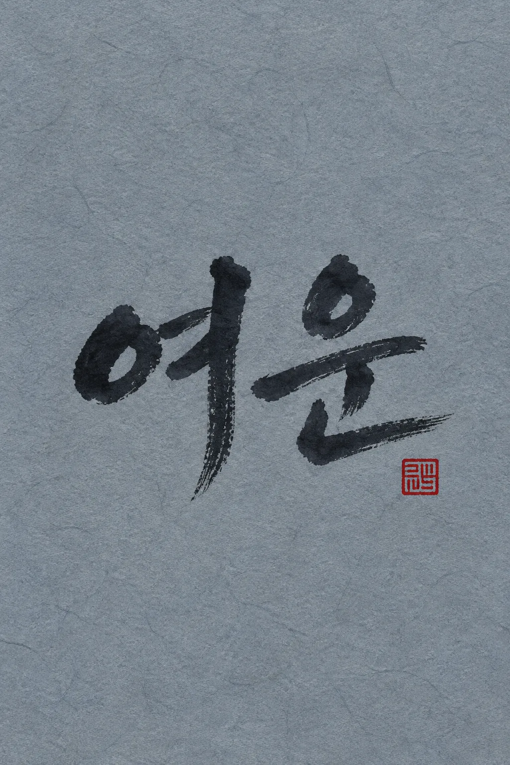
短い韓国語名を、かすれのある墨の筆致と小さな赤い落款で力強く仕上げます。
受け取れるもの
- かすれた墨の筆致が残る大きな韓国語名
- 余分な文字を入れない小さな赤い落款
- 韓紙など選んだ素材のロゴ一枚
ChatGPT 無料 OK
項目を入力
- 1項目を入力します
- 2コピーを押します
- 3GPTのチャットに貼り付けます
- 4そのまま送ると、サムネイルの例のような画像になります
- 5カードに合う実際の写真を一緒に入れると反映されます。背景カードなら背景の写真、人物・料理カードならその写真 任意
プロンプト全文を見る 5,732文字
Generate this image now. Return exactly ONE finished logo image itself; draw it directly, without explanations or questions.
出力サイズは1080×1080ピクセル、1:1の正方形にしてください。文字を読みやすく配置してください。
Create one original professional brand identity, one finished composition and one material. No options sheet, multiple applications, props, hands, devices or collage. Never imitate an existing brand's recognizable logo, mascot or typography. Do not add slogans, field labels, unrelated words, watermarks or trademark symbols. The chosen substrate fills the canvas edge to edge.
Keep all essential lettering below the top 12% and above the bottom 15% of the canvas. Center the complete logo group with quiet margins, about 70-78% of canvas width. Adapt the same identity to the chosen ratio without changing the style.

[INPUTS FOR THIS IMAGE]
韓国語の名前 selected: "【韓国語の名前】"
Set BRAND_NAME to this input. Preserve its exact spelling, case, spaces and punctuation. Print it exactly once. Never translate or romanize it. This card creates a KOREAN HANGUL name logo only. Prefer 2-4 Hangul syllable blocks. If explicitly asked to choose, invent one short original Korean name in Hangul; never substitute English or Japanese lettering. If no name was supplied, ask for the name rather than inventing an existing business. Do not print the field label.
素材 selected: "【素材】"
Apply only this finish to the whole logo. Preserve the fixed style of this card. Foil keeps its physical metal color; palette changes mainly affect the substrate. One continuous surface fills the canvas.
Interpret the selected choice as follows (use only the selected one):
- 青灰色の韓紙と墨: near-black ink on muted blue-gray Korean hanji paper, visible long natural fibers.
- アイボリーの韓紙と墨: rich black ink on natural ivory hanji with paper fibers.
- 白い書画紙と墨: black ink on white absorbent calligraphy paper with restrained feathering.
- 黒紙の金箔: gold-foil reproduction of the brush strokes on black cotton paper, dry-brush cutouts remain visible.
- 漆喰壁の黒い筆文字サイン: raised matte black reproduction of brush strokes on cool gray plaster.
- フラットな墨の図案: clean near-black brush artwork with dry-brush cutouts on a plain light background.
If the selection line is absent or empty, use 青灰色の韓紙と墨 only.
配色 selected: "【配色】"
Use this restrained palette and necessary substrate tones only. Keep the name clearly readable against its background. Real metal retains its physical color.
Interpret the selected choice as follows (use only the selected one):
- 墨+朱+青灰: near-black name, vermilion seal, muted blue-gray background.
- 墨+赤+アイボリー: black name, red seal, natural ivory background.
- 金+朱+黒: gold name, vermilion seal, black background.
- 濃紺+朱+白: dark navy name, vermilion seal, white background.
If the selection line is absent or empty, use 墨+朱+青灰 only.
筆のタッチ selected: "【筆のタッチ】"
The result remains expressive Korean calligraphy, never printed sans serif, Chinese characters or Japanese lettering.
Interpret the selected choice as follows (use only the selected one):
- 力強いかすれ筆: confident thick-to-thin strokes, dry-brush gaps mainly inside broad strokes, intact essential Hangul strokes.
- 柔らかい流れる筆: graceful flowing pressure changes, Hangul blocks remain distinct.
- 端正な太筆: balanced bold brush strokes with controlled texture and readable block structure.
If the selection line is absent or empty, use 力強いかすれ筆 only.
墨のにじみ selected: "【墨のにじみ】"
Keep every supplied Hangul block complete. Ink texture is secondary to character accuracy.
Interpret the selected choice as follows (use only the selected one):
- 控えめ: very restrained ink feathering, clear outside contour and readable dry fibers.
- 明瞭: crisp outer contour, visible internal brush grain.
- やわらかく: gentle natural ink spread that never fills counters or erases final consonants.
If the selection line is absent or empty, use 控えめ only.
落款の位置 selected: "【落款の位置】"
The optional seal contains a simple abstract carved geometric pattern only, never invented names, Chinese characters, dates or extra words.
Interpret the selected choice as follows (use only the selected one):
- 右下: one small vermilion square seal just below the final character on the right.
- 左下: one small vermilion square seal below the first character on the left.
- 落款なし: omit the seal entirely.
If the selection line is absent or empty, use 右下 only.

[RESOLVED DESIGN]
ONE Korean HANGUL calligraphic name, BRAND_NAME, large across the central canvas, about 73-78% of its width. Dynamic original hand-brushed ink strokes, confident thick-to-thin pressure and dry-brush fibers. Every Hangul syllable block is recognizable and complete; dry texture never removes the final consonants or changes the spelling. Default near-black ink on muted blue-gray Korean hanji with visible fibers, one small vermilion square abstract seal at lower right. The seal is only a carved geometric texture, not another word. Name is the main and only lettering. No external illustration, landscape, brush tool, extra poem, slogan or calligrapher signature. Use horizontal balanced writing, energetic but readable. A short 2-4 Hangul-block name is ideal.
Before returning, compare every visible name character with BRAND_NAME, one by one, including Hangul initial consonants, vowels and final consonants. Repair missing or altered letters while retaining the design. Print the brand name exactly once. The finish may be realistic, but the identity must remain clear at thumbnail size.

[Final output format]
出力サイズは1080×1080ピクセル、1:1の正方形にしてください。文字を読みやすく配置してください。
This selected output format takes priority over any fixed canvas size or aspect ratio elsewhere in this template. Adapt the composition, text zones and margins to the selected canvas without stretching or cropping essential content. Device safe areas apply only when a device is selected. Never print these format instructions on the image.
結果はどうでしたか?
こちらのカードも人気です






使い方・よくある質問
墨の力で名前一つ
伝統工芸・陶芸・伝統酒工房のように、短い名前の印象を強く残したい時に使います。韓国語の名前専用の筆文字ロゴです。墨の太くて細い圧力、かすれた筆の亀裂、小さな赤い落款だけで完成させます。表紙は架空の陶芸工房「여운」を青灰色の韓紙に書いた例です。落款は追加の名前なしで抽象模様のみを入れ、詩や背景の風景は描きません。
韓国語で2〜4文字をおすすめします
必ず入力する項目は韓国語の名前一つです。実際の名前にあたる韓国語を2〜4文字で入れることをおすすめします。短い名前ほど正確に、1文字ずつ確認してください。まだ名前が決まっていない場合は、「おまかせ」で短い架空の韓国語の名前を受け取ることができます。英語や日本語のカードも韓国語の名前ロゴを作成するためのものであり、日本の書道や英字の筆文字に変更することはありません。長い名前は画数がくっつきやすいため、すべての文字が残っているかより入念に確認します。
筆のタッチと用紙を選びます
青灰色の韓紙と墨、アイボリーの韓紙と墨、白い書画紙と墨、黒紙の金箔、漆喰壁の黒い筆文字サイン、フラットな墨の図案の6種類の素材があります。金箔とサインは筆の形を再現した素材の例です。力強いかすれ筆、柔らかい流れる筆、端正な太筆の中から選んでも、韓国語の構造は維持されます。墨のにじみと落款の位置を調節でき、落款なしにすることも可能です。選択を空欄にすると、青灰色の韓紙と墨、墨+朱+青灰、力強いかすれ筆、控えめ、右下の落款が基本となります。
華麗なタッチより名前から読みます
写真なしで1:1を選び、プロンプトを送信してください。初声・中声・終声を1文字ずつ対照します。終声がかすれたタッチに埋もれた場合は「名前여운のストロークは正確に残し、筆の質感は太いストロークの中にのみ」、落款が大きい場合は「落款を名前の高さの15%程度に縮小して」とリクエストしてください。実際の看板やハンコには、用紙の繊維と影を除外してフラットな図案を整理し、にじみによって生じた小さな破片も確認してください。表紙は2:3、基本の結果は1:1です。
商用利用前にKIPRISおよび利用する国の商標データベースで検索し、大きく使うときはベクターで描き直してください。