
すべて · 広告・ポスター · 飲食店
190とんかつSNS広告
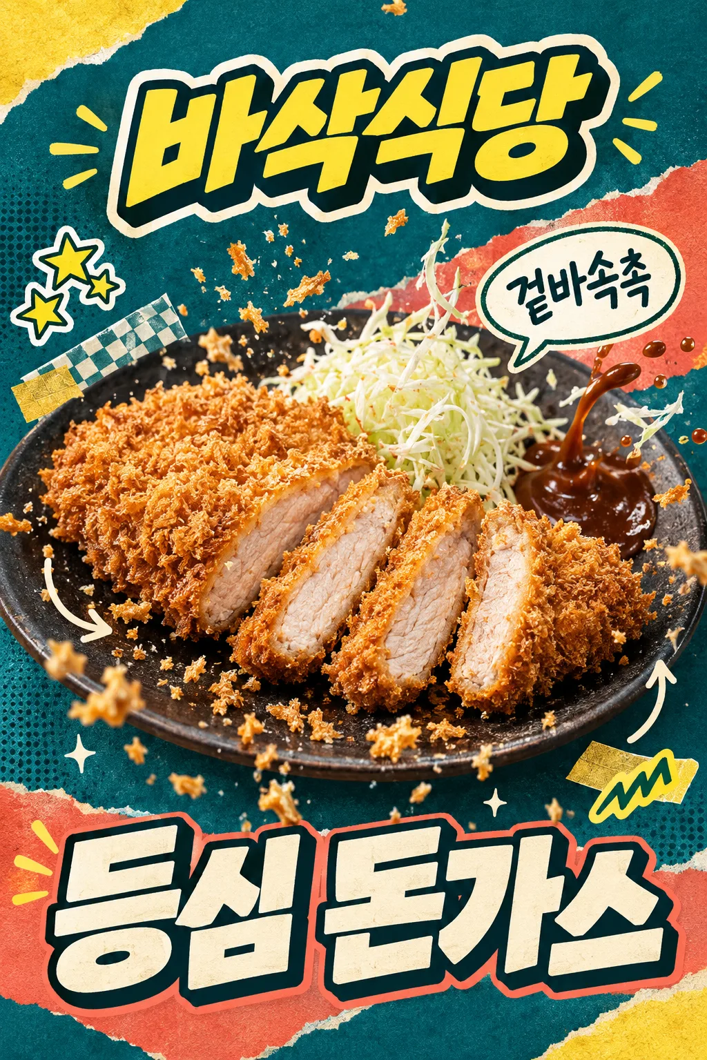
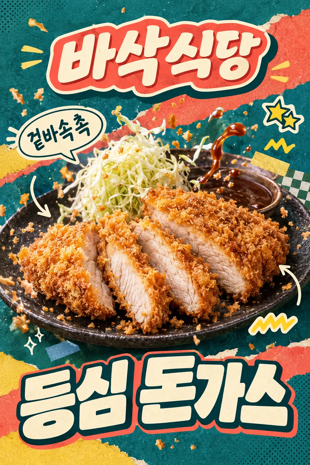
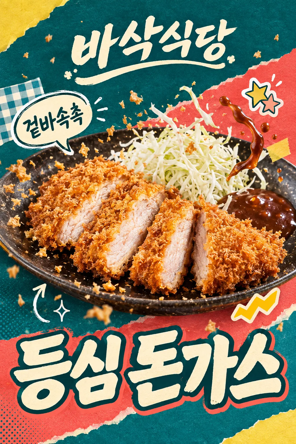
Instagramフィードに投稿する一枚。店名ロゴ、動く食材、手描きステッカー、大きな料理名で、価格を載せずに目を引きます。
完成物 SNS投稿用の一枚 · 店名ロゴ・コラージュ・大きな料理名、価格なし
項目を入力
- 1項目を入力します
- 2プロンプトをコピーします
- 3GPTのチャットに実際に販売するとんかつの写真1枚とプロンプトを一緒に送ります
- 4写真と文章の両方が入っていることを確認します
プロンプト全文を見る 5,919文字
Generate ONE finished raster image now, directly, without questions or explanation.
出力サイズは1080×1350ピクセル、4:5の縦型Instagram投稿にしてください。
[SOCIAL FEED — FIXED T1 + T3 COMPOSITION]
Make an exuberant Instagram food ad, default portrait 4:5. Combine the photographed moment of ingredients in motion (T1) WITH photo cutouts, hand-drawn speech bubbles and sticker collage (T3). The food is the dominant central hero; decorations must not make the meal look drawn.
[REAL FOOD IS THE HERO]
Use the attached merchant-owned food photograph as the only food reference. Preserve the actual serving size, slice count, irregular slice arrangement, meat thickness, coating and cooked interior. Keep an unsliced cutlet unsliced. The food stays photographic: golden coarse irregular bread flakes, a thin fried edge, moist pale fully cooked pork with fine fibers. A cross-section is visible only if it exists in the source. Preserve the actual vessel and existing sides. Do not add another serving, cheese, rice, drinks, new sides, packaging or a third-party logo. Warm soft side light and crisp close detail make the real food appetizing; never make identical repeated slices, a bread sandwich or a hollow fried shell.
[EXACT SHORT COPY]
Print the menu exactly once: "【料理名】". Do not abbreviate it.
Short copy input: "【短いひとこと】". If it equals "おまかせで選んで", use "サクッとジューシー" only when the visible texture supports it; otherwise choose one equally short sensory phrase. Print the final phrase once. Never print field labels, placeholder braces or option names.
Render all lettering in Japanese, preserving every supplied character and space.
[STORE NAME AS A DESIGNED LOGO — UPPER AREA]
Store name exactly "【店名】", printed once, mandatory and prominent. Make the whole name a custom logo-shaped block in the upper area, never plain small type or a copied existing brand logo. Design choice: "【店名のデザイン】".
If "やわらかく": rounded handwritten lettering on a soft pastel ribbon with folded ends and a smooth cream keyline.
If "インパクト強く": very bold slightly slanted connected display letters, a thick cream outline and a short hard-offset dark extrusion; a compact impactful sign or sticker silhouette.
If "レタリングロゴ": bespoke lettering where the letters themselves form an illustrated restaurant logo, with restrained crumb-shaped stroke terminals and one integrated underline. Keep every glyph legible, never replace a character with a food icon.
If "おまかせで選んで": choose the bold-impact logo above for this composition. Apply this choice ONLY to the store-name block. Keep the same finished image type, food, menu placement, background and other decorations. Output one image, not a logo sheet or alternate layouts.
[MOTION AND TACTILE COLLAGE]
A huge cutlet-and-plate photograph, filling about 90% of the width, tilts gently through the middle. Freeze tiny real bread flakes in a lively arc. If brown cutlet sauce and shredded cabbage are already in the source, lift a small sauce ribbon and a few cabbage strands into the air beside their original side portions; keep the same ingredients and serving, with no added toppings. If either is absent, omit just that ingredient motion and keep the crumb burst. Sauce, crumbs and cabbage form real photographed layers in front of and behind the outer food contour, never through the lettering or meat face.
Use saturated deep teal paper, a broad coral torn-paper diagonal, lemon-yellow and cream fragments, faint halftone ink and paper fibers. Layer one checkered paper corner and two small tape tabs behind the food. Add three restrained graphic accents: one cream hand-drawn speech bubble carrying the exact short copy, one decorative star cluster sticker without a score or digits, and one small lemon zigzag sticker without text. Two loose appetite arrows and tiny sparkles give rhythm. The speech bubble sits beside the food, not in a giant headline that competes with it. Add no review rating, time limit, discount or unsupported promotional claim.
[HUGE MENU AT THE BOTTOM — NO PRICE SLOT]
Make the exact menu name occupy the lower 25–30% as monumental cream display lettering with a dark outline and a short coral offset. Use one line when it fits; for a long menu use a deliberate two-line title, still one menu occurrence. Letters may interact with the torn-paper edges, but every stroke stays readable. The menu is the main lower shape, not left-aligned text in a horizontal information band. There is NO price row, empty price space, currency, price digits, percentage, sale copy or number anywhere in the advertisement. Print only the store name, menu and short sensory copy; stars and other stickers are decorative marks.
[FULL CANVAS AND THUMBNAIL ADAPTATION]
Fill the canvas edge to edge; no outer border, white mat, photographed paper, device or wall mockup. At normal display ratios the upper logo stays fully inside x7–93%, y8–26%; food occupies the central y30–68%; the lower menu area fills y70–98%.
For a 2:3 site thumbnail only, protect the site's overlays: all essential ink, outlines and shadows must lie inside x7–93%, y14–84% (at 1024×1536, y215–1290). The lower menu region still uses the full lower 25–30% of the usable safe composition, around y64–84%; surrounding background and decorative shapes continue to the bottom edge. Keep the menu large by shortening the upper caption and allowing the plate rim to crop; never put the menu into a tiny strip. At 4:5 and print ratios retain the large lower menu region without a blank footer.
Deliver exactly one finished image. No watermark, franchise imitation, artist signature or instructions to assemble it.

[Final output format]
出力サイズは1080×1350ピクセル、4:5の縦型Instagram投稿にしてください。
This selected output format takes priority over any fixed canvas size or aspect ratio elsewhere in this template. Adapt the composition, text zones and margins to the selected canvas without stretching or cropping essential content. Device safe areas apply only when a device is selected. Never print these format instructions on the image.
結果はどうでしたか?
こちらのカードも人気です




使い方・よくある質問
Instagramフィードに投稿する一枚
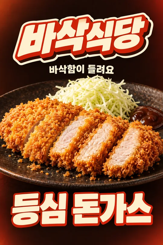
実際のとんかつ写真に、食材が動く瞬間と手描きステッカーを組み合わせます。青緑の紙、コーラルの色面、小さな装飾を重ねても、中央の料理が主役です。下部は大きな料理名で埋め、価格や割引は載せません。基本比率は4:5です。
店名をロゴとして選ぶ
店名は必須です。「サクサク食堂」は架空の入力例です。やわらかくは丸い手書き文字とパステルのリボン、インパクト強くは太い立体文字・縁取り・傾き、レタリングロゴは文字自体を絵のように組むデザインです。おまかせはインパクト型を選びます。変更するのは上部の店名だけで、完成物は同じSNS広告一枚です。作例はインパクト、やわらかく、レタリングの順です。
写真と四つの項目
店名、店名のデザイン、料理名、短いひとことを入力します。実際に販売する料理の写真とコピーしたプロンプトを一緒に送ってください。ソースや千切りキャベツが写真にある場合だけ、その一部の動きを加えます。ない食材を追加せず、量・切れ数・肉の厚さ・付け合わせを保ちます。
投稿前の確認
店名と料理名を一文字ずつ確認し、価格・数字・割引が増えていないか見ます。星は装飾で、口コミの点数や期間限定の条件ではありません。小さな画面でも料理と料理名が先に伝わるか確認してください。誤字は正しい文字列を示し、その箇所だけの修正を頼みます。作例はAPI生成の構図案で、実店舗写真の保持性能を実証したものではありません。