
すべて · 広告・ポスター · ロゴ・ブランド
120韓国語ニュートロ看板ロゴ
短い韓国語の名前を、1980年代風の手描き看板文字と小さな絵で仕上げます。
受け取れるもの
- 1980年代の看板風の大きな韓国語名
- 名前の下に小さな業種アイコン
- 選んだ看板素材のロゴ一枚
ChatGPT 無料 OK
項目を入力
- 1項目を入力します
- 2コピーを押します
- 3GPTのチャットに貼り付けます
- 4そのまま送ると、サムネイルの例のような画像になります
- 5カードに合う実際の写真を一緒に入れると反映されます。背景カードなら背景の写真、人物・料理カードならその写真 任意
プロンプト全文を見る 5,558文字
Generate this image now. Return exactly ONE finished logo image itself; draw it directly, without explanations or questions.
出力サイズは1080×1080ピクセル、1:1の正方形にしてください。文字を読みやすく配置してください。
Create one original professional brand identity, one finished composition and one material. No options sheet, multiple applications, props, hands, devices or collage. Never imitate an existing brand's recognizable logo, mascot or typography. Do not add slogans, field labels, unrelated words, watermarks or trademark symbols. The chosen substrate fills the canvas edge to edge.
Keep all essential lettering below the top 12% and above the bottom 15% of the canvas. Center the complete logo group with quiet margins, about 70-78% of canvas width. Adapt the same identity to the chosen ratio without changing the style.

[INPUTS FOR THIS IMAGE]
韓国語の名前 selected: "【韓国語の名前】"
Set BRAND_NAME to this input. Preserve its exact spelling, case, spaces and punctuation. Print it exactly once. Never translate or romanize it. This card creates a KOREAN HANGUL name logo only. Prefer 2-4 Hangul syllable blocks. If explicitly asked to choose, invent one short original Korean name in Hangul; never substitute English or Japanese lettering. If no name was supplied, ask for the name rather than inventing an existing business. Do not print the field label.
小さな看板の絵 selected: "【小さな看板の絵】"
Use one subject described by this input, preserving the requested defining feature. If asked to choose or no subject was supplied, use a small plate with three dumplings and two simple steam strokes. Keep the silhouette immediately recognizable at small size.
素材 selected: "【素材】"
Apply only this finish to the whole logo. Preserve the fixed style of this card. Foil keeps its physical metal color; palette changes mainly affect the substrate. One continuous surface fills the canvas.
Interpret the selected choice as follows (use only the selected one):
- 古いからし色のブリキ: mustard-yellow enamel on one aged rectangular tin sign, lightly rusted corners and small screw heads, readable paint.
- クリーム色のブリキ: cream enamel tin sign with subtle chipped corners.
- 青緑のブリキ: aged turquoise enamel tin with light wear.
- 濃紺の鉄板: matte navy painted steel sign with lightly worn edges.
- 温かい木の看板: painted sign lettering on warm aged timber, modest wood grain.
- フラットな看板図案: clean flat rectangular sign artwork with no rust or material shadows.
If the selection line is absent or empty, use 古いからし色のブリキ only.
配色 selected: "【配色】"
Use this restrained palette and necessary substrate tones only. Keep the name clearly readable against its background. Real metal retains its physical color.
Interpret the selected choice as follows (use only the selected one):
- クリーム+えんじ+からし: cream letter faces, burgundy outlines and offset shadows, mustard-yellow sign background.
- クリーム+赤+青緑: cream letter faces, red outlines, turquoise sign background.
- 黄+紺+クリーム: yellow letter faces, navy outlines and cream background.
- 白+橙+紺: white letter faces, orange outlines, navy sign background.
If the selection line is absent or empty, use クリーム+えんじ+からし only.
看板文字 selected: "【看板文字】"
This remains a Korean Hangul name logo, never replace it with Latin, Japanese or fake pseudo-Hangul glyphs.
Interpret the selected choice as follows (use only the selected one):
- 太い丸形の手描き看板文字: bold hand-painted 1980s Korean rounded display forms, intact Hangul blocks.
- 角形の手描き看板文字: chunky angular hand-painted Korean sign lettering with intact blocks.
- 少し傾いた手描き看板文字: slightly slanted retro Korean sign hand, careful alignment and clear counters.
If the selection line is absent or empty, use 太い丸形の手描き看板文字 only.
看板の古び具合 selected: "【看板の古び具合】"
Sign age changes the physical surface, never the name spelling or the one-name composition.
Interpret the selected choice as follows (use only the selected one):
- 角だけ控えめ: light rust and chips at corners, no wear through the name.
- きれいな新しい看板: fresh paint and clean edges, retaining retro typography.
- 古い街の看板: moderate weathering mainly at edges and substrate, lettering fully readable.
If the selection line is absent or empty, use 角だけ控えめ only.

[RESOLVED DESIGN]
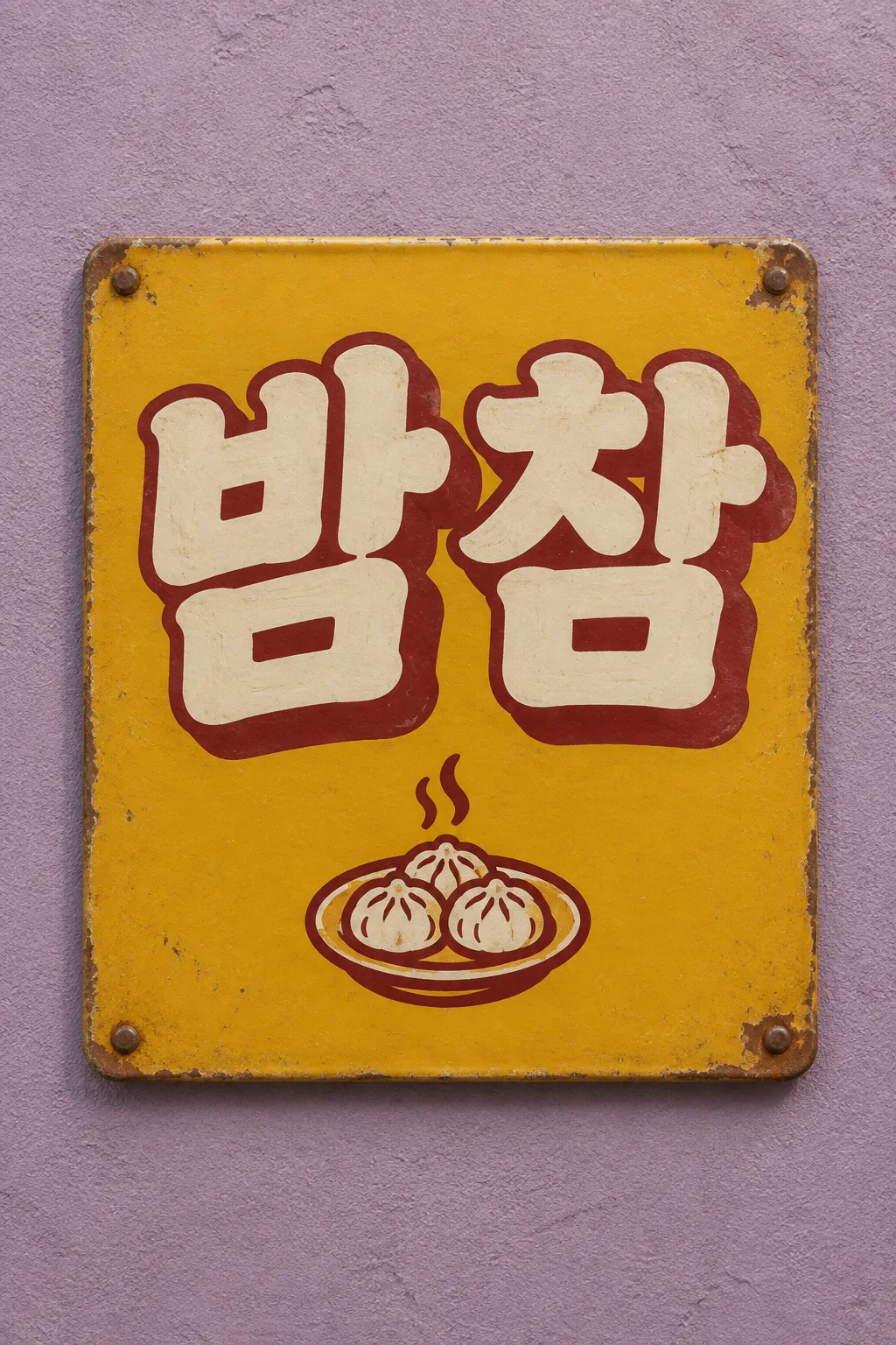
ONE Korean NEWTRO sign logo on one rectangular sign centered against a muted dusty-lilac plaster wall. Large exact Hangul BRAND_NAME dominates the upper two-thirds of the sign. Hand-painted 1980s Korean street-sign lettering: cream fill, thick burgundy outline and offset burgundy depth by default, with lively rounded handmade forms. Preserve all initial consonants, vowels and final consonants, no fused or substituted blocks. A small plate icon with three dumplings and two steam strokes sits below, much smaller than the name. Mustard enamel tin sign by default, small rusty corners and screws, subtle cast shadow on the wall. The sign occupies 76-80% of canvas width, no other signs, border words or invented menu/price. Only the supplied Korean name is printed. Short 2-4 block names are ideal.
Before returning, compare every visible name character with BRAND_NAME, one by one, including Hangul initial consonants, vowels and final consonants. Repair missing or altered letters while retaining the design. Print the brand name exactly once. The finish may be realistic, but the identity must remain clear at thumbnail size.

[Final output format]
出力サイズは1080×1080ピクセル、1:1の正方形にしてください。文字を読みやすく配置してください。
This selected output format takes priority over any fixed canvas size or aspect ratio elsewhere in this template. Adapt the composition, text zones and margins to the selected canvas without stretching or cropping essential content. Device safe areas apply only when a device is selected. Never print these format instructions on the image.
結果はどうでしたか?
こちらのカードも人気です






使い方・よくある質問
下町の看板の太い韓国語
夜食店、軽食店、小さな修理店など、古い下町の看板が持つ親しみやすさが必要な場所で使用します。これは韓国語の名前専用のロゴです。80年代の手描き看板のように、太い塗りつぶし、輪郭線、影が名前を作り、その下に小さなお店のイラストが付きます。表紙は架空の夜食店「밤참」で、3個の餃子と二本の湯気をからし色のブリキの看板に入れた例です。メニュー表や実際の価格表を作成するカードではありません。
名前は2〜4文字で確認を
韓国語の名前には、実際の名前をハングル2〜4文字で入力することをお勧めします。短い名前ほど正確です。1文字ずつ確認してください。「おまかせ」と書くと、短い架空の韓国語の名前を決めます。英語や日本語の画面でも結果は韓国語の名前のロゴであり、名前をローマ字に変換することはありません。小さな看板の絵は、餃子の皿、麺、椅子、ハサミ、桃のように、一目で判別できる対象を入れます。補助文句は受け付けません。
文字と看板が刻んだ歳月
古いからし色のブリキ、クリーム色のブリキ、青緑のブリキ、濃紺の鉄板、温かい木の看板、フラットな看板図案の6種類の素材があります。配色は文字の塗りつぶし、輪郭、背景を一緒に変更します。太い丸形、角形、少し傾いた手描き看板文字を選んでも、ハングルの構造は維持されます。看板の古び具合は主に角に反映され、名前には錆をかぶせません。選択を空欄にすると、古いからし色のブリキ、クリーム+えんじ+からし、太い丸形の手描き看板文字、角だけ控えめに古びた姿がデフォルトになります。
パッチムと影を区別する
写真なしでサイトから1:1を選択し、プロンプトを送信します。名前を1文字ずつ確認し、パッチムが抜けていないか、影にくっついていないかを確認してください。間違っている場合は「韓国語の名前だけ밤참に正確に直し、輪郭線は維持」、小さすぎる場合は「絵を小さくして韓国語の名前を大きく」と要求します。実際の制作には、ブリキの写真の錆と壁の影を図案から分離し、フラットな看板図案を使用してください。表紙は2:3、デフォルトの結果は1:1です。
商用利用前にKIPRISおよび利用する国の商標データベースで検索し、大きく使うときはベクターで描き直してください。